How can I help you?
Data Labels in .NET MAUI Chart
12 Nov 202416 minutes to read
Data labels are used to display values related to a chart segment. Values from data point(x, y) or other custom properties from a data source can be displayed.
Each data label can be represented by the following:
- Label - displays the segment label content at the (X, Y) point.
- Connector line - used to connect the (X, Y) point and the label element.
Enable Data Labels
ShowDataLabels property of series is used to enable the data labels.
<chart:SfCircularChart>
    . . .
    <chart:PieSeries ItemsSource="{Binding Data}"
                     XBindingPath="Product"
                     YBindingPath="SalesRate"
                     ShowDataLabels="True"/>
    . . .
</chart:SfCircularChart>
SfCircularChart chart = new SfCircularChart();
. . .
PieSeries series = new PieSeries();
series.ShowDataLabels = true;
. . .
chart.Series.Add(series);
this.Content = chart;Data labels can be customized by using the DataLabelSettings property of chart series. For customizing, need to create an instance of CircularDataLabelSettings and set to the DataLabelSettings property. Following properties are used to customize the data labels which are available in CircularDataLabelSettings.
- LabelPosition - Gets or sets the data label position, either inside or outside of the chart segment.
- SmartLabelAlignment - Gets or sets the option to smartly arrange the data labels to avoid intersection when labels overlap.
- UseSeriesPalette - Gets or sets a value indicating whether the data label should reflect the series interior.
- ConnectorLineSettings - Gets or sets the options for customizing the appearance of the data label connector line.
- LabelStyle - Gets or sets the options for customizing the data labels.
NOTE
Data label support is applicable only for PieSeries and DoughnutSeries chart types.

Data Label Position
The LabelPosition property is used to place the data labels either Inside or Outside of the chart segment. By default the data labels are placed inside the series.
<chart:SfCircularChart>

    <chart:PieSeries ItemsSource="{Binding Data}"
                     XBindingPath="Product"
                     YBindingPath="SalesRate"
                     ShowDataLabels="True">
        <chart:PieSeries.DataLabelSettings>
            <chart:CircularDataLabelSettings LabelPosition="Outside">
            </chart:CircularDataLabelSettings>
        </chart:PieSeries.DataLabelSettings>
    </chart:PieSeries>

</chart:SfCircularChart>
SfCircularChart chart = new SfCircularChart();
. . .
PieSeries series = new PieSeries();
series.ItemsSource = new ViewModel().Data;
series.XBindingPath = "Product";
series.YBindingPath = "SalesRate";
series.ShowDataLabels = true;
series.DataLabelSettings = new CircularDataLabelSettings()
{
LabelPosition = ChartDataLabelPosition.Outside,
};
chart.Series.Add(series);
this.Content = chart;Smart labels
The SmartLabelAlignment property is used to arrange the data labels smartly to avoid intersection when labels overlap. The SmartLabelAlignment enum contains the following values.
- Shift - Gets or sets the option to smartly arrange the overlapped data labels.
- Hide - Gets or sets the option to hide the intersected data labels.
- None - Gets or sets the option to keep the intersected data labels visible.
By default, value for SmartLabelAlignment property is Shift.
If the LabelPosition is Inside and the SmartLabelAlignment is Shift, then the overlapped labels will shift to outside the slices and arrange smartly. If the LabelPosition is Inside and the SmartLabelAlignment is Hide, then the overlapped labels will be hidden.
If the LabelPosition is Outside and the SmartLabelAlignment is Shift, then the overlapped labels arrange smartly. If the LabelPosition is Outside and the SmartLabelAlignment is Hide, then the overlapped labels will be hidden.
If the SmartLabelAlignment is None, then the overlapped labels will be visible irrespective of LabelPosition.
When the SmartLabelAlignment is Shift, and if the data label goes out of the chart area, then the labels got trimmed.
<chart:SfCircularChart>
    <chart:SfCircularChart.Resources>
        <DataTemplate x:Key="labelTemplate">
        ...
        </DataTemplate>
    </chart:SfCircularChart.Resources>

    <chart:PieSeries ItemsSource="{Binding Data}"
                     XBindingPath="Product"
                     YBindingPath="SalesRate"
                     ShowDataLabels="True"
                     LabelTemplate="{StaticResource labelTemplate}">
        <chart:PieSeries.DataLabelSettings>
            <chart:CircularDataLabelSettings LabelPosition="Outside" SmartLabelAlignment="Shift">
            </chart:CircularDataLabelSettings>
        </chart:PieSeries.DataLabelSettings>
    </chart:PieSeries>
</chart:SfCircularChart>
SfCircularChart chart = new SfCircularChart();
. . .
PieSeries series = new PieSeries();
series.ItemsSource = new ViewModel().Data;
series.XBindingPath = "Product";
series.YBindingPath = "SalesRate";
series.ShowDataLabels = true;
DataTemplate labelTemplate = new DataTemplate(() =>
{
...
});
series.LabelTemplate = labelTemplate;
series.DataLabelSettings = new CircularDataLabelSettings()
{
LabelPosition= ChartDataLabelPosition.Outside,
SmartLabelAlignment = SmartLabelAlignment.Shift,
};
chart.Series.Add(series);
this.Content = chart;
Applying Series Brush
UseSeriesPalette property is used to set the interior of the series to the data label background.
<chart:SfCircularChart>
    . . .
    <chart:PieSeries ShowDataLabels="True">
        <chart:PieSeries.DataLabelSettings>
            <chart:CircularDataLabelSettings UseSeriesPalette="True"/>
        </chart:PieSeries.DataLabelSettings>
    </chart:PieSeries>
</chart:SfCircularChart>
SfCircularChart chart = new SfCircularChart();
. . .
PieSeries series = new PieSeries();
series.ShowDataLabels = true;
series.DataLabelSettings = new CircularDataLabelSettings()
{
UseSeriesPalette = true,
};
chart.Series.Add(series);
this.Content = chart;
Formatting Label Context
The content of the label can be customized using the LabelContext property. Following are the two options that are supported now,
-
Percentage - This will show the percentage value of corresponding data point Y value.
-
YValue - This will show the corresponding Y value.
<chart:SfCircularChart>
    . . .
    <chart:PieSeries ItemsSource="{Binding Data}"
                     XBindingPath="Product"
                     YBindingPath="SalesRate"
                     ShowDataLabels="True"
                     LabelContext="Percentage"/>
</chart:SfCircularChart>
SfCircularChart chart = new SfCircularChart();
. . .
PieSeries series = new PieSeries()
{
ItemsSource = new ViewModel().Data,
XBindingPath = "Product",
YBindingPath = "SalesRate",
ShowDataLabels = true,
LabelContext = LabelContext.Percentage
};
chart.Series.Add(series);
this.Content = chart;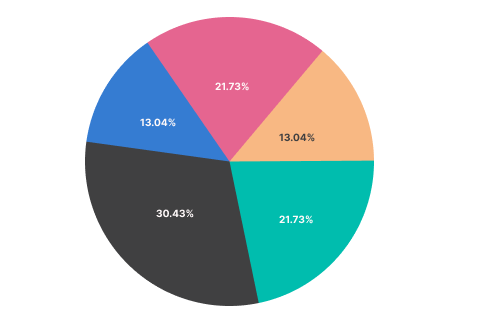
LabelTemplate
The SfCircularChart provides support to customize the appearance of the data labels using the LabelTemplate property.
<chart:SfCircularChart>

    <chart:SfCircularChart.Resources>
        <DataTemplate x:Key="labelTemplate">
            <HorizontalStackLayout Spacing="5">
                <Label Text="{Binding Item.Product}" TextColor="White" FontSize="13"/>
                <Label Text=" : " TextColor="White" FontSize="13"/>
                <Label Text="{Binding Item.SalesRate}" TextColor="White" FontSize="13"/>
            </HorizontalStackLayout>
        </DataTemplate>
    </chart:SfCircularChart.Resources>

    <chart:PieSeries ItemsSource="{Binding Data}"
                     XBindingPath="Product"
                     YBindingPath="SalesRate"
                     ShowDataLabels="True"
                     LabelTemplate="{StaticResource labelTemplate}">
    </chart:PieSeries>

</chart:SfCircularChart>
SfCircularChart chart = new SfCircularChart();
. . .
PieSeries series = new PieSeries();
series.ItemsSource = new ViewModel().Data;
series.XBindingPath = "Product";
series.YBindingPath = "SalesRate";
series.ShowDataLabels = true;
DataTemplate labelTemplate = new DataTemplate(() =>
{
var horizontalStackLayout = new HorizontalStackLayout { Spacing = 5 };
var productLabel = new Label
{
TextColor = Color.White,
FontSize = 13
};
productLabel.SetBinding(Label.TextProperty, "Item.Product");
var separatorLabel = new Label
{
Text = " : ",
TextColor = Color.White,
FontSize = 13,
};
var salesRateLabel = new Label
{
TextColor = Color.White,
FontSize = 13,
};
salesRateLabel.SetBinding(Label.TextProperty, "Item.SalesRate");
horizontalStackLayout.Children.Add(productLabel);
horizontalStackLayout.Children.Add(separatorLabel);
horizontalStackLayout.Children.Add(salesRateLabel);
return horizontalStackLayout;
});
series.LabelTemplate = labelTemplate;
chart.Series.Add(series);
this.Content = chart;
Connector line style
The ConnectorLineStyle is used to customize the appearance of the line that connects data labels positioned outside the chart series. The following ConnectorLineStyle properties are used to customize the connector line.
- Stroke – Gets or sets the stroke color of the connector line.
- StrokeWidth – Gets or sets the stroke thickness of the connector line.
- StrokeDashArray – Gets or sets the dashes for the connector line.
- ConnectorType - Gets or sets a value that specifies the connector type.
<chart:SfCircularChart>
    <chart:SfCircularChart.Resources>
        <DoubleCollection x:Key="dashArray">
            <x:Double>5</x:Double>
            <x:Double>2</x:Double>
        </DoubleCollection>
    </chart:SfCircularChart.Resources>
    <chart:PieSeries ItemsSource ="{Binding Data}"
                     XBindingPath="XValue"
                     YBindingPath="YValue"
                     ShowDataLabels="True">
        <chart:PieSeries.DataLabelSettings>
            <chart:CircularDataLabelSettings LabelPosition="Outside">
                <chart:CircularDataLabelSettings.ConnectorLineSettings>
                    <chart:ConnectorLineStyle StrokeDashArray="{StaticResource dashArray}"
                                              ConnectorType="Curve"
                                              Stroke="Black"
                                              StrokeWidth="3"/>
                </chart:CircularDataLabelSettings.ConnectorLineSettings>
            </chart:CircularDataLabelSettings>
        </chart:PieSeries.DataLabelSettings>
    </chart:PieSeries>
</chart:SfCircularChart>
SfCircularChart chart = new SfCircularChart();
DoubleCollection doubleCollection = new DoubleCollection();
doubleCollection.Add(5);
doubleCollection.Add(2);
. . .
PieSeries series = new PieSeries()
{
ItemsSource = viewModel.Data,
XBindingPath = "XValue",
YBindingPath = "YValue",
ShowDataLabels = true,
};
var connectorLineStyle = new ConnectorLineStyle
{
StrokeDashArray = doubleCollection,
ConnectorType = ConnectorType.Curve,
Stroke = Colors.Black,
StrokeWidth = 3
};
series.DataLabelSettings = new CircularDataLabelSettings()
{
LabelPosition = ChartDataLabelPosition.Outside,
ConnectorLineSettings = connectorLineStyle
};
chart.Series.Add(series);
this.Content = chart;