About Syncfusion® .NET MAUI Circular Chart Control
18 Nov 20185 minutes to read
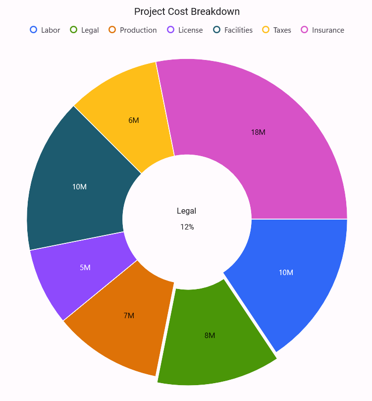
Syncfusion® .NET MAUI Circular Charts is used to create the chart with beautiful and enhanced UI visualization of data that are used in high-quality .NET MAUI applications.
Business use cases
- Business dashboards that require proportion-based data visualization using pie or doughnut charts.
- Financial applications that display distribution of expenses, revenue, or category-based data.
- Analytics tools that present comparative insights using percentage-based charts.
- Reporting applications that require easy-to-understand graphical representation of segmented data.
Key features
- Circular chart types support pie and doughnut series to represent data in intuitive and visually distinct formats.
- User interaction support includes selection, tooltip, and explode features to improve data exploration and usability.
- Legend support provides additional information about data points and helps users interpret chart values.
- Dynamic data updates allow updating the chart in real time or lazily based on changing data sources.
- RadialBar chart displays values using circular bars, making proportional comparisons visually clear and distinctive.
Globalization
The following table summarizes the globalization support available in this control.
 Full Support
 Partial Support
 No Support
 Not Applicable
| Control | Localization | RTL | Time zone | Screen reader | Keyboard navigation |
|---|---|---|---|---|---|
| Circular Charts | |
|
|
|
|
Related controls
- Cartesian Charts for trend analysis, comparisons, and multi‑series data visualization using X and Y axes.
- Funnel Charts for visualizing stages in a process or pipeline.
- Pyramid Charts for hierarchical or comparative data representation.
See Also
- Getting Started shows a step‑by‑step guide to begin using the Circular Chart control.
- Pie Chart creates simple part‑to‑whole visualizations with clear category splits.
- Doughnut Chart highlights proportions with a modern ring‑style chart for better readability.
- RadialBar Chart displays values in a circular bar style, making comparisons visually clear and engaging.
- UI Kit provides interactive demos and ready‑made UI examples.
Resources
Feature Tour
Get a quick overview of key features and capabilities to kick start your journey.
Explore Features
Tutorial Videos
Watch step‑by‑step video guides to quickly understand concepts and implementation.
Watch now
Knowledge Base
Find practical solutions, troubleshooting tips and how‑to guides for common scenarios.
Search KB's
Use Case Sample
Explore a real-world application that demonstrates the practical use of the Circular Chart.
View Sample