Radial Bar Chart in .NET MAUI Circular Chart
9 Jul 202612 minutes to read
RadialBarSeries is a type of doughnut chart that represents each segment as a separate circle. It is used to compare values between various categories. To render a RadialBarSeries in circular chart, create an instance of the RadialBarSeries and add it to the Series collection property of SfCircularChart.
NOTE
Prerequisite: Ensure that the required NuGet package is installed, the necessary namespaces are imported, and the SfCircularChart control is properly configured in your application. For detailed setup and configuration instructions, refer to the Getting Started guide.
NOTE
The circular chart has Series as its default content.
To customize the .NET MAUI Radial Bar Chart, you can check the below video.
The following properties can be used to customize the appearance of the radial bar segment:
-
Opacity - To control the transparency of the chart segments.
-
Stroke - To customize the outer layer of the chart segments.
-
StrokeWidth - To customize the width of the stroke in chart segments.
-
GapRatio - To customize the spacing between each chart segments.
-
MaximumValue - To represent the span of the segment-filled area in the radial bar track. The default value of this property is
double.NaN. -
PaletteBrushes - To customize the appearance of the series.
<chart:SfCircularChart>
    <chart:RadialBarSeries ItemsSource="{Binding Data}"
                           XBindingPath="Product"
                           YBindingPath="SalesRate"/>
</chart:SfCircularChart>
SfCircularChart chart = new SfCircularChart();
RadialBarSeries series = new RadialBarSeries();
series.ItemsSource = (new SalesViewModel()).Data;
series.XBindingPath = "Product";
series.YBindingPath = "SalesRate";
chart.Series.Add(series);
this.Content = chart;
Changing the radial bar size
You can use the Radius property to change the radial bar chart size. The default value of the radius property is 0.8.
<chart:SfCircularChart>
    <chart:RadialBarSeries ItemsSource="{Binding Data}"
                           XBindingPath="Product"
                           YBindingPath="SalesRate"
                           Radius="0.5"/>
</chart:SfCircularChart>
SfCircularChart chart = new SfCircularChart();
RadialBarSeries series = new RadialBarSeries();
series.ItemsSource = (new SalesViewModel()).Data;
series.XBindingPath = "Product";
series.YBindingPath = "SalesRate";
series.Radius = 0.5;
chart.Series.Add(series);
this.Content = chart;
Changing the radial bar inner radius
The InnerRadius property of radial bar series is used to define the inner circle. The default value of this property is 0.4.
<chart:SfCircularChart>
    <chart:RadialBarSeries ItemsSource="{Binding Data}"
                           XBindingPath="Product"
                           YBindingPath="SalesRate"
                           InnerRadius="0.1"/>
</chart:SfCircularChart>
SfCircularChart chart = new SfCircularChart();
RadialBarSeries series = new RadialBarSeries();
series.ItemsSource = (new SalesViewModel()).Data;
series.XBindingPath = "Product";
series.YBindingPath = "SalesRate";
series.InnerRadius = 0.1;
chart.Series.Add(series);
this.Content = chart;
CapStyle customization
The CapStyle property of the radial bar series is used to specify the shape of the start and end points of the circular segment. The default value of this property is CapStyle.BothFlat.
The following types are available for CapStyle property.
-
BothFlat - Start and end positions of the segment should be updated with a flat shape.
-
BothCurve - Start and end positions of the segment should be updated with a curve shape.
-
StartCurve - Start position of the segment should be updated with a curve shape.
-
EndCurve - End position of the segment should be updated with a curve shape.
BothCurve
You can customize the CapStyle property of the radial bar based on its types. The following example demonstrates the BothCurve cap style; other cap styles follow the same pattern.
<chart:SfCircularChart>
    <chart:RadialBarSeries ItemsSource="{Binding Data}"
                           XBindingPath="Product"
                           YBindingPath="SalesRate"
                           CapStyle = "BothCurve"/>
</chart:SfCircularChart>
SfCircularChart chart = new SfCircularChart();
RadialBarSeries series = new RadialBarSeries();
series.ItemsSource = (new SalesViewModel()).Data;
series.XBindingPath = "Product";
series.YBindingPath = "SalesRate";
series.CapStyle = CapStyle.BothCurve;
chart.Series.Add(series);
this.Content = chart;
Segment spacing
The GapRatio property of the radial bar series is used to define the spacing between each segment. The default value of this property is 0.2.
<chart:SfCircularChart>
    <chart:RadialBarSeries ItemsSource="{Binding Data}"
                           XBindingPath="Product"
                           YBindingPath="SalesRate"
                           InnerRadius="0.2"
                           GapRatio="0.4"/>
</chart:SfCircularChart>
SfCircularChart chart = new SfCircularChart();
RadialBarSeries series = new RadialBarSeries();
series.ItemsSource = (new SalesViewModel()).Data;
series.XBindingPath = "Product";
series.YBindingPath = "SalesRate";
series.InnerRadius = 0.2;
series.GapRatio = 0.4;
chart.Series.Add(series);
this.Content = chart;
Track customization
You can use the following properties to customize the appearance of the circular bar track.
-
TrackStroke - To customize the circular bar border color.
-
TrackStrokeWidth - To customize the border width of the circular bar.
-
TrackFill - To customize the circular bar area behind the radial bar segments.
TrackFill
<chart:SfCircularChart>
    <chart:RadialBarSeries ItemsSource="{Binding Data}"
                           XBindingPath="Product"
                           YBindingPath="SalesRate"
                           TrackFill="#FFF7ED"
                           TrackStrokeWidth="1"
                           TrackStroke="#FED7AA"/>
</chart:SfCircularChart>
SfCircularChart chart = new SfCircularChart();
RadialBarSeries series = new RadialBarSeries();
series.ItemsSource = (new SalesViewModel()).Data;
series.XBindingPath = "Product";
series.YBindingPath = "SalesRate";
series.TrackFill = new SolidColorBrush(Color.FromArgb("#FFF7ED"));
series.TrackStrokeWidth = 1;
series.TrackStroke = new SolidColorBrush(Color.FromArgb("#FED7AA"));
chart.Series.Add(series);
this.Content = chart;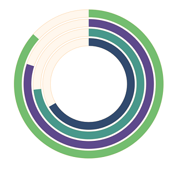
CenterView
Any view can be added to the center of the radial bar chart using the CenterView property of RadialBarSeries. The view placed in the center of the radial bar chart is useful for displaying additional information about the radial bar chart. The binding context of the CenterView will be the respective radial bar series.
CenterHoleSize
The CenterHoleSize property of RadialBarSeries is used to get the diameter value (in px) of the center hole. Using the CenterHoleSize, we can protect the view in the radial bar center from overlapping with the series.
<chart:SfCircularChart>
    <chart:RadialBarSeries ItemsSource="{Binding Data}"
                           XBindingPath="Product"
                           YBindingPath="SalesRate"
                           MaximumValue ="100"
                           CapStyle = "BothCurve">
        <chart:RadialBarSeries.CenterView>
            <VerticalStackLayout HeightRequest="{Binding CenterHoleSize}"
                                 WidthRequest="{Binding CenterHoleSize}">
                <Image Source="person.png"/>
            </VerticalStackLayout>
        </chart:RadialBarSeries.CenterView>
    </chart:RadialBarSeries>
</chart:SfCircularChart>
SfCircularChart chart = new SfCircularChart();
RadialBarSeries series = new RadialBarSeries();
series.ItemsSource = (new SalesViewModel()).Data;
series.XBindingPath = "Product";
series.YBindingPath = "SalesRate";
series.MaximumValue = 100;
series.CapStyle = CapStyle.BothCurve;
VerticalStackLayout layout = new VerticalStackLayout();
Image image = new Image { Source = "person.png" };
layout.SetBinding(HeightRequestProperty, nameof(RadialBarSeries.CenterHoleSize));
layout.SetBinding(WidthRequestProperty, nameof(RadialBarSeries.CenterHoleSize));
layout.Children.Add(image);
series.CenterView = layout;
chart.Series.Add(series);
this.Content = chart;