Data Labels in .NET MAUI Cartesian Chart
18 Nov 201813 minutes to read
Data labels are used to display values related to a chart segment. Values from data point(x, y) or other custom properties from a data source can be displayed.
Each data label can be represented by the following:
- Label - displays the segment label content at the (X, Y) point.
To learn how to customize the data labels in .NET MAUI Cartesian Charts quickly, you can check the following video.
Enable data labels
The ShowDataLabels property of the series is used to enable the data labels.
Prerequisite: Ensure that the required NuGet package is installed, the necessary namespaces are imported, and the SfCartesianChart control is properly configured in your application. For detailed setup and configuration instructions, refer to the Getting Started guide.
<chart:SfCartesianChart>
    <!-- code omitted for brevity -->
    <chart:ColumnSeries ItemsSource="{Binding Data}"
                        XBindingPath="Category"
                        YBindingPath="Value" ShowDataLabels="True">
    </chart:ColumnSeries>
</chart:SfCartesianChart>
SfCartesianChart chart = new SfCartesianChart();
//code omitted for brevity
ColumnSeries series = new ColumnSeries()
{
ItemsSource = new ViewModel().Data,
XBindingPath = "Category",
YBindingPath = "Value",
ShowDataLabels = true
};
chart.Series.Add(series);
this.Content = chart;Data labels can be customized by using the DataLabelSettings property of the chart series. To customize, create an instance of CartesianDataLabelSettings and set it to the DataLabelSettings property. The following properties are used to customize the data labels, which are available in CartesianDataLabelSettings.
- BarAlignment - Gets or sets the data label alignment top, middle or bottom.
- LabelPlacement - Gets or sets the data label position inside, outside or default.
- LabelStyle - Gets or sets the options for customizing the data labels.
- UseSeriesPalette - Gets or sets a value indicating whether the data label should reflect the series interior.
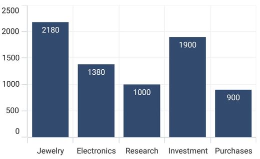
Data label alignment
The alignment of data labels inside the series is defined by using the BarAlignment property.
- Top - Positions the data label at the top edge point of a chart segment.
- Middle - Positions the data label at the center point of a chart segment.
- Bottom - Positions the data label at the bottom edge point of a chart segment.
This behavior varies based on the chart series type.
<chart:SfCartesianChart>
    <!-- code omitted for brevity -->
    <chart:ColumnSeries ShowDataLabels="True">
        <chart:ColumnSeries.DataLabelSettings>
            <chart:CartesianDataLabelSettings BarAlignment="Middle"/>
        </chart:ColumnSeries.DataLabelSettings>
    </chart:ColumnSeries>
</chart:SfCartesianChart>
SfCartesianChart chart = new SfCartesianChart();
//code omitted for brevity
ColumnSeries series = new ColumnSeries()
{
ShowDataLabels = true,
};
series.DataLabelSettings = new CartesianDataLabelSettings()
{
BarAlignment = DataLabelAlignment.Middle,
};
chart.Series.Add(series);
this.Content = chart;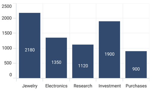
Label placement
In addition to the alignment options above, the chart provides an additional customization option to position the data labels.
The LabelPlacement property is used to position the data labels at Center, Inner and Outer positions relative to the actual data point position. By default, labels are positioned based on the series types for better readability.
<chart:SfCartesianChart>
    <!-- code omitted for brevity -->
    <chart:ColumnSeries ShowDataLabels="True">
        <chart:ColumnSeries.DataLabelSettings>
            <chart:CartesianDataLabelSettings LabelPlacement="Outer"/>
        </chart:ColumnSeries.DataLabelSettings>
    </chart:ColumnSeries>
</chart:SfCartesianChart>
SfCartesianChart chart = new SfCartesianChart();
//code omitted for brevity
ColumnSeries series = new ColumnSeries()
{
ShowDataLabels = true,
};
series.DataLabelSettings = new CartesianDataLabelSettings()
{
LabelPlacement = DataLabelPlacement.Outer,
};
chart.Series.Add(series);
this.Content = chart;Applying series brush
The UseSeriesPalette property is used to set the interior of the series to the data marker background.
<chart:SfCartesianChart>
    <!-- code omitted for brevity -->
    <chart:ColumnSeries ShowDataLabels="True">
        <chart:ColumnSeries.DataLabelSettings>
            <chart:CartesianDataLabelSettings UseSeriesPalette="False"/>
        </chart:ColumnSeries.DataLabelSettings>
    </chart:ColumnSeries>
</chart:SfCartesianChart>
SfCartesianChart chart = new SfCartesianChart();
ColumnSeries series = new ColumnSeries()
{
ShowDataLabels = true,
};
series.DataLabelSettings = new CartesianDataLabelSettings()
{
UseSeriesPalette = false,
};
chart.Series.Add(series);
this.Content = chart;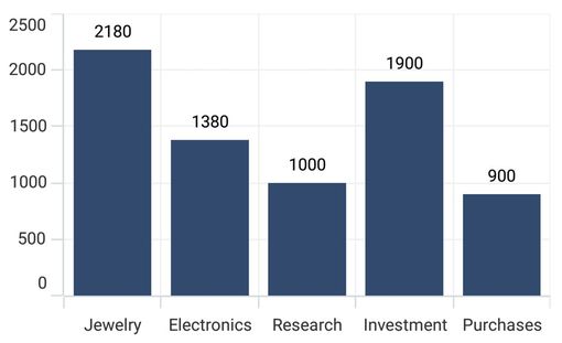
Formatting label context
The content of the label can be customized using the LabelContext property. The following two options are supported:
-
Percentage - Shows the percentage value of the corresponding data point Y value.
-
YValue - Shows the corresponding Y value.
The
Percentageoption is supported only for stacked series types (e.g.,StackedColumnSeries,StackedBarSeries).
<chart:SfCartesianChart IsTransposed="True">
    <!-- code omitted for brevity -->
    <chart:ColumnSeries ItemsSource="{Binding Data}"
                        XBindingPath="XValue"
                        YBindingPath="YValue"
                        ShowDataLabels="True"
                        LabelContext="Percentage"/>
</chart:SfCartesianChart>
SfCartesianChart chart = new SfCartesianChart();
chart.IsTransposed = true;
//code omitted for brevity
ColumnSeries series = new ColumnSeries()
{
ItemsSource = new ViewModel().Data,
XBindingPath = "XValue",
YBindingPath = "YValue",
ShowDataLabels = true,
LabelContext = LabelContext.Percentage,
};
chart.Series.Add(series);
this.Content = chart;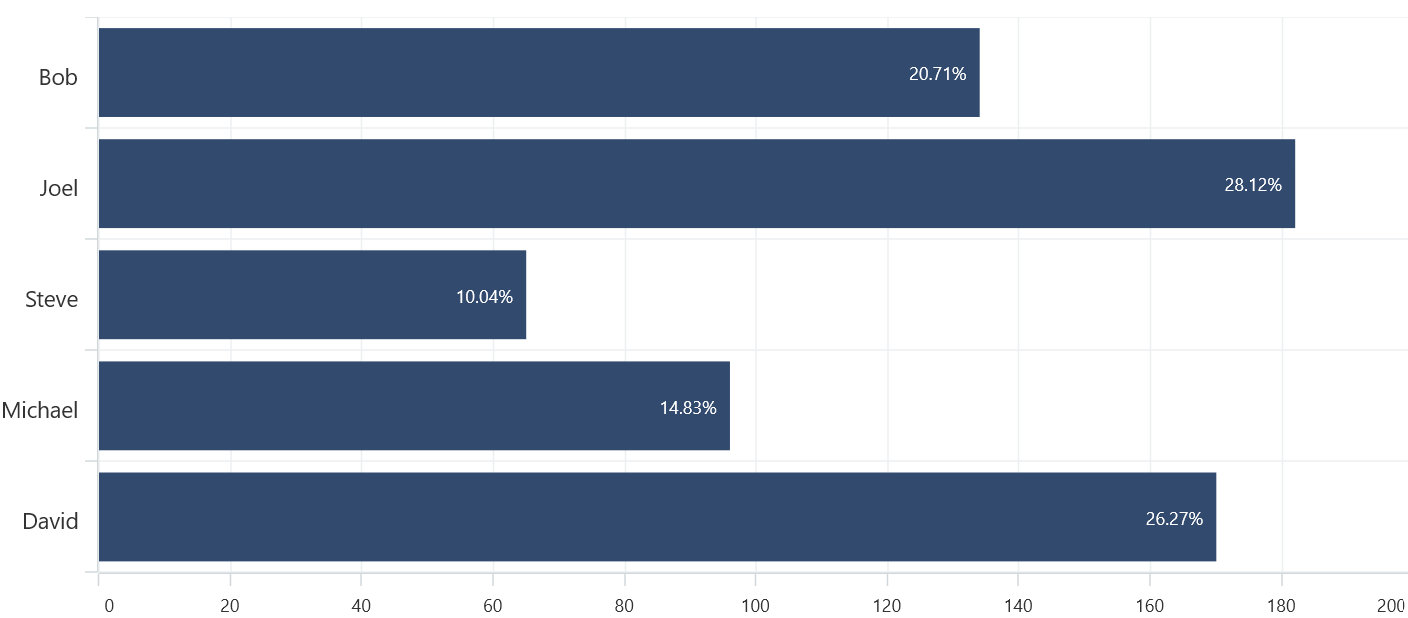
Label template
The SfCartesianChart provides support to customize the appearance of the data labels using the LabelTemplate property.
The
arrow.pngimage used in the following example must be added to the project’sResources/Imagesfolder.
<chart:SfCartesianChart IsTransposed="True">
    <chart:SfCartesianChart.Resources>
        <DataTemplate x:Key="labelTemplate">
            <HorizontalStackLayout Spacing="5" WidthRequest="100">
                <Image Source="arrow.png" WidthRequest="15" HeightRequest="15"/>
                <Label Text="{Binding Item.Values}" VerticalOptions="Center" FontSize="15"/>
            </HorizontalStackLayout>
        </DataTemplate>
    </chart:SfCartesianChart.Resources>
    <!-- code omitted for brevity -->
    <chart:ColumnSeries ItemsSource="{Binding Data}"
                        XBindingPath="Name"
                        YBindingPath="Values"
                        LabelTemplate="{StaticResource labelTemplate}"
                        ShowDataLabels="True">

        <chart:ColumnSeries.DataLabelSettings>
            <chart:CartesianDataLabelSettings LabelPlacement="Outer"/>
        </chart:ColumnSeries.DataLabelSettings>

    </chart:ColumnSeries>
</chart:SfCartesianChart>
SfCartesianChart chart = new SfCartesianChart();
chart.IsTransposed = true;
//code omitted for brevity
ColumnSeries series = new ColumnSeries();
series.ItemsSource = new ViewModel().Data;
series.XBindingPath = "Name";
series.YBindingPath = "Values";
series.ShowDataLabels = true;
series.DataLabelSettings = new CartesianDataLabelSettings()
{
LabelPlacement = DataLabelPlacement.Outer
};
DataTemplate labelTemplate = new DataTemplate(() =>
{
HorizontalStackLayout horizontalStackLayout = new HorizontalStackLayout { Spacing = 5, WidthRequest = 100 };
var label = new Label
{
VerticalOptions = LayoutOptions.Center,
FontSize = 15
};
label.SetBinding(Label.TextProperty, "Item.Values");
var image = new Image
{
Source = "arrow.png",
WidthRequest = 15,
HeightRequest = 15
};
horizontalStackLayout.Children.Add(image);
horizontalStackLayout.Children.Add(label);
return horizontalStackLayout;
});
series.LabelTemplate = labelTemplate;
chart.Series.Add(series);
this.Content = chart;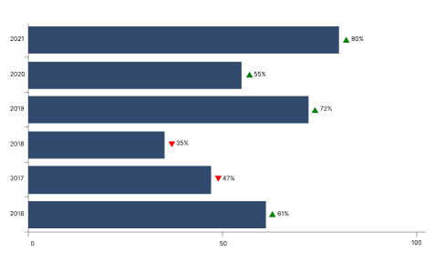
Event
DataLabelTapped
The DataLabelTapped event occurs when a user taps on a data label in a chart series. The DataLabelTappedEventArgs object exposes the following properties:
-
Series- Gets the chart series associated with the tapped data label. -
DataIndex- Gets the zero-based index of the tapped data point in the series. -
DataItem- Gets the original data object from the seriesItemsSource. -
Position- Gets the screen coordinates (X, Y) of the tap location in device-independent pixels. -
Segment- Gets the chart segment associated with the tapped data point. This value may benull.
<chart:SfCartesianChart DataLabelTapped="OnDataLabelTapped">

    <chart:SfCartesianChart.XAxes>
        <chart:CategoryAxis />
    </chart:SfCartesianChart.XAxes>

    <chart:SfCartesianChart.YAxes>
        <chart:NumericalAxis />
    </chart:SfCartesianChart.YAxes>

    <chart:ColumnSeries ItemsSource="{Binding Data}"
                        XBindingPath="Category"
                        YBindingPath="Value"
                        ShowDataLabels="True"/>
</chart:SfCartesianChart>
private void OnDataLabelTapped(object sender, DataLabelTappedEventArgs e)
{
var series = e.Series;
var dataIndex = e.DataIndex;
var dataItem = e.DataItem;
var tapPosition = e.Position;
var segment = e.Segment;
string message = $"Series: {series}\n" +
$"Segment: {segment}\n" +
$"Data Item: {dataItem}\n" +
$"Data Index: {dataIndex}\n" +
$"Tap Location: ({tapPosition.X:F0}, {tapPosition.Y:F0})";
DisplayAlertAsync("Data Label Details", message, "OK");
}The
DataLabelTappedevent is triggered only when the ShowDataLabels property is set totrue.