About Syncfusion® .NET MAUI Cartesian Chart Control
18 Nov 20186 minutes to read
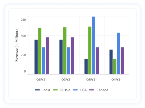
The Syncfusion® .NET MAUI Cartesian chart provides a perfect way to visualize data with a high level of user involvement that focuses on development, productivity, and simplicity of use. Chart also provides a wide variety of charting features that can be used to visualize large quantities of data, as well as flexibility in data binding and user customization.
Business use cases
- Business dashboards that require interactive data visualization with charts and graphs.
- Financial and analytics applications that rely on trend analysis and comparison of multiple datasets.
- Reporting tools that display large volumes of data in an easy-to-understand visual format.
- Real-time monitoring applications that require dynamic updates and interactive chart exploration.
Key features
- Rich chart types include line, spline, column, bar, area, scatter, and combination series.
- MVVM-Friendly data binding supports property path binding, collection binding, and dynamic updates.
- Interactive exploration provides zooming, panning, tooltips, selection, and trackball interaction.
- Plot bands highlight specific ranges on the chart to emphasize thresholds or target values.
- Trendlines show statistical trends and patterns across data points for better analysis.
- Chart export supports saving charts as images or documents for sharing and reporting purposes.
- Annotations allow adding custom text, shapes, or markers to highlight important information on the chart.
- Multi-series visualization enables comparison of multiple datasets and supports combining different chart types.
- Visual customization offers styling for axes, gridlines, labels, legends, markers, and themes.
Globalization
The following table summarizes the globalization support available in this control.
 Full Support
 Partial Support
 No Support
 Not Applicable
| Control | Localization | RTL | Time zone | Screen reader | Keyboard navigation |
|---|---|---|---|---|---|
| Cartesian Charts | |
|
|
|
|
Related controls
- Circular Charts for proportional data visualization using pie, doughnut, and radial bar charts.
- Funnel Charts for visualizing stages in a process or pipeline.
- Pyramid Charts for hierarchical or comparative data representation.
See Also
- Getting Started shows how to begin using the Cartesian chart control step by step.
- Customization and Styling shows how to configure chart appearance, axes, gridlines, labels, legends, and themes.
- Labels display values directly on data points.
- Zooming & Panning provides interactive navigation to focus on specific ranges and move across large datasets smoothly.
- Annotation adds custom text, shapes, or markers to highlight important areas or notes within the chart.
- UI Kit provides interactive demos and ready-made UI examples.
Resources
Feature Tour
Get a quick overview of key features and capabilities to kick start your journey.
Explore Features
Tutorial Videos
Watch step‑by‑step video guides to quickly understand concepts and implementation.
Watch now
Knowledge Base
Find practical solutions, troubleshooting tips and how‑to guides for common scenarios.
Search KB's
Use Case Sample
Explore a real-world application that demonstrates the practical use of the Cartesian Chart.
View Sample