Tooltip in .NET MAUI Cartesian Chart
10 Jul 202612 minutes to read
Tooltip is used to display any information or metadata of the tapped segment. The Cartesian chart provides tooltip support for all series.
NOTE
Prerequisite: Ensure that the required NuGet package is installed, the necessary namespaces are imported, and the SfCartesianChart control is properly configured in your application. For detailed setup and configuration instructions, refer to the Getting Started guide.
To learn how to customize the tooltips in .NET MAUI Cartesian Charts quickly, you can check the below video.
Define Tooltip
To define the tooltip in the series, set the EnableTooltip property to true. The default value of EnableTooltip property is false.
<chart:SfCartesianChart>
    <!-- code omitted for brevity -->
    <chart:ColumnSeries ItemsSource="{Binding Data}"
                        XBindingPath="Demand"
                        YBindingPath="Year2010"
                        EnableTooltip="True"/>

    <chart:ColumnSeries ItemsSource="{Binding Data}"
                        XBindingPath="Demand"
                        YBindingPath="Year2011"
                        EnableTooltip="True"/>
</chart:SfCartesianChart>
SfCartesianChart chart = new SfCartesianChart();
//code omitted for brevity
ColumnSeries series1 = new ColumnSeries()
{
ItemsSource = new ViewModel().Data,
XBindingPath = "Demand",
YBindingPath = "Year2010",
EnableTooltip = true
};
ColumnSeries series2 = new ColumnSeries()
{
ItemsSource = new ViewModel().Data,
XBindingPath = "Demand",
YBindingPath = "Year2011",
EnableTooltip = true
};
chart.Series.Add(series1);
chart.Series.Add(series2);
this.Content = chart;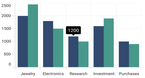
The ChartTooltipBehavior is used to customize the tooltip. For customizing the tooltip, create an instance ChartTooltipBehavior and set it to the TooltipBehavior property of SfCartesianChart. The following properties are used to customize the tooltip:
- Background - Gets or sets the background color to the tooltip label.
- FontAttributes - Gets or sets the font style for the label.
- FontFamily - Gets or sets the font family name for the label.
- FontSize - Gets or sets the font size for the label.
- Duration - Gets or sets the duration of the tooltip text in seconds.
- Margin - Gets or sets the margin of the label to customize the appearance of label.
- TextColor - Used to set the color for the text of the label.
-
Stroke- Gets or sets the border color of the tooltip. -
StrokeWidth- Gets or sets the thickness of the tooltip border. -
UseSeriesFillColor- Gets or sets a value indicating whether the tooltip background should use the fill color of the associated series. When set totrue, the tooltip adopts the series color as its background.
<chart:SfCartesianChart>
    <chart:SfCartesianChart.TooltipBehavior>
        <chart:ChartTooltipBehavior/>
    </chart:SfCartesianChart.TooltipBehavior>
    <!-- code omitted for brevity -->
</chart:SfCartesianChart>
SfCartesianChart chart = new SfCartesianChart();
chart.TooltipBehavior = new ChartTooltipBehavior();
//code omitted for brevity
this.Content = chart;Duration
The Duration property is used to specify the duration time in milliseconds for which tooltip will be displayed.
<chart:SfCartesianChart>
    <!-- code omitted for brevity -->
    <chart:SfCartesianChart.TooltipBehavior>
        <chart:ChartTooltipBehavior Duration="5000"/>
    </chart:SfCartesianChart.TooltipBehavior>

    <chart:ColumnSeries ItemsSource="{Binding Data}"
                        XBindingPath="Demand"
                        YBindingPath="Year2010"
                        EnableTooltip="True"/>

    <chart:ColumnSeries ItemsSource="{Binding Data}"
                        XBindingPath="Demand"
                        YBindingPath="Year2011"
                        EnableTooltip="True"/>
</chart:SfCartesianChart>
SfCartesianChart chart = new SfCartesianChart();
//code omitted for brevity
chart.TooltipBehavior = new ChartTooltipBehavior()
{
Duration = 5000
};
ColumnSeries series1 = new ColumnSeries()
{
ItemsSource = new ViewModel().Data,
XBindingPath = "Demand",
YBindingPath = "Year2010",
EnableTooltip = true
};
ColumnSeries series2 = new ColumnSeries()
{
ItemsSource = new ViewModel().Data,
XBindingPath = "Demand",
YBindingPath = "Year2011",
EnableTooltip = true
};
chart.Series.Add(series1);
chart.Series.Add(series2);
this.Content = chart;Template
The SfCartesianChart provides support to customize the appearance of the tooltip by using the TooltipTemplate property.
<chart:SfCartesianChart >
    <chart:SfCartesianChart.Resources>
        <DataTemplate x:Key="tooltipTemplate">
            <StackLayout Orientation="Horizontal">
                <Label Text="{Binding Item.Category}"
                       TextColor="Black"
                       FontAttributes="Bold"
                       FontSize="12"
                       HorizontalOptions="Center"
                       VerticalOptions="Center"/>
                <Label Text=" : "
                       TextColor="Black"
                       FontAttributes="Bold"
                       FontSize="12"
                       HorizontalOptions="Center"
                       VerticalOptions="Center"/>
                <Label Text="{Binding Item.Value}"
                       TextColor="Black"
                       FontAttributes="Bold"
                       FontSize="12"
                       HorizontalOptions="Center"
                       VerticalOptions="Center"/>
            </StackLayout>
        </DataTemplate>
        <!-- code omitted for brevity -->
    </chart:SfCartesianChart.Resources>
    <!-- code omitted for brevity -->
    <chart:SfCartesianChart.TooltipBehavior>
        <chart:ChartTooltipBehavior/>
    </chart:SfCartesianChart.TooltipBehavior>

    <chart:ColumnSeries ItemsSource="{Binding Data}" TooltipTemplate="{StaticResource tooltipTemplate}"
                        XBindingPath="Category"
                        YBindingPath="Value"
                        EnableTooltip="True"/>
    <chart:ColumnSeries ItemsSource="{Binding Data}" TooltipTemplate="{StaticResource tooltipTemplate}"
                        XBindingPath="Category"
                        YBindingPath="Value"
                        EnableTooltip="True"/>
</chart:SfCartesianChart>
SfCartesianChart chart = new SfCartesianChart();
//code omitted for brevity
ColumnSeries series1 = new ColumnSeries()
{
ItemsSource = new ViewModel().Data,
XBindingPath = "Category",
YBindingPath = "Value",
EnableTooltip = true,
TooltipTemplate = chart.Resources["tooltipTemplate"] as DataTemplate
};
ColumnSeries series2 = new ColumnSeries()
{
ItemsSource = new ViewModel().Data,
XBindingPath = "Category",
YBindingPath = "Value",
EnableTooltip = true,
TooltipTemplate = chart.Resources["tooltipTemplate"] as DataTemplate
};
chart.Series.Add(series1);
chart.Series.Add(series2);
this.Content = chart;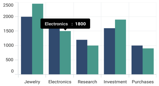
Methods
You can show or hide the chart tooltip programmatically by using the show or hide method.
Show method
The Show method is used to activate the tooltip at the specified location.
<chart:SfCartesianChart>
    <!-- code omitted for brevity -->
    <chart:SfCartesianChart.TooltipBehavior>
        <chart:ChartTooltipBehavior x:Name="tooltip"/>
    </chart:SfCartesianChart.TooltipBehavior>
    <!-- code omitted for brevity -->
</chart:SfCartesianChart>

<Button Text="Show tooltip" Clicked="Button_Clicked"/>private void Button_Clicked(object sender, EventArgs e)
{
//pointX - determines the x position of the tooltip, pointY - determines the y position of the tooltip and the bool value determines whether the tooltip should be animated while displaying.
tooltip.Show(pointX, pointY, true);
}NOTE
The tooltip will be activated at the specified location only if there is any data point under the specified location.
Hide method
The Hide method is used to hide the tooltip programmatically.
//The argument determines whether the tooltip should be animated while hiding.

tooltip.Hide();