How can I help you?
Rows
The TreeGrid rows displays the information of each row from the bounded data source.
Row Template
Row template is used to customize the TreeGrid rows based on requirements. In TreeGrid, the rowTemplateID and altRowTemplateID properties are used for customizing the row.
The rowTemplateID is used to customize all the rows in TreeGrid. For this property, ID of the row template is to be provided.
The altRowTemplateID is used to customize the alternative rows in TreeGrid. For this property, ID of the alternative row template is to be provided.
.e-treegrid .e-selectionbackground {
        background-color: #CED8F6;
        }

      .border {
        border-color: #BDBDBD;
        border-width: 1px;
        border-style: solid;
}<script id="rowTemplateScript" type="text/x-jsrender">
<tr style="background-color:#F2F2F2;color:#000000;">
<td class="border" style='height:30px;'>
<div>{{:#data['EmployeeID']}}</div>
</td>
<td class="border" style='height:30px;'>
<div style="font-size:14px;">
{{:#data['Name']}}
<p style="font-size:9px;">{{:#data['Designation']}}</p>
</div>
</td>
<td class="border">
<div style="padding-top:5px;">
<div style="display:inline-flex !important;">
<img src="../images/treegrid/{{:#data['Full Name']}}.png"/></div>
<div style="display:inline-block;padding-left:10px;">
{{:#data['Address']}}
<p>{{:#data['Country']}}</p>
<p style="font-size:12px;">{{:#data['Contact']}}</p>
</div>
</div>
</td>
<td class="border" style='height:30px;'>
<div>{{:#data['DOB']}}</div>
</td>
</tr>
</script>
<script id="altRowTemplateScript" type="text/x-jsrender">
<tr style="background-color:#E6E6E6;color:#000000;">
<td class="border" style='height:30px;'>
<div>{{:#data['EmployeeID']}}</div>
</td>
<td class="border" style='height:30px;'>
<div style="font-size:14px;">{{:#data['Name']}}
<p style="font-size:9px;">{{:#data['Designation']}}</p>
</div>
</td>
<td class="border">
<div style="padding-top:5px;">
<div style="display:inline-flex !important;">
<img src="../images/treegrid/{{:#data['Full Name']}}.png"/></div>
<div style="display:inline-block;padding-left:10px;">
{{:#data['Address']}}
<p>{{:#data['Country']}}</p>
<p style="font-size:12px;">{{:#data['Contact']}}</p>
</div>
</div>
</td>
<td class="border" style='height:30px;'>
<div>{{:#data['DOB']}}</div>
</td>
</tr>
</script>var treeData = [{
"Name": "Robert King",
"Full Name": "Robert King",
"Designation": "Chief Executive Officer",
"EmployeeID": "EMP001",
"Address": "507 - 20th Ave. E.Apt. 2A, Seattle",
"Contact": "(206) 555-9857",
"Country": "USA",
"DOB": "2/15/1963",
"Children": [{
"Name": "David William",
"Full Name": "David William",
"Designation": "Vice President",
"EmployeeID": "EMP004",
"Address": "722 Moss Bay Blvd., Kirkland",
"Country": "USA",
"Contact": "(206) 555-3412",
"DOB": "5/20/1971",
// ...
}]
}];
$(function () {
$("#TreeGridContainer").ejTreeGrid({
dataSource: treeData,
childMapping: "Children",
allowColumnResize: true,
rowTemplateID: "rowTemplateScript",
altRowTemplateID: "altRowTemplateScript",
editSettings: { allowEditing: true, editMode: "cellEditing" },
columns: [
{headerText: "Employee ID", width: "180" },
{ field: "Name", headerText: "Employee Name" },
{ field: "Address", headerText: "Employee picture", width: "300" },
{ field: "DOB", headerText: "DOB", editType: "datepicker" },
]
})
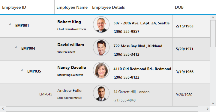
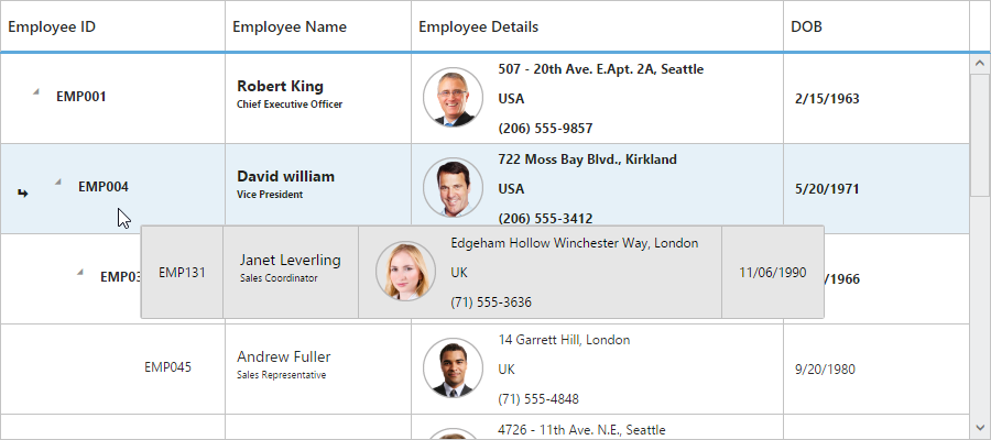
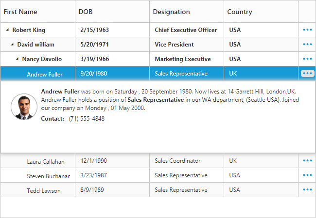
});The output of TreeGrid with Row Template is as follows.
NOTE
- In TreeGrid, the given row template is parsed for default row functionality like row selection, alt row and other default row customization. Using
parseRowTemplateproperty we can disable the row template parsing. TreeGrid is rendered with given row template, if we disable that property.
Row Height
The rowHeight property is used to change the height of row in tree grid, default value of this property is 30.
The following code example explains how to change the row height in tree grid
$("#treegrid").ejTreeGrid({
          //...
          rowHeight: 50,
          // ...
       });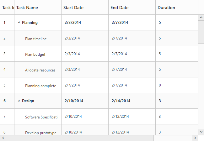
The above screenshot shows TreeGrid render with row height of 50.
Alternate row styling
Alternate row style is used to enable the different background color for every alternate row. The enableAltRow property is used to enable the alternate row style in tree grid, default value of this property is true.
The following code explains about enabling the alternate row style in tree grid
$("#treegrid").ejTreeGrid({
          //...
          enableAltRow: true,
          // ...
       });
The above screenshot shows TreeGrid with alternate row style.
Row Drag and Drop
It is possible to dynamically re-arrange the rows in the TreeGrid control by using the allowDragAndDrop property. With this property, row drag and drop can be enabled or disabled. Rows can be inserted above, below as a sibling or as a child to the existing row with the help of this feature. A default tooltip is rendered while dragging the TreeGrid row and this tooltip can be customized by the dragTooltip property. This property has inner properties such as the showTooltip, tooltipItems, tooltipTemplate.
The showTooltip property is used to enable or disable the tooltip. By default, this property value is false.
The following code explains about enabling the row drag and drop with the default tooltip in the TreeGrid.
$("#treegrid1").ejTreeGrid({
//...
columns: [{
field: "taskID",
headerText: "Task Id"
}, {
field: "taskName",
headerText: "Task Name"
},
//...
],
allowDragAndDrop: true,
dragTooltip: {
showTooltip: true
},
// ...
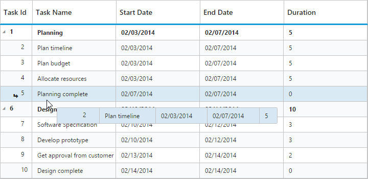
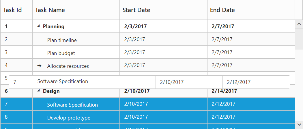
});The following screenshot depicts a row drag and drop in the TreeGrid widget.
Customizing Drag tooltip
The tooltipItems property is used to customize the tooltip items. By using this property, specific fields can be rendered in the tooltip. By default this property value is null, and all the defined field items are rendered in the tooltip.
The following code shows how to render row drag tooltip with the desired field items.
$("#treegrid1").ejTreeGrid({
          //...
          dragTooltip: {
              showTooltip: true,
              tooltipItems: [
                  "taskID",
                  "taskName",
                  "startDate",
                  "endDate"
              ]
          },
          //...
      });
The tooltipTemplate property renders the template tooltip for row drag and drop in the TreeGrid control by using the JsRender template. You can provide either the id value of the script element or the script element to the property.
The following code shows how to render row drag tooltip with tooltip template.
<script id="customTooltip" type="text/x-jsrender">
      <tr>
         <td class="border" style='height:30px;'>
         <div>{{:#data['TaskId']}}</div>
         </td>

         <td class="border" style='height:30px;'>
         <div>{{:#data['TaskName']}}</div>
         </td>
      </tr>
</script>$("#treegrid1").ejTreeGrid({
//...
dragTooltip: {
showTooltip: true,
tooltipTemplate: "#customTooltip",
},
//...
});
Customize row drag and drop action
In TreeGrid, rowDragStart, rowDrag, rowDragStop and rowDropActionBegin events are triggered on row drag and drop action. Using this event we can prevent drag and drop action of particular record and validate the drop position on particular record.
The below code example shows how to use this events.
$("#treegrid1").ejTreeGrid({
            //...
            allowDragAndDrop: true,
            rowDragStart: function (args) {
                if (args.draggedRow.taskID == 6) // Task Id 6 can't be dragged
                    args.cancel = true;
            },
            rowDrag: function (args) {
                if (args.targetRow.taskID == 5 && args.dropPosition == "insertAsChild") // Can't drop task as child on Task Id 5
                    args.canDrop = false;
            },
            rowDragStop: function (args) {
                if (args.targetRow.taskID == 6) // Can't drop any task on Task Id 6
                    args.cancel = true;
            },
        });
Multiple Row drag and drop
Using Multiple row drag and drop we can re-order multiple rows at a time.Using this we can drop the rows as above, below and child position as like single row drag and drop.
In TreeGrid we can enable the multiple drag and drop by setting selectionSettings.selectionType as multiple or checkbox and also we should enable the allowDragAndDrop.
Please find the code example below to enable multiple drag and drop in TreeGrid.
$("#treegrid1").ejTreeGrid({
          //...
          selectionSettings:{
              selectionType:"multiple"
          },
          allowDragAndDrop: true,
          // ...
       });
We can also customize row drag and drop actions by using below properties
-
canDrag – It is used to enable/disable the row drag action for draggedRecords collection in
rowDragStartclient side event. -
canDrop – It is used to enable/disable the row drop action for draggedRecords collection in
rowDropActionBeginclient side event.
Click here to view the demo sample for multiple drag and drop action.
Drag and drop row programmatically
TreeGrid provide option to drag and drop a row programmatically at button click using moveRow public method.
The following arguments are used to specify positions to drag and drop a row,
- fromIndex - where we going to drag a row
- toIndex - where we wish to drop it
- position - drop the row as above below or child.
The following code example shows how to drag and drop a row in button click.
<div id="treeGridContainer"></div>

<script>
// Create Tree Grid object
var treegridObj = $("#treeGridContainer").data("ejTreeGrid");
treegridObj.moveRow(4, 15, "child"); // To move the row
</script>
Details row
Details row is used to provide a additional information about each row of tree grid. You can specify the detail row JsRender template id or HTML element as string to detailsTemplate property. However you need to enable the details template by setting showDetailsRow property as true.
The following code example shows how to enable details tow in tree grid.
<script id="descriptionTemplate" type="text/x-jsrender">
    <div style="position: relative; display: inline-block; float: left; font-weight: bold; width: 10%">
        <img src="../content/images/treegrid/.png" style="margin-left: 10px;margin-top:15px;" />
    </div>
    <div style="padding-left: 10px; display: inline-block; width: 88%; text-wrap: normal;font-size:12px;font-family:'Segoe UI';margin-top:2px;">
        <div class="e-description" style="word-wrap: break-word;">
            <b></b> was born on . Now lives at ,.  holds a position of <b></b> in our WA department, (Seattle USA). Joined our company on .
        </div>
        <div class="e-description" style="word-wrap: break-word;margin-top:5px;">
         <b style="margin-right:10px;">Contact:</b>
        </div>
    </div>
</script>

<script>
    $("#TreeGrid").ejTreeGrid({
        //...
        detailsTemplate:"descriptionTemplate",
        enableCollapseAll: true,
        //...
    });
</script>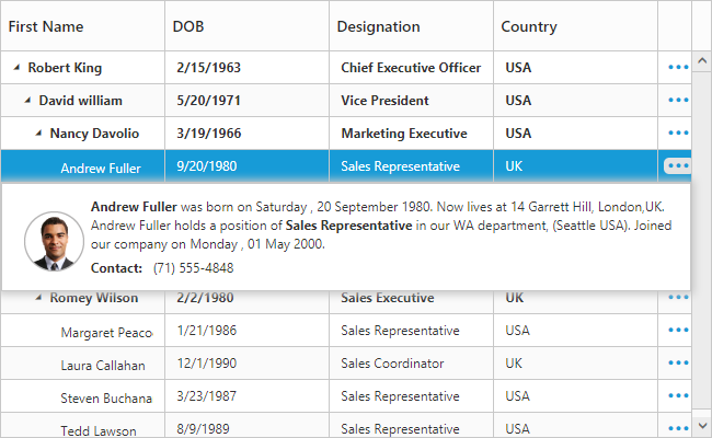
The above screenshot shows details row in tree grid.
The visibility of the details view of a record can also be toggled with any custom actions by using the method showHideDetailsRow.
Click here to view the demo sample for details row template.
Disable details row info column
On enabling details template, details row info column will be added in tree grid. It is used for show or hide the detail row of respective row. You can disable that column while enabling details template using showDetailsRowInfoColumn property. If you disable details row info column, then the details row will render next to the respective row.
The following code example shows how to hide detail info column in tree grid.
$("#TreeGrid").ejTreeGrid({
    //...
    detailsTemplate:"descriptionTemplate",
    enableCollapseAll: true,
    showDetailsRowInfoColumn:false,
    //...
});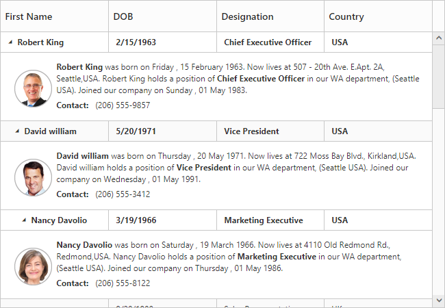
The above screenshot shows details row rendered next to the respective row.
Defining row height for detail template
In TreeGrid, It is provide a support to change the detail template height using detailsRowHeight property.
The following code example shows how to set details row height in tree grid.
$("#TreeGrid").ejTreeGrid({
    //...
    detailsTemplate:"descriptionTemplate",
    detailsRowHeight:150,
    //...
});
The above screenshot shows details row rendered with height of 150px.
Customize detail row
In TreeGrid, while rendering the details row the detailsDataBound event will trigger. Using this event we can customize the detail row for specific row.
The below code example shows how to customize details row for specific row.
$("#TreeGrid").ejTreeGrid({
    //...
    detailsTemplate:"descriptionTemplate",
    detailsDataBound:function(args)
    {
        if (args.data.Name == "Andrew Fuller")
            $(args.detailsElement).css("background-color", "rgba(133, 133, 173,1)");
    },
    //...
});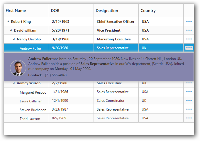
The above screenshot shows details row customization for specific row.
While opening and closing the details row, the detailsShown and detailsHidden events are triggered. Using this event we can prevent the details row show and hide for specific row.
The below code example shows how to prevent details row show for specific row.
$("#TreeGrid").ejTreeGrid({
    //...
    detailsTemplate:"descriptionTemplate",
    detailsShown:function(args)
    {
        if (args.data.Name == "Andrew Fuller")
           args.cancel = true;
    },
    //...
});
Expand/Collapse Row
In TreeGrid, parent rows are expanded/collapsed by using expand/collapse icons, expand all/collapse all toolbar items and by using the expandCollapseRow method. By default all records in TreeGrid will be rendered in expanded state.
Collapse parent records at initial load
It is possible to display all the records in collapsed state by setting enableCollapseAll property as true.
The following code example shows how to use this property.
$("#TreeGrid").ejTreeGrid({
    //...
    enableCollapseAll: true,
    //...
});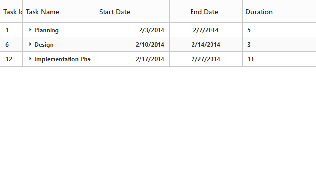
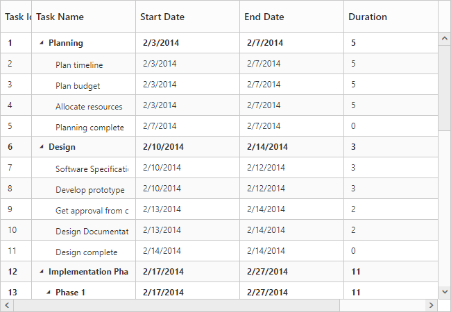
The above screenshot shows TreeGrid render with collapsed state.
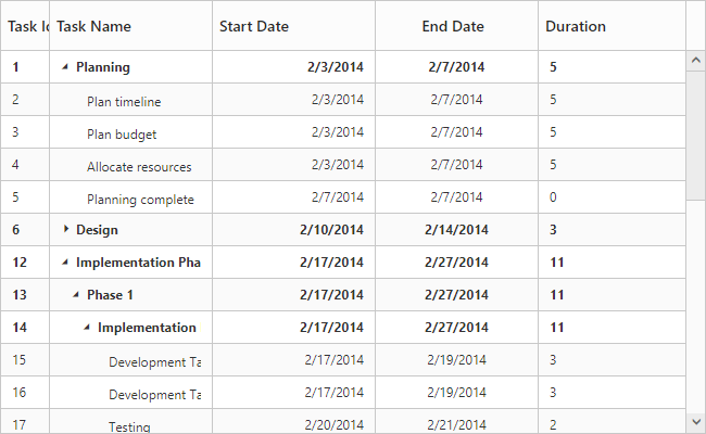
Define expand/collapse state of every record
In TreeGrid, it is possible to render records either in collapsed state or in expanded state, and this can done by mapping the expand state to the records from the data source by using expandStateMapping property.
The following code example shows how to use this property.
var data = [
    //...
    {
         taskID: 6,
         taskName: "Design",
         startDate: new Date("02/10/2014"),
         endDate: new Date("02/14/2014"),
         duration: 3,
         expandState:false,
         subtasks: [
             {
                 taskID: 7,
                 taskName: "Software Specification",
                 startDate: new Date("02/10/2014"),
                 endDate: new Date("02/12/2014"),
                 duration: 3,
                 expandState:false },
            //...
         ]
     },
];
$("#TreeGrid").ejTreeGrid({
    //...
    dataSource: data,
    expandStateMapping: "expandState",
    //...
});
The below screenshot shows the output of above code example..
Expand/Collapse all the rows dynamically
All the rows in tree grid will be expanded/collapsed by clicking expandAll and collapsedAll toolbar items or by using expandAll and collapseAll methods. We can invoke this methods dynamically on any action like external button click.
The below code example shows how to use this methods.
$("#TreeGrid").ejTreeGrid({
    //...
    toolbarSettings: {
        showToolbar: true,
        toolbarItems: [
            ej.TreeGrid.ToolbarItems.Add,
            //..
            ej.TreeGrid.ToolbarItems.ExpandAll,
		    ej.TreeGrid.ToolbarItems.CollapseAll
        ]
    },
});

$("#expandAll").click(function () {
    var treegridObj = $("#TreeGrid").ejTreeGrid("instance");
        treegridObj.expandAll();
});

$("#collapseAll").click(function () {
    var treegridObj = $("#TreeGrid").ejTreeGrid("instance");
        treegridObj.collapseAll();
});
Dynamically expand/Collapse the specific level row
The tree grid control provide the support to dynamically expand/collapse the specific level row by using expandAtLevel and collapseAtLevel methods. This methods are used to expand/ collapse the all rows which are in specific level.
The below code example shows how to use this methods.
$("#TreeGrid").ejTreeGrid({
    //...
    dataSource:data,
    //..
});

$("#expandAtLevel").click(function () {
    var treegridObj = $("#TreeGrid").ejTreeGrid("instance");
        treegridObj.expandAtLevel(1);
});

$("#collapseAtLevel").click(function () {
    var treegridObj = $("#TreeGrid").ejTreeGrid("instance");
        treegridObj.collapseAtLevel(1);
});
Customize expand/collapse action
In TreeGrid,While expanding the parent row expanding and expanded event will be trigger with current expanding row detail. Similarly collapsing and collapsed event will be trigger while collapsing the parent row. Using this event and it’s arguments we can customize the expand/collapse action.
The following code example shows how to prevent the particular row from expand/collapse action using expanding and collapsing event.
$("#TreeGrid").ejTreeGrid({
    //...
    collapsing:function(args){
        if(args.data.progress < 50) // we can't collapse the record which has progress is less than 50
            args.cancel = true;
    },
    expanding:function(args){
        if(args.data.duration > 5) // we can't expand the record which has duration is greater than 5
            args.cancel = true;
    },
    //..
});