How can I help you?
Responsive
The Kanban control has support for responsive behavior based on client browser’s width and height. To enable responsive, isResponsive property should be true.There are two modes of responsive layout is available in Kanban based on client width. They are.
- Mobile(<480px)
- Desktop(>480px)
You can check the image representation of touch actions from the below image.
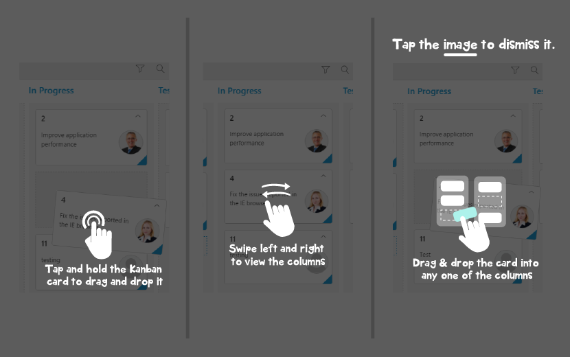
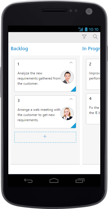
Mobile Layout
If client width is less than 480px, the Kanban will render in mobile mode. In which, you can see that kanban user interface is customized and redesigned for best view in small screens.To enable responsive, isResponsive property should be true.
<div id='Kanban'></div>$(function() {
var data = ej.DataManager(window.kanbanData).executeLocal(ej.Query().take(10));
$("#Kanban").ejKanban(
{
dataSource: data,
isResponsive: true,
allowSelection: false,
allowKeyboardNavigation: true,
allowTitle: true,
columns: [
{ headerText: "Backlog", key: "Open", showAddButton: true },
{ headerText: "In Progress", key: "InProgress" },
{ headerText: "Testing", key: "Testing" },
{ headerText: "Done", key: "Close" }
],
editSettings: {
editItems: [
{ field: "Id", editType: ej.Kanban.EditingType.String, validationRules: { required: true, number: true } },
{ field: "Status", editType: ej.Kanban.EditingType.Dropdown },
{ field: "Assignee", editType: ej.Kanban.EditingType.Dropdown },
{ field: "Estimate", editType: ej.Kanban.EditingType.Numeric, editParams: { decimalPlaces: 2 }, validationRules: { range: [0, 1000] } },
{ field: "Summary", editType: ej.Kanban.EditingType.TextArea, validationRules: { required: true } }
],
allowEditing: true,
allowAdding: true
},
keyField: "Status",
allowSearching: true,
filterSettings: [
{ text: "Janet Issues", query: new ej.Query().where("Assignee", "equal", "Janet"), description: "Displays issues which matches the assignee as 'Janet'" },
{ text: "Testing Issues", query: new ej.Query().where("Status", "equal", "Testing"), description: "Display the issues of 'Testing'" }
],
fields: {
primaryKey: "Id",
content: "Summary",
imageUrl: "ImgUrl"
}
});
});
WARNING
IE8 and IE9 does not support responsive kanban.
ej.responsive.cssshould be referred to display Responsive Kanban.
CRUD in mobile layout
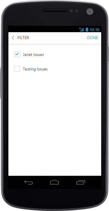
Filtering in mobile layout
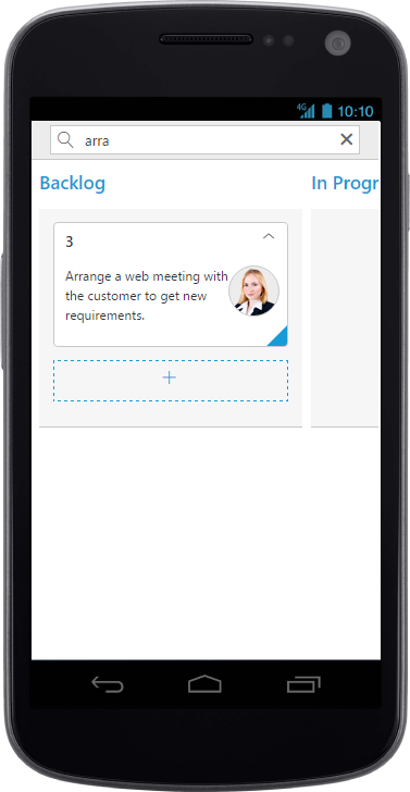
Searching in mobile layout
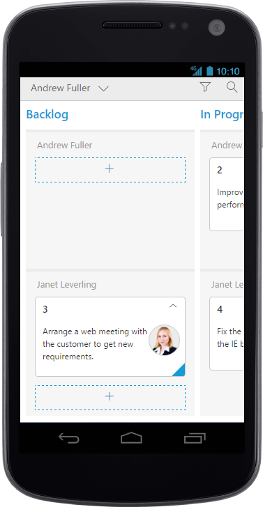
Kanban with Swim-lane
Width
By default, the Kanban is adaptable to its parent container. It can adjust its width of columns based on parent container width. You can also assign width of columns in percentage.
The following code example describes the above behavior.
<div id='Kanban'></div>$(function() {
var data = ej.DataManager(window.kanbanData).executeLocal(ej.Query().take(20));
$("#Kanban").ejKanban(
{
dataSource: data,
isResponsive: true,
columns: [
{ headerText: "Backlog", key: "Open",width:"10%" },
{ headerText: "In Progress", key: "InProgress", width: "10%" },
{ headerText: "Done", key: "Close", width: "10%" }
],
keyField: "Status",
fields: {
primaryKey: "Id",
content: "Summary",
tag: "Tags"
}
});
});NOTE
allowScrollingshould be false while defining width in percentage.
Min Width
Min Width is used to maintain minimum width for the Kanban. If the Kanban width is less than minWidth then the scrollbar will be displayed to maintain minimum width.
The following code example describes the above behavior.
<div id='Kanban'></div>$(function () {
var data = ej.DataManager(window.kanbanData).executeLocal(ej.Query().take(20));
$("#Kanban").ejKanban(
{
dataSource: data,
minWidth: 700,
isResponsive: true,
columns: [
{ headerText: "Backlog", key: "Open", width: 120 },
{ headerText: "In Progress", key: "InProgress", width: 110 },
{ headerText: "Done", key: "Close", width: 110 }
],
keyField: "Status",
fields: {
primaryKey: "Id",
content: "Summary",
tag: "Tags"
}
});
});The following output is displayed as a result of the above code example.