How can I help you?
Columns
Column fields are present in the dataSource schema and it is rendering cards based its mapping column values.
Key Mapping
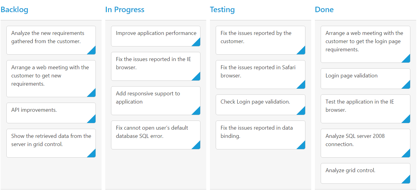
To render Kanban with simple cards, you need to map the dataSource fields to Kanban cards and columns. The required mapping field are listed as follows
| Mapping Fields | Description |
|---|---|
| Map the column name to use as values to columns. | |
| Map the corresponding `key` values of `keyField` column to each columns. | |
| It represents the title for particular column | |
| Map the column name to use as content to cards. |
NOTE
- If the column with
keyFieldis not in the dataSource andkeyvalues specified will not available in column values, then the cards will not be rendered.- If the
fields.contentis not in the dataSource, then empty cards will be rendered.
The following code example describes the above behavior.
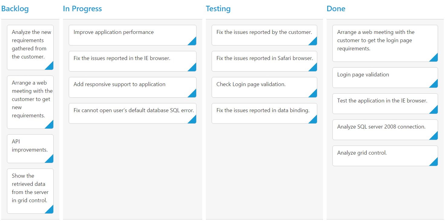
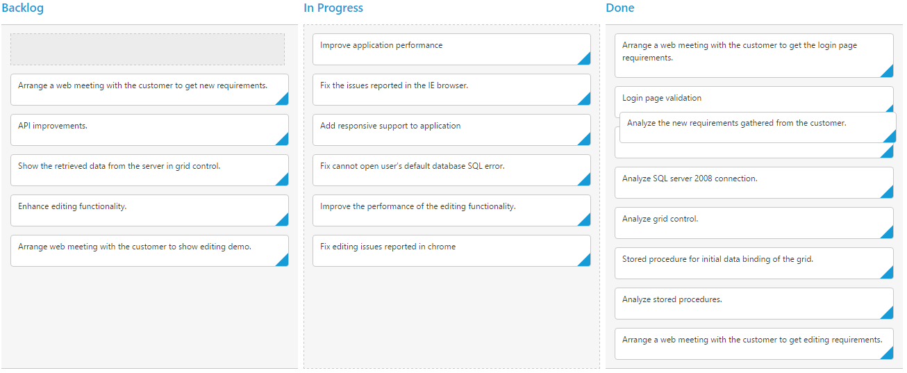
<div id='Kanban'></div>$(function () {
var data = ej.DataManager(window.kanbanData).executeLocal(ej.Query().take(30));
$("#Kanban").ejKanban({
dataSource: data,
columns: [
{ headerText: "Backlog", key: "Open"},
{ headerText: "In Progress", key: "InProgress"},
{ headerText: "Testing", key: "Testing"},
{ headerText: "Done", key: "Close"}
],
keyField: "Status",
fields: {
content: "Summary",
primaryKey: "Id"
}
});
});The following output is displayed as a result of the above code example.
Multiple Key Mapping
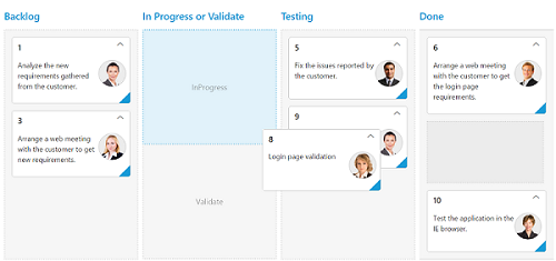
You can map more than one datasource fields as key values to show different key cards into single column. For e.g , you can map “Validate,In progress” keys under “In progress” column.
The following code example and screenshot which describes the above behavior.
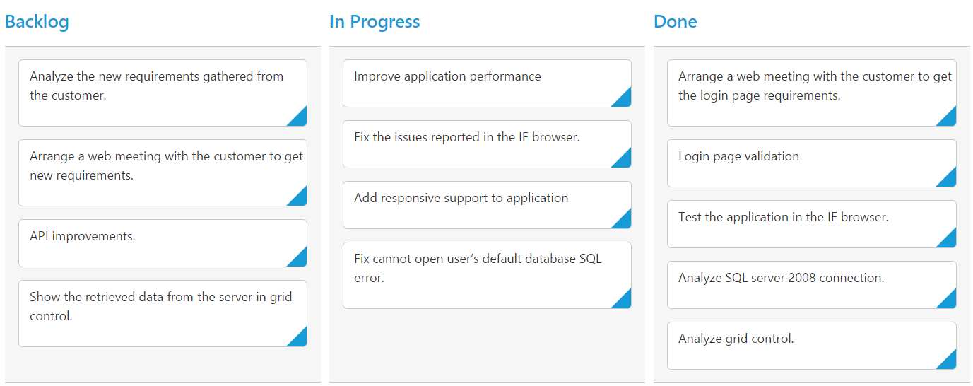
<div id='Kanban'></div>$(function() {
var data = ej.DataManager(window.kanbanData).executeLocal(ej.Query().take(10));
$("#Kanban").ejKanban(
{
dataSource: data,
columns: [
{ headerText: "Backlog", key: "Open"},
{ headerText: "In Progress or Validate", key: "InProgress,Validate" },
{ headerText: "Testing", key: "Testing" },
{ headerText: "Done", key: "Close" }
],
keyField: "Status",
allowTitle: true,
fields: {
content: "Summary",
primaryKey: "Id"
},
});
});The following output is displayed as a result of the above code example.
Headers
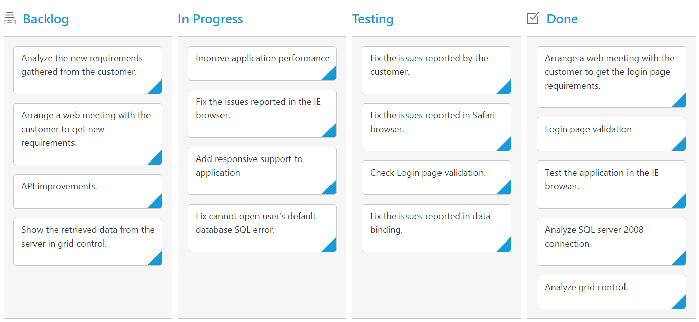
Header Template
The template design that applies on for the column header. To render template, set headerTemplate property of the columns.
You can use JsRender syntax in the template. For more information about JsRender syntax, please refer the link.
The following code example describes the above behavior.
<!—Column Template -->
        <script id="column1" type="text/x-jsrender">
            <span class="e-backlog e-icon"></span> Backlog
        </script>
        <div id="column4">
            <span class="e-done e-icon"></span> Done
        </div>
<div id='Kanban'></div>$(function () {
var data = ej.DataManager(window.kanbanData).executeLocal(ej.Query().take(30));
$("#Kanban").ejKanban(
{
dataSource: data,
columns: [
{ headerText: "Backlog", key: "Open", headerTemplate: "#column1" },
{ headerText: "In Progress", key: "InProgress" },
{ headerText: "Testing", key: "Testing" },
{ headerText: "Done", key: "Close", headerTemplate: "#column4" }
],
keyField: "Status",
fields: {
content: "Summary",
primaryKey: "Id"
}
});
});/*CSS for Header template icon*/
.e-backlog,.e-done {
font-size: 16px;
padding-right: 5px;
display: inline-block;
}
.e-backlog:before {
content: "\e807";
}
.e-done:before {
content: "\e80a";
}The following output is displayed as a result of the above code example.
Width
You can specify the width for particular column by setting width property of columns as in pixel (ex: 100) or in percentage (ex: 40%).
The following code example describes the above behavior.
<div id='Kanban'></div>$(function () {
var data = ej.DataManager(window.kanbanData).executeLocal(ej.Query().take(30));
$("#Kanban").ejKanban(
{
dataSource: data,
columns: [
{ headerText: "Backlog", key: "Open", width: "5%" },
{ headerText: "In Progress", key: "InProgress", width: "12%" },
{ headerText: "Testing", key: "Testing", width: 100 },
{ headerText: "Done", key: "Close", width: 100 }
],
keyField: "Status",
fields: {
content: "Summary",
primaryKey: "Id"
}
});
});The following output is displayed as a result of the above code example.
Visibility
You can hide particular column in Kanban by setting visible property of it as false.
The following code example describes the above behavior.
<div id='Kanban'></div>$(function () {
var data = ej.DataManager(window.kanbanData).executeLocal(ej.Query().take(30));
$("#Kanban").ejKanban(
{
dataSource: data,
columns: [
{ headerText: "Backlog", key: "Open" },
{ headerText: "In Progress", key: "InProgress" },
{ headerText: "Testing", key: "Testing", visible: false },
{ headerText: "Done", key: "Close" }
],
keyField: "Status",
fields: {
content: "Summary",
primaryKey: "Id"
}
});
});The following output is displayed as a result of the above code example.
Toggle
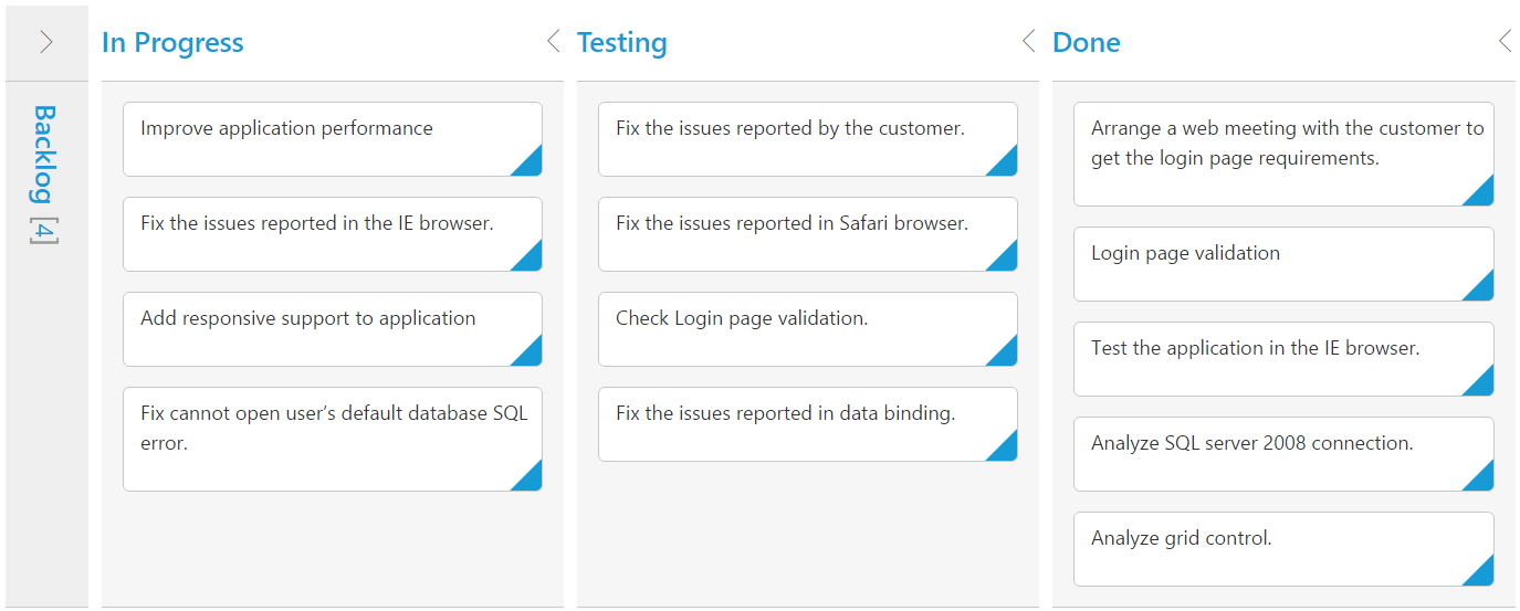
You can set particular column collapsed state in Kanban by setting isCollapsed property of it as true. You need to set allowToggleColumn as true to use “Expand/Collapse” Column.
The following code example describes the above behavior.
<div id='Kanban'></div>$(function() {
var data = ej.DataManager(window.kanbanData).executeLocal(ej.Query().take(30));
$("#Kanban").ejKanban(
{
dataSource: data,
allowToggleColumn:true,
columns: [
{ headerText: "Backlog", key: "Open",isCollapsed:true },
{ headerText: "In Progress", key: "InProgress" },
{ headerText: "Testing", key: "Testing" },
{ headerText: "Done", key: "Close" }
],
keyField: "Status",
fields: {
content: "Summary",
primaryKey: "Id"
},
});
});The following output is displayed as a result of the above code example.
Allow Dragging
You can enable and disable drag behavior to the cards in the Kanban columns using the allowDrag property and the default value is true.
The following code example describes the above behavior.
<div id='Kanban'></div>$(function () {
var data = ej.DataManager(window.kanbanData).executeLocal(ej.Query().take(30));
$("#Kanban").ejKanban(
{
dataSource: data,
columns: [
{ headerText: "Backlog", key: "Open", allowDrag: false },
{ headerText: "In Progress", key: "InProgress" },
{ headerText: "Done", key: "Close" }
],
keyField: "Status",
fields: {
content: "Summary",
primaryKey: "Id",
priority: "RankId"
}
});
});The following output is displayed as a result of the above code example.
Allow Dropping
You can enable and disable drop behavior to the cards in the Kanban columns using the allowDrop property and the default value is true.
The following code example describes the above behavior.
<div id='Kanban'></div>$(function () {
var data = ej.DataManager(window.kanbanData).executeLocal(ej.Query().take(30));
$("#Kanban").ejKanban(
{
dataSource: data,
columns: [
{ headerText: "Backlog", key: "Open"},
{ headerText: "In Progress", key: "InProgress" },
{ headerText: "Done", key: "Close", allowDrop: false }
],
keyField: "Status",
fields: {
content: "Summary",
primaryKey: "Id",
priority: "RankId"
}
});
});The following output is displayed as a result of the above code example.
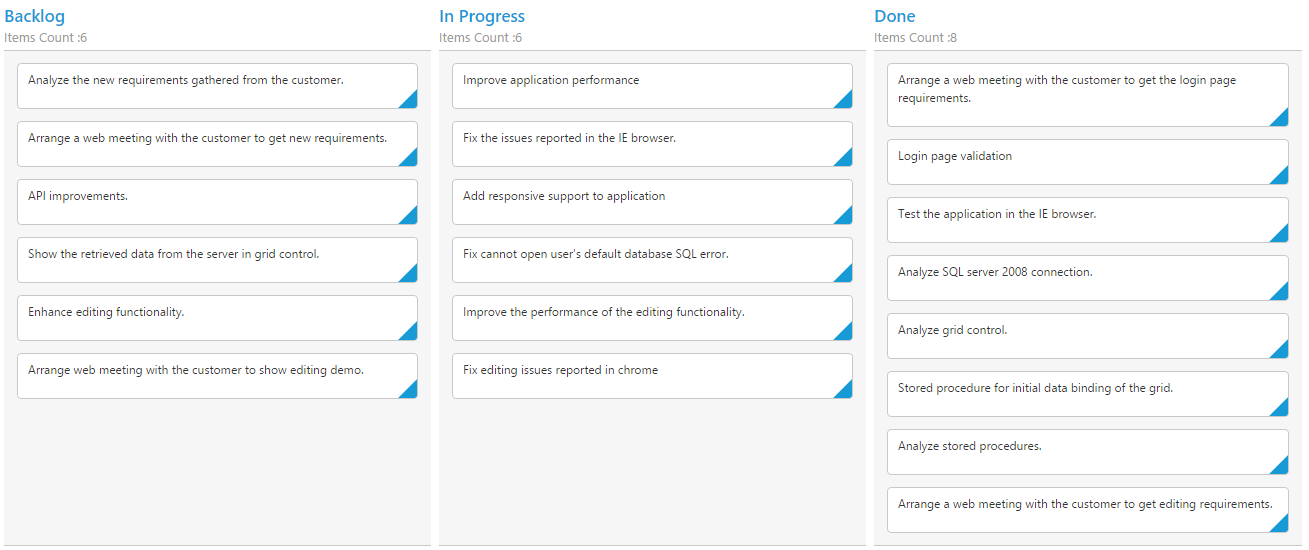
Items Count
You can show total cards count in each column’s header using the property enableTotalCount and the default value is false.
The following code example describes the above behavior.
<div id='Kanban'></div>$(function () {
var data = ej.DataManager(window.kanbanData).executeLocal(ej.Query().take(30));
$("#Kanban").ejKanban(
{
dataSource: data,
enableTotalCount:true,
columns: [
{ headerText: "Backlog", key: "Open"},
{ headerText: "In Progress", key: "InProgress" },
{ headerText: "Done", key: "Close" }
],
keyField: "Status",
fields: {
content: "Summary",
primaryKey: "Id"
}
});
});The following output is displayed as a result of the above code example.
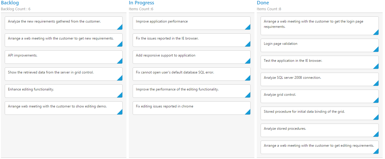
Customize Items Count Text
You can customize the Items count text using totalCount property of text.
The following code example describes the above behavior.
<div id='Kanban'></div>$(function () {
var data = ej.DataManager(window.kanbanData).executeLocal(ej.Query().take(30));
$("#Kanban").ejKanban(
{
dataSource: data,
enableTotalCount:true,
columns: [
{ headerText: "Backlog", key: "Open",totalCount:{text:"Backlog Count"}},
{ headerText: "In Progress", key: "InProgress" },
{ headerText: "Done", key: "Close" }
],
keyField: "Status",
fields: {
content: "Summary",
primaryKey: "Id"
}
});
});The following output is displayed as a result of the above code example.
Display Empty Column
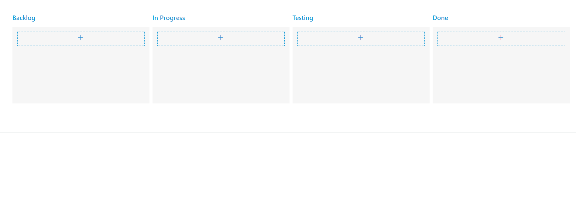
On binding empty data source to Kanban control, it displays “No cards to display” text. Using showColumnWhenEmpty property, we can render empty kanban columns. Set allowEditing and allowAdding property as true to add new data into the empty kanban column.
The following code example describes the above behavior.
<div id='Kanban'></div>$(function () {
var data = ej.DataManager(window.kanbanData).executeLocal(ej.Query().take(0));
$("#Kanban").ejKanban(
{
dataSource: data,
showColumnWhenEmpty: true,
columns: [
{ headerText: "Backlog", key: "Open"},
{ headerText: "In Progress", key: "InProgress" },
{ headerText: "Testing", key: "Testing" },
{ headerText: "Done", key: "Close" }
],
keyField: "Status",
fields: {
content: "Summary",
primaryKey: "Id"
},
editSettings: {
editItems: [
{ field: "Id", editType: ej.Kanban.EditingType.Text,validationRules: { required: true, number: true }},
{ field: "Status", editType: ej.Kanban.EditingType.Text },
{ field: "Assignee", editType: ej.Kanban.EditingType.Text },
{ field: "Estimate", editType: ej.Kanban.EditingType.Numeric, editParams: { decimalPlaces: 2 },validationRules: {range: [0, 1000]}},
{ field: "Summary", editType: ej.Kanban.EditingType.TextArea,validationRules: { required: true}}
],
allowEditing: true,
allowAdding: true
}
});
});The following output is displayed as a result of the above code example.