Enabled and disabled states in Flutter Slider (SfSlider)
30 Mar 202312 minutes to read
This section helps to learn about the enabled and disabled state in the Flutter slider.
Enabled state
The slider will be in enabled state if onChanged is set.
Horizontal
double _value = 5.0;

@override
Widget build(BuildContext context) {
  return MaterialApp(
      home: Scaffold(
          body: Center(
              child: SfSlider(
                min: 0.0,
                max: 10.0,
                value: _value,
                onChanged: (dynamic newValue) {
                  setState(() {
                    _value = newValue;
                  });
                },
              )
          )
      )
  );
}
Vertical
double _value = 5.0;

@override
Widget build(BuildContext context) {
  return MaterialApp(
      home: Scaffold(
          body: Center(
              child: SfSlider.vertical(
                min: 0.0,
                max: 10.0,
                value: _value,
                onChanged: (dynamic newValue) {
                  setState(() {
                    _value = newValue;
                  });
                },
              )
          )
      )
  );
}
Disabled state
The slider will be in disabled state if onChanged is null.
Horizontal
double _value = 5.0;

@override
Widget build(BuildContext context) {
  return MaterialApp(
      home: Scaffold(
          body: Center(
              child: SfSlider(
                min: 0.0,
                max: 10.0,
                value: _value,
                onChanged: null,
              )
          )
      )
  );
}
Vertical
double _value = 5.0;

@override
Widget build(BuildContext context) {
  return MaterialApp(
      home: Scaffold(
          body: Center(
              child: SfSlider.vertical(
                min: 0.0,
                max: 10.0,
                value: _value,
                onChanged: null,
              )
          )
      )
  );
}
Disabled color
You can change,
- The color of the active and inactive track in disabled state using the
disabledActiveTrackColoranddisabledInactiveTrackColorproperties. - The color of the active and inactive major ticks in disabled state using the
disabledActiveTickColoranddisabledInactiveTickColorproperties. - The color of the active and inactive minor ticks in disabled state using the
disabledActiveMinorTickColoranddisabledInactiveMinorTickColorproperties. - The color of the active and inactive dividers in disabled state using the
disabledActiveDividerColoranddisabledInactiveDividerColorproperties. - The color of the thumb in disabled state using the
disabledThumbColorproperty.
NOTE
You must import the
theme.dartlibrary from theCorepackage to useSfSliderTheme.
Horizontal
double _value = 6.0;

@override
Widget build(BuildContext context) {
  return MaterialApp(
      home: Scaffold(
          body: Center(
              child: SfSliderTheme(
                data: SfSliderThemeData(
                  disabledActiveTrackColor: Colors.orange,
                  disabledInactiveTrackColor: Colors.orange[200],
                  disabledActiveTickColor: Colors.orange,
                  disabledInactiveTickColor: Colors.orange[200],
                  disabledActiveMinorTickColor: Colors.orange,
                  disabledInactiveMinorTickColor: Colors.orange[200],
                  disabledActiveDividerColor: Colors.purple,
                  disabledInactiveDividerColor: Colors.purple[200],
                  disabledThumbColor: Colors.orange,
                ),
                child: SfSlider(
                  min: 2.0,
                  max: 10.0,
                  interval: 2,
                  showTicks: true,
                  minorTicksPerInterval: 1,
                  showDividers: true,
                  value: _value,
                  onChanged: null,
                ),
              )
          )
      )
  );
}
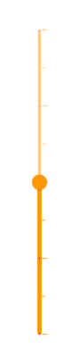
Vertical
double _value = 6.0;

@override
Widget build(BuildContext context) {
  return MaterialApp(
      home: Scaffold(
          body: Center(
              child: SfSliderTheme(
                data: SfSliderThemeData(
                  disabledActiveTrackColor: Colors.orange,
                  disabledInactiveTrackColor: Colors.orange[200],
                  disabledActiveTickColor: Colors.orange,
                  disabledInactiveTickColor: Colors.orange[200],
                  disabledActiveMinorTickColor: Colors.orange,
                  disabledInactiveMinorTickColor: Colors.orange[200],
                  disabledActiveDividerColor: Colors.purple,
                  disabledInactiveDividerColor: Colors.purple[200],
                  disabledThumbColor: Colors.orange,
                ),
                child: SfSlider.vertical(
                  min: 2.0,
                  max: 10.0,
                  interval: 2,
                  showTicks: true,
                  minorTicksPerInterval: 1,
                  showDividers: true,
                  value: _value,
                  onChanged: null,
                ),
              )
          )
      )
  );
}