Populating Items in Xamarin Picker (SfPicker)
11 Jun 202619 minutes to read
This section explains the ways of populating items for Xamarin Picker control.
Binding data source
Xamarin Picker control is bound to the external data source to display the data. It supports any collections that implements the IEnumerable interface.
To bind the data source in picker, set the SfPicker.ItemsSource property as shown in the following code.
<?xml version="1.0" encoding="utf-8" ?>

<ContentPage

x:Class="GettingStarted.PickerSample"

xmlns="http://xamarin.com/schemas/2014/forms"

xmlns:x="http://schemas.microsoft.com/winfx/2009/xaml"

xmlns:local="clr-namespace:GettingStarted"

xmlns:syncfusion="clr-namespace:Syncfusion.SfPicker.XForms;assembly=Syncfusion.SfPicker.XForms">

<ContentPage.BindingContext>

<local:ColorInfo />

</ContentPage.BindingContext>

<ContentPage.Content>

<syncfusion:SfPicker

x:Name="picker"

HeaderText="Select a Color"

ItemsSource="{Binding Colors}" />

</ContentPage.Content>

</ContentPage>
ColorInfo info = new ColorInfo();
picker.ItemsSource = info.Colors;Multi-column items
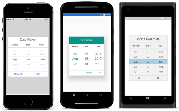
The picker automatically populates the items as Multi-column based on the data source.
Collection of items can be created and assigned to a Collection, and each item Collection is a column of picker.
The following code example illustrates how to populate Month, Day, and Year values in each column of picker.
public class DateTimePicker : SfPicker
    {
        #region Public Properties

        // Months api is used to modify the Day collection as per change in Month

        internal Dictionary<string, string> Months { get; set; }

        /// <summary>
        /// Date is the actual DataSource for SfPicker control which will holds the collection of Day ,Month and Year
        /// </summary>
        /// <value>The date.</value>
        public ObservableCollection<object> Dates { get; set; }

        //Day is the collection of day numbers
        internal ObservableCollection<object> Day { get; set; }

        //Month is the collection of Month Names
        internal ObservableCollection<object> Month { get; set; }

        //Year is the collection of Years from 1990 to 2042
        internal ObservableCollection<object> Year { get; set; }

        /// <summary>
        /// Headers api is holds the column name for every column in date picker
        /// </summary>
        /// <value>The Headers.</value>
        public ObservableCollection<string> Headers { get; set; }

        #endregion

        public DateTimePicker()
        {
            Months = new Dictionary<string, string>();

            Dates = new ObservableCollection<object>();
            Day = new ObservableCollection<object>();
            Month = new ObservableCollection<object>();
            Year = new ObservableCollection<object>();
            Headers = new ObservableCollection<string>();

            //First column of picker
            Headers.Add("Month");

            //Second column of picker
            Headers.Add("Day");

            //Third column of picker
            Headers.Add("Year");

            HeaderText = "Date Time Picker";
            PopulateDateCollection();
            this.ItemsSource = Dates;
            this.ColumnHeaderText = Headers;
            ShowFooter = true;
            ShowHeader = true;
            ShowColumnHeader = true;
        }

        private void PopulateDateCollection()
        {

            //populate months
            for (int i = 1; i < 13; i++)
            {
                if (!Months.ContainsKey(CultureInfo.CurrentCulture.DateTimeFormat.GetMonthName(i).Substring(0, 3)))
                    Months.Add(CultureInfo.CurrentCulture.DateTimeFormat.GetMonthName(i).Substring(0, 3), CultureInfo.CurrentCulture.DateTimeFormat.GetMonthName(i));

                Month.Add(CultureInfo.CurrentCulture.DateTimeFormat.GetMonthName(i).Substring(0, 3));
            }

            //populate year
            for (int i = 1990; i < 2050; i++)
            {
                Year.Add(i.ToString());
            }

            //populate Days
            for (int i = 1; i <= DateTime.DaysInMonth(DateTime.Now.Year, DateTime.Now.Month); i++)
            {
                if (i < 10)
                {
                    Day.Add("0" + i);
                }
                else
                    Day.Add(i.ToString());
            }

            Dates.Add(Month);
            Dates.Add(Day);
            Dates.Add(Year);
        }

    }
<ContentPage.BindingContext>
<local:DateTimeViewModel/>
</ContentPage.BindingContext>
<ContentPage.Content>
<local:DateTimePicker x:Name="picker"
PickerHeight="400"
PickerWidth="300"
HeaderText="Date Picker"
SelectedItem="{Binding StartDate}"
ColumnHeaderHeight="50">
</local:DateTimePicker>
</ContentPage.Content>You can download the multi column sample from the following link.
Sample link: MultiColumn
The following screenshot illustrates the output of the above code.
Set items colors and font attributes customization
Xamarin Picker control, both items text color and font can be selected and unselected by customizing as shown in the following code.
Selected item customization
Text Color
Selected item’s text color can be customized by setting SfPicker.SelectedItemTextColor property.
<syncfusion:SfPicker

x:Name="picker"

ItemsSource="{Binding Colors}"

SelectedItemTextColor="Red" />picker.SelectedItemTextColor = Color.Red;Font
This section explains about the customization of selected item’s font.
FontFamily
Selected item’s text FontFamily can be customized by setting SfPicker.SelectedItemFontFamily property.
<syncfusion:SfPicker

x:Name="picker"

ItemsSource="{Binding Colors}"

SelectedItemFontFamily="Arial" />picker.SelectedItemFontFamily = "Arial";FontSize
Selected item’s text FontSize can be customized by setting SfPicker.SelectedItemFontSize property.
<syncfusion:SfPicker

x:Name="picker"

ItemsSource="{Binding Colors}"

SelectedItemFontSize="12" />picker.SelectedItemFontSize = 12;FontAttribute
Selected item’s text FontAttribute can be customized by setting SfPicker.SelectedItemFontAttribute property.
<syncfusion:SfPicker

x:Name="picker"

ItemsSource="{Binding Colors}"

SelectedItemFontAttribute="Bold" />picker.SelectedItemFontAttribute = FontAttributes.Bold;Unselected item customization
Text Color
Unselected item’s text color can be customized by setting SfPicker.UnSelectedItemTextColor property.
<syncfusion:SfPicker

x:Name="picker"

ItemsSource="{Binding Colors}"

UnSelectedItemTextColor="Gray" />picker.UnSelectedItemTextColor = Color.Gray;Font
This section explains about the customization of unselected item’s font.
FontFamily
Unselected item’s text FontFamily can be customized by setting SfPicker.UnSelectedItemFontFamily property.
<syncfusion:SfPicker

x:Name="picker"

ItemsSource="{Binding Colors}"

UnSelectedItemFontFamily="Calibri" />picker.UnSelectedItemFontFamily = "Calibri";FontSize
Unselected item’s text FontSize can be customized by setting SfPicker.UnSelectedItemFontSize property.
<syncfusion:SfPicker

x:Name="picker"

ItemsSource="{Binding Colors}"

UnSelectedItemFontSize="11" />picker.UnSelectedItemFontSize = 11;FontAttribute
Unselected item’s text FontAttribute can be customized by setting SfPicker.UnSelectedItemFontAttribute property.
<syncfusion:SfPicker

x:Name="picker"

ItemsSource="{Binding Colors}"

UnSelectedItemFontAttribute="Italic" />picker.UnSelectedItemFontAttribute = FontAttributes.Italic;Adding custom view to items
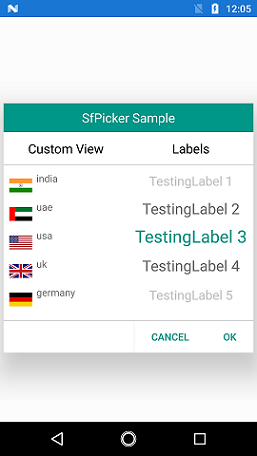
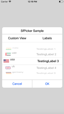
In picker control, the items can be customized with custom view of each item by hooking SfPicker.OnPickerItemLoaded event, and assign custom view in PickerViewEventArgs.View property to add the all the item with custom view.
<Grid x:Name="main">

<Button

x:Name="button"

Text="Open Picker"

Clicked="Handle_Clicked"

HeightRequest="100"

WidthRequest="200"

VerticalOptions="Center"

HorizontalOptions="Center" />

<picker:SfPicker

x:Name="picker"

HeaderHeight="40"

ShowHeader="true"

HeaderText="SfPicker Sample"

ShowColumnHeader="True"

ColumnHeaderHeight="46"

PickerMode="Dialog"

ItemsHeight="40"

PickerHeight="350"

PickerWidth="350"

ShowFooter="True"

FooterHeight="46"/>

    </Grid>
public partial class MainPage : ContentPage
{
public MainPage()
{
InitializeComponent();
ObservableCollection<object> mainCollection = new ObservableCollection<object>();
ObservableCollection<object> column0 = new ObservableCollection<object>();
ObservableCollection<object> column1 = new ObservableCollection<object>();
ObservableCollection<string> columnHeader = new ObservableCollection<string>();
columnHeader.Add("Custom View");
columnHeader.Add("Labels");
picker.ColumnHeaderText = columnHeader;
picker.OnPickerItemLoaded+=HandlePickerViewEvent;
column0.Add("India.png");
column0.Add("UAE.png");
column0.Add("USA.png");
column0.Add("UK.png");
column0.Add("Germany.png");
column1.Add("TestingLabel 1");
column1.Add("TestingLabel 2");
column1.Add("TestingLabel 3");
column1.Add("TestingLabel 4");
column1.Add("TestingLabel 5");
mainCollection.Add(column0);
mainCollection.Add(column1);
picker.ItemsSource = mainCollection;
picker.Parent = main;
}
void HandlePickerViewEvent(object sender, Syncfusion.SfPicker.XForms.PickerViewEventArgs e)
{
if (e.Column == 0)
{
Country country = new Country() { Name = e.Item.ToString() };
e.View = new ItemView(country);
}
}
void Handle_Clicked(object sender, System.EventArgs e)
{
picker.IsOpen = true;
}
}CustomView Xaml
<Grid>

<Grid.ColumnDefinitions>

        <ColumnDefinition Width="40" />
        <ColumnDefinition Width="*" />

</Grid.ColumnDefinitions>

<Image

Source="{Binding Name}"

Margin="8,0,0,0"

VerticalOptions="Center"  />

<Label

Text="{Binding Text}"

Grid.Column="1" />

    </Grid>
public partial class ItemView : ContentView
{
Country countryName;
int i;
public ItemView(Country country)
{
i = 0;
countryName = country;
InitializeComponent();
foreach(char count in country.Name)
{
i++;
}
countryName.Text = country.Name.Remove(i - 4);
this.BindingContext = countryName;
}
}
public class Country
{
public string Name { get; set; }
public string Text { get; set; }
}Screen shot for the above code.
NOTE
You can refer to our Xamarin Picker feature tour page for its groundbreaking feature representations. You can also explore our Xamarin.Forms Picker example to knows the functionalities of each feature.