How can I help you?
Xamarin Picker (SfPicker) Overview
10 Feb 20261 minute to read
The picker control allows you to pick an item among a list of items that can be customized with custom view. This control can be opened as dialog. Its rich feature set includes functionalities such as data binding, multi column, header/footer, custom view on header/footer, and default validation buttons.
Feature comparisons across iOS, Android, and UWP
| Features | Xamarin.Forms (Android, iOS and UWP) |
Xamarin.Android | Xamarin.iOS |
|---|---|---|---|
| Show Picker in Dialog | |||
| Selection | |||
| Header Customization | |||
| Footer Customization | |||
| Item Customization | |||
| Multi Column Support | |||
| Customize each column width | |||
| Column Header support | |||
| Column Header Customization |
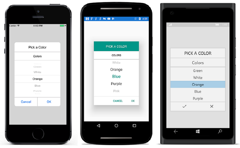
The following screenshot illustrates picker’s color selection

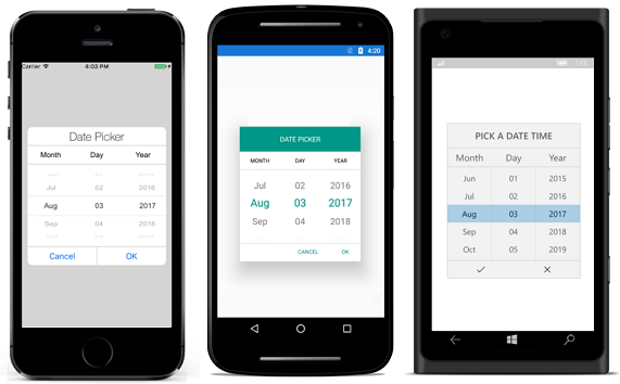
The following screenshot illustrates picker’s multicolumn

NOTE
You can refer to our Xamarin Picker feature tour page for its groundbreaking feature representations. You can also explore our Xamarin.Forms Picker example to knows the functionalities of each feature.