Dealing with Columns in Xamarin Picker (SfPicker)
8 Jan 202512 minutes to read
This section explains about the customization of picker columns
Adjust column width
Picker allows user to adjust the column width by hooking SfPicker.OnColumnLoaded event, and check the column by using the ColumnLoadedEventArgs.Column property, and then adjust width of column by setting the ColumnLoadedEventArgs.ColumnWidth property.
The following code snippets demonstrate the DateTimePicker sample by using OnColumnLoaded event.
MainPage
Column width of the each column can be adjusted by using the OnColumnLoaded event in picker. That is implemented in the following code.
<ContentPage xmlns="http://xamarin.com/schemas/2014/forms"

xmlns:x="http://schemas.microsoft.com/winfx/2009/xaml"

xmlns:local="clr-namespace:ColumnDateTime"

x:Class="ColumnDateTime.MainPage"

xmlns:picker="clr-namespace:Syncfusion.SfPicker.XForms;assembly=Syncfusion.SfPicker.XForms">

<!--Assign the TimePickerViewModel to BindingContext of Page-->

<ContentPage.BindingContext>

<local:DateTimePickerViewModel />

</ContentPage.BindingContext>

<Grid>


<Button

Clicked="Button_Clicked"

HeightRequest="50"

HorizontalOptions="Center"

Text="Show DateTimePicker"

VerticalOptions="Center"

WidthRequest="200" />

<!--Initialize the CustomDateTimePicker-->


<local:CustomDateTimePicker

x:Name="date"

ColumnHeaderHeight="40"

HorizontalOptions="Center"

OnColumnLoaded="date_OnColumnLoaded"

VerticalOptions="Center"

PickerHeight="300"

PickerMode="Dialog"

PickerWidth="310" SelectedItem="{Binding SelectedTime,Mode=TwoWay}"/>


</Grid>

</ContentPage>
[XamlCompilation(XamlCompilationOptions.Compile)]
public partial class MainPage : ContentPage
{
public MainPage()
{
InitializeComponent();
}
private void Button_Clicked(object sender, EventArgs e)
{
//open picker dialog
date.IsOpen = !date.IsOpen;
}
private void date_OnColumnLoaded(object sender, ColumnLoadedEventArgs e)
{
//Column width adjusted based on platform
if (Device.OS == TargetPlatform.Android)
{
if (e.Column == 0)
e.ColumnWidth = 400;
if (e.Column == 1)
e.ColumnWidth = 150;
if (e.Column == 2)
e.ColumnWidth = 150;
if (e.Column == 3)
e.ColumnWidth = 200;
}
if (Device.OS == TargetPlatform.iOS)
{
if (e.Column == 0)
e.ColumnWidth = 130;
if (e.Column == 1)
e.ColumnWidth = 50;
if (e.Column == 2)
e.ColumnWidth = 50;
if (e.Column == 3)
e.ColumnWidth = 70;
}
else
{
if (e.Column == 0)
e.ColumnWidth = 130;
}
}
}You can download the sample for reference from the following link.
Sample link: DateTimePicker
Add caption
picker allows users to add header for each column by setting the SfPicker.ColumnHeaderText property and enabling the SfPicker.ShowColumnHeader property to True.
The ColumnHeaderText property is object type and user can assign string or collection.
If a string type is assigned in SfPicker.ColumnHeaderText, that string will be updated in all the column of picker.
To assign the collection in SfPicker.ColumnHeaderText, picker column header should be updated based on index with value or collection.
The following code illustrates assigning the ColumnHeaderText for picker
public class DatesInfo

{

public ObservableCollection<object> Dates { get; set; }

//Day is the collection of day numbers

private ObservableCollection<string> Day { get; set; }

//Month is the collection of Month Names

private ObservableCollection<string> Month { get; set; }

//Year is the collection of Years from 1990 to 2050

private ObservableCollection<string> Year { get; set; }

//ColumnHeader is the collection of Header Day,Month and Year

public ObservableCollection<string> ColumnHeader { get; set; }

public DatesInfo()

{

Dates = new ObservableCollection<object>();

//Populate Day, Month and Year values of each collection

PopulateDates();

//first column of SfPicker

Dates.Add(Day);

//Second column of SfPicker

Dates.Add(Month);

//Third column of SfPicker

Dates.Add(Year);

ColumnHeader = new ObservableCollection<string>();

ColumnHeader.Add("Day");

ColumnHeader.Add("Month");

ColumnHeader.Add("Year");

}

private void PopulateDates()

{

Day = new ObservableCollection<string>();

Month = new ObservableCollection<string>();

Year = new ObservableCollection<string>();

for (int i = 1; i <= 31; i++)

Day.Add(i.ToString());

for (int i = 1; i <= 12; i++)

Month.Add(System.Globalization.CultureInfo.CurrentCulture.DateTimeFormat.GetMonthName(i));

for (int i = 1990; i <= 2050; i++)

Year.Add(i.ToString());

}

}
<?xml version="1.0" encoding="utf-8" ?>
<ContentPage
x:Class="GettingStarted.PickerSample"
xmlns="http://xamarin.com/schemas/2014/forms"
xmlns:x="http://schemas.microsoft.com/winfx/2009/xaml"
xmlns:local="clr-namespace:GettingStarted"
xmlns:syncfusion="clr-namespace:Syncfusion.SfPicker.XForms;assembly=Syncfusion.SfPicker.XForms">
<ContentPage.BindingContext>
<local:DatesInfo />
</ContentPage.BindingContext>
<ContentPage.Content>
<syncfusion:SfPicker
x:Name="picker"
ColumnHeaderText="{Binding ColumnHeader}"
HeaderText="Select a Date"
ItemsSource="{Binding Dates}"
ShowColumnHeader="True" />
</ContentPage.Content>
</ContentPage>Caption customization
This section explains about the column header’s Background, TextColor, and Fonts customization of picker.
Background
Column header’s background color can be customized by setting the SfPicker.ColumnHeaderBackgroundColor property.
<syncfusion:SfPicker

x:Name="picker"

ColumnHeaderBackgroundColor="SkyBlue"

ColumnHeaderText="Color"

ShowColumnHeader="True" />picker.ColumnHeaderBackgroundColor = Color.SkyBlue;Text-Color
Column header’s text color can be customized by setting the SfPicker.ColumnHeaderTextColor property.
<syncfusion:SfPicker

x:Name="picker"

ColumnHeaderTextColor="Red"

ColumnHeaderText="Color"

ShowColumnHeader="True" />picker.ColumnHeaderTextColor = Color.Red;Font
This section explains about the customization of column header’s text or Font.
FontFamily
Column header’s text FontFamily can be customized by setting the SfPicker.ColumnHeaderFontFamily property.
<syncfusion:SfPicker

x:Name="picker"

ColumnHeaderFontFamily="Courier New"

ColumnHeaderText="Color"

ShowColumnHeader="True" />picker.ColumnHeaderFontFamily = "Courier New";FontSize
Column header’s text FontSize can be customized by setting the SfPicker.ColumnHeaderFontSize property.
<syncfusion:SfPicker

x:Name="picker"

ColumnHeaderFontSize="16"

ColumnHeaderText="Color"

ShowColumnHeader="True" />picker.ColumnHeaderFontSize = 16;FontAttribute
Column header’s text FontAttribute can be customized by setting the SfPicker.ColumnHeaderFontAttribute property.
<syncfusion:SfPicker

x:Name="picker"

ColumnHeaderFontAttribute="Bold"

ColumnHeaderText="Color"

ShowColumnHeader="True" />picker.ColumnHeaderFontAttribute = FontAttributes.Bold;Multi Column SelectedIndex
Picker allows users to set selected index for particular column of picker or all columns of picker.To achieve this we need to set collection as Selected Index like below.
ObservableCollection<int> selectedIndex = new ObservableCollection<int>() { 1, 2, 3 };
selectedIndex[0] = 1;
selectedIndex[1] = 1;
selectedIndex[2] = 3;
this.SelectedIndex = selectedIndex;
You can get sample link from the following link
Sample:MultiColumn-SelectedIndex
Cascading
Picker allows users to get selection change intimation by setting the SfPicker.SelectionChanged event.
Refer the following code example to prepare cascading sample for change the picker’s background color when change the selection of picker.
<?xml version="1.0" encoding="utf-8" ?>
<ContentPage
    x:Class="ColorCascading.MainPage"
    xmlns="http://xamarin.com/schemas/2014/forms"
    xmlns:x="http://schemas.microsoft.com/winfx/2009/xaml"
    xmlns:local="clr-namespace:ColorCascading"
    xmlns:syncfusion="clr-namespace:Syncfusion.SfPicker.XForms;assembly=Syncfusion.SfPicker.XForms">

    <ContentPage.BindingContext>
        <local:ColorInfo />
    </ContentPage.BindingContext>

    <Grid HorizontalOptions="Center" VerticalOptions="Center">
        <syncfusion:SfPicker
            x:Name="picker"
            HeaderText="Select a Color"
            ItemsSource="{Binding Colors}"
            PickerHeight="260"
            PickerWidth="300"
            SelectionChanged="picker_SelectionChanged"
            />
    </Grid>
</ContentPage>*MainPage*
public partial class MainPage : ContentPage
{
public MainPage()
{
InitializeComponent();
}
private void Button_Clicked(object sender, EventArgs e)
{
picker.IsOpen = true;
}
private void picker_SelectionChanged(object sender, Syncfusion.SfPicker.XForms.SelectionChangedEventArgs e)
{
if (e.NewValue != null)
{
var color = PickerHelper.GetColor(e.NewValue.ToString());
if ((Device.OS==TargetPlatform.Android)||(Device.OS==TargetPlatform.iOS))
{
picker.BackgroundColor = Color.FromRgba(color.R, color.G, color.B, 0.2);
}
else
picker.SelectionBackgroundColor = color;
}
}
}
ColorInfo:
public class ColorInfo
{
private ObservableCollection<string> _color;
public ObservableCollection<string> Colors
{
get { return _color; }
set { _color = value; }
}
public ColorInfo()
{
Colors = new ObservableCollection<string>();
Colors.Add("Red");
Colors.Add("Green");
Colors.Add("Yellow");
Colors.Add("Purple");
Colors.Add("SkyBlue");
Colors.Add("Orange");
Colors.Add("Gray");
Colors.Add("Pink");
SelectedColor = "Yellow";
}
}
PickerHelper:
public static class PickerHelper
{
static Dictionary<string, Color> colors = new Dictionary<string, Color>();
public static Color GetColor(string color)
{
colors.Clear();
colors.Add("Yellow", Color.Yellow);
colors.Add("Green", Color.Green);
colors.Add("Orange", Color.Orange);
colors.Add("Lime", Color.Lime);
colors.Add("Purple", Color.Purple);
colors.Add("Pink", Color.Pink);
colors.Add("Black", Color.Black);
colors.Add("SkyBlue", Color.SkyBlue);
colors.Add("Navy", Color.Navy);
colors.Add("Red", Color.Red);
colors.Add("Gray", Color.Gray);
return colors[color.ToString()];
}
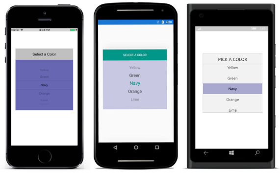
}The following screenshot illustrates the output of above code example.
You can download the sample for reference from the following link.
Sample link:Cascading