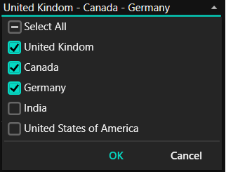
Getting Started with WPF ComboBox
18 Nov 201817 minutes to read
This section provides a quick overview for working with the ComboBoxAdv.
Assembly deployment
Refer to the control dependencies section to get the list of assemblies or NuGet packages that need to be added as references to use the ComboBoxAdv control in any application. The minimum NuGet package required is Syncfusion.Shared.WPF.
You can find more details about installing the NuGet package in a WPF application in the following link:
Creating an application with ComboBox
In this walk-through, the user will create a WPF application that contains the ComboBoxAdv control.
- Creating the project
- Adding control via designer
- Adding control manually in XAML
- Adding control manually in C#
- Creating the data model for the sample application
- Binding to data
Creating the project
The section below provides detailed information to create a new project in Visual Studio to display ComboBoxAdv.
- Open Visual Studio and click Create a new project.
- Select WPF App (.NET Framework) (or WPF Application for .NET/.NET Core) and click Next.
- Type a project name, choose a location, and click Create.
Adding control via designer
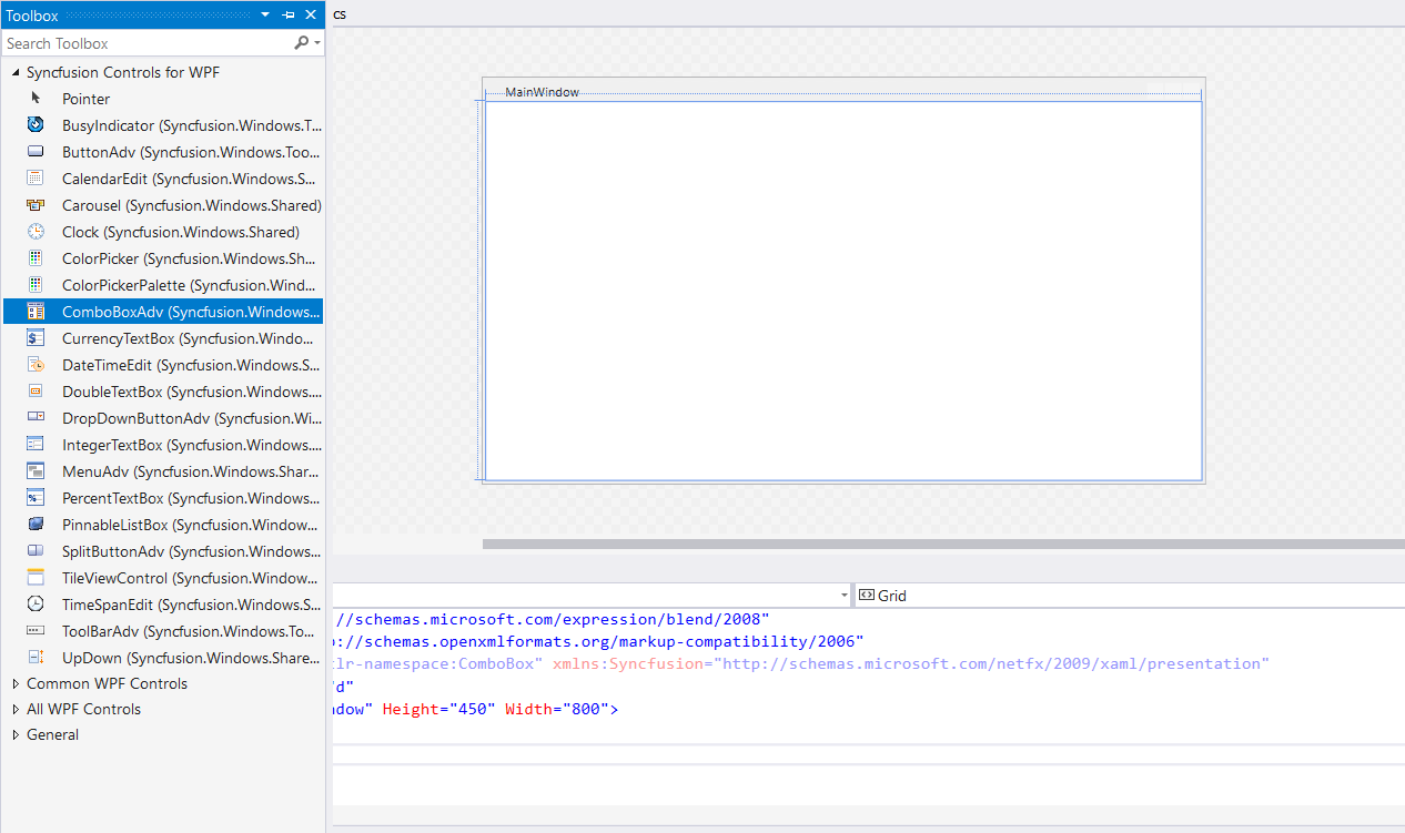
The ComboBoxAdv control can be added to the application by dragging it from the Toolbox and dropping it on the designer. The required assemblies will be added automatically.
Adding control manually in XAML
To add ComboBoxAdv manually in XAML, do the steps below.
- Add the required assembly reference to the project:
Syncfusion.Shared.WPF
- Import the Syncfusion WPF schema
http://schemas.syncfusion.com/wpfin the XAML page, or theSyncfusion.Windows.Tools.Controlsnamespace in code. -
Declare ComboBoxAdv in the XAML page.
<Window
        xmlns="http://schemas.microsoft.com/winfx/2006/xaml/presentation"
        xmlns:x="http://schemas.microsoft.com/winfx/2006/xaml"
        xmlns:d="http://schemas.microsoft.com/expression/blend/2008"
        xmlns:mc="http://schemas.openxmlformats.org/markup-compatibility/2006"
        xmlns:local="clr-namespace:GettingStartedComboBox"
        xmlns:syncfusion="http://schemas.syncfusion.com/wpf" x:Class="GettingStartedComboBox.MainWindow"
        mc:Ignorable="d"
        Title="MainWindow" Height="450" Width="800">
    <Grid>
        <syncfusion:ComboBoxAdv Height="30" Width="150"/>
    </Grid>
</Window>
Adding control manually in C#
To add ComboBoxAdv manually in C#, do the steps below.
- Add the required assembly reference to the project:
Syncfusion.Shared.WPF
- Import the
Syncfusion.Windows.Tools.Controlsnamespace. -
Create a
ComboBoxAdvinstance and add it to the page.using System.Windows; using Syncfusion.Windows.Tools.Controls; namespace GettingStartedComboBox { /// <summary> /// Interaction logic for MainWindow.xaml /// </summary> public partial class MainWindow : Window { public MainWindow() { InitializeComponent(); ComboBoxAdv comboBoxAdv = new ComboBoxAdv(); this.Content = comboBoxAdv; comboBoxAdv.Height = 30; comboBoxAdv.Width = 150; comboBoxAdv.DefaultText = "choose Items"; } } }
Adding items in ComboBox
Items can be added in the ComboBoxAdv control in the following ways.
- Adding items by
ComboBoxItemAdv. - Adding items by data binding.
Add items using ComboBoxItemAdv
The items in ComboBoxAdv can be created by using ComboBoxItemAdv in XAML or C# code.
<syncfusion:ComboBoxAdv Height="30" Width="200"
                              HorizontalAlignment="Center"
                              VerticalAlignment="Center" >

  <syncfusion:ComboBoxItemAdv Content="Denmark" />
  <syncfusion:ComboBoxItemAdv Content="New Zealand" />
  <syncfusion:ComboBoxItemAdv Content="Canada" />
  <syncfusion:ComboBoxItemAdv Content="Russia" />
  <syncfusion:ComboBoxItemAdv Content="Japan" />
</syncfusion:ComboBoxAdv>
public MainWindow()
{
InitializeComponent();
ComboBoxAdv comboBoxAdv = new ComboBoxAdv() { Height=30,Width= 200
,HorizontalAlignment= HorizontalAlignment.Center, VerticalAlignment = VerticalAlignment.Center };
ComboBoxItemAdv item1 = new ComboBoxItemAdv() { Content = "Denmark" };
ComboBoxItemAdv item2 = new ComboBoxItemAdv() { Content = "New Zealand" };
ComboBoxItemAdv item3 = new ComboBoxItemAdv() { Content = "Canada" };
ComboBoxItemAdv item4 = new ComboBoxItemAdv() { Content = "Russia" };
ComboBoxItemAdv item5 = new ComboBoxItemAdv() { Content = "Japan" };
comboBoxAdv.Items.Add(item1);
comboBoxAdv.Items.Add(item2);
comboBoxAdv.Items.Add(item3);
comboBoxAdv.Items.Add(item4);
comboBoxAdv.Items.Add(item5);
this.Content = comboBoxAdv;
}Adding items by data binding
The items in ComboBoxAdv can be added by data binding by following the procedure below.
Creating the data model for the sample application
-
Create a data object class named
PopulationInfoand declare the properties as shown below.public class PopulationInfo { private string continent; private double population; private string country; private double growth; public string Continent { get { return continent; } set { continent = value; } } public string Country { get { return country; } set { country = value; } } public double Growth { get { return growth; } set { growth = value; } } public double Population { get { return population; } set { population = value; } } } -
Create a
ViewModelclass with several data objects in its constructor.public class PopulationViewModel { public PopulationViewModel() { this.PopulationDetails = new ObservableCollection<PopulationInfo>(); PopulationDetails.Add(new PopulationInfo() { Continent = "Asia", Country = "Indonesia", Growth = 3, Population = 237641326 }); PopulationDetails.Add(new PopulationInfo() { Continent = "Asia", Country = "Russia", Growth = 2, Population = 152518015 }); PopulationDetails.Add(new PopulationInfo() { Continent = "Asia", Country = "Malaysia", Growth = 1, Population = 29672000 }); PopulationDetails.Add(new PopulationInfo() { Continent = "North America", Country = "United States", Growth = 4, Population = 315645000 }); PopulationDetails.Add(new PopulationInfo() { Continent = "North America", Country = "Mexico", Growth = 2, Population = 112336538 }); PopulationDetails.Add(new PopulationInfo() { Continent = "North America", Country = "Canada", Growth = 1, Population = 35056064 }); PopulationDetails.Add(new PopulationInfo() { Continent = "South America", Country = "Colombia", Growth = 1, Population = 47000000 }); PopulationDetails.Add(new PopulationInfo() { Continent = "South America", Country = "Brazil", Growth = 3, Population = 193946886 }); PopulationDetails.Add(new PopulationInfo() { Continent = "Africa", Country = "Nigeria", Growth = 2, Population = 170901000 }); PopulationDetails.Add(new PopulationInfo() { Continent = "Africa", Country = "Egypt", Growth = 1, Population = 83661000 }); PopulationDetails.Add(new PopulationInfo() { Continent = "Europe", Country = "Germany", Growth = 1, Population = 81993000 }); PopulationDetails.Add(new PopulationInfo() { Continent = "Europe", Country = "France", Growth = 1, Population = 65605000 }); PopulationDetails.Add(new PopulationInfo() { Continent = "Europe", Country = "UK", Growth = 1, Population = 63181775 }); } public ObservableCollection<PopulationInfo> PopulationDetails { get; set; } }
Binding to data
To bind the ComboBoxAdv to data, bind the collection created in the previous step to the ItemsSource property by setting the PopulationViewModel as the DataContext.
<Window
        xmlns="http://schemas.microsoft.com/winfx/2006/xaml/presentation"
        xmlns:x="http://schemas.microsoft.com/winfx/2006/xaml"
        xmlns:d="http://schemas.microsoft.com/expression/blend/2008"
        xmlns:mc="http://schemas.openxmlformats.org/markup-compatibility/2006"
        xmlns:local="clr-namespace:GettingStartedComboBox"
        xmlns:syncfusion="http://schemas.syncfusion.com/wpf" x:Class="GettingStartedComboBox.MainWindow"
        mc:Ignorable="d"
        Title="MainWindow" Height="450" Width="800">
    <Grid>
        <Grid.DataContext>
            <local:PopulationViewModel/>
        </Grid.DataContext>
        <syncfusion:ComboBoxAdv x:Name="comboBoxAdv" Height="30" Width="200" ItemsSource="{Binding PopulationDetails}"/>
    </Grid>
</Window>
namespace GettingStartedComboBox
{
public partial class MainWindow : Window
{
public MainWindow()
{
InitializeComponent();
this.DataContext = new PopulationViewModel();
}
}
}Binding display member
The DisplayMemberPath property denotes the path to a value on the data object for visual presentation of items in the drop-down list and for displaying the selected item in ComboBoxAdv. The default value is an empty string.
<Grid>
    <Grid.DataContext>
        <local:PopulationViewModel/>
    </Grid.DataContext>
    <syncfusion:ComboBoxAdv x:Name="comboBoxAdv" Height="30" Width="200" ItemsSource="{Binding PopulationDetails}" DisplayMemberPath="Country"/>
</Grid>
// Initialize the display member path for the ComboBox.
this.comboBoxAdv.DisplayMemberPath = "Country";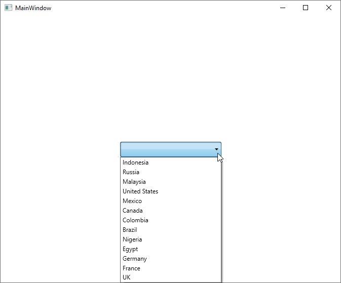
Defining ItemTemplate
You can customize the visualization of a data object using the ItemTemplate property.
<Grid>
    <Grid.DataContext>
        <local:PopulationViewModel/>
    </Grid.DataContext>
    <syncfusion:ComboBoxAdv x:Name="comboBoxAdv" Height="30" Width="200" ItemsSource="{Binding PopulationDetails}">
      <syncfusion:ComboBoxAdv.ItemTemplate>
        <DataTemplate>
            <StackPanel Orientation="Horizontal">
                <TextBlock Text="{Binding Country}"/>
                <TextBlock Text=" - "/>
                <TextBlock Text="{Binding Continent}"/>
            </StackPanel>
        </DataTemplate>
      </syncfusion:ComboBoxAdv.ItemTemplate>
    </syncfusion:ComboBoxAdv>
</Grid>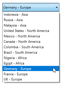
Selection
ComboBoxAdv control supports single and multiple selection of items. By default, selection in ComboBox is single selection. To select multiple items, enable the AllowMultiSelect property and select those items from the drop-down list. For more details, see MultiSelection Support.
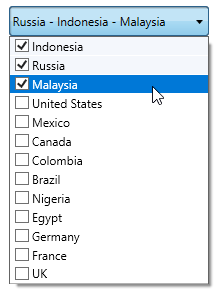
You can select the item or get the index of the selected item by using the SelectedIndex property. When an item is selected in ComboBoxAdv, you can get their information using SelectedItem or SelectedValue property. For multiple selected items, use SelectedItems property. The selection of the items can be handled using SelectionChanged event.
Editing
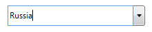
IsEditable property helps to edit the text in ComboBoxAdv control.
Theme
ComboBox supports various built-in themes. Apply a theme to the ComboBox using the links below.