MultiSelection Support in WPF ComboBox
18 Nov 201812 minutes to read
This section explains how to select multiple items and programmatically select items in the ComboBoxAdv control.
Properties
| Property | Description | Type | Data Type | Reference links |
|---|---|---|---|---|
| AllowMultiSelect | Multiple items can be selected. | Dependency Property | Boolean | NA |
| SelectedItems | It contains the selected items value | Dependency Property | ObservableCollection<object> | NA |
Adding multiple selection to an application
You can select multiple items in the ComboBoxAdv control by setting the AllowMultiSelect property to true.
<syncfusion:ComboBoxAdv x:Name="comboBoxAdv" AllowMultiSelect="True">
</syncfusion:ComboBoxAdv>
ComboBoxAdv comboBoxAdv = new ComboBoxAdv();
comboBoxAdv.AllowMultiSelect = true;Selecting items programmatically
You can select items programmatically by using the SelectedItems property. When AllowMultiSelect is set to true, the SelectedItems property exposes the items that are selected in the drop-down list.
In the example below, the first two items from the observable collection are bound to the SelectedItems property.
Creating the model and view-model
-
Create a data object class named
Countryand declare the property as follows.public class Country { public string Name { get; set; } } -
Create a
ViewModelclass withSelectedItems, which are initialized with data objects in the constructor.public class ViewModel : INotifyPropertyChanged { private ObservableCollection<object> _items; private ObservableCollection<object> selectedItems; public ObservableCollection<object> SelectedItems { get { return selectedItems; } set { selectedItems = value; RaisePropertyChanged("SelectedItems"); } } private ObservableCollection<Country> countries; public ObservableCollection<Country> Countries { get { return countries; } set { countries = value; } } public ViewModel() { Countries = new ObservableCollection<Country>(); Countries.Add(new Country() { Name = "Denmark" }); Countries.Add(new Country() { Name = "New Zealand" }); Countries.Add(new Country() { Name = "Canada" }); Countries.Add(new Country() { Name = "Russia" }); Countries.Add(new Country() { Name = "Japan" }); _items = new ObservableCollection<object>(); for (int i = 0; i < 2; i++) { _items.Add(Countries[i]); } SelectedItems = new ObservableCollection<object>(_items); } public event PropertyChangedEventHandler PropertyChanged; public void RaisePropertyChanged(string PropertyName) { var property = PropertyChanged; if (property != null) property(this, new PropertyChangedEventArgs(PropertyName)); } } -
To bind the ComboBoxAdv control to data, set the
ViewModelas theDataContextand bind theCountriescollection to theItemsSourceproperty.<Window.DataContext> <local:ViewModel /> </Window.DataContext> <Grid> <syncfusion:ComboBoxAdv DisplayMemberPath="Name" SelectedItems="{Binding SelectedItems, Mode=TwoWay, UpdateSourceTrigger=PropertyChanged}" AllowMultiSelect="True" Name="comboboxadv" HorizontalAlignment="Center" Height="30" VerticalAlignment="Center" Width="150" ItemsSource="{Binding Products}"/> </Grid>
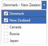
Overriding the selected items programmatically
You can override the selected items programmatically by overriding the OnItemChecked and OnItemUnchecked methods. Build the project so the custom ComboBoxExt is available before the XAML is parsed.
<Window x:Class="ComboBoxExtDemo.MainWindow"
        xmlns="http://schemas.microsoft.com/winfx/2006/xaml/presentation"
        xmlns:x="http://schemas.microsoft.com/winfx/2006/xaml"
        xmlns:d="http://schemas.microsoft.com/expression/blend/2008"
        xmlns:mc="http://schemas.openxmlformats.org/markup-compatibility/2006"
        xmlns:local="clr-namespace:ComboBoxExtDemo" xmlns:syncfusion="http://schemas.syncfusion.com/wpf"
        mc:Ignorable="d"
        Title="MainWindow" Height="450" Width="800">
    <Grid>
          <local:ComboBoxExt
                Width="250"
                Height="24"
                AllowMultiSelect="True"
                AllowSelectAll="True"
                EnableOKCancel="True"
                DefaultText="Select continent..."
                DisplayMemberPath="Name"
                ItemsSource="{Binding Continent}" />
    </Grid>
</Window>
public class ComboBoxExt : ComboBoxAdv
{
protected override ObservableCollection<object> OnItemChecked(object checkedItem, ObservableCollection<object> selectedItems)
{
var item = ((FrameworkElement)checkedItem).DataContext;
if (item == this.Items[0])
AddItem(selectedItems, new int[] { 1, 2 });
if (item == this.Items[4])
AddItem(selectedItems, new int[] { 5, 6 });
return base.OnItemChecked(checkedItem, selectedItems);
}
protected override ObservableCollection<object> OnItemUnchecked(object unCheckedItem, ObservableCollection<object> selectedItems)
{
var item = ((FrameworkElement)uncheckedItem).DataContext;
if (item == this.Items[0])
RemoveItem(selectedItems, new int[] { 1, 2 });
if (item == this.Items[4])
RemoveItem(selectedItems, new int[] { 5, 6 });
return base.OnItemUnchecked(unCheckedItem, selectedItems);
}
public void AddItem(ObservableCollection<object> selectedItems, int[] index)
{
foreach (int i in index)
{
if (!selectedItems.Contains(this.Items[i]))
selectedItems.Add(this.Items[i]);
}
}
public void RemoveItem(ObservableCollection<object> selectedItems, int[] index)
{
foreach (int i in index)
{
if (selectedItems.Contains(this.Items[i]))
selectedItems.Remove(this.Items[i]);
}
}
}On selecting Asia, the items at indices 1 and 2 (for example, India and China) are automatically added to the selected items.
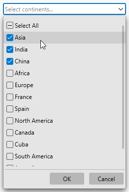
Multi-select edit using tokens
The selected items are represented by a rounded-polygon shape with a close icon, which can be interacted with by pressing the close button. The EnableToken property determines whether the ComboBox’s selected items should be displayed as tokens. The default value is false.
When an item is selected from the drop-down, it is added to the text area as a token. The corresponding item is removed from the text box when you click the close icon.
<syncfusion:ComboBoxAdv
      AllowMultiSelect="true"
      IsEditable="true"
      EnableToken="true">
</syncfusion:ComboBoxAdv>
ComboBoxAdv comboBox = new ComboBoxAdv();
combobox.AllowMultiSelect = true;
combobox.IsEditable = true;
combobox.EnableToken = true;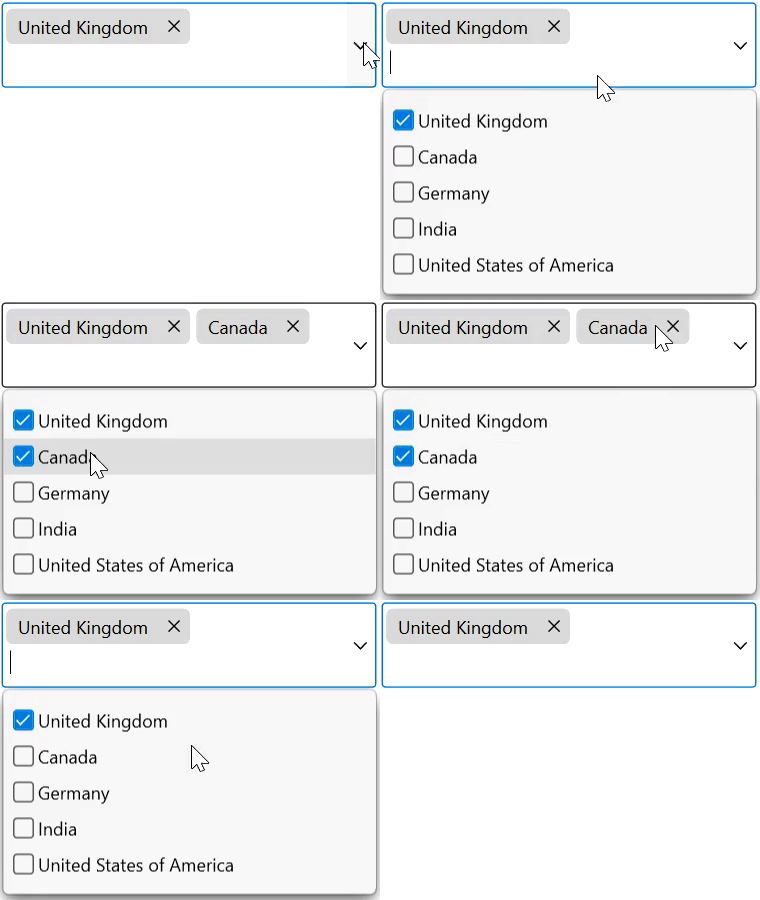
Token support is available only in multi-selection mode. The text area height automatically increases or decreases based on the placement of the selected items.
Editing
You can type any text in the text box, and it will be added as a token only if it matches an item in the drop-down.
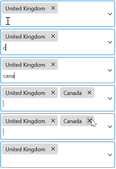
Keyboard access
- Use the Down Arrow, Up Arrow, Space, Enter, and Tab keys to select an item from the drop-down.
- Use the Enter and Tab keys to validate the typed text. It is added as a token only if it matches an item in the drop-down.
- Use the Backspace key to remove the last token from the text area.
- Press the Esc key to close the drop-down if it is open.