Getting Started with WinUI Slider
18 Nov 20184 minutes to read
This section explains the steps required to add the WinUI Slider control and its elements such as values, ticks, dividers, labels, and tooltip. This section covers only basic features needed to get started with Syncfusion Slider.
Creating an application with WinUI Slider
-
Create a WinUI 3 desktop application using C# and .NET 8 or later.
-
Add a reference to the Syncfusion.Sliders.WinUI NuGet package.
-
Import the control namespace
Syncfusion.UI.Xaml.Slidersin XAML or C# code. -
Initialize the
SfSlidercontrol:
The default value of the Minimum and Maximum properties of the SfSlider is 0 and 100 respectively. So, the Value property must be given within the range.
<slider:SfSlider />SfSlider sfSlider = new SfSlider();
this.Content = sfSlider;Set Value
You can set the slider’s value using the Value property. The default value of Value is 0 and the value is clamped to the Minimum and Maximum range.
<slider:SfSlider Value="50" />SfSlider sfSlider = new SfSlider();
sfSlider.Value = 50;
this.Content = sfSlider;
Enable Ticks
You can enable ticks in the slider using the ShowTicks property.
<slider:SfSlider Value="50"
                 ShowTicks="True" />
SfSlider sfSlider = new SfSlider();
sfSlider.Value = 50;
sfSlider.ShowTicks = true;
this.Content = sfSlider;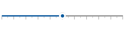
Enable Labels
You can enable labels in the slider using the ShowLabels property.
<slider:SfSlider Value="50"
                 ShowLabels="True" />
SfSlider sfSlider = new SfSlider();
sfSlider.Value = 50;
sfSlider.ShowLabels = true;
this.Content = sfSlider;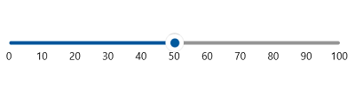
Enable Dividers
You can enable dividers in the slider using the ShowDividers property.
<slider:SfSlider Value="50"
                 ShowDividers="True"
                 DividerHeight="4"
                 DividerWidth="4"
                 ActiveTrackHeight="4"
                 InactiveTrackHeight="4" />
SfSlider sfSlider = new SfSlider();
sfSlider.Value = 50;
sfSlider.ShowDividers = true;
sfSlider.DividerHeight = 4;
sfSlider.DividerWidth = 4;
sfSlider.ActiveTrackHeight = 4;
sfSlider.InactiveTrackHeight = 4;
this.Content = sfSlider;
Download the demo application from GitHub.