Ticks in WinUI Slider
18 Nov 201811 minutes to read
This section explains how to add major and minor ticks in the slider.
Show Major Ticks
You can enable the major ticks on the track. Major ticks are shapes used to represent the major interval points of the track. The default value of the ShowTicks property is false. The ShowTicks property controls the visibility of both major and minor ticks.
For example, if Minimum is 0, Maximum is 10, and Interval is 2, the slider will render the major ticks at 0, 2, 4 and so on.
<slider:SfSlider Minimum="0"
                 Maximum="10"
                 Interval="2"
                 Value="4"
                 MinorTicksPerInterval="0"
                 ShowTicks="True"
                 ShowLabels="True" />
using Syncfusion.UI.Xaml.Sliders;
SfSlider sfSlider = new SfSlider();
sfSlider.Minimum = 0;
sfSlider.Maximum = 10;
sfSlider.Interval = 2;
sfSlider.MinorTicksPerInterval = 0;
sfSlider.Value = 4;
sfSlider.ShowTicks = true;
sfSlider.ShowLabels = true;
this.Content = sfSlider;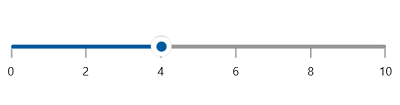
Show Minor Ticks
Minor ticks are used to represent the smaller intervals between two major ticks. For example, if Minimum is 0, Maximum is 10 and Interval is 2, the slider will render the major ticks as 0, 2, 4 and so on. If MinorTicksPerInterval is 1, then minor ticks will be rendered at 1, 3, 5 and so on. A value of 0 disables minor ticks. The default value of the MinorTicksPerInterval property is 1.
<slider:SfSlider Minimum="0"
                 Maximum="10"
                 Interval="2"
                 Value="4"
                 MinorTicksPerInterval="2"
                 ShowTicks="True"
                 ShowLabels="True" />
SfSlider sfSlider = new SfSlider();
sfSlider.Minimum = 0;
sfSlider.Maximum = 10;
sfSlider.Interval = 2;
sfSlider.MinorTicksPerInterval = 2;
sfSlider.Value = 4;
sfSlider.ShowTicks = true;
sfSlider.ShowLabels = true;
this.Content = sfSlider;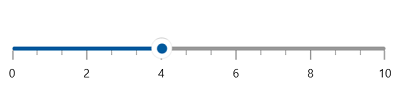
Tick Length
You can change the major and minor ticks length of the slider using the MajorTickLength and MinorTickLength properties respectively. The default value of MajorTickLength and MinorTickLength properties are 10 and 5 respectively.
<slider:SfSlider Minimum="0"
                 Maximum="10"
                 Interval="2"
                 Value="4"
                 MinorTicksPerInterval="2"
                 MajorTickLength="15"
                 MinorTickLength="10"
                 ShowTicks="True"
                 ShowLabels="True" />
SfSlider sfSlider = new SfSlider();
sfSlider.Minimum = 0;
sfSlider.Maximum = 10;
sfSlider.Interval = 2;
sfSlider.Value = 4;
sfSlider.MinorTicksPerInterval = 2;
sfSlider.MajorTickLength = 15;
sfSlider.MinorTickLength = 10;
sfSlider.ShowTicks = true;
sfSlider.ShowLabels = true;
this.Content = sfSlider;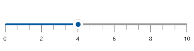
Tick Placement
The TickPlacement property is used to place the ticks either before or after the track. The default value of the TickPlacement property is Placement.After.
<slider:SfSlider ShowTicks="True"
                 TickPlacement="Before"
                 Value="50" />
SfSlider sfSlider = new SfSlider();
sfSlider.ShowTicks = true;
sfSlider.TickPlacement = Placement.Before;
sfSlider.Value = 50;
this.Content = sfSlider;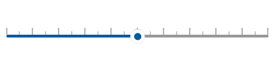
Ticks Offset
You can adjust the space between track and ticks of the slider using the TickOffset property. The default value of the TickOffset property is 0.
<slider:SfSlider Minimum="0"
                 Maximum="10"
                 Interval="2"
                 Value="4"
                 MinorTicksPerInterval="2"
                 TickOffset="10"
                 ShowTicks="True"
                 ShowLabels="True" />
SfSlider sfSlider = new SfSlider();
sfSlider.Minimum = 0;
sfSlider.Maximum = 10;
sfSlider.Interval = 2;
sfSlider.Value = 4;
sfSlider.MinorTicksPerInterval = 2;
sfSlider.TickOffset = 10;
sfSlider.ShowTicks = true;
sfSlider.ShowLabels = true;
this.Content = sfSlider;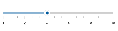
Tick Style
Setting a Style for Major and Minor Ticks
The MajorTickStyle and MinorTickStyle properties allow you to define the style for the major and minor ticks respectively as shown in the following code example.
<Style x:Key="MajorTickStyle"
       TargetType="Line">
    <Setter Property="Stroke"
            Value="Red" />
    <Setter Property="StrokeThickness"
            Value="1.5" />
    <Setter Property="StrokeDashArray"
            Value="1,1" />
</Style>
<Style x:Key="MinorTickStyle"
       TargetType="Line">
    <Setter Property="Stroke"
            Value="Green" />
    <Setter Property="StrokeThickness"
            Value="1.5" />
    <Setter Property="StrokeDashArray"
            Value="1,1" />
</Style>

<slider:SfSlider ShowTicks="True"
                 Interval="10"
                 Value="50"
                 MajorTickStyle="{StaticResource MajorTickStyle}"
                 MinorTickStyle="{StaticResource MinorTickStyle}" />
SfSlider sfSlider = new SfSlider();
sfSlider.ShowTicks = true;
sfSlider.Interval = 10;
sfSlider.Value = 50;
sfSlider.MajorTickStyle = this.Resources["MajorTickStyle"] as Style;
sfSlider.MinorTickStyle = this.Resources["MinorTickStyle"] as Style;
this.Content = sfSlider;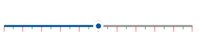
Setting an Active Style for Major and Minor Ticks
The ActiveMajorTickStyle and ActiveMinorTickStyle properties allow you to define the active style for the major and minor ticks, i.e., the ticks positioned between the Minimum value and the thumb, as shown in the following code example.
<Style x:Key="ActiveMajorTickStyle"
       TargetType="Line">
    <Setter Property="Stroke"
            Value="{ThemeResource SystemAccentColor}" />
    <Setter Property="StrokeThickness"
            Value="1.5" />
</Style>

<Style x:Key="ActiveMinorTickStyle"
       TargetType="Line">
    <Setter Property="Stroke"
            Value="{ThemeResource SystemAccentColor}" />
    <Setter Property="StrokeThickness"
            Value="1" />
</Style>

<slider:SfSlider ShowTicks="True"
                 Interval="5"
                 Value="50"
                 ActiveMajorTickStyle="{StaticResource ActiveMajorTickStyle}"
                 ActiveMinorTickStyle="{StaticResource ActiveMinorTickStyle}" />
SfSlider sfSlider = new SfSlider();
sfSlider.ShowTicks = true;
sfSlider.Interval = 5;
sfSlider.Value = 50;
sfSlider.ActiveMajorTickStyle = this.Resources["ActiveMajorTickStyle"] as Style;
sfSlider.ActiveMinorTickStyle = this.Resources["ActiveMinorTickStyle"] as Style;
this.Content = sfSlider;