Getting Started with WinUI Circular Chart
18 Nov 201810 minutes to read
This section explains how to populate the circular chart with data, header, data labels, legend, and tooltips, as well as the essential aspects for getting started with the chart.
Creating an application with WinUI Circular Charts
- Create a WinUI 3 desktop app for C# and .NET 5.
- Add reference to Syncfusion.Chart.WinUI NuGet.
- Import the control namespace
Syncfusion.UI.Xaml.Chartsin XAML or C# to initialize the control. -
Initialize SfCircularChart control.
<Window
    x:Class="ChartDemo.MainWindow"

    <!-- Configure additional chart elements -->
    xmlns:chart="using:Syncfusion.UI.Xaml.Charts">

    <chart:SfCircularChart/>
</Window>
using Syncfusion.UI.Xaml.Charts; // Configure additional chart elements public sealed partial class MainWindow : Window { public MainWindow() { this.InitializeComponent(); SfCircularChart chart = new SfCircularChart(); this.Content = chart; } }
Initialize View Model
Now, let us define a simple data model that represents a data point in the chart.
public class Sales
{
    public string Product { get; set; }
    public double SalesRate { get; set; }
}
Next, create a view model class and initialize a list of Model objects as follows.
public class ChartViewModel
{
    public List<Sales> Data { get; set; }

    public ChartViewModel()
    {
        Data = new List<Sales>()
        {
            new Sales(){Product = "iPad", SalesRate = 25},
            new Sales(){Product = "iPhone", SalesRate = 35},
            new Sales(){Product = "MacBook", SalesRate = 15},
            new Sales(){Product = "Mac", SalesRate = 5},
            new Sales(){Product = "Others", SalesRate = 10},
        };
    }
}
Create a ViewModel instance and set it as the chart’s DataContext. This enables property binding from ViewModel class.
Add namespace of
ViewModelclass to your XAML Page if you prefer to setDataContextin XAML.
<Window

    <!-- Configure additional chart elements -->
    xmlns:chart="using:Syncfusion.UI.Xaml.Charts"
    xmlns:model="using:ChartDemo.ViewModel">

    <chart:SfCircularChart>
        <chart:SfCircularChart.DataContext>
            <model:ChartViewModel/>
        </chart:SfCircularChart.DataContext>

    </chart:SfCircularChart>
</Window>
ChartViewModel viewModel = new ChartViewModel();
chart.DataContext = viewModel;Populate Chart with Data
Adding PieSeries to the chart Series collection and binding Data to the series ItemsSource property from its DataContext for creating our own Product-Sales Pie chart.
To plot the series, the XBindingPath and YBindingPath properties must be configured so that the chart can get values from the respective properties in the data model.
<chart:SfCircularChart>
<!-- Configure additional chart elements -->
<chart:SfCircularChart.Series>
<chart:PieSeries
ItemsSource="{Binding Data}"
XBindingPath="Product"
YBindingPath="SalesRate"/>
</chart:SfCircularChart.Series>
</chart:SfCircularChart>SfCircularChart chart = new SfCircularChart();
ChartViewModel viewModel = new ChartViewModel();
chart.DataContext = viewModel;
PieSeries series = new PieSeries();
series.SetBinding(PieSeries.ItemsSourceProperty, new Binding()
{
Path = new PropertyPath("Data")
});
series.XBindingPath = "Product";
series.YBindingPath = "SalesRate";
chart.Series.Add(series);
// Configure additional chart elementsAdd Title
The header of the chart acts as the title to provide quick information to the user about the data being plotted in the chart. You can set the title using the Header property of the circular chart as follows.
<chart:SfCircularChart Header="PRODUCT SALES">

    <!-- Configure additional chart elements -->
</chart:SfCircularChart>
SfCircularChart chart = new SfCircularChart();
chart.Header = "PRODUCT SALES";Enable Data Labels
The ShowDataLabels property of ChartSeries can be used to enable data labels to improve the readability of the circular chart. The label visibility is set to False by default.
<chart:SfCircularChart>
<!-- Configure additional chart elements -->
<chart:PieSeries
ShowDataLabels="True"
ItemsSource="{Binding Data}"
XBindingPath="Product"
YBindingPath="SalesRate"/>
</chart:SfCircularChart>SfCircularChart chart = new SfCircularChart();
// Configure additional chart elements
PieSeries series = new PieSeries();
series.ShowDataLabels = true;
chart.Series.Add(series);Enable Legend
The legend provides information about the data point displayed in the circular chart. The Legend property of the chart is used to enable it.
<chart:SfCircularChart>
<!-- Configure additional chart elements -->
<chart:SfCircularChart.Legend>
<chart:ChartLegend/>
</chart:SfCircularChart.Legend>
</chart:SfCircularChart>SfCircularChart chart = new SfCircularChart();
// Configure additional chart elements
chart.Legend = new ChartLegend();Enable Tooltip
Tooltips are used to show information about the segment when the mouse hovers over it. Enable the tooltip by setting the series EnableTooltip property to true.
<chart:SfCircularChart>
<!-- Configure additional chart elements -->
<chart:PieSeries EnableTooltip="True"/>
</chart:SfCircularChart>SfCircularChart chart = new SfCircularChart();
// Configure additional chart elements
PieSeries series = new PieSeries();
series.EnableTooltip = true;
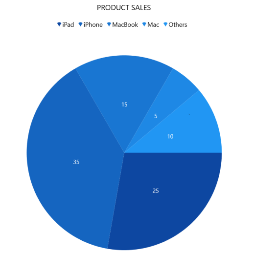
chart.Series.Add(series);The following code example gives you the complete code of above configurations.
<chart:SfCircularChart Header="PRODUCT SALES">
<chart:SfCircularChart.DataContext>
<model:ChartViewModel/>
</chart:SfCircularChart.DataContext>
<chart:SfCircularChart.Legend>
<chart:ChartLegend/>
</chart:SfCircularChart.Legend>
<chart:SfCircularChart.Series>
<chart:PieSeries
ItemsSource="{Binding Data}"
ShowDataLabels="True"
XBindingPath="Product"
EnableTooltip="True"
YBindingPath="SalesRate">
</chart:PieSeries>
</chart:SfCircularChart.Series>
</chart:SfCircularChart>using Syncfusion.UI.Xaml.Charts;
// Configure additional chart elements
public sealed partial class MainWindow : Window
{
public MainWindow()
{
SfCircularChart chart = new SfCircularChart();
chart.Header = "PRODUCT SALES";
chart.Legend = new ChartLegend();
ChartViewModel viewModel = new ChartViewModel();
chart.DataContext = viewModel;
PieSeries series = new PieSeries();
series.SetBinding(PieSeries.ItemsSourceProperty, new Binding()
{
Path = new PropertyPath("Data")
});
series.XBindingPath = "Product";
series.YBindingPath = "SalesRate";
series.EnableTooltip = true;
series.ShowDataLabels = true;
chart.Series.Add(series);
this.Content = chart;
}
}
Download demo application from GitHub.