Data Label in WinUI Chart (SfCircularChart)
13 Jul 202617 minutes to read
Data labels are used to display values related to a chart segment. Values from a data point (x, y) or other custom properties from a data source can be displayed.
Each data label can be represented by the following:
- Label - Displays the segment label content at the (X, Y) point.
- Connector line - Used to connect the (X, Y) point and the label element.
Enable Data Label
The ShowDataLabels property of the series is used to enable the data labels.
<chart:SfCircularChart>

    <!-- Configure additional chart elements -->
    <chart:PieSeries
        ShowDataLabels="True"
        ItemsSource="{Binding Data}"
        XBindingPath="Product"
        YBindingPath="SalesRate"/>
</chart:SfCircularChart>
SfCircularChart chart = new SfCircularChart();
// Configure additional chart elements
PieSeries series = new PieSeries();
series.ShowDataLabels = true;
chart.Series.Add(series);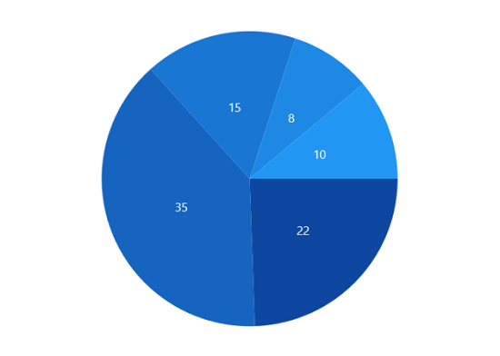
Context
To customize the content of data labels, you need to define the DataLabelSettings of the series and set the Context property of DataLabelSettings to define the value to be displayed as the label content.
<chart:SfCircularChart>

    <!-- Configure additional chart elements -->
    <chart:PieSeries ShowDataLabels="True">
        <chart:PieSeries.DataLabelSettings>
            <chart:CircularDataLabelSettings Context="Percentage"/>
        </chart:PieSeries.DataLabelSettings>
    </chart:PieSeries>

</chart:SfCircularChart>
SfCircularChart chart = new SfCircularChart();
// Configure additional chart elements
PieSeries series = new PieSeries();
series.ShowDataLabels = true;
series.DataLabelSettings = new CircularDataLabelSettings()
{
Context = LabelContext.Percentage
};
chart.Series.Add(series);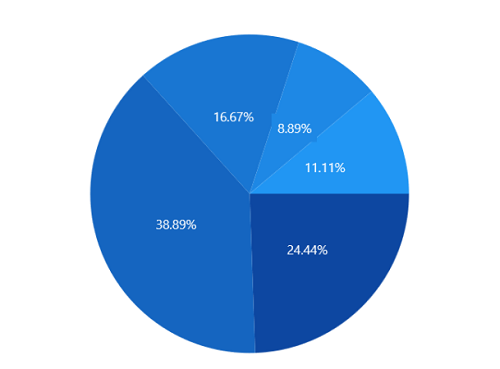
Customization
The following properties are used to customize the data label.
- BorderBrush - Used to change the border color.
- BorderThickness - Used to change the thickness of the border.
- Margin - Used to change the margin size for the label.
- FontStyle - Used to change the font style of the label.
- FontSize - Used to change the font size of the label.
- Foreground - Used to change the color of the label.
- FontFamily - Used to change the font family of the label.
- Background - Used to change the label background color.
<chart:SfCircularChart>

    <!-- Configure additional chart elements -->
    <chart:PieSeries.DataLabelSettings>
        <chart:CircularDataLabelSettings
            Position="Outside"
            Foreground="White"
            FontSize="11"
            FontFamily="Calibri"
            BorderBrush="Black"
            BorderThickness="1"
            Margin="1"
            FontStyle="Italic"
            Background="#1E88E5"
            Context="Percentage"/>
    </chart:PieSeries.DataLabelSettings>

</chart:SfCircularChart>
SfCircularChart chart = new SfCircularChart();
// Configure additional chart elements
PieSeries series = new PieSeries();
series.ShowDataLabels = true;
series.DataLabelSettings = new CircularDataLabelSettings()
{
Position = CircularSeriesLabelPosition.Outside,
Foreground = new SolidColorBrush(Colors.White),
BorderBrush = new SolidColorBrush(Colors.Black),
Background = new SolidColorBrush(Color.FromArgb(255, 30, 136, 229)),
BorderThickness = new Thickness(1),
Margin = new Thickness(1),
FontStyle = FontStyle.Italic,
FontFamily = new FontFamily("Calibri"),
FontSize = 11,
Context = LabelContext.Percentage
};
chart.Series.Add(series);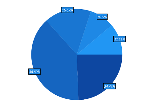
Template
The appearance of the data label can be customized using the ContentTemplate property of CircularDataLabelSettings as in the following code example:
<Grid x:Name="grid">
    <Grid.Resources>
        <DataTemplate x:Key="labelTemplate">
            <StackPanel Margin="10" Orientation="Vertical">
                <Ellipse
                    Height="15"
                    Width="15"
                    Fill="Cyan"
                    Stroke="#4a4a4a"
                    StrokeThickness="2"/>
                <TextBlock
                    HorizontalAlignment="Center"
                    FontSize="12"
                    Foreground="Black"
                    FontWeight="SemiBold"
                    Text="{Binding Item.Product}"/>
            </StackPanel>
        </DataTemplate>
    </Grid.Resources>

    <chart:SfCircularChart>

        <!-- Configure additional chart elements -->
        <chart:PieSeries ShowDataLabels="True">
            <chart:PieSeries.DataLabelSettings>
                <chart:CircularDataLabelSettings
                        Position="Inside"
                        ContentTemplate="{StaticResource labelTemplate}"
                        Context="DataLabelItem"/>
            </chart:PieSeries.DataLabelSettings>
        </chart:PieSeries>

    </chart:SfCircularChart>
</Grid>
SfCircularChart chart = new SfCircularChart();
// Configure additional chart elements
PieSeries series = new PieSeries();
series.ShowDataLabels = true;
// The 'labelTemplate' resource is defined in XAML Resources and referenced here.
series.DataLabelSettings = new CircularDataLabelSettings()
{
Position = CircularSeriesLabelPosition.Inside,
Context = LabelContext.DataLabelItem,
ContentTemplate = grid.Resources["labelTemplate"] as DataTemplate,
};
chart.Series.Add(series);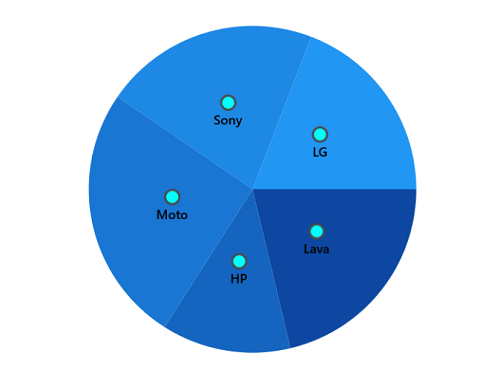
NOTE
The binding context for the DataLabelSettings
ContentTemplateis Context, which is used to customize the content of data labels. This property defines the value displayed in the data label, such as the X value or any other value from the underlying model object. By default, the value ofContextis YValue.
Position
The SfCircularChart provides an additional customization option to position the data label smartly based on series types using the Position property.
The following are the values for this property:
Inside - Data labels will be placed inside the CircularSeries.
Outside - Data labels will be placed just outside the CircularSeries.
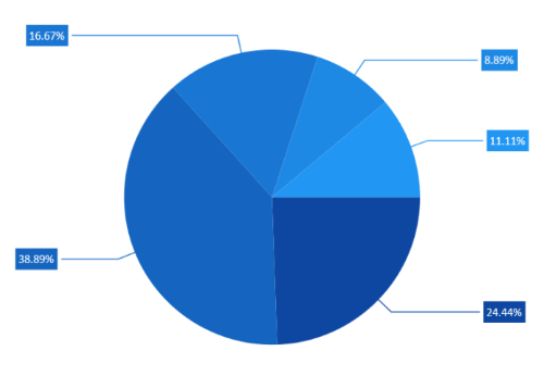
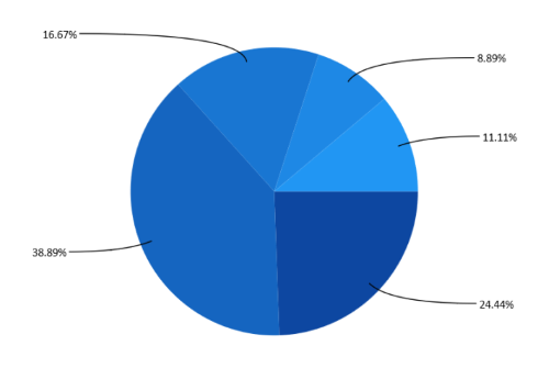
OutsideExtended - Data labels will be placed outside the CircularSeries at a certain distance.
<chart:SfCircularChart>

    <!-- Configure additional chart elements -->
    <chart:PieSeries ShowDataLabels="True">
        <chart:PieSeries.DataLabelSettings>
            <chart:CircularDataLabelSettings
                Position="OutsideExtended"
                ShowConnectorLine="True"
                Context="Percentage"/>
        </chart:PieSeries.DataLabelSettings>
    </chart:PieSeries>

</chart:SfCircularChart>
SfCircularChart chart = new SfCircularChart();
// Configure additional chart elements
PieSeries series = new PieSeries();
series.ShowDataLabels = true;
series.DataLabelSettings = new CircularDataLabelSettings()
{
Position = CircularSeriesLabelPosition.OutsideExtended,
ShowConnectorLine = true,
Context = LabelContext.Percentage
};
chart.Series.Add(series);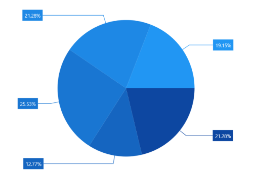
Rotation
The Rotation property is used to define the angle at which the label should be rotated. The following code demonstrates the label rotating angle.
<chart:SfCircularChart>

    <!-- Configure additional chart elements -->
    <chart:PieSeries ShowDataLabels="True">
        <chart:PieSeries.DataLabelSettings>
            <chart:CircularDataLabelSettings
                Context="Percentage"
                Position="Outside"
                Rotation="335"/>
        </chart:PieSeries.DataLabelSettings>
    </chart:PieSeries>

</chart:SfCircularChart>
SfCircularChart chart = new SfCircularChart();
// Configure additional chart elements
PieSeries series = new PieSeries();
series.ShowDataLabels = true;
series.DataLabelSettings = new CircularDataLabelSettings()
{
Context = LabelContext.Percentage,
Position = CircularSeriesLabelPosition.Outside,
Rotation = 335,
};
chart.Series.Add(series);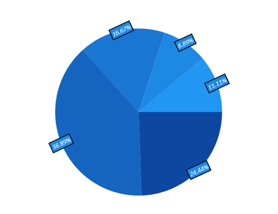
Connector Line
The connector line is used to connect the label and data point using a line. The ShowConnectorLine property of CircularDataLabelSettings is used to enable the connector line in the circular chart.
The connector line can be customized using the following properties.
- ConnectorHeight - Used to set the height for the connector line.
- ConnectorLineStyle - Used to customize the style of the line.
- ConnectorType - Used to set the connector line type.
<Grid x:Name="grid">
    <Grid.Resources>
        <Style TargetType="Path" x:Key="lineStyle">
            <Setter Property="StrokeDashArray" Value="10,7,5"/>
            <Setter Property="Stroke" Value="Black"/>
        </Style>
    </Grid.Resources>
    <chart:SfCircularChart>

        <!-- Configure additional chart elements -->
        <chart:PieSeries ShowDataLabels="True">
            <chart:PieSeries.DataLabelSettings>
                <chart:CircularDataLabelSettings
                    Position="Outside"
                    Context="Percentage"
                    ShowConnectorLine="True"
                    ConnectorHeight="40"
                    ConnectorType="StraightLine"
                    ConnectorLineStyle="{StaticResource lineStyle}"/>
            </chart:PieSeries.DataLabelSettings>
        </chart:PieSeries>
    </chart:SfCircularChart>
</Grid>
SfCircularChart chart = new SfCircularChart();
// Configure additional chart elements
PieSeries series = new PieSeries();
series.ShowDataLabels = true;
// The 'lineStyle' resource is defined in XAML Resources and referenced here.
series.DataLabelSettings = new CircularDataLabelSettings()
{
Context = LabelContext.Percentage,
Position = CircularSeriesLabelPosition.Outside,
ShowConnectorLine = true,
ConnectorHeight = 40,
ConnectorLineStyle = grid.Resources["lineStyle"] as Style,
};
chart.Series.Add(series);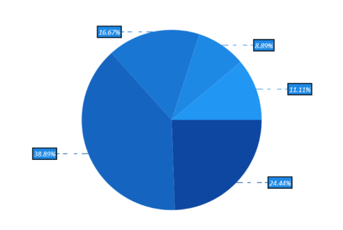
Connector Line Type
The ConnectorType property in CircularDataLabelSettings is used to specify the connector line type such as Line, Bezier, or StraightLine.
<chart:SfCircularChart>

    <!-- Configure additional chart elements -->
    <chart:PieSeries ShowDataLabels="True">
        <chart:PieSeries.DataLabelSettings>
            <chart:CircularDataLabelSettings
                ConnectorType="Bezier"
                ConnectorHeight="40"
                Position="Outside"
                ShowConnectorLine="True"/>
        </chart:PieSeries.DataLabelSettings>
    </chart:PieSeries>
</chart:SfCircularChart>
SfCircularChart chart = new SfCircularChart();
PieSeries series = new PieSeries();
series.ShowDataLabels = true;
series.DataLabelSettings = new CircularDataLabelSettings()
{
ShowConnectorLine = true,
ConnectorHeight = 40,
ConnectorType = ConnectorMode.Bezier,
Position = CircularSeriesLabelPosition.Outside,
};
chart.Series.Add(series);Bezier
Applying Series Fill
The UseSeriesPalette property is used to set the Fill of the series to the data label background.
<chart:SfCircularChart>

    <!-- Configure additional chart elements -->
    <chart:PieSeries ShowDataLabels="True">
        <chart:PieSeries.DataLabelSettings>
            <chart:CircularDataLabelSettings
                UseSeriesPalette="True"
                ShowConnectorLine="True"
                ConnectorHeight="40"
                Position="Outside"/>
        </chart:PieSeries.DataLabelSettings>
    </chart:PieSeries>
</chart:SfCircularChart>
SfCircularChart chart = new SfCircularChart();
// Configure additional chart elements
PieSeries series = new PieSeries();
series.ShowDataLabels = true;
series.DataLabelSettings = new CircularDataLabelSettings()
{
UseSeriesPalette = true,
ShowConnectorLine = true,
ConnectorHeight = 40,
Position = CircularSeriesLabelPosition.Outside,
};
chart.Series.Add(series);