Animation Settings in Windows Forms Splash Panel
29 Apr 20219 minutes to read
This section demonstrates how to display a splash image with animation.
When animation is set for the splash image, by default, the splash image will be drawn from left to right.
Property Table
| SplashPanel Property | Description |
|---|---|
| AnimationSpeed | Indicates the speed at which the animation unfolds on the screen and the SplashPanel becomes visible. |
| ShowAnimation | Specifies if the window display should be animated. |
| ShowAsTopMost | Specifies if the SplashPanel is to be displayed as a topmost window. |
This can be achieved through code also. Create a SplashPanel and set the below properties.
this.splashPanel1.AnimationSpeed = 30;
this.splashPanel1.ShowAnimation = true;
this.splashPanel1.ShowAsTopMost = true;Me.splashPanel1.AnimationSpeed = 30
Me.splashPanel1.ShowAnimation = True
Me.splashPanel1.ShowAsTopMost = TrueSliding style
The splash image, can not only be displayed from left to right, but can be displayed in different styles using the property given below.
Property Table
| SplashPanel Property | Description |
|---|---|
| SlideStyle | Gets / sets the slide style for the SplashPanel. The options included are as follows.Horizontal,Vertical,LeftToRight,RightToLeft,TopToBottom,BottomToTop andFadeIn.The ShowAnimation property must be set to 'True'. |
this.splashPanel1.SlideStyle = Syncfusion.Windows.Forms.Tools.SlideStyle.FadeIn;Me.splashPanel1.SlideStyle = Syncfusion.Windows.Forms.Tools.SlideStyle.FadeInAutoClose
This section discusses the properties that can be set for the animation of SplashPanel.
AutoClose
Auto closing of the SplashPanel can be accomplished using the property given below.
Property Table
| SplashPanel Property | Description |
|---|---|
| SuspendAutoCloseWhenMouseOver | Indicates whether the SplashPanel should not be closed when the mouse is over it. |
This property which is available in SplashPanel, when enabled, will close the SplashPanel at run time before the specified time interval ends, when the mouse is moved over it. By default this will be set to ‘False’.
NOTE
The CloseOnClick property can also be used to close the SplashPanel by a single mouse click.
this.splashPanel1.SuspendAutoCloseWhenMouseOver = true;Me.splashPanel1.SuspendAutoCloseWhenMouseOver = TrueAutoClose mode of the splash screen can be suspended or restored using the below methods.
Methods Table
| Methods | Description |
|---|---|
| SuspendAutoCloseMode | Suspends the auto closing of the SplashPanel after the TimerInterval. |
| RestoreAutoCloseMode | Restores the auto closing of the SplashPanel. |
- SuspendAutoCloseMode() - The splash screen will be displayed at run time for a specific time interval and it closes automatically by default. This auto closing of the splash screen can be suspended by calling this method.
On calling this method, the splash screen will be displayed till the application is closed or the RestoreAutoCloseMode() method is called. You can use the below code snippet to call this method.
private void button1_Click(object sender, EventArgs e)
{
    this.splashPanel1.SuspendAutoCloseMode();
}
Private Sub button1_Click(ByVal sender As Object, ByVal e As EventArgs)
Me.splashPanel1.SuspendAutoCloseMode()
End Sub- RestoreAutoCloseMode() - This method will restore the auto closing of the splash screen which was suspended by calling the SuspendAutoCloseMode() method.
private void button1_Click(object sender, EventArgs e)
{
    this.splashPanel1.RestoreAutoCloseMode();
}
Private Sub button1_Click(ByVal sender As Object, ByVal e As EventArgs)
Me.splashPanel1.RestoreAutoCloseMode()
End SubAppearance settings
The SplashPanel allows the user to customize the appearance of the panel using the below given properties.
Background settings
The background of the SplashPanel can be customized using the properties given below.
Property Table
| SplashPanel Property | Description |
|---|---|
| BackgroundColor | Gets / sets the background gradient and other styles. |
| Style | Specifies the brush style.Solid,Pattern andGradient. |
| BackColor | Specifies the back color of the control. |
| ForeColor | Specifies the fore color for any text or graphics in the control. |
| GradientStyle | Specifies the gradient style of the background.ForwardDiagonal,BackwardDiagonal,Horizontal,Vertical,PathRectangle andPathEllipse. |
| GradientColors | Specifies the gradient colors.The first entry in this list will be the same as the BackColor property, the last entry will be the same as the ForeColor property. |
| BackgroundImage | Specifies the background image used for the control. |
| TransparentColor | Specifies the transparent color for the background. |
this.splashPanel1.BackgroundColor = new Syncfusion.Drawing.BrushInfo(Syncfusion.Drawing.GradientStyle.PathRectangle, System.Drawing.Color.AliceBlue, System.Drawing.Color.SteelBlue);
this.splashPanel1.BackgroundImage = ((System.Drawing.Image)(resources.GetObject("blue hills")));
this.splashPanel1.TransparentColor = System.Drawing.Color.White;Me.splashPanel1.BackgroundColor = New Syncfusion.Drawing.BrushInfo(Syncfusion.Drawing.GradientStyle.PathRectangle, System.Drawing.Color.AliceBlue, System.Drawing.Color.SteelBlue)
Me.splashPanel1.BackgroundImage = CType((resources.GetObject("blue hills")), System.Drawing.Image)
Me.splashPanel1.TransparentColor = System.Drawing.Color.White

NOTE
The RefreshRegionFromImage() method can be used to refresh the region from the background image.
Behavior settings
The user will not be able to close or resize the splash image, which is displayed during run time, normally. But by setting certain properties of the SplashPanel, the user can alter the SplashPanel. These properties are explained below in detail.
Property Table
| SplashPanel Property | Description |
|---|---|
| AllowMove | Indicates whether the SplashPanel can be moved by the user at run time. |
| AllowResize | Indicates whether the SplashPanel can be resized by the user at run time. |
| CloseOnClick | Indicates whether the SplashPanel gets closed when the user clicks on it. |
When the AllowMove property is set to ‘True’, the user will be allowed to click within the SplashPanel and move the SplashPanel on the screen.
When the AllowResize property is set to ‘True’, resize handles will be displayed when the user moves the mouse near the border of the SplashPanel.
NOTE
In the above cases, the splash panel will not be closed, until the host form is closed.
The user can also close the SplashPanel by a single mouse click. This feature can be enabled by setting the CloseOnClick property to ‘True’.
this.splashPanel1.AllowMove = true;
this.splashPanel1.AllowResize = true;
this.splashPanel1.CloseOnClick = true;Me.splashPanel1.AllowMove = True
Me.splashPanel1.AllowResize = True
Me.splashPanel1.CloseOnClick = TrueBorder settings
The border settings of the SplashPanel control can be customized to provide a 3D look for the border.
Property Table
| SplashPanel Property | Description |
|---|---|
| BorderStyle | Specifies the 3D border for the SplashPanel. The options included are as follows.RaisedOuter,SunkenOuter,RaisedInner,SunkenInner,Raised,Etched,Bump,Sunken,Adjust andFlat. |
| BorderType | Specifies the type of border. The options included are as follows.Border3D andNone. |
this.splashPanel1.BorderStyle = System.Windows.Forms.Border3DStyle.Flat;
this.splashPanel1.BorderType = Syncfusion.Windows.Forms.Tools.SplashBorderType.Border3D;Me.splashPanel1.BorderStyle = System.Windows.Forms.Border3DStyle.Flat
Me.splashPanel1.BorderType = Syncfusion.Windows.Forms.Tools.SplashBorderType.Border3D;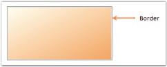
Alignment settings
The position of the SplashPanel in the desktop can be changed according to the needs of the user using the property given below.
Property Table
| SplashPanel Property | Description |
|---|---|
| DesktopAlignment | Specifies the desktop alignment of the splash image. It includes the following options.SystemTray,Center,LeftTop,LeftBottom,RightTop,RightBottom andCustom. |
this.splashPanel1.DesktopAlignment = Syncfusion.Windows.Forms.Tools.SplashAlignment.SystemTray;Me.splashPanel1.DesktopAlignment = Syncfusion.Windows.Forms.Tools.SplashAlignment.SystemTray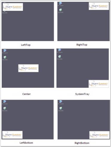
A Sample which demonstrates theDesktop Alignment options is available in the below sample installation path.
…\My Documents\Syncfusion\EssentialStudio\Version Number\Windows\Tools.Windows\Samples\Advanced Editor Functions\ActionGroupingDemo
ToolTip
ToolTip can be displayed for the SplashPanel when the mouse is moved over the control. This can be done using the following property.
Property Table
| SplashPanel Property | Description |
|---|---|
| ToolTip on toolTip1 | Determines the ToolTip shown when the mouse hovers over the control.The ToolTip on toolTip1 property is an extender property, i.e., it will appear in the Property grid only when you add a tooltip control onto the form. |
ToolTip can also be set through the code given below.
this.toolTip1.SetToolTip(this.splashPanel1, "Splash Panel Tooltip");Me.toolTip1.SetToolTip(this.splashPanel1, "Splash Panel Tooltip")