Getting Started with Windows Forms SkinManager
18 Nov 20188 minutes to read
This section briefly describes how to create a new Windows Forms project in Visual Studio and apply themes using the SkinManager component.
Assembly deployment and theme assemblies
SkinManager is present in the Syncfusion.Shared.Base assembly.
| Theme name | Assembly name |
|---|---|
| Office2016Theme | Syncfusion.Office2016Theme.WinForms.dll assembly reference is needed only for the SfDataGrid, SfButton, SfDateTimeEdit, SfNumericTextBox, SfToolTip, and SfSmithChart controls only. |
| Office2019Theme | Syncfusion.Office2019Theme.WinForms.dll |
| HighContrastTheme | Syncfusion.HighContrastTheme.WinForms.dll |
| Other Themes | Themes are included in the control assembly itself. |
Loading theme assemblies
Skin manager loads theme assembly using the LoadAssembly method before applying theme. This is applicable for the themes loaded from separate assembly, and not applicable for the themes loaded from built-in assembly.
// Loading Office2019Theme assembly
SkinManager.LoadAssembly(typeof(Office2019Theme).Assembly);

//Loading HighContrastTheme assembly
SkinManager.LoadAssembly(typeof(HighContrastTheme).Assembly);

// Loading Office2016Theme assembly
SkinManager.LoadAssembly(typeof(Syncfusion.WinForms.Themes.Office2016Theme).Assembly);
' Loading Office2019Theme assembly
SkinManager.LoadAssembly(GetType(Office2019Theme).Assembly)
' Loading HighContrastTheme assembly
SkinManager.LoadAssembly(GetType(HighContrastTheme).Assembly)
' Loading Office2016Theme assembly
SkinManager.LoadAssembly(GetType(Syncfusion.WinForms.Themes.Office2016Theme).Assembly)Adding SkinManager component
Through designer
1 Create a new Windows Forms application in Visual Studio.
2) Open the target form in the designer.
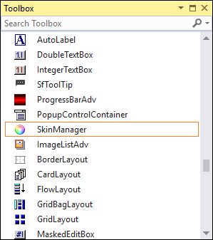
3) Drag the SkinManager component from the toolbox and drop it onto the designer.
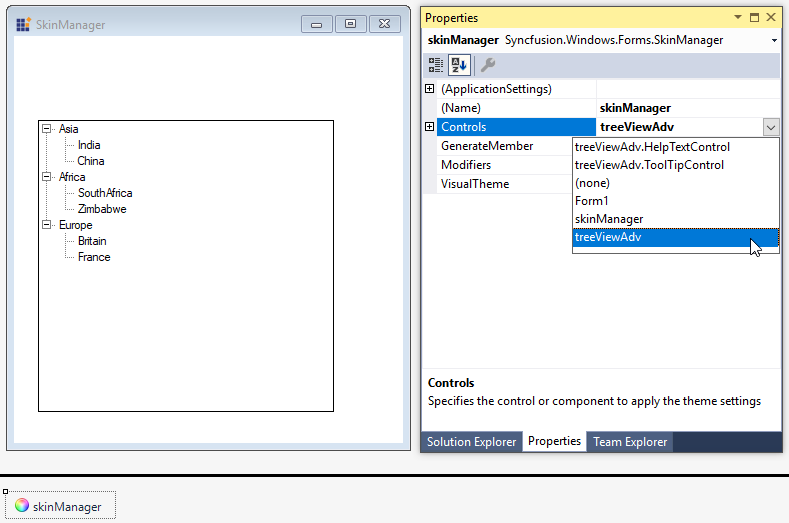
4) Select the SkinManager component and use the Controls property in the Properties window to choose the control or form to which the theme should be applied.
The following dependent assemblies will be added automatically:
- Syncfusion.Shared.Base
Applying theme
After the SkinManager component has been added into the designer, select the SkinManager component, and go to properties window. Here, you can apply theme for a control or form using the Controls property.
SkinManager does not support the custom themes ( themes generated using ThemeStudio). It works only with predefined themes.
Applying theme to the form
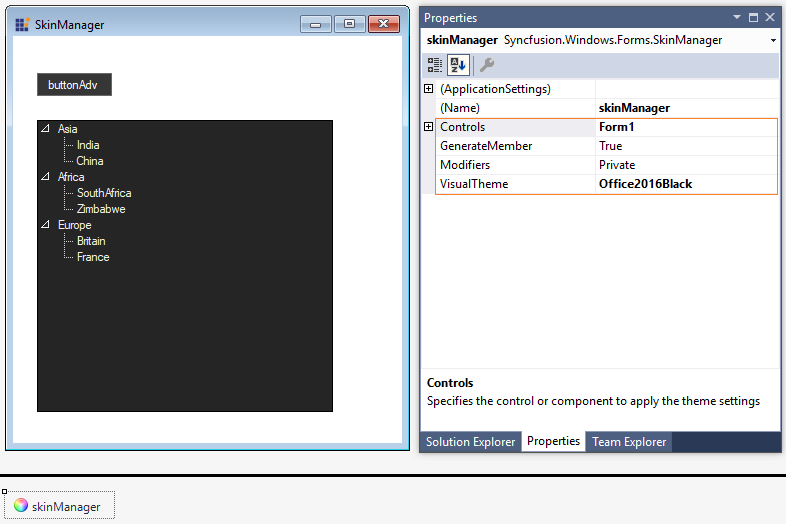
SkinManager supports applying a theme for all controls in the form or a container by applying the theme to the form or container. So, you do not need to apply the theme for each control.
Through code
Theme for a control or form can be applied by setting the Controls property of SkinManager.
using Syncfusion.Windows.Forms;

this.components = new System.ComponentModel.Container();
SkinManager skinManager1 = new SkinManager(this.components);
skinManager1.Controls = treeViewAdv1;
Imports Syncfusion.Windows.Forms
Me.components = New System.ComponentModel.Container()
Dim skinManager1 As New SkinManager(Me.components)
skinManager1.Controls = treeViewAdv1Applying theme to the form
SkinManager supports applying a theme for all controls in the form or a container by applying the theme to the form or container. So, you do not need to apply the theme for each control.
skinManager1.Controls = this;
skinManager1.VisualTheme = VisualTheme.Office2016Black;skinManager1.Controls = Me
skinManager1.VisualTheme = VisualTheme.Office2016Black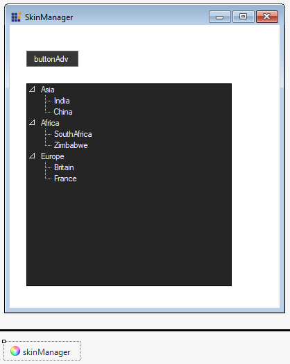
Apply Themes to entire application
SkinManager allows you to apply a theme to all controls and forms in an application by setting the ApplicationVisualTheme property. It allows you to theme the entire application using a single ApplicationVisualTheme property.
static void Main()
{
    SkinManager.ApplicationVisualTheme = "Office2019Colorful";
    Application.EnableVisualStyles();
    Application.SetCompatibleTextRenderingDefault(false);
    Application.Run(new Form1());
}
Set the
ApplicationVisualThemeproperty before the main form is initialized.
Apply theme for individual control
Theme can be applied to an individual control using SkinManager or by setting the ThemeName property. You need to call the LoadAssembly method for required themes when applying using the ThemeName property also.
this.treeViewAdv1.ThemeName = "Office2019Colorful";Me.treeViewAdv1.ThemeName = "Office2019Colorful"
Theme studio based themes
The Office2019Colorful and HighContrastBlack themes can be customized using the WinForms Theme Studio. Refer to the Theme Studio documentation to know how to create custom themes.
Use Office2019Colorful for a colorful, modern look and HighContrastBlack for high-contrast accessibility scenarios.
Appearance customization settings done at the control level will not take effect when a Theme Studio based theme is applied. So, for customization, refer to the Style section.
Change font for entire application
When using Theme Studio based themes, the font for the entire application can be customized by setting the CanOverrideFontFamily property to true. This property is used only in a constructor.
FontHelper.CanOverrideFontFamily = true;
FontHelper.FontFamily = new FontFamily("Algerian");FontHelper.CanOverrideFontFamily = True
FontHelper.FontFamily = New FontFamily("Algerian")
Styles
When using Theme Studio based themes, the appearance for each control or component can be customized using the ThemeStyle property.
If the control name starts with Sf, you can access appearance properties using the
Styleproperty, and for the remaining controls, use theThemeStyleproperty.
For example, in the following code, the style of each control has been changed.
this.treeViewAdv1.ThemeStyle.BackColor = System.Drawing.Color.White;
this.treeViewAdv1.ThemeStyle.BorderColor = System.Drawing.Color.SteelBlue;
this.treeViewAdv1.ThemeStyle.LineColor = System.Drawing.Color.DarkBlue;
this.treeViewAdv1.ThemeStyle.TreeNodeAdvStyle.ArrowColor = System.Drawing.Color.Aqua;
this.treeViewAdv1.ThemeStyle.TreeNodeAdvStyle.TextColor = System.Drawing.Color.Red;Me.treeViewAdv1.ThemeStyle.BackColor = System.Drawing.Color.White
Me.treeViewAdv1.ThemeStyle.BorderColor = System.Drawing.Color.SteelBlue
Me.treeViewAdv1.ThemeStyle.LineColor = System.Drawing.Color.DarkBlue
Me.treeViewAdv1.ThemeStyle.TreeNodeAdvStyle.ArrowColor = System.Drawing.Color.Aqua
Me.treeViewAdv1.ThemeStyle.TreeNodeAdvStyle.TextColor = System.Drawing.Color.Red
Overriding user customization when applying theme
You can customize the appearance of a control using the Style or ThemeStyle property when using Theme Studio based themes. The Syncfusion control provides an option for whether the theme can override style settings using the CanOverrideStyle property.
For example, in the following code, the TreeView foreground color is customized, and the theme is applied after that line. If you run the application, the theme will not override the foreground color settings since the default value of CanOverrideStyle is false. If you set the CanOverrideStyle property to true before setting the theme, then the foreground color setting will be overridden by the theme.
this.treeViewAdv1.CanOverrideStyle = false;
this.treeViewAdv1.ThemeName = "Office2019Colorful";
this.treeViewAdv1.ThemeStyle.TreeNodeAdvStyle.TextColor = System.Drawing.Color.Red;Me.treeViewAdv1.CanOverrideStyle = False
Me.treeViewAdv1.ThemeName = "Office2019Colorful"
Me.treeViewAdv1.ThemeStyle.TreeNodeAdvStyle.TextColor = System.Drawing.Color.Red