How can I help you?
Grouping in UWP DataGrid (SfDataGrid)
28 Feb 202524 minutes to read
SfDataGrid allows you to group the data against one or more columns. When grouping is applied, the data is organized into a hierarchical structure based on matching column values and it is sorted by ascending order.
SfDataGrid allows you to group the data in below ways,
-
UI Grouping
-
Programmatic Grouping
UI Grouping
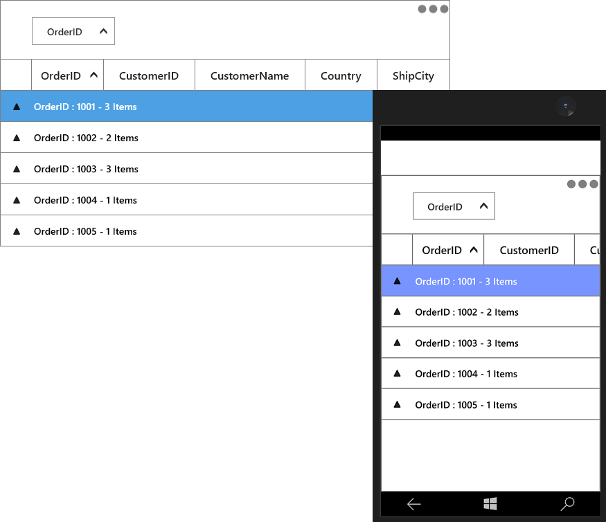
You can allow end-user to group the data by setting SfDataGrid.AllowGrouping property to true, where user can drag and drop the column into GroupDropArea to group based on that column.
When the column is grouped, records that have an identical value in the column are combined to form a group. The GroupDropArea can be enabled by setting the SfDataGrid.ShowGroupDropArea property to true.
<syncfusion:SfDataGrid  x:Name="dataGrid"
                        AllowGrouping="False"
                        AutoGenerateColumns="True"
                        ItemsSource="{Binding Orders}"
ShowGroupDropArea="True" />this.dataGrid.AllowGrouping = true;You can enable or disable grouping on particular column by setting the GridColumn.AllowGrouping property.
<syncfusion:SfDataGrid  x:Name="dataGrid"
                        AutoGenerateColumns="False"
                        ItemsSource="{Binding Orders}"
                        ShowGroupDropArea="True">
    <syncfusion:SfDataGrid.Columns>
        <syncfusion:GridTextColumn AllowGrouping="True" MappingName="OrderID" />
        <syncfusion:GridTextColumn AllowGrouping="False" MappingName="CustomerID" />
    </syncfusion:SfDataGrid.Columns>
</syncfusion:SfDataGrid>this.dataGrid.Columns["OrderID"].AllowGrouping = true;
this.dataGrid.Columns["CustomerID"].AllowGrouping = true;NOTE
GridColumn.AllowGrouping takes higher priority than SfDataGrid.AllowGrouping.
The data can be grouped by an unlimited number of columns. To group more than one columns, drag-and-drop the desired columns in to GroupDropArea.
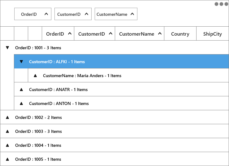
Each group is identified by its CaptionSummaryRows and it is used to organize the data into a hierarchical tree structure based on identical values of that column. The underlying records in each caption summary row can be expanded or collapsed by clicking its group caption.
Each CaptionSummaryRow carries information about a particular group like group name, number of items (records) in the group, etc.
You can refer Caption Summaries section, for more information about CaptionSummaryRow.
Programmatic Grouping
SfDataGrid allows you to group the data programmatically by adding or removing GroupColumnDescription to SfDataGrid.GroupColumnDescriptions collection.
For example, if you want to group the OrderID column programmatically, define its MappingName to ColumnName property of GroupColumnDescription. Then add the GroupColumnDescription to the SfDataGrid.GroupColumnDescriptions collection.
<syncfusion:SfDataGrid  x:Name="dataGrid"
                        AutoGenerateColumns="True"
                        ItemsSource="{Binding Orders}"
                        ShowGroupDropArea="True">
    <syncfusion:SfDataGrid.GroupColumnDescriptions>
        <syncfusion:GroupColumnDescription ColumnName="OrderID" />
    </syncfusion:SfDataGrid.GroupColumnDescriptions>
</syncfusion:SfDataGrid>this.dataGrid.GroupColumnDescriptions.Add(new GroupColumnDescription() { ColumnName = "OrderID" });You can group more than one column programmatically.
<syncfusion:SfDataGrid x:Name="dataGrid"
                        ItemsSource="{Binding Orders}"
                        ShowGroupDropArea="True">
    <syncfusion:SfDataGrid.GroupColumnDescriptions>
        <syncfusion:GroupColumnDescription ColumnName="OrderID" />
        <syncfusion:GroupColumnDescription ColumnName="CustomerID" />
    </syncfusion:SfDataGrid.GroupColumnDescriptions>

</syncfusion:SfDataGrid>this.dataGrid.View.BeginInit();
this.dataGrid.GroupColumnDescriptions.Add(new GroupColumnDescription() { ColumnName = "OrderID" });
this.dataGrid.GroupColumnDescriptions.Add(new GroupColumnDescription() { ColumnName = "CustomerID" });
this.dataGrid.View.EndInit();Display based grouping using GroupMode property
You can group the column in SfDataGrid based on the value being displayed in cell by setting GridColumn.GroupMode as ‘Display’.
In the below example, OrderID column displays value with one decimal digit in cell. But when you group, groups will be created based on actual value considering all decimal digits of value (Refer right side screen shot). You can group based value displayed in the cell by setting GridColumn.GroupMode as ‘Display’ (Refer left side screen shot for the same data).
<Syncfusion:GridNumericColumn MappingName="OrderID" HeaderText="OrderID" DisplayBinding="{Binding OrderID,Converter={StaticResource converter}}" GroupMode="Display"/>this.datagrid.Columns["OrderID"].GroupMode = DataReflectionMode.Display;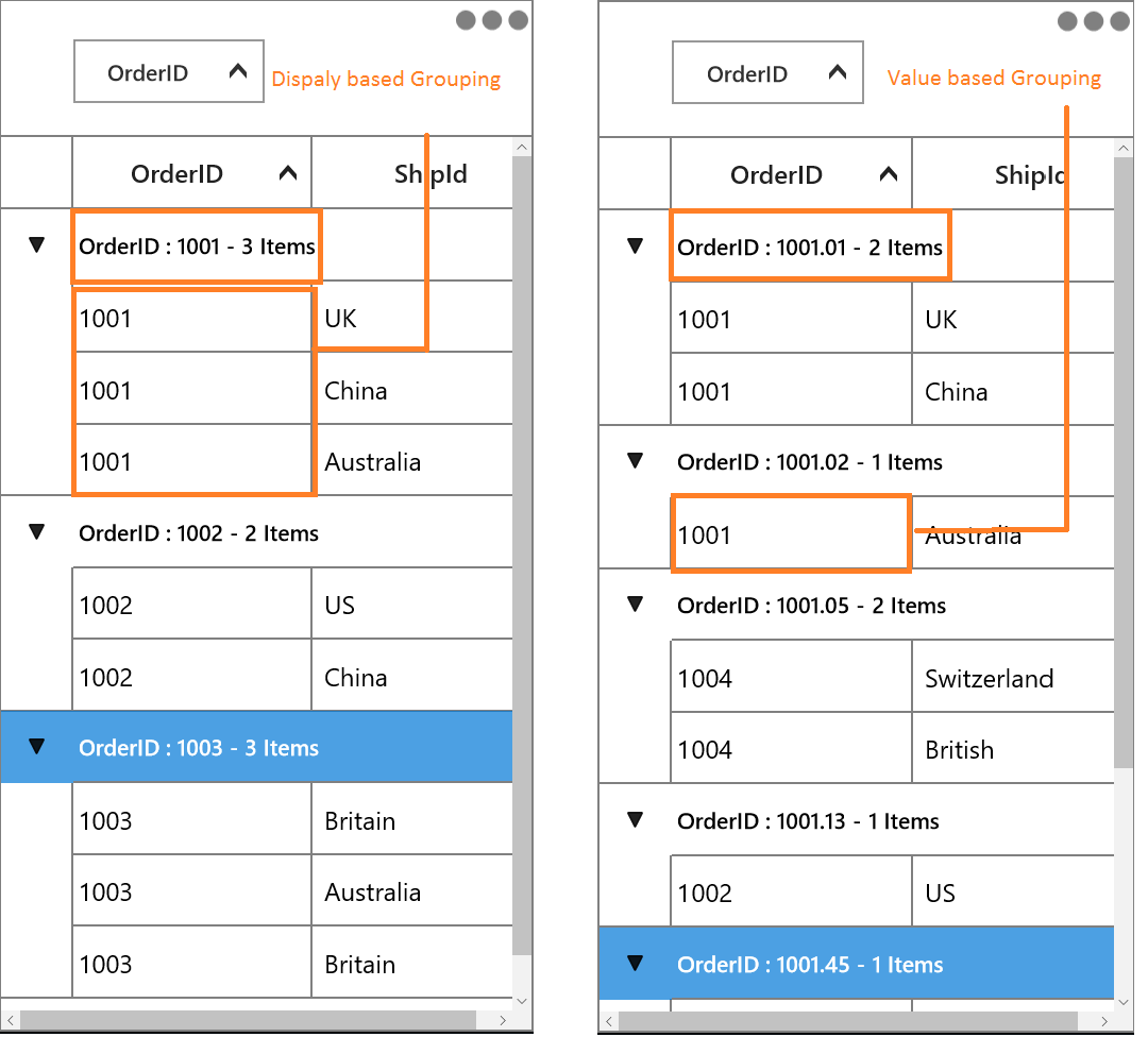
Group caption based on DisplayMember when grouping GridComboBoxColumn and GridMultiColumnDropDownList
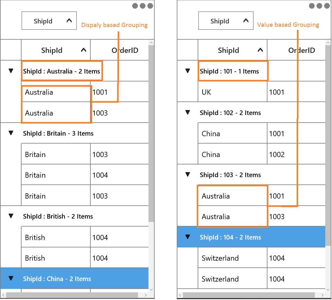
In SfDataGrid, you can group the column based on display value and also the same can be displayed in caption summary by setting GridColumn.GroupMode as ‘Display’.
<Syncfusion:GridComboBoxColumn ItemsSource="{Binding ComboItemsSource}" MappingName="ShipId" DisplayMemberPath="ShipCity" SelectedValuePath="ShipId" GroupMode="Display"/>this.datagrid.Columns.Add(new GridComboBoxColumn()
{
ItemsSource = viewModel.ComboItemsSource,
DisplayMemberPath = "ShipCity",
MappingName = "ShipId",
SelectedValuePath = "ShipId",
GroupMode = DataReflectionMode.Display
});
Clearing or Removing Group
You can remove all the groups by clearing SfDataGrid.GroupColumnDescriptions collection.
this.dataGrid.GroupColumnDescriptions.Clear();You can ungroup the column programmatically at runtime by removing GroupColumnDescription from SfDataGrid.GroupColumnDescriptions collection.
this.dataGrid.View.BeginInit();
this.dataGrid.GroupColumnDescriptions.Remove(this.dataGrid.GroupColumnDescriptions[0]);
this.dataGrid.View.EndInit();
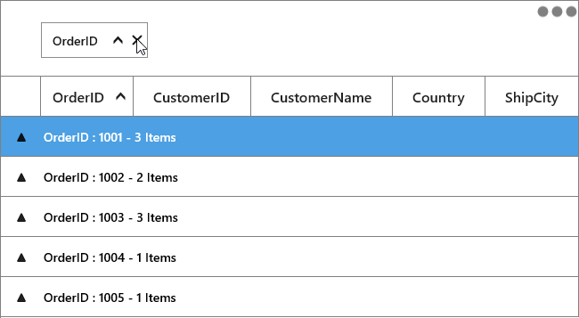
To ungroup the column in UI, click the close button on column header or drag the column header from the GroupDropArea and drop it on the header row.
Hiding the column when grouped
You can hide the column header when the particular column gets grouped by setting SfDataGrid.ShowColumnWhenGrouped property to false.
<syncfusion:SfDataGrid  x:Name="dataGrid"
                        AutoGenerateColumns="True"
                        ItemsSource="{Binding Orders}"
                        ShowColumnWhenGrouped="False"
ShowGroupDropArea="True" />this.dataGrid.ShowColumnWhenGrouped = false;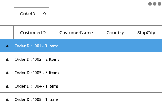
Freezing caption rows when scrolling
You can freeze the group caption of the group in view until its records scrolled out of the view by setting the SfDataGrid.AllowFrozenGroupHeaders property to true.
<syncfusion:SfDataGrid  x:Name="dataGrid"
                        AutoGenerateColumns="True"
                        AllowFrozenGroupHeaders="True"
                        ItemsSource="{Binding Orders}"
ShowGroupDropArea="True" />this.dataGrid.AllowFrozenGroupHeaders = true;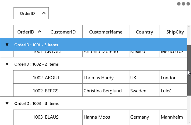
Expanding or collapsing the groups
By default, you can view the records in each group by expanding or collapsing its group caption.
You can allow end-user to expand or collapse the groups programmatically at runtime.
Expand groups while grouping
You can expand all the groups while grouping by setting SfDataGrid.AutoExpandGroups to true. So, when user group any column, then all groups will be in expanded state.
<syncfusion:SfDataGrid  x:Name="dataGrid"
                        AutoExpandGroups="True"
                        AutoGenerateColumns="True"
                        ItemsSource="{Binding Orders}"
ShowGroupDropArea="True" />this.dataGrid.AutoExpandGroups = true;Programmatically expanding or collapsing the groups
Expand or collapse all the Groups
You can expand or collapse all the groups at programmatically at runtime by using SfDataGrid.ExpandAllGroup and SfDataGrid.CollapseAllGroup methods.
this.dataGrid.ExpandAllGroup();
this.dataGrid.CollapseAllGroup();
Expand or Collapse the Group based on its level
You can expand or collapse the group based on its level by using SfDataGrid.ExpandGroupsAtLevel and SfDataGrid.CollapseGroupsAtLevel methods.
this.dataGrid.ExpandGroupsAtLevel(2);
this.dataGrid.CollapseGroupsAtLevel(2);
Expand or Collapse the specific Group
You can expand or collapse specific group by using SfDataGrid.ExpandGroup and SfDataGrid.CollapseGroup methods.
var group = (dataGrid.View.CollectionGroups[0] as Group);
this.dataGrid.ExpandGroup(group);
this.dataGrid.CollapseGroup(group);
Customize IndentColumn width
You can customize the width of IndentColumn in SfDataGrid by using IndentColumnWidth property as like below.
<Syncfusion:SfDataGrid x:Name="dataGrid"
                       AllowGrouping="True"
                       IndentColumnWidth="50"
                       ShowGroupDropArea="True"
ItemsSource="{Binding OrderInfoCollection }">this.dataGrid.IndentColumnWidth = 50;GroupDropArea customization
GroupDropArea Text
You can change the GroupDropArea’s text can by setting SfDataGrid.GroupDropAreaText property.
<syncfusion:SfDataGrid x:Name="dataGrid"
                       GroupDropAreaText="Drag and drop the columns here"
                       ItemsSource="{Binding Orders}"
                       ShowGroupDropArea="True" />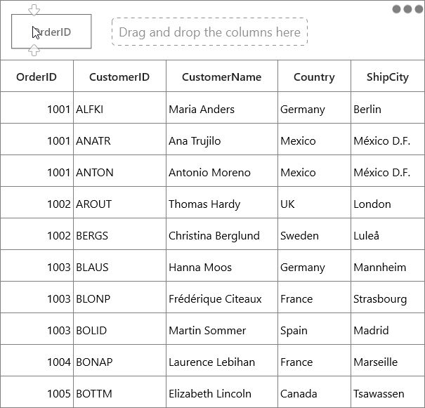
GroupDropArea Height and Appearance
SfDataGrid allows you to customize the appearance and height of GroupDropArea by writing the style of TargetType GroupDropArea.
<Page.Resources>
    <Style TargetType="syncfusion:GroupDropArea">
        <Setter Property="Height" Value="90" />
        <Setter Property="Foreground" Value="Red" />
        <Setter Property="Background" Value="Pink" />
    </Style>
</Page.Resources>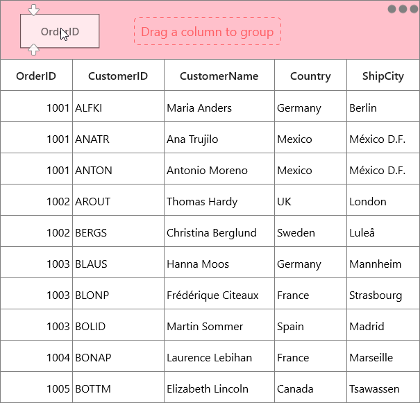
Expanding GroupDropArea while loading
By default, the GroupDropArea will be expanded while dragging the column towards the GroupDropArea. You can set the GroupDropArea to be always expanded by setting the SfDataGrid.IsGroupDropAreaExpanded property to true.
<syncfusion:SfDataGrid  x:Name="dataGrid"
                        AutoGenerateColumns="True"
                        IsGroupDropAreaExpanded="True"
                        ItemsSource="{Binding Orders}"
ShowGroupDropArea="True" />this.dataGrid.IsGroupDropAreaExpanded = true;Custom Grouping
SfDataGrid allows you to group the data based on custom logic when the built-in grouping functionality doesn’t meet your requirement.
To perform custom grouping on a particular column, specify the custom logic through GroupColumnDescription.Converter property and the column name to GroupColumnDescription.ColumnName property.
For an example, the Date column is grouped based on the week basis in the following example.
public class GroupDateTimeConverter : IValueConverter
{

    public object Convert(object value, System.Type targetType, object parameter, CultureInfo culture)
    {
        var saleInfo = value as SalesByDate;
        var date = DateTime.Now;
        var days = (int)Math.Floor((date - saleInfo.Date).TotalDays);
        var dayofWeek = (int)date.DayOfWeek;
        var difference = days - dayofWeek;

        if (days <= dayofWeek)
        {

            if (days == 0)
                return "TODAY";

            if (days == 1)
                return "YESTERDAY";
            return saleInfo.Date.DayOfWeek.ToString().ToUpper();
        }

        if (difference > 0 && difference <= 7)
            return "LAST WEEK";

        if (difference > 7 && difference <= 14)
            return "TWO WEEKS AGO";

        if (difference > 14 && difference <= 21)
            return "THREE WEEKS AGO";

        if (date.Year == saleInfo.Date.Year && date.Month == saleInfo.Date.Month)
            return "EARLIER THIS MONTH";

        if (DateTime.Now.AddMonths(-1).Month == saleInfo.Date.Month)
            return "LAST MONTH";
        return "OLDER";
    }

    public object ConvertBack(object value, System.Type targetType, object parameter, CultureInfo culture)
    {
        throw new System.NotImplementedException();
    }
}
Now, assign the GroupDateTimeConverter into GroupColumnDescription.Converter and set Date property to GroupColumnDescription.ColumnName property.
<Page.Resources>
    <local:GroupDateTimeConverter x:Key="customGroupDateTimeConverter" />
</Page.Resources>

<syncfusion:SfDataGrid  x:Name="dataGrid"
                        AutoGenerateColumns="True"
                        ItemsSource="{Binding DailySalesDetails}">
    <syncfusion:SfDataGrid.GroupColumnDescriptions>
        <syncfusion:GroupColumnDescription ColumnName="Date" Converter="{StaticResource customGroupDateTimeConverter}" />
    </syncfusion:SfDataGrid.GroupColumnDescriptions>

</syncfusion:SfDataGrid>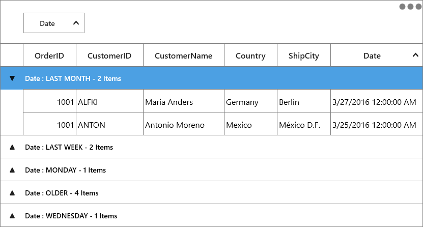
You can refer here to apply custom sorting when grouping is applied. You can download sample demo here.
Sorting Inner Records
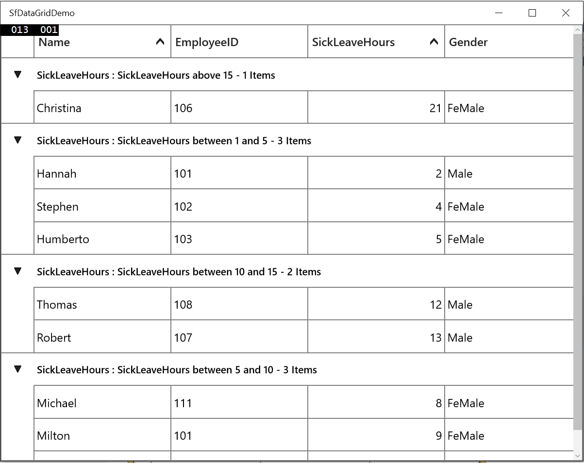
In custom grouping, you can sort all the inner records of each group by setting GroupColumnDescription.SortGroupRecords
sorted based on the column name described in GroupColumnDescription.
<syncfusion:SfDataGrid.GroupColumnDescriptions>
        <syncfusion:GroupColumnDescription ColumnName="SickLeaveHours"
                                           Converter="{StaticResource customGrouping}"
                                           SortGroupRecords="True" />
</syncfusion:SfDataGrid.GroupColumnDescriptions>
GroupColumnDescription groupColumnDesc = new GroupColumnDescription()
{
ColumnName = "SickLeaveHours",
Converter = new CustomGroupingConverter(),
SortGroupRecords = true
};
dataGrid.GroupColumnDescriptions.Add(groupColumnDesc);In the below screenshot custom grouping is applied based on SickLeaveHours column and the inner records in each group are sorted based on SickLeaveHours value.
Sorting CaptionSummaryRows by Aggregate
SfDataGrid allows you to sort the groups based its summary values. You can sort the groups based on summary aggregate value by using SfDataGrid. SummaryGroupComparer property.
Follow the below steps to sort the groups based on caption aggregate value.
Define custom group comparer with custom sort logic
In the below code snippet, the OrderID column compared and sorted based on the number of order count in each OrderID.
public class CustomSummaryGroupComparer : IComparer<Group>, ISortDirection
{
    public ListSortDirection SortDirection { get; set; }

    public int Compare(Group x, Group y)
    {
        int compare = 0;
        var xGroupSummary = Convert.ToInt32((x as Group).GetSummaryValue(x.SummaryDetails.SummaryRow.SummaryColumns[0].MappingName, "Count"));
        var yGroupSummary = Convert.ToInt32((y as Group).GetSummaryValue(x.SummaryDetails.SummaryRow.SummaryColumns[0].MappingName, "Count"));
        compare = ((IComparable)xGroupSummary).CompareTo(yGroupSummary);

        if (this.SortDirection == ListSortDirection.Descending)
            compare = -compare;

        return compare;
    }
}
Defining custom group comparer to SfDataGrid
Custom group comparer can be defined in SfDataGrid using SfDataGrid.SummaryGroupComparer property. SummaryGroupComparer maintains the custom comparers and the custom comparer gets called when corresponding column is grouped.
<Page.Resources>
    <local:CustomSummaryGroupComparer x:Key="groupComparer" />
</Page.Resources>

<syncfusion:SfDataGrid  x:Name="dataGrid"
                        AutoGenerateColumns="True"
                        ItemsSource="{Binding Orders}"
                        ShowGroupDropArea="True"
                        SummaryGroupComparer="{StaticResource groupComparer}">
    <syncfusion:SfDataGrid.GroupColumnDescriptions>
        <syncfusion:GroupColumnDescription ColumnName="OrderID" />
    </syncfusion:SfDataGrid.GroupColumnDescriptions>
    <syncfusion:SfDataGrid.CaptionSummaryRow>
        <syncfusion:GridSummaryRow Title="Items Count: {IDCount}" ShowSummaryInRow="True">
            <syncfusion:GridSummaryRow.SummaryColumns>
                <syncfusion:GridSummaryColumn Name="IDCount"
                                                Format="'{Count}'"
                                                MappingName="OrderID"
                                                SummaryType="CountAggregate" />
            </syncfusion:GridSummaryRow.SummaryColumns>
        </syncfusion:GridSummaryRow>
    </syncfusion:SfDataGrid.CaptionSummaryRow>
</syncfusion:SfDataGrid>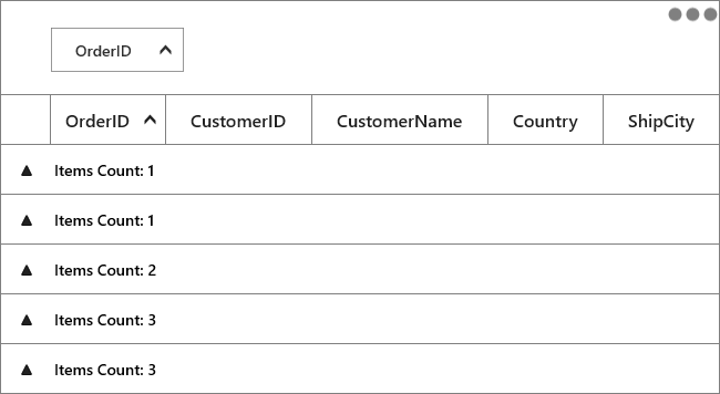
You can download the sample demo here.
Events
GroupExpanding event
The SfDataGrid.GroupExpanding event occurs when the group is being expanded.
The GroupChangingEventArgs of the GroupExpanding event provides the information about the expanding group and it has the following members.
Group - Gets the group that’s being expanded.
Cancel – Decides whether to cancel the group expansion.
You can cancel the group expansion by setting GroupChangingEventArgs.Cancel to true.
this.dataGrid.GroupExpanding += DataGrid_GroupExpanding;

private void DataGrid_GroupExpanding(object sender, GroupChangingEventArgs e)
{

    if (e.Group.Key.Equals(1001))
        e.Cancel = true;
}
GroupExpanded event
The SfDataGrid.GroupExpanded event occurs after the group is expanded.
The GroupChangedEventArgs of the GroupExpanded event provides the information about the expanded group and it has the following member.
Group - Gets the expanded group.
GroupCollapsing event
The SfDataGrid.GroupCollapsing event occurs when the group is being collapsed.
The GroupChangingEventArgs of the GroupCollapsing event provides the information about the collapsing group and it contains the following member.
Group - Gets the group that’s being collapsed.
Cancel – Decides whether to cancel the group collapsing.
You can cancel the group is being collapsed by using GroupChangingEventArgs.Cancel of GroupCollapsing event.
this.dataGrid.GroupCollapsing += DataGrid_GroupCollapsing;

private void DataGrid_GroupCollapsing(object sender, GroupChangingEventArgs e)
{

    if (e.Group.Key.Equals(1001))
        e.Cancel = true;
}
GroupCollapsed event
The SfDataGrid.GroupCollapsed event occurs after the group is collapsed.
GroupChangedEventArgs of the GroupCollapsed event provides the information about collapsed group and it contains the following member.
Group - Gets the collapsed group.