How can I help you?
Programmatic filtering in UWP DataGrid (SfDataGrid)
28 Feb 202524 minutes to read
SfDataGrid allows you to filter the data programmatically in below ways
- Through View Predicate
- Through Column Filter
View Filtering
View filtering can be achieved by setting SfDataGrid.View.Filter delegate. You can refresh the view by calling SfDataGrid.View.RefreshFilter method.
Here, FilterRecords delegate filters the data based on Country name. FilterRecords delegate is assigned to SfDataGrid.View.Filter predicate to filter Country column. After that, SfDataGrid.View.RefreshFilter method is called to refresh the records. If the record satisfies the filter conditions, true will be returned. Else false is returned.
public bool FilterRecords(object o)
{
   string filterText = "Germany";
   var item = o as OrderInfo;

   if (item != null)
   {

      if (item.Country.Equals(filterText))
          return true;
   }
   return false;
}

private void Button_Click(object sender, RoutedEventArgs e)
{
    dataGrid.View.Filter = FilterRecords;
    dataGrid.View.RefreshFilter();
}
Column Filtering
Column filtering is achieved by using GridColumn.FilterPredicates property and adding FilterPredicate to it.
Here, OrderID column is filtered for the data which has OrderID as 1005.
dataGrid.Columns["OrderID"].FilterPredicates.Add(new FilterPredicate() { FilterType = FilterType.Equals, FilterValue = "1005" });Filter Behavior
- StringTyped - Records are filtered without considering the type and it takes FilterValue type as string.
- StronglyTyped - Records are filtered by considering the
FilterValueunderlying type.
Improving performance while adding multiple FilterPredicates to the column in loop
You can improve the performance of filtering by suspending the data operation while adding FilterPredicates to the column for bulk updates by calling SfDataGrid.View.BeginInit and SfDataGrid.View.EndInit method, before and after the data operation.
private void OnApplyFilterPredicate(object obj)
{
    var dataGrid = obj as SfDataGrid;
    var gridColumn = dataGrid.Columns["EmployeeId"];
    dataGrid.View.BeginInit();
    foreach (var filterValue in FilterValues)
    {
        gridColumn.FilterPredicates.Add(new FilterPredicate()
        {
            FilterType = FilterType.Equals,
            FilterValue = filterValue,
            FilterBehavior = FilterBehavior.StronglyTyped,
            FilterMode = ColumnFilter.Value,
            PredicateType = PredicateType.Or,
            IsCaseSensitive = true
        });
    }
    dataGrid.View.EndInit();
}
Clear Filtering
SfDataGrid allows you to clear the filters by clearing the filter predicates. This is achieved by invoking the following methods.
- SfDataGrid.ClearFilters - Clears filters for all the columns programmatically.
-
SfDataGrid.ClearFilter(String columnName) - Clears the filter for particular column that has the columnName as
MappingName. - SfDataGrid.ClearFilter(GridColumn column) - Clears the filter for particular column alone.
this.dataGrid.ClearFilters();
this.dataGrid.ClearFilter("OrderID");
this.dataGrid.ClearFilter(this.dataGrid.Columns[0]);
UI Filtering
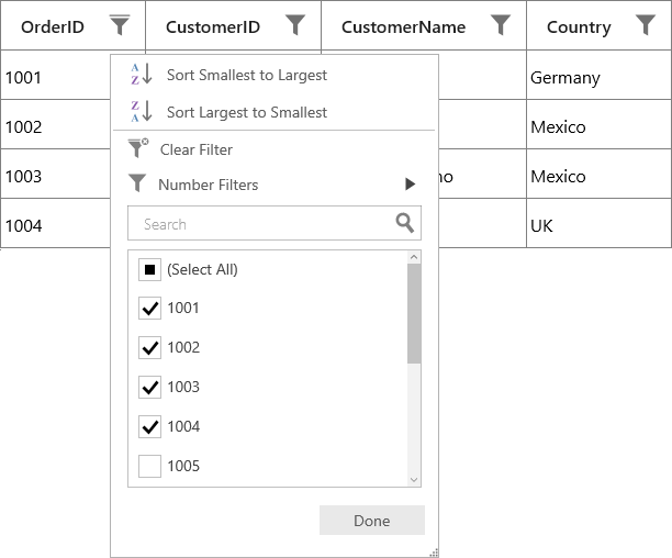
SfDataGrid provides excel like filtering UI and also advanced filter UI to filter the data easily. UI filtering can be enabled by setting SfDataGrid.AllowFiltering property to true, where you can open filter UI by clicking the Filter icon in column header and filter the records.
<syncfusion:SfDataGrid x:Name="dataGrid"
                       AllowFiltering="True"
                       AutoGenerateColumns="True"
ItemsSource="{Binding Orders}" />dataGrid.AllowFiltering = true;You can enable/disable filtering for particular column by setting GridColumn.AllowFiltering property.
<syncfusion:GridTextColumn AllowFiltering="True" MappingName="OrderID" />dataGrid.Columns["OrderID"].AllowFiltering = true;NOTE
- GridColumn.AllowFiltering has higher priority than SfDataGrid.AllowFiltering property.
- UI filtering is not supported when using on-demand paging by setting
UseOnDemandPagingtotrue.
Built-in UI Views
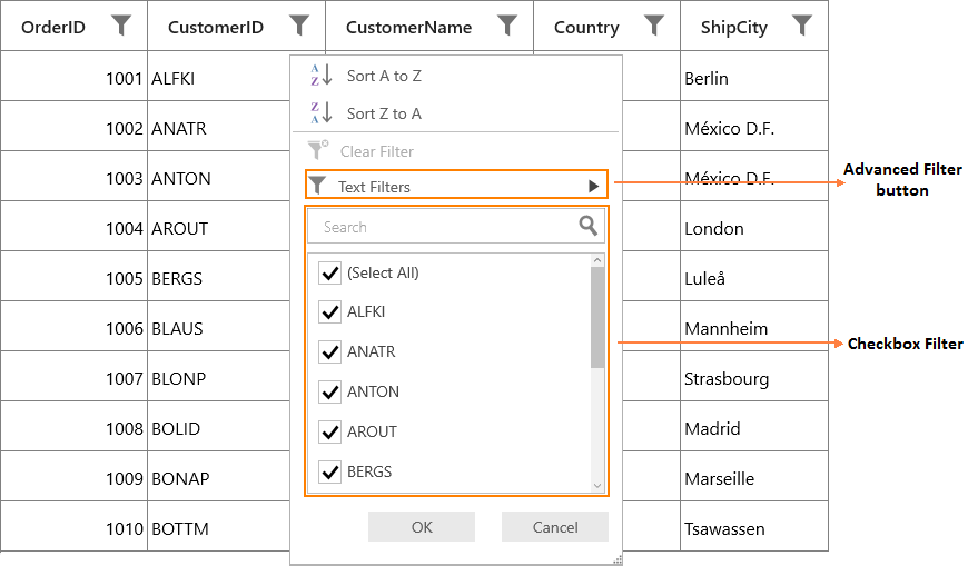
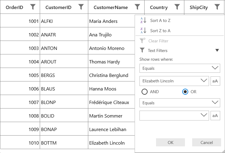
SfDataGrid filter UI comprises of two different UIs.
-
Checkbox Filter UI - Provides excel like filter interface with list of check box’s.
-
Advanced Filter UI - Provides advanced filter options to filter the data.
By default, both Checkbox Filter and Advanced Filter are loaded while opening the filter pop-up. You can switch between AdvancedFilter and CheckboxFilter by using AdvancedFilter button in the UI View.
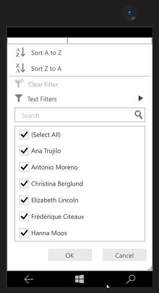
SfDataGrid with Checkbox Filter View
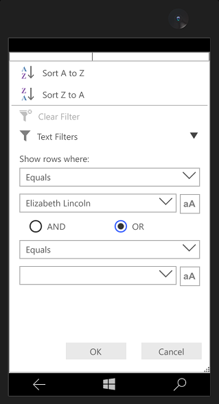
SfDataGrid with Advanced Filter View
Choose between built-in UI Views
SfDataGrid lets you to customize the UI Views displayed for particular column or grid using FilterMode property in GridFilterControl.
Below are the options,
- CheckboxFilter – Displays only Checkbox filter View.
- AdvancedFilter – Displays only Advanced filter View.
- Both – Displays both filters Views.
Changing filter UI View for Grid
Filter UI view can be changed for all the columns in grid by changing FilterMode in GridFilterControl by writing style and assign it to SfDataGrid.FilterPopupStyle.
<Style x:Key="filterControlStyle" TargetType="syncfusion:GridFilterControl">
    <Setter Property="FilterMode" Value="AdvancedFilter" />
</Style>

<syncfusion:SfDataGrid x:Name="dataGrid"
                       AllowFiltering="True"
                       AutoGenerateColumns="True"
                       FilterPopupStyle="{StaticResource filterControlStyle}"
                       ItemsSource="{Binding Orders}"/>
Changing filter UI View for columns
Filter UI view can be changed for the particular column by changing FilterMode in GridFilterControl by writing style and assign it to SfDataGrid.FilterPopupStyle.
<Style x:Key="filterControlStyle" TargetType="syncfusion:GridFilterControl">
    <Setter Property="FilterMode" Value="AdvancedFilter" />
</Style>

<syncfusion:GridTextColumn MappingName="OrderID"
                           FilterPopupStyle="{StaticResource filterControlStyle}"  />
Changing filter UI View programmatically
You can change FilterMode programmatically by using FilterItemsPopulating event.
this.dataGrid.FilterItemsPopulating += dataGrid_FilterItemsPopulating;

void dataGrid_FilterItemsPopulating(object sender, Syncfusion.UI.Xaml.Grid.GridFilterItemsPopulatingEventArgs e)
{

     if (e.Column.MappingName == "OrderID")
           e.FilterControl.FilterMode = FilterMode.AdvancedFilter;
}
Setting Default Filter popup style for particular column
You can skip the GridFilterControl styling for particular column from SfDataGrid.FilterPopupStyle by setting GridColumn.FilterPopupStyle to null.
<Window.Resources>
    <Style x:Key="filterControlStyle" TargetType="syncfusion:GridFilterControl">
           <Setter Property="FilterMode" Value="AdvancedFilter" />
    </Style>
</Window.Resources>

<syncfusion:SfDataGrid x:Name="dataGrid"
                       AllowFiltering="True"
                       FilterPopupStyle="{StaticResource filterControlStyle}"
                       ItemsSource="{Binding OrderList}">

    <syncfusion:SfDataGrid.Columns>
      <syncfusion:GridTextColumn FilterPopupStyle="{x:Null}" MappingName="OrderID" />
    </syncfusion:SfDataGrid.Columns>

</syncfusion:SfDataGrid>this.dataGrid.Columns["OrderID"].FilterPopupStyle = null;Here, advanced filter will be loaded for all the columns in grid except OrderID column since GridColumn.FilterPopupStyle is set as null for OrderID column. So both checkbox filter and advanced filter (default style) will be loaded for OrderID column.
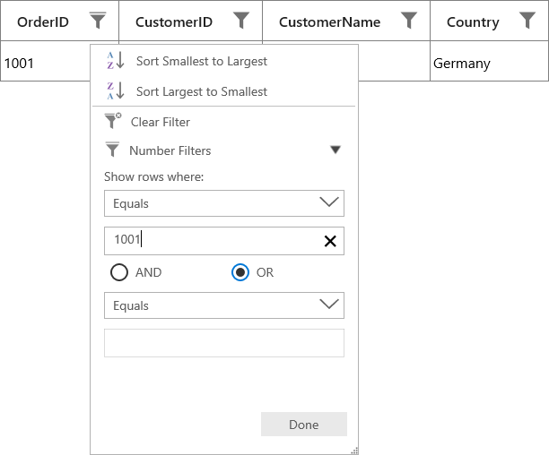
Advanced Filter UI
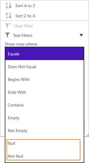
Advanced filter UI provides multiple filter options to filter the data easily. Filter menu options are loaded based on Advanced filter type by automatically detecting the underlying date type.
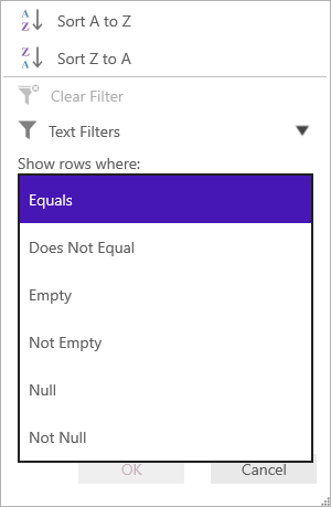
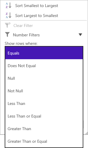
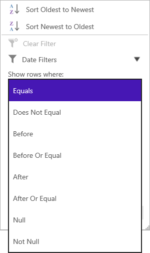
Below are the built-in filter types supported.
- Text Filters – Loads various menu options to filter the display text effectively.
- Number Filters – Loads various menu options to filter the numeric data.
- Date Filters – Loads various menu options and DatePicker to filter DateTime type column.
| Text Filters | Number Filters | Date Filters |
|---|---|---|
| When the string value is bounded to the or the items source is , then TextFilters are loaded in . | When integer, double, short, decimal, byte or long are bound to the then Number Filters are loaded in . |
When the DateTime type value is bound to the
, then Date Filters are loaded in
.
|
|
|
|
Filter menu options
|
Filter menu options
|
Filter menu options
|
NOTE
- Null and Not Null options are available only when AllowBlankFilters is set to ‘True’.
- If the column is GridUnboundColumn or
GridMaskColumn, then Text Filters will be loaded.
Changing Advanced Filter type
FilterBehavior determines the Advanced filter type loaded in GridFilterControl. By using FilterBehavior, you can change Advanced filter type.
- StringTyped - TextFilters will be loaded in AdvancedFilterControl.
- Strongly Typed – Advanced filter type is automatically detected based on underlying data type.
<syncfusion:SfDataGrid.Columns>
<syncfusion:GridTextColumn MappingName="OrderID" FilterBehavior="StringTyped"/>
</syncfusion:SfDataGrid.Columns>dataGrid.Columns["OrderID"].FilterBehavior = FilterBehavior.StringTyped;Advanced filter type can be changed programmatically by using FilterItemsPopulating event also.
this.dataGrid.FilterItemsPopulating += dataGrid_FilterItemsPopulating;

void dataGrid_FilterItemsPopulating(object sender, Syncfusion.UI.Xaml.Grid.GridFilterItemsPopulatingEventArgs e)
{

    if (e.Column.MappingName != "OrderID")
        return;
     e.FilterControl.AdvancedFilterType = AdvancedFilterType.TextFilter;
     e.FilterControl.SetColumnDataType(typeof(string));
     e.FilterControl.AscendingSortString = GridResourceWrapper.SortStringAscending;
     e.FilterControl.DescendingSortString = GridResourceWrapper.SortStringDescending;
}
Case Sensitive
By default, casing is not considered while filtering. Because, filter predicates will be created with IsCaseSensitive as false. If you want to filter the records with IsCaseSensitive as true, you need to click case sensitive button present in Advanced Filter.
Performance tips
GridFilterControl’s loading performance can be increased by setting FilterMode as AdvancedFilter and CanGenerateUniqueItems as False. Because a textbox is loaded instead of AdvancedFilter ComboBox that allows you to manually enter text for filtering.
<Style TargetType="syncfusion:AdvancedFilterControl">
    <Setter Property="CanGenerateUniqueItems" Value="False" />
</Style>

<Style x:Key="filterControlStyle" TargetType="syncfusion:GridFilterControl">
    <Setter Property="FilterMode" Value="AdvancedFilter" />
</Style>

<syncfusion:SfDataGrid x:Name="dataGrid"
                       AllowFiltering="True"
                       AutoGenerateColumns="True"
                       FilterPopupStyle="{StaticResource filterControlStyle}"
                       ItemsSource="{Binding Orders}"/>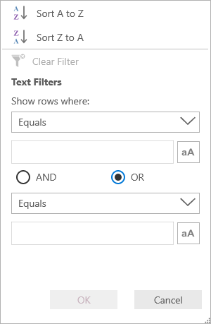
By default, CanGenerateUniqueItems is true. So all the unique items in the column are loaded in the AdvancedFilter ComboBox that allows you to select the value easily from the combo box and filter it.
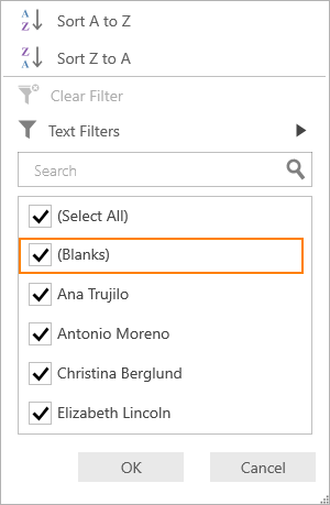
Filtering null values
To filter the null values, you need to set AllowBlankFilters property as True. So null values will be included in filter items list. If you want to exclude the null values from filter items list, you need to set AllowBlankFilters as False.
<syncfusion:GridTextColumn AllowBlankFilters="False" MappingName="Country" />dataGrid.Columns["Country"].AllowBlankFilters = false;Checkbox Filter with AllowBlankFilters as True
Advanced Filter with AllowBlankFilters as True
Instant Filtering
By default, filters are applied to the columns when OK button is clicked in UI filtering. If you want to update the filters immediately whenever update in filter popup, you need to set ImmediateUpdateColumnFilter as True.
<syncfusion:GridTextColumn ImmediateUpdateColumnFilter="True" MappingName="OrderID" />dataGrid.Columns["OrderID"].ImmediateUpdateColumnFilter = true;Here, the OK and Cancel buttons are unavailable and Done button is available to just close the popup.
Checkbox Filter with ImmediateUpdateColumnFilter is True
Advanced Filter with ImmediateUpdateColumnFilter is True
NOTE
In Checkbox Filter, the
SelectAlloption is not reflected in the filter updates ifImmediateUpdateColumnFilteristrue.
Filtering based on DisplayText
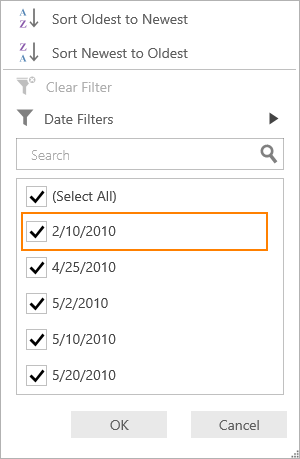
In UI filtering, records are filtered based on actual value by default. If you want to filter the records based on DisplayText, you need to set ColumnFilter property as DisplayText.
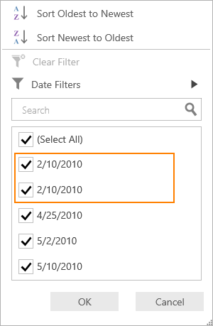
<syncfusion:GridDateTimeColumn MappingName="OrderDate" ColumnFilter="DisplayText"/>dataGrid.Columns["OrderDate"].ColumnFilter = ColumnFilter.DisplayText;Consider in the following DataGrid, first and second records have same display value for OrderDate column but both have different actual value (E.g. 2/10/2010 12:00:00 AM and 2/10/2010 6:30:00 PM).
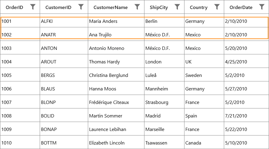
By default, based on the actual value only filter will be applied. So it will consider both values as different. And while opening filter popup, both values will be displayed like below.
If you set ColumnFilter as DisplayText, display value only will be considered for filtering. So filter popup will be shown like below.
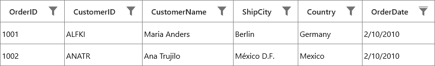
After filtering, both records having the same OrderDate display value will be displayed in view.
Events
SfDataGrid provides the following events for filtering.
FilterChanging event
FilterChanging event is raised while applying filters to a particular column. You can use this event to change the FilterPredicates, FilterType and FilterBehavior.
this.dataGrid.FilterChanging += dataGrid_FilterChanging;

void dataGrid_FilterChanging(object sender, GridFilterEventArgs e)
{
}
FilterChanged event
FilterChanged event is raised after filter is applied. You can use this event to get filtered records.
this.dataGrid.FilterChanged += dataGrid_FilterChanged;

void dataGrid_FilterChanged(object sender, GridFilterEventArgs e)
{
}
FilterItemsPopulating event
FilterItemsPopulating event is raised while populating the filter list items in GridFilterControl. You can change GridFilterControl properties by using this event.
this.dataGrid.FilterItemsPopulating += dataGrid_FilterItemsPopulating;

void dataGrid_FilterItemsPopulating(object sender,                                             Syncfusion.UI.Xaml.Grid.GridFilterItemsPopulatingEventArgs e)
{
}
FilterItemsPopulated event
FilterItemsPopulated event is raised after filter list items are populated. You can change GridFilterControl ItemsSource by using this event.
this.dataGrid.FilterItemsPopulated += dataGrid_FilterItemsPopulated;

void dataGrid_FilterItemsPopulated(object sender, GridFilterItemsPopulatedEventArgs e)
{
}
Getting the filtered records
You can get the filtered records from View in FilterChanged event. When filter is applied, the filtered records are available in View.Records.
this.dataGrid.FilterChanged += dataGrid_FilterChanged;
void dataGrid_FilterChanged(object sender, GridFilterEventArgs e)
{

    //OrderInfo is Model Class
    ObservableCollection<OrderInfo> order = new ObservableCollection<OrderInfo>();

    // Get filtered records
    var records = (sender as SfDataGrid).View.Records;

    foreach (RecordEntry record in records)
        order.Add(record.Data as OrderInfo);
}
Show image in CheckBoxFilterControl instead of image path
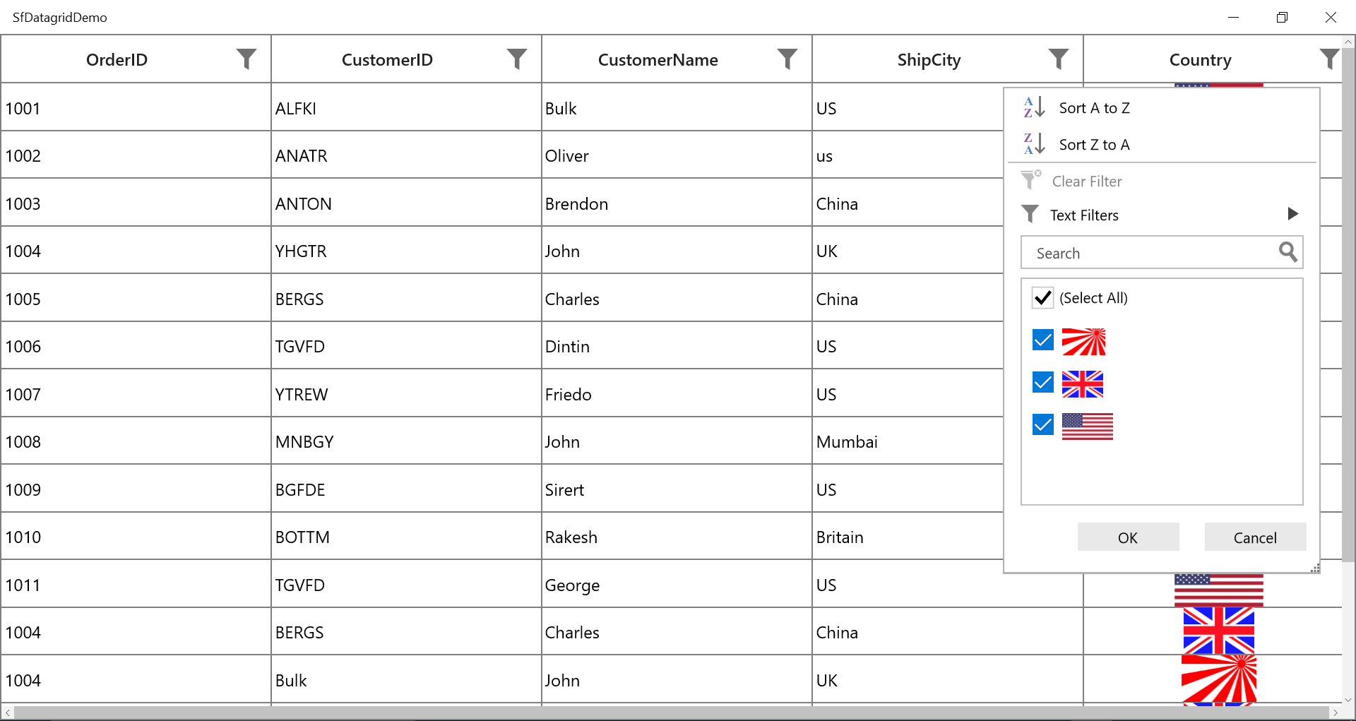
By default, in SfDataGrid image path is shown inside the CheckBoxFilterControl instead of image but you can show the image in CheckBoxFilterControl by setting CheckBoxFilterControl.ItemTemplate as like below.
<syncfusion:GridTextColumn AllowEditing="False" HeaderText="Country" MappingName="ImageLink">
                    <syncfusion:GridTextColumn.FilterPopupStyle>
                        <Style TargetType="syncfusion:GridFilterControl">
                            <Setter Property="CheckboxFilterStyle">
                                <Setter.Value>
                                    <Style TargetType="syncfusion:CheckboxFilterControl">
                                        <Setter Property="Background" Value="Red"/>
                                        <Setter Property="ItemTemplate">
                                            <Setter.Value>
                                                <DataTemplate>
                                                    <CheckBox Margin="4"
            HorizontalAlignment="Stretch"
            HorizontalContentAlignment="Stretch"
            Focusable="False"
            Content="{Binding}"
            FontWeight="{Binding FontWeight,RelativeSource={RelativeSource Self}}"
            Foreground="{Binding Foreground,RelativeSource={RelativeSource Self}}"
            IsChecked="{Binding IsSelected,
                                Mode=TwoWay}">
                                                        <CheckBox.ContentTemplate>
                                                            <DataTemplate>
                                                                <Image Source="{Binding Path=ActualValue, Converter={StaticResource stringToImageConverter}}"
                                                                       HorizontalAlignment="Left"
                                                                       Height="25"/>
                                                            </DataTemplate>
                                                        </CheckBox.ContentTemplate>
                                                    </CheckBox>
                                                </DataTemplate>
                                            </Setter.Value>
                                        </Setter>
                                    </Style>
                                </Setter.Value>
                            </Setter>
                        </Style>
                    </syncfusion:GridTextColumn.FilterPopupStyle>
                    <syncfusion:GridTextColumn.CellTemplate>
                        <DataTemplate>
                            <Grid>
                                <Image Source="{Binding Path=ImageLink,Converter={StaticResource stringToImageConverter}}"/>
                            </Grid>
                        </DataTemplate>
                    </syncfusion:GridTextColumn.CellTemplate>
</syncfusion:GridTextColumn>
public class StringToImageConverter : IValueConverter
{
public object Convert(object value, Type targetType, object parameter, string language)
{
string name = value as string;
return new BitmapImage(new Uri(@"ms-appx:/Images/"+name, UriKind.Absolute));
}
public object ConvertBack(object value, Type targetType, object parameter, string language)
{
return null;
}
}
You can get the sample from here.
Functionality Customization
Loading the Text Filters for the column having Number or Date value as underlying type
If you want to use the Text Filters for the column that has number or date value as underlying type, you need to set FilterBehavior property of the GridColumn as StringTyped. This loads the TextFilter instead of Number or Date Filters.
<syncfusion:GridNumericColumn MappingName="OrderID" FilterBehavior="StringTyped"/>You can achieve this programmatically by using FilterItemsPopulating event also.
this.dataGrid.FilterItemsPopulating += dataGrid_FilterItemsPopulating;

void dataGrid_FilterItemsPopulating(object sender, GridFilterItemsPopulatingEventArgs e)
{
    if (e.Column.MappingName == "OrderID")
        e.FilterControl.AdvancedFilterType = AdvancedFilterType.TextFilter;
        e.FilterControl.SetColumnDataType(typeof(string));
        e.FilterControl.AscendingSortString = GridResourceWrapper.SortStringAscending;
        e.FilterControl.DescendingSortString = GridResourceWrapper.SortStringDescending;
}
Changing AdvancedFilter type while loading dynamic ItemsSource
By default, TextFilters will be loaded for the columns if ItemsSource is dynamic. If you want to load NumberFilter or DateFilter based on column values, you need to use ColumnMemberType property.
this.dataGrid.Columns["OrderID"].ColumnMemberType = typeof(double?);You can achieve this by using FilterItemsPopulating event also. But in this case, nullable values will not be filtered in advanced filtering. So you need to set ColumnMemberType.
Customizing Excel like Filter ItemsSource
When you want to restrict some data from filtering, you need to customize the GridFilterControl ItemsSource by using FilterItemsPopulated event. Here, FilterElement which has ActualValue as 1005 is removed from ItemsSource.
this.dataGrid.FilterItemsPopulated += dataGrid_FilterItemsPopulated;

void dataGrid_FilterItemsPopulated(object sender, GridFilterItemsPopulatedEventArgs e)
{

     if (e.Column.MappingName == "OrderID")
     {
         var itemsSource = e.ItemsSource as List<FilterElement>;

         //Get the FilterElement to remove from ItemsSource.
         var filterElement = itemsSource.FirstOrDefault(items => items.ActualValue.Equals(1005));

         //Remove the FilterElement from ItemsSource.
         itemsSource.Remove(filterElement);
     }
}
Likewise, FilterElement also can be changed.
Customizing Filter predicates
If you want to customize the filter predicates, you need to use FilterChanging event. Here, FilterValue is changed according to some conditions.
this.dataGrid.FilterChanging += dataGrid_FilterChanging;

void dataGrid_FilterChanging(object sender, GridFilterEventArgs e)
{

    if (e.FilterPredicates == null || e.Column.MappingName != "CustomerID" || e.FilterPredicates.Count == 0)
        return;

    if (e.FilterPredicates[0].FilterValue.Equals("ALFKI"))
        e.FilterPredicates[0].FilterValue = "ANATR";

}
Appearance customization
GridFilterControl is derived from ContentControl and has its own structure. This structure is customized using the properties SfDataGrid.FilterPopupStyle and SfDataGrid.FilterPopupTemplate for all the columns in grid.
When you need to change the appearance of the GridFilterControl for a particular column, GridColumn.FilterPopupStyle and GridColumn.FilterPopupTemplate properties are used.
Collapsing Sort Options in GridFilterControl
Sort Options can be collapsed by setting SortOptionVisibility property in GridFilterControl.
<Style TargetType="syncfusion:GridFilterControl" x:Key="gridFilterControlStyle">
    <Setter Property="SortOptionVisibility" Value="Collapsed"/>
</Style>

<syncfusion:SfDataGrid x:Name="dataGrid"
                      AllowFiltering="True"
                      AutoGenerateColumns="True"
                      FilterPopupStyle="{StaticResource  gridFilterControlStyle}"
                      ItemsSource="{Binding Orders}"/>
Customizing Sort Options text
Sort Options text can be customized by using AscendingSortString and DescendingSortString properties in GridFilterControl.
this.dataGrid.FilterItemsPopulating += DataGrid_FilterItemsPopulating;

void DataGrid_FilterItemsPopulating(object sender, GridFilterItemsPopulatingEventArgs e)
{

    if(e.Column.MappingName=="CustomerName")
    {
        e.FilterControl.AscendingSortString = "Sort Ascending";
        e.FilterControl.DescendingSortString = "Sort Descending";
    }
}
Customize the FilterPopup size using GridFilterControl style
You can customize the FilterPopup size using FilterPopupHeight property by writing style of TargetType as GridFilterControl.
<Window.Resources>
        <Style TargetType="Syncfusion:GridFilterControl">
            <Setter Property="FontSize" Value="14" />
            <Setter Property="FontWeight" Value="Normal" />
            <Setter Property="FilterPopupHeight" Value="632"/>
        </Style>
</Window.Resources>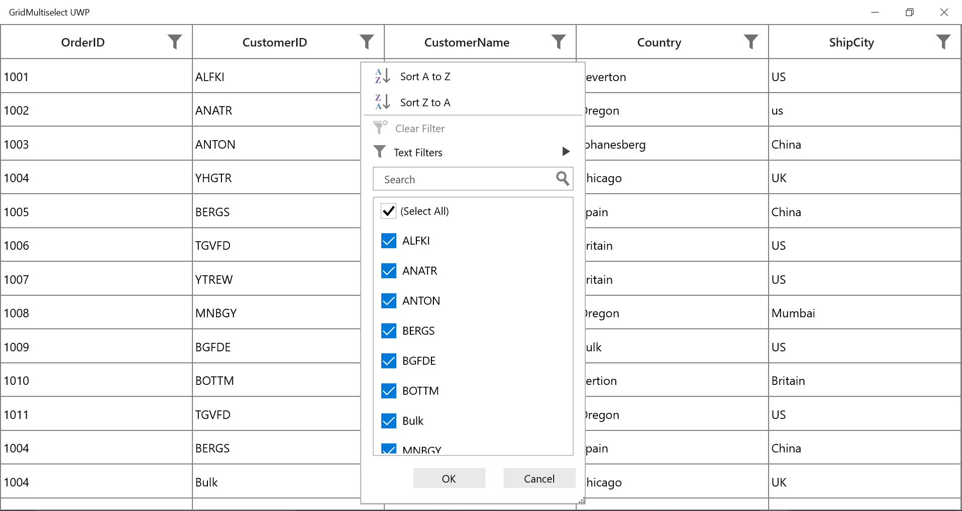
Changing filter icon style after applying filters
You can change the filter icon style by editing the FilterToggleButton style. In FilterToggleButton style, you can see Filtered and UnFiltered VisualStates. In that, you can change PathFillColor for FilterToggleButton.
<Style TargetType="syncfusion:FilterToggleButton">
    <Setter Property="Template">
        <Setter.Value>
            <ControlTemplate TargetType="syncfusion:FilterToggleButton">
                <Grid>
                    <VisualStateManager.VisualStateGroups>
                        <VisualStateGroup x:Name="FilterStates">

                            <VisualState x:Name="Filtered">

                                <Storyboard BeginTime="0">

                                    <ObjectAnimationUsingKeyFrames BeginTime="0"
                                                                   Duration="1"
                                                                   Storyboard.TargetName="PART_FilterToggleButtonIndicator"
                                                                   Storyboard.TargetProperty="Data">

                                        <DiscreteObjectKeyFrame KeyTime="0" Value="M2.1299944,9.9798575L55.945994,9.9798575 35.197562,34.081179 35.197562,62.672859 23.428433,55.942383 23.428433,33.52121z M1.3001332,0L56.635813,0C57.355887,0,57.935946,0.5891428,57.935946,1.3080959L57.935946,2.8258877C57.935946,3.5448422,57.355887,4.133985,56.635813,4.133985L1.3001332,4.133985C0.58005941,4.133985,-2.3841858E-07,3.5448422,0,2.8258877L0,1.3080959C-2.3841858E-07,0.5891428,0.58005941,0,1.3001332,0z" />

                                    </ObjectAnimationUsingKeyFrames>

                                    <ColorAnimation BeginTime="0"
                                                    Duration="00:00:01"
                                                    Storyboard.TargetName="PathFillColor"
                                                    Storyboard.TargetProperty="Color"
                                                    To="Red" />
                                </Storyboard>
                            </VisualState>

                            <VisualState x:Name="UnFiltered">

                                <Storyboard BeginTime="0">

                                    <ObjectAnimationUsingKeyFrames BeginTime="0"
                                                                   Duration="1"
                                                                   Storyboard.TargetName="PART_FilterToggleButtonIndicator"
                                                                   Storyboard.TargetProperty="Data">

                                        <DiscreteObjectKeyFrame KeyTime="0" Value="M0,0 L118.49799,0 L72.811813,53.068943 L72.811813,116.02525 L46.897243,101.20534 L46.897243,51.835941 z" />

                                    </ObjectAnimationUsingKeyFrames>

                                    <ColorAnimation BeginTime="0"
                                                    Duration="00:00:01"
                                                    Storyboard.TargetName="PathFillColor"
                                                    Storyboard.TargetProperty="Color"
                                                    To="Gray" />
                                </Storyboard>
                            </VisualState>

                        </VisualStateGroup>

                    </VisualStateManager.VisualStateGroups>

                    <Border Width="{TemplateBinding Width}"
                            Height="{TemplateBinding Height}"
                            Background="Transparent">

                        <Path Name="PART_FilterToggleButtonIndicator"
                              Margin="{TemplateBinding Margin}"
                              HorizontalAlignment="{TemplateBinding HorizontalContentAlignment}"
                              VerticalAlignment="{TemplateBinding VerticalContentAlignment}"
                              Data="M0,0 L118.49799,0 L72.811813,53.068943 L72.811813,116.02525 L46.897243,101.20534 L46.897243,51.835941 z"
                              Stretch="Fill">

                            <Path.Fill>
                                <SolidColorBrush x:Name="PathFillColor" Color="Gray" />
                            </Path.Fill>

                        </Path>
                    </Border>
                </Grid>
            </ControlTemplate>
        </Setter.Value>
    </Setter>
</Style>
When you apply above style to FilterToggleButton, FilterIcon changes from Default to Gray and to Red when filtering is applied. When you clear it, it changes from Red to Gray and to default style.