How can I help you?
Column Types in UWP DataGrid (SfDataGrid)
28 Feb 202524 minutes to read
SfDataGrid provides support for various built-in column types. Each column has its own properties and renderer to handle different types of data.
You can also add or override existing columns and renderers as you need.
| Column Type | Renderer | Description |
|---|---|---|
| Use to display the string data. | ||
| Use to display the numeric data. | ||
| Use to display the date time value. | ||
Use to display the IEnumerable data using ComboBox.
|
||
| Use to display the boolean type data. | ||
| Use to display the image in each row. | ||
| Use to display the URI data. | ||
| Use to display the custom template-specified content. | ||
| Use to display custom information of each record. | ||
| Use to display the IEnumerable data using | ||
Use to display the numeric data using SfNumericUpDown.
|
||
Use to display the boolean data using ToggleSwitch.
|
||
| Selects or deselects rows based on the check box value, which is not bound with data object. |
GridColumn
GridColumn is an abstract class provides base functionalities for all the column types in SfDataGrid.
Mapping column to particular property
Column can be bound to a property in data object using GridColumn.MappingName property. In addition, it supports to format or bind different property for display and edit mode separately via GridColumn.DisplayBinding and GridColumn.ValueBinding.
When you set MappingName, DisplayBinding and ValueBinding are created based on MappingName, if these properties are not defined explicitly. You can use DisplayBinding property to format the column in display, by setting Converter property of Binding.
public class DisplayBindingConverter : IValueConverter
{
    public object Convert(object value, Type targetType, object parameter, string language)
    {
        return string.Format("{0:C2}", value);
    }

    public object ConvertBack(object value, Type targetType, object parameter, string language)
    {
        return value;
    }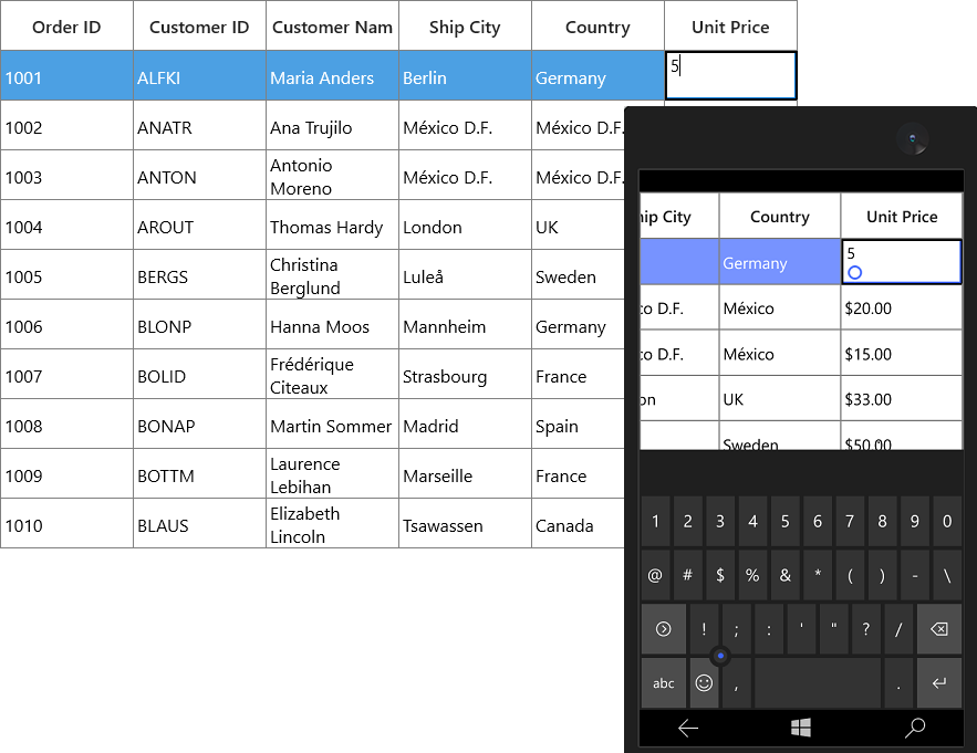
}<syncfusion:GridTextColumn DisplayBinding="{Binding Path=UnitPrice,
Converter={StaticResource Converter}}"
HeaderText="Unit Price"
MappingName="UnitPrice"
ValueBinding="{Binding Path=Quantity}" />In the below screenshot, Unit Price column display value is formatted to currency by setting DisplayBinding property.
By default, Columns handling the data operations (sorting and grouping) based on MappingName property. You can perform data operations based on ValueBinding by setting GridColumn.UseBindingValue to true, when the standard reflection not works or binding column with complex or indexer properties.
CellTemplate in GridColumn
You can load any UWP control in the display mode for all columns by setting GridColumn.CellTemplate property. In edit mode, corresponding editor will be loaded based on column type.
In the below code snippet, GridNumericColumn is loaded with ProgressBar and TextBlock. When you start editing DoubleTextBox will be loaded as Editor.
<syncfusion:SfDataGrid x:Name="dataGrid"
                       AllowEditing="True"
                       AutoGenerateColumns="False"
                       ItemsSource="{Binding Orders}">
    <syncfusion:SfDataGrid.Columns>
        <syncfusion:GridNumericColumn HeaderText="Unit Price" MappingName="UnitPrice">
            <syncfusion:GridNumericColumn.CellTemplate>
                <DataTemplate>
                    <Grid>
                        <ProgressBar x:Name="progressBar"
                                     Height="50"
                                     Background="Transparent"
                                     BorderThickness="0"
                                     Maximum="50"
                                     Minimum="0"
                                     Visibility="Visible"
                                     Value="{Binding Path=UnitPrice}" />
                        <TextBlock HorizontalAlignment="Right"
                                   VerticalAlignment="Center"
                                   Text="{Binding Path=UnitPrice}"
                                   TextAlignment="Center" />
                    </Grid>
                </DataTemplate>
            </syncfusion:GridNumericColumn.CellTemplate>
        </syncfusion:GridNumericColumn>
    </syncfusion:SfDataGrid.Columns>
</syncfusion:SfDataGrid>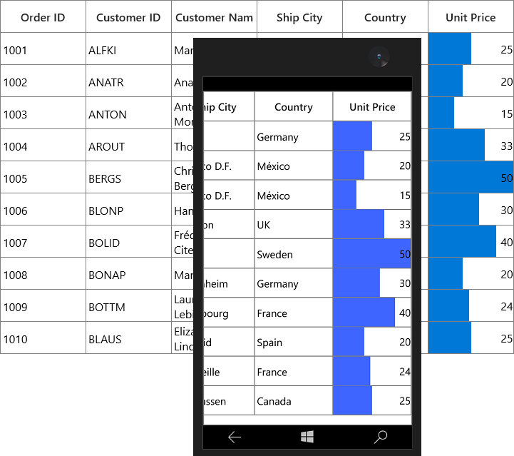
CellTemplate is not support by GridHyperlinkColumn, GridCheckboxColumn and GridImageColumn columns.
Reusing same DataTemplate for multiple columns
By default, underlying record is DataContext for CellTemplate. So you have to define, template for each column to display values based on MappingName.
You can use the same DataTemplate for all columns to display value based on MappingName by setting GridColumn.SetCellBoundValue property to true. Setting SetCellBoundValue to true, changes the
DataContext for CellTemplate to DataContextHelper which has the following members,
-
Value- Return the value base onMappingName. -
Record- Returns the underlying data object.
<Page.Resources>
    <DataTemplate x:Key="cellTemplate">
        <TextBlock Margin="3,0,0,0"
                   Foreground="Red"
                   Text="{Binding Path=Value}" />
    </DataTemplate>
</Page.Resources>

<syncfusion:SfDataGrid x:Name="dataGrid"
                       AutoGenerateColumns="False"
                       ItemsSource="{Binding Orders}">
    <syncfusion:SfDataGrid.Columns>
        <syncfusion:GridTextColumn CellTemplate="{StaticResource cellTemplate}"
                                   HeaderText="Order ID"
                                   MappingName="OrderID"
                                   SetCellBoundValue="True" />
        <syncfusion:GridTextColumn CellTemplate="{StaticResource cellTemplate}"
                                   HeaderText="Customer Name"
                                   MappingName="CustomerName"
                                   SetCellBoundValue="True" />
    </syncfusion:SfDataGrid.Columns>
</syncfusion:SfDataGrid>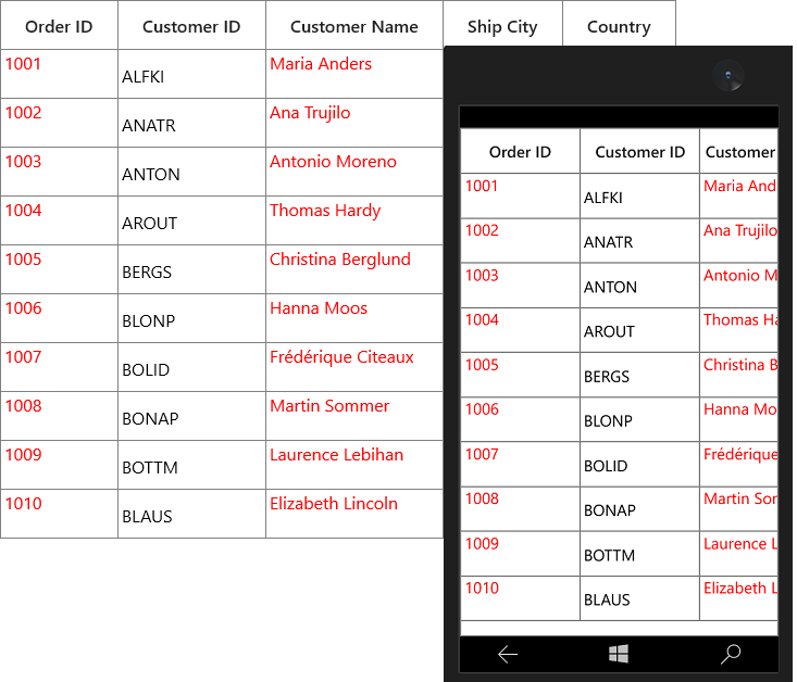
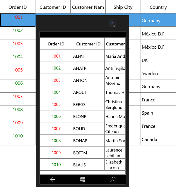
Setting CellTemplate based on custom logic using TemplateSelector
GridColumn provides support to choose different DataTemplate based on underlying data object using GridColumn.CellTemplateSelector property.
For example, two different templates loaded alternatively in OrderID column.
<App.Resources>
    <local:CustomCellTemplateSelector x:Key="cellTemplateSelector"/>
    <DataTemplate   x:Key="DefaultTemplate">
        <TextBlock  Background="Wheat"
                    Foreground="Red"
                    Text="{Binding Path=OrderID}"
                    TextAlignment="Center" />
    </DataTemplate>
    <DataTemplate   x:Key="AlternateTemplate">
        <TextBlock  Background="Beige"
                    Foreground="Green"
                    Text="{Binding Path=OrderID}"
                    TextAlignment="Center" />
    </DataTemplate>
</ App.Resources>
Below code returns the DefaultTemplate and AlternateTemplate based on OrderID’s value.
public class CustomCellTemplateSelector: DataTemplateSelector
{

    protected override DataTemplate SelectTemplateCore(object item, DependencyObject container)
    {

        if (item == null)
            return null;
        var data = item as OrderInfo;

        if (data.OrderID % 2 == 0)
            return App.Current.Resources["AlternateTemplate"] as DataTemplate;

        else
            return App.Current.Resources["DefaultTemplate"] as DataTemplate;
    }
}
In the below code, the custom template selector set to GridColumn.CellTemplateSelector and set SetCellBoundValue to true.
<syncfusion:SfDataGrid  x:Name="dataGrid"
                        AutoGenerateColumns="False"
                        ItemsSource="{Binding Orders}">
    <syncfusion:SfDataGrid.Columns>
        <syncfusion:GridTextColumn CellTemplateSelector="{StaticResource cellTemplateSelector}"
                                   HeaderText="Order ID"
                                   MappingName="OrderID" />
    </syncfusion:SfDataGrid.Columns>
</syncfusion:SfDataGrid>
NOTE
Non-Editable columns does not support
CellTemplate.
Binding ViewModel properties with CellTemplate
You can bind properties in ViewModel with the controls in CellTemplate.
Below command defined in ViewModel is bound to Button inside CellTemplate. Below code, denote the base command.
public class BaseCommand : ICommand
{
    #region Fields
    readonly Action<object> _execute;
    readonly Predicate<object> _canExecute;
    public event EventHandler CanExecuteChanged;
    #endregion
    #region Constructors

    /// <summary>
    /// Creates a new command that always execute.
    /// </summary>
    /// <param name="execute">The execution logic.</param>
    public BaseCommand(Action<object> execute)
        : this(execute, null)
    {
    }
    /// <summary>
    /// Creates a new command.
    /// </summary>
    /// <param name="execute">The execution logic.</param>
    /// <param name="canExecute">The execution status logic.</param>

    public BaseCommand(Action<object> execute, Predicate<object> canExecute)
    {

        if (execute == null)
            throw new ArgumentNullException("execute");
        _execute = execute;
        _canExecute = canExecute;
    }

    #endregion

    bool ICommand.CanExecute(object parameter)
    {
        return _canExecute == null ? true : _canExecute(parameter);
    }

    void ICommand.Execute(object parameter)
    {
        _execute(parameter);
    }
}
Below code, defines the command for Button in ViewModel.
public class ViewModel
{
    private BaseCommand deleteRecord;

    public BaseCommand DeleteRecord
    {
        get
        {

            if (deleteRecord == null)
                deleteRecord = new BaseCommand(OnDeleteRecordClicked, OnCanDelete);
            return deleteRecord;
        }
    }

    private static bool OnCanDelete(object obj)
    {
        return true;
    }

    private void OnDeleteRecordClicked(object obj)
    {

        //TODO ACTION.
    }
}
In the below code, Button inside CellTemplate bound to the command in ViewModel.
<syncfusion:SfDataGrid x:Name="dataGrid"
                       AutoGenerateColumns="False"
                       ItemsSource="{Binding Orders}">
    <syncfusion:SfDataGrid.Columns>
        <syncfusion:GridTextColumn MappingName="Delete">
            <syncfusion:GridTextColumn.CellTemplate>
                <DataTemplate>
                    <Button Command="{Binding DataContext.DeleteRecord,
                                              ElementName=dataGrid}"
                            CommandParameter="{Binding}"
                            Content="Delete" />
                    <!--  or  -->
                    <Button Command="{Binding DeleteRecord,
                                              Source={StaticResource viewModel}}"
                            CommandParameter="{Binding}"
                            Content="Delete" />
                </DataTemplate>
            </syncfusion:GridTextColumn.CellTemplate>
        </syncfusion:GridTextColumn>
    </syncfusion:SfDataGrid.Columns>
</syncfusion:SfDataGrid>
Data Formatting
GridColumn supports to format the data using Converter properties, by defining GridColumn.DisplayBinding and GridColumn.ValueBinding. GridColumn.DisplayBinding formats the data in display mode. GridColumn.ValueBinding formats the data in edit mode.
Format column using Converter
You can format the column using Converter property by defining DisplayBinding.
public class CurrencyFormatConverter : IValueConverter
{

    public object Convert(object value, Type targetType, object parameter, string language)
    {
        return string.Format("{0:C2}", value);
    }

    public object ConvertBack(object value, Type targetType, object parameter, string language)
    {
        return value;
    }
}<Page.Resources>
<local:CurrencyFormatConverter x:Key="currencyFormatConverter" />
</Page.Resources>
<syncfusion:SfDataGrid x:Name="dataGrid"
AllowEditing="True"
AutoGenerateColumns="False"
ItemsSource="{Binding Orders}">
<syncfusion:SfDataGrid.Columns>
<syncfusion:GridNumericColumn DisplayBinding="{Binding UnitPrice,
Converter={StaticResource currencyFormatConverter}}"
HeaderText="Unit Price"
MappingName="UnitPrice" />
</syncfusion:SfDataGrid.Columns>
</syncfusion:SfDataGrid>When column is auto-generated, you can set the Converter by handling AutoGeneratingColumn event.
this.dataGrid.AutoGeneratingColumn += DataGrid_AutoGeneratingColumn;

private void DataGrid_AutoGeneratingColumn(object sender, Syncfusion.UI.Xaml.Grid.AutoGeneratingColumnArgs e)
{

    if (e.Column.MappingName == "UnitPrice")
    {

        if (e.Column is GridNumericColumn)
        {
            e.Column = new GridTextColumn() { MappingName = "UnitPrice", HeaderText = "Unit Price" };
        }
        e.Column.DisplayBinding = new Binding() { Path = new PropertyPath(e.Column.MappingName), Converter = new CurrencyFormatConverter() };
    }
}
Styling GridColumn
GridColumn support to customize the style of particular column using GridColumn.CellStyle property. For more information, refer Styling and Template section.
Change the font setting
You can change the font settings such as FontSize, FontFamily, FontWeight etc. by writing style of TargetType GridCell or GridColumn.CellStyle property.
<syncfusion:SfDataGrid x:Name="dataGrid"
                       AutoGenerateColumns="False"
                       ItemsSource="{Binding Orders}">
    <syncfusion:SfDataGrid.Columns>
        <syncfusion:GridTextColumn MappingName="CustomerName">
            <syncfusion:GridTextColumn.CellStyle>
                <Style TargetType="syncfusion:GridCell">
                    <Setter Property="FontSize" Value="12" />
                    <Setter Property="FontFamily" Value="Segoe UI" />
                    <Setter Property="FontWeight" Value="Bold" />
                    <Setter Property="FontStyle" Value="Italic" />
                    <Setter Property="FontStretch" Value="Condensed" />
                </Style>
            </syncfusion:GridTextColumn.CellStyle>
        </syncfusion:GridTextColumn>
    </syncfusion:SfDataGrid.Columns>
</syncfusion:SfDataGrid>
When column is auto-generated, you can style the column by handling AutoGeneratingColumn event.
<Page.Resources>
    <Style x:Key="cellStyle" TargetType="syncfusion:GridCell">
        <Setter Property="FontSize" Value="12" />
        <Setter Property="FontFamily" Value="Segoe UI" />
        <Setter Property="FontWeight" Value="Bold" />
        <Setter Property="FontStyle" Value="Italic" />
        <Setter Property="FontStretch" Value="Condensed" />
    </Style>

</Page.Resources>this.dataGrid.AutoGeneratingColumn += DataGrid_AutoGeneratingColumn;
private void DataGrid_AutoGeneratingColumn(object sender, Syncfusion.UI.Xaml.Grid.AutoGeneratingColumnArgs e)
{
if (e.Column.MappingName == "CustomerName")
e.Column.CellStyle = this.Resources["cellStyle"] as Style;
}
Styles based on custom logic
You can apply the styles to columns based on certain condition using GridColumn.CellStyleSelector property.
Below code creates two different styles by TargetType GridCell.
<Application.Resources>
    <Style x:Key="cellStyle1" TargetType="syncfusion:GridCell">
        <Setter Property="Background" Value="Bisque" />
    </Style>

    <Style x:Key="cellStyle2" TargetType="syncfusion:GridCell">
        <Setter Property="Background" Value="Aqua" />
    </Style>

</Application.Resources>
In the below code, returns the style based on OrderID value. Using Container you can format the columns data based on GridCell.
public class CustomCellStyleSelector: StyleSelector
{

    protected override Style SelectStyleCore(object item, DependencyObject container)
    {
        var gridCell = container as GridCell;
        var mappingName = gridCell.ColumnBase.GridColumn.MappingName;
        var record = gridCell.DataContext;
        var cellValue = record.GetType().GetProperty(mappingName).GetValue(record);

        if (mappingName.Equals("OrderID"))
        {

            if (Convert.ToInt16(cellValue) <= 1005)
                return App.Current.Resources["cellStyle1"] as Style;

            else
                return App.Current.Resources["cellStyle2"] as Style;
        }
        return base.SelectStyleCore(item, container);
    }
}
Below code, sets the customized style selector to GridColumn.CellStyleSelector property.
<Page.Resources>
    <local:CustomCellStyleSelector x:Key="cellStyleSelector"/>
</Page.Resources>

<syncfusion:SfDataGrid x:Name="dataGrid"
                       ItemsSource="{Binding Orders}"
                       AutoGenerateColumns="False" >
    <syncfusion:SfDataGrid.Columns>
        <syncfusion:GridTextColumn MappingName="OrderID" CellStyleSelector="{StaticResource cellStyleSelector}">
    </syncfusion:SfDataGrid.Columns>
</syncfusion:SfDataGrid>
When column is auto-generated, you can style the column by handling AutoGeneratingColumn event.
this.dataGrid.AutoGeneratingColumn += DataGrid_AutoGeneratingColumn;

private void DataGrid_AutoGeneratingColumn(object sender, Syncfusion.UI.Xaml.Grid.AutoGeneratingColumnArgs e)
{

    if (e.Column.MappingName == "OrderID")
    {
        e.Column.CellStyleSelector = new CustomCellStyleSelector();
    }
}
![Applying cell style to the columns by using CellStyleSelector in UWP SfDataGrid]](Column-Types_images/Column-Types_img7.png)
UI Interaction
Hide Column
You can hide or unhide the particular column programmatically by setting GridColumn.IsHidden property. For allowing end-user to hide or unhide column in UI refer Resizing Columns section.
Disable column
You can disable column by setting GridColumn.AllowFocus property. Therefore, that column can’t be selected or edited.
Width, alignment and padding settings
Width
The width of GridColumn can be changed by setting Width property. Column width set based on GridColumn.MinimumWidth and GridColumn.MaximumWidth properties.
NOTE
If the
GridColumn.Widthis defined explicitly takes priority thanGridColumn.ColumnSizer.
Padding
GridColumn allows you to the change the padding of cell content by setting `Padding property.
Alignment
GridColumn allows you to change the alignment of GridCell and GridHeaderCellControl content using TextAlignment, VerticalAlignment and HorizontalHeaderContentAlignment properties.
GridTextColumnBase
GridTextColumnBase is the abstract class derived from GridColumn. The following columns are derived from the GridTextColumnBase.
-
GridTextColumn
-
GridDateTimeColumn
-
GridTemplateColumn
-
GridMultiColumnDropDownList
GridTextColumnBase properties
- Text trimming - You can trim the column’s data using
TextTrimmingproperty. - Text wrapping - You can wrap the column’s data using
TextWrappingproperty.
GridTextColumn
GridTextColumn derived from GridTextColumnBase which hosts TextBox in edit mode.
<syncfusion:SfDataGrid x:Name="dataGrid"
                       AutoGenerateColumns="False"
                       ItemsSource="{Binding Orders}">
    <syncfusion:SfDataGrid.Columns>
        <syncfusion:GridTextColumn HeaderText="Customer Name" MappingName="CustomerName" />
    </syncfusion:SfDataGrid.Columns>
</syncfusion:SfDataGrid>this.dataGrid.Columns.Add(new GridTextColumn()
{
HeaderText = "Customer Name",
MappingName = "CustomerName",
});Spell check while editing
You can enable spell check in GridTextColumn using IsSpellCheckEnabled property.
<syncfusion:GridTextColumn HeaderText="Ship City"
                           IsSpellCheckEnabled="True"
MappingName="ShipCity" />this.dataGrid.Columns.Add(new GridTextColumn() { HeaderText = "Ship City", MappingName = "ShipCity", IsSpellCheckEnabled = true });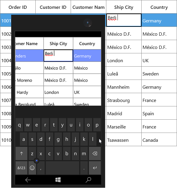
GridNumericColumn
GridNumericColumn derived from GridTextColumnBase which displays columns data as numeric. It hosts SfNumericTextBox in editing mode.
<syncfusion:SfDataGrid x:Name="dataGrid"
                       AutoGenerateColumns="False"
                       ItemsSource="{Binding Orders}">
    <syncfusion:SfDataGrid.Columns>
            <syncfusion:GridNumericColumn HeaderText="Quantity" MappingName="Quantity" />
    </syncfusion:SfDataGrid.Columns>
</syncfusion:SfDataGrid>this.dataGrid.Columns.Add(new GridNumericColumn() { MappingName = "Quantity", HeaderText = "Quantity" });
Data formatting
GridNumericColumn allows you to format the numeric data by specifying the predefined format specifier or custom numeric format strings into GridNumericColumn.FormatString property.
<syncfusion:GridNumericColumn FormatString="c"
                              HeaderText="Unit Price"
MappingName="UnitPrice" />this.dataGrid.Columns.Add(new GridNumericColumn() { HeaderText = "Unit Price", MappingName = "UnitPrice", FormatString = "c" });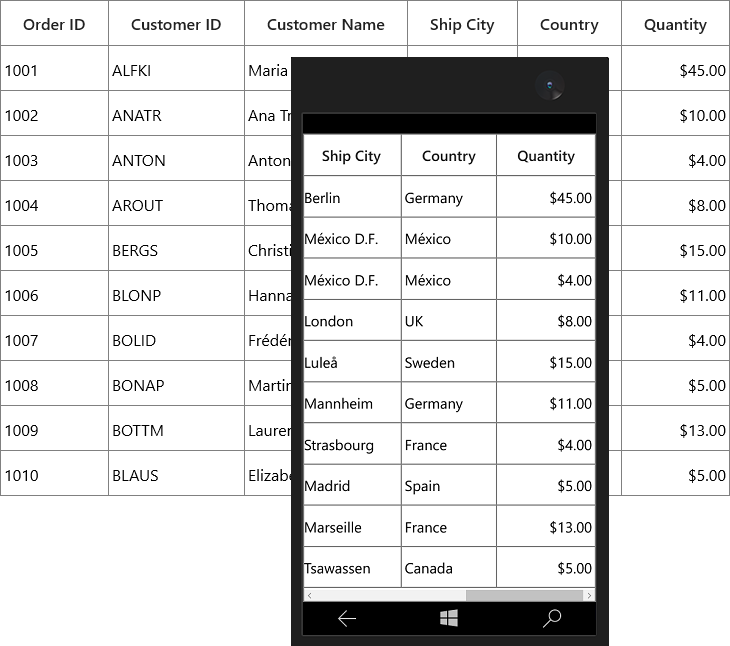
Null value support
GridNumericColumn provides support to restrict or allow null value in columns based on AllowNullInput property. Instead of displaying null values, you can display hint text using Watermark property.
The Watermark property won’t work, when the AllowNullInput is false.
<syncfusion:GridNumericColumn AllowNullInput="True"
                              HeaderText="Unit Price"
                              MappingName="UnitPrice"
WaterMark="Enter unit price" />this.dataGrid.Columns.Add(new GridNumericColumn() { HeaderText = "Unit Price", MappingName = "UnitPrice", AllowNullInput = true, WaterMark = "Enter unit price" });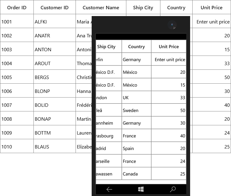
Parsing Mode
You can bind either Decimal or Double values with GridNumericColumn by using ParsingMode property. The default parsing mode is Double.
Percent Display Mode
You can allow users to display the value in Value mode or Compute mode by setting by PercentDisplayMode property. Value mode displays the value with percentage symbol and Compute mode displays the computed value with percentage symbol.
<syncfusion:GridNumericColumn HeaderText="UnitPrice" MappingName="UnitPrice" PercentDisplayMode="Compute"/>this.sfDataGrid.Columns.Add(new GridNumericColumn() { MappingName = "UnitPrice", HeaderText = "UnitPrice", PercentDisplayMode = PercentDisplayMode.Value });GridDateTimeColumn
GridDateTimeColumn derived from GridTextColumnBase and it displays columns data as date time. It hosts SfDatePicker element in editing mode.
<syncfusion:SfDataGrid x:Name="dataGrid"
                       AutoGenerateColumns="False"
                       ItemsSource="{Binding Orders}">

    <syncfusion:SfDataGrid.Columns>
        <syncfusion:GridDateTimeColumn HeaderText="Order Date" MappingName="OrderDate" />
    </syncfusion:SfDataGrid.Columns>

</syncfusion:SfDataGrid>this.dataGrid.Columns.Add(new GridDateTimeColumn() { HeaderText = "Order Date", MappingName = "OrderDate" });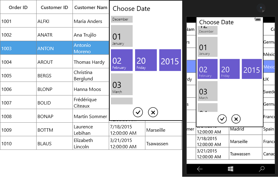
Formatting date time value
You can format the date time value by specifying the predefined format specifier into GridDateTimeColumn.FormatString property.
<syncfusion:GridDateTimeColumn FormatString="f"
                               HeaderText="Order Date"
MappingName="OrderDate" />this.dataGrid.Columns.Add(new GridDateTimeColumn() { HeaderText = "Order Date", MappingName = "OrderDate", FormatString = "f" });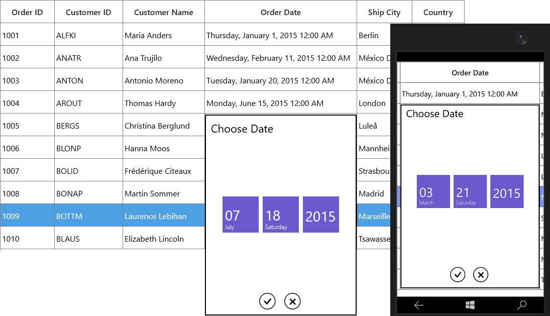
When the predefined format specifier does not meet your requirement, you can set the custom date and time format strings into FormatString property.
<syncfusion:GridDateTimeColumn FormatString="yyyy/dd/MM"
                               HeaderText="Order Date"
                               MappingName="OrderDate"
SelectorFormatString="yyyy/dd/MM" />this.dataGrid.Columns.Add(new GridDateTimeColumn() { HeaderText = "Order Date", MappingName = "OrderDate", FormatString = "yyyy/dd/MM" ,SelectorFormatString= "yyyy/dd/MM" });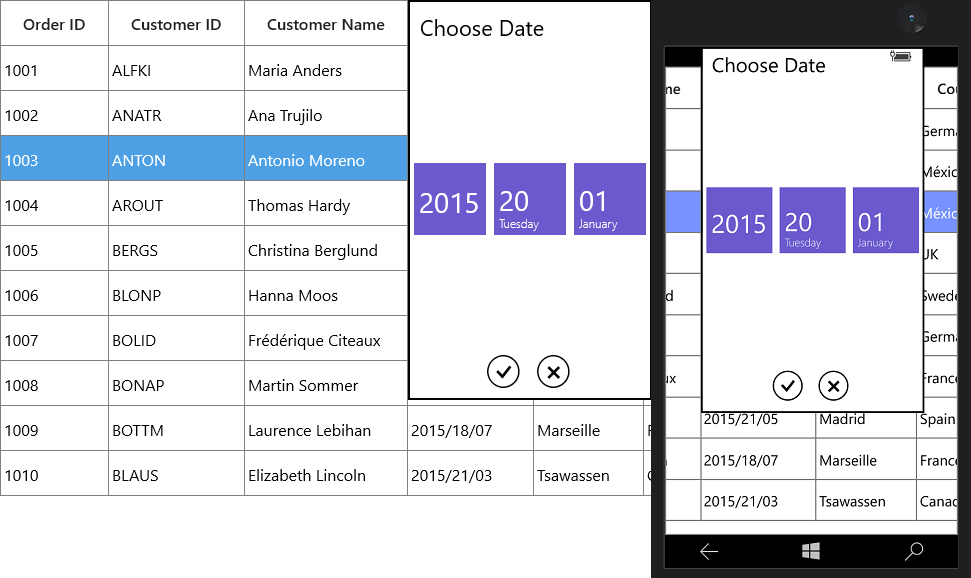
Editing support
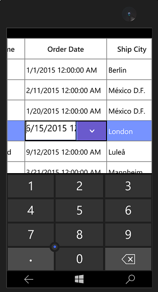
By default, the user can input the date time value by selecting through date selector. You can allow users to input or delete the date time value from the keyboard by setting AllowInlineEditing to true.
Setting input scope for On-Screen Keyboard
You can set the input scope for On-Screen Keyboard using InputScope property when AllowInlineEditing is set to true.
<syncfusion:GridDateTimeColumn AllowInlineEditing="True"
                               HeaderText="Order Date"
                               InputScope="Number"
MappingName="OrderDate" />this.dataGrid.Columns.Add(new GridDateTimeColumn() { HeaderText = "Order Date", MappingName = "OrderDate", AllowInlineEditing = true, InputScope = InputScopeNameValue.Number });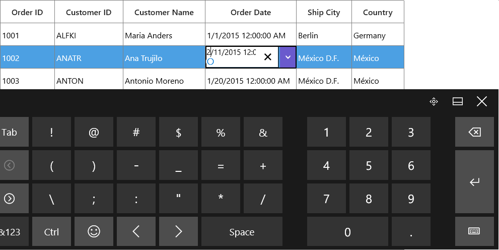
Null value support
GridDateTimeColumn provides support to restrict or allow null value in columns based on AllowNullValue property. Instead of displaying null values, you can display hint text using Watermark property.
The Watermark property won’t work, when the AllowNullValue is false.
<syncfusion:GridDateTimeColumn AllowNullValue="True"
                               HeaderText="Order Date"
                               MappingName="OrderDate"
WaterMark="Enter order date" />this.dataGrid.Columns.Add(new GridDateTimeColumn() { HeaderText = "Order Date", MappingName = "OrderDate", AllowNullValue = true, WaterMark = "Enter order date" });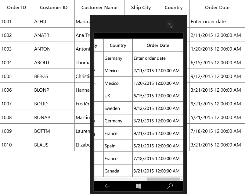
Setting date time value range
You can restrict and display the input value with in the range using MinDate and MaxDate properties.
public class ViewModel
{
    DateTime minDate = new DateTime(2015 , 2 , 2);

    public DateTime MinDate
    {
        get { return minDate; }
        set { minDate = value; RaisePropertyChanged("MinDate"); }
    }
    DateTime maxDate = new DateTime(2015 , 5 , 5);

    public DateTime MaxDate
    {
        get { return maxDate; }
        set { maxDate = value; RaisePropertyChanged("MaxDate"); }
    }
}<Page.Resources>
<local:ViewModel x:Key="viewModel" />
</Page.Resources>
<syncfusion:GridDateTimeColumn HeaderText="Order Date"
MappingName="OrderDate"
MaxDate="{Binding MaxDate,
Source={StaticResource viewModel}}"
MinDate="{Binding MinDate,
Source={StaticResource viewModel}}" />Dropdown customization
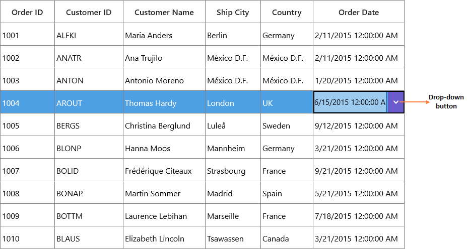
You can hide or unhide the dropdown button by using ShowDropDownButton property. The height of dropdown can be changed using DropDownHeight property.
Styling
You can style the SelectorItem with solid color using AccentBrush property.
<syncfusion:GridDateTimeColumn AccentBrush="Red"
                               HeaderText="Order Date"
MappingName="OrderDate" />this.dataGrid.Columns.Add(new GridDateTimeColumn() { HeaderText = "Order Date", MappingName = "OrderDate", AccentBrush = new SolidColorBrush(Colors.Red) });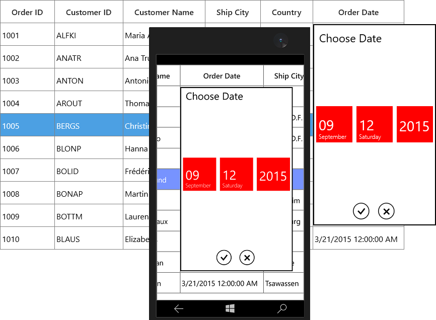
SelectorItem customization
Height and width customization
The height and width of SelectorItem can be customized using SelectorItemWidth and SelectorItemHeight property.
<syncfusion:GridDateTimeColumn HeaderText="Order Date"
                               MappingName="OrderDate"
                               SelectorItemHeight="80"
SelectorItemWidth="80" />this.dataGrid.Columns.Add(new GridDateTimeColumn() { HeaderText = "Order Date", MappingName = "OrderDate", SelectorItemHeight = 80, SelectorItemWidth = 80});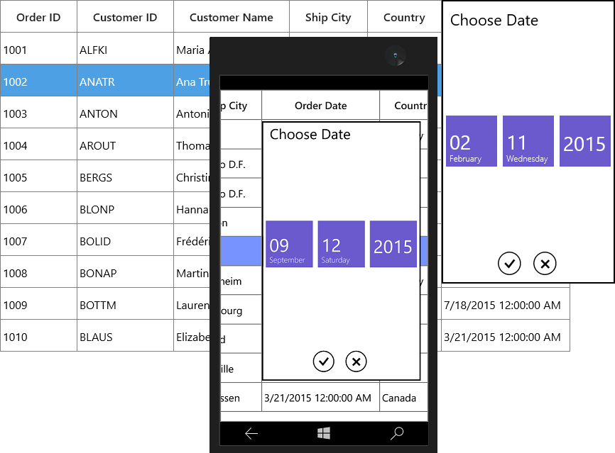
SelectorItem formatting
You can specify the format for the selector using SelectorFormatString property.
<syncfusion:GridDateTimeColumn HeaderText="Order Date"
                               MappingName="OrderDate"
SelectorFormatString="yyyy/MM/dd" />this.dataGrid.Columns.Add(new GridDateTimeColumn() { HeaderText = "Order Date", MappingName = "OrderDate", SelectorFormatString = "yyyy/MM/dd" });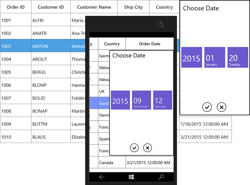
SelectorItem spacing and count customization
You can customize the space between date, month and year selector items using SelectorItemSpacing property.
You can restrict the number of item to displayed in selector using SelectorItemCount property.
<syncfusion:GridDateTimeColumn HeaderText="Order Date"
                               MappingName="OrderDate"
                               SelectorItemCount="3"
SelectorItemSpacing="15"/>this.dataGrid.Columns.Add(new GridDateTimeColumn() { HeaderText = "Order Date", MappingName = "OrderDate", SelectorItemSpacing = 15, SelectorItemCount = 3 });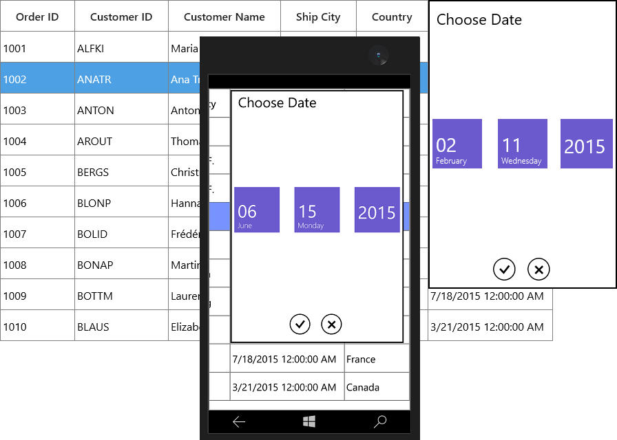
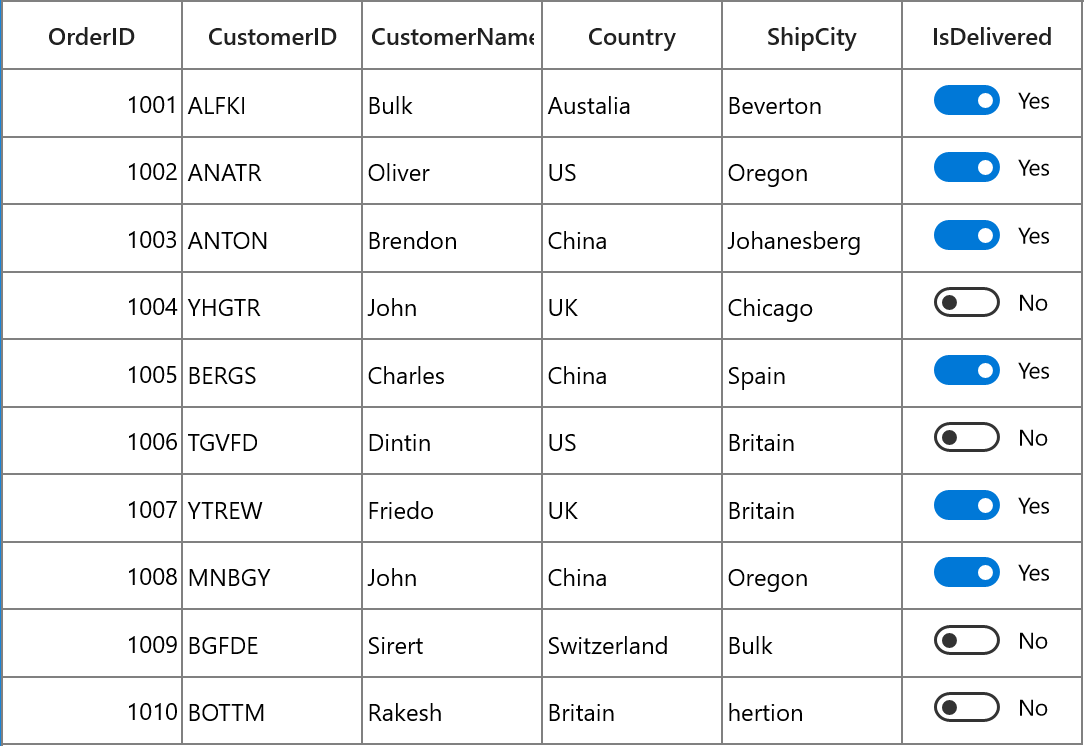
GridCheckBoxColumn
GridCheckBoxColumn derived from GridColumn and it used display and edit Boolean type data. It hosts CheckBox element as GridCell content.
<syncfusion:SfDataGrid x:Name="dataGrid"
                       AutoGenerateColumns="False"
                       ItemsSource="{Binding Orders}">
    <syncfusion:SfDataGrid.Columns>
        <syncfusion:GridCheckBoxColumn HeaderText="Is Delivered" MappingName="IsDelivered" />
    </syncfusion:SfDataGrid.Columns>
</syncfusion:SfDataGrid>this.dataGrid.Columns.Add(new GridCheckBoxColumn() { HeaderText = "Is Delivered", MappingName = "IsDelivered" });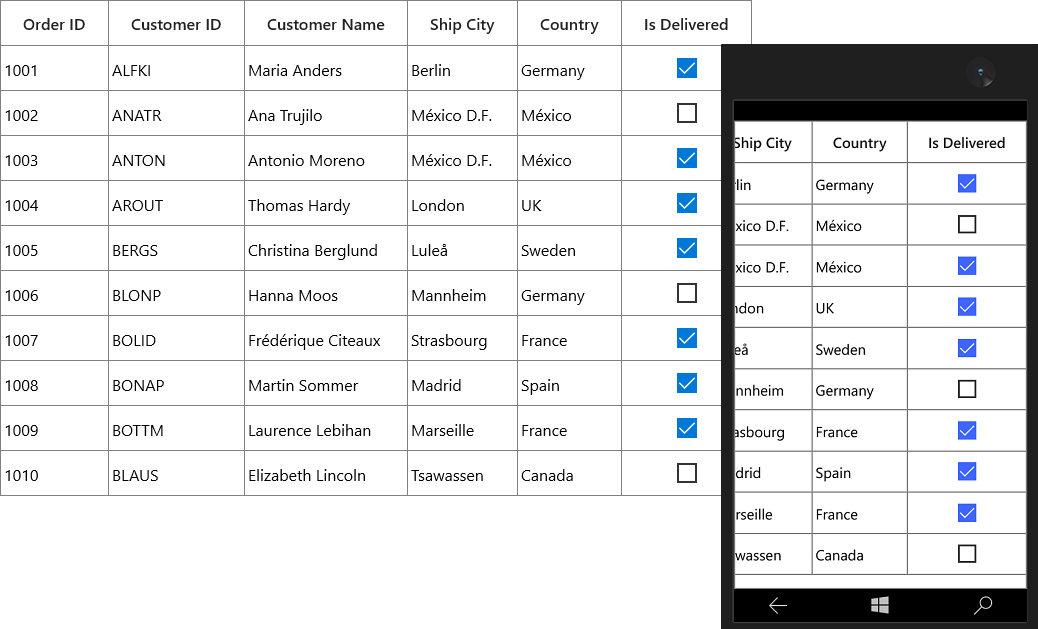
GridCheckBoxColumn allows you to customize check box state and its alignment.
-
IsThreeState - By default, the
GridCheckBoxColumnhasCheckedandUnchecked**** state. You can enable anotherIntermediatestate settingIsThreeStateproperty totrue. -
HorizontalAlignment - You can change the horizontal alignment of CheckBox using
HorizontalAlignmentproperty.
GridTemplateColumn
GridTemplateColumn derived from GridTextColumnBase and it displays the template-specified cell content. You can load any UWP control in the display mode for all columns by setting CellTemplate and EditTemplate properties.
<syncfusion:SfDataGrid x:Name="dataGrid"
                       AutoGenerateColumns="False"
                       ItemsSource="{Binding Orders}">
    <syncfusion:SfDataGrid.Columns>
        <syncfusion:GridTemplateColumn MappingName="CustomerID">
            <syncfusion:GridTemplateColumn.CellTemplate>
                <DataTemplate>
                    <TextBlock Text="{Binding CustomerID}" />
                </DataTemplate>
            </syncfusion:GridTemplateColumn.CellTemplate>
            <syncfusion:GridTemplateColumn.EditTemplate>
                <DataTemplate>
                    <TextBox Text="{Binding CustomerID, Mode=TwoWay}"  syncfusion:FocusManagerHelper.FocusedElement="True"/>
                </DataTemplate>
            </syncfusion:GridTemplateColumn.EditTemplate>
            </syncfusion:GridTemplateColumn>
    </syncfusion:SfDataGrid.Columns>
</syncfusion:SfDataGrid>
StringBuilder sb1 = new StringBuilder();
sb1.Append("<DataTemplate xmlns=\"http://schemas.microsoft.com/winfx/2006/xaml/presentation\">");
sb1.Append("<TextBlock Text=\"{Binding CustomerID}\" />");
sb1.Append("</DataTemplate>");
DataTemplate cellTemplate = (DataTemplate)XamlReader.Load(sb1.ToString());
StringBuilder sb2 = new StringBuilder();
sb2.Append("<DataTemplate xmlns=\"http://schemas.microsoft.com/winfx/2006/xaml/presentation\">");
sb2.Append("<TextBox Text=\"{Binding CustomerID, Mode=TwoWay}\" />");
sb2.Append("</DataTemplate>");
DataTemplate editTemplate = (DataTemplate)XamlReader.Load(sb2.ToString());
this.dataGrid.Columns.Add(new GridTemplateColumn() { MappingName = "IsClosed", CellTemplate = cellTemplate, EditTemplate = editTemplate });Keyboard interaction for UIElement loaded inside CellTemplate
You can allow UIElement loaded inside CellTemplate to handle keyboard interaction by setting FocusManagerHelper.WantsKeyInput attached property to GridColumn. You can use this when loading edit element in CellTemplate.
In this case SfDataGrid handles the below key operations and other keys are handled by UIElement loaded inside CellTemplate.
- Tab
- Enter
- PageUp
- PageDown
<syncfusion:GridTemplateColumn MappingName="CustomerName" syncfusion:FocusManagerHelper.WantsKeyInput="True">
    <syncfusion:GridTemplateColumn.CellTemplate>
        <DataTemplate>
            <TextBox Text="{Binding CustomerName}" />
        </DataTemplate>
    </syncfusion:GridTemplateColumn.CellTemplate>
</syncfusion:GridTemplateColumn>
Setting focus to particular element inside Template when cell gets activated or edited
You can allow logical focus to specific UIElement loaded inside EditTemplate or CellTemplate by setting FocusManagerHelper.FocusedElement attached property.
You can use this property to start editing the template column value as like normal column when the user gets into edit mode.
<syncfusion:SfDataGrid x:Name=”dataGrid”
                       AutoGenerateColumns="False"
                       ItemsSource="{Binding Orders}">
    <syncfusion:SfDataGrid.Columns>
        <syncfusion:GridTemplateColumn MappingName="CustomerName">
            <syncfusion:GridTemplateColumn.CellTemplate>
                <DataTemplate>
                    <Grid>
                        <TextBlock Text="{Binding CustomerName}" />
                    </Grid>
                </DataTemplate>
            </syncfusion:GridTemplateColumn.CellTemplate>
            <syncfusion:GridTemplateColumn.EditTemplate>
                <DataTemplate>
                    <Grid>
                        <TextBox Text="{Binding CustomerName}" syncfusion:FocusManagerHelper.FocusedElement="True" />
                    </Grid>
                </DataTemplate>
            </syncfusion:GridTemplateColumn.EditTemplate>
        </syncfusion:GridTemplateColumn>
    </syncfusion:SfDataGrid.Columns>
</syncfusion:SfDataGrid>
Binding CellTemplate and EditTemplate based on MappingName
By default, underlying record is DataContext for CellTemplate. So you have to define, template for each column to display values based on MappingName.
You can use the same DataTemplate for all columns to display value based on MappingName by setting SetCellBoundValue property to true. Setting SetCellBoundValue to true, changes the DataContext for CellTemplate to DataContextHelper which has the following members,
-
Value- Return the value base onMappingName. -
Record- Returns the underlying data object.
NOTE
EditTemplate support available only for GridTemplateColumn.
<syncfusion:SfDataGrid x:Name="dataGrid"
                       AutoGenerateColumns="False"
                       ItemsSource="{Binding Orders}">
    <syncfusion:SfDataGrid.Columns>
        <syncfusion:GridTemplateColumn MappingName="OrderID" SetCellBoundValue="True">
            <syncfusion:GridTemplateColumn.CellTemplate>
                <DataTemplate>
                    <Grid>
                        <TextBlock Text="{Binding Value}" />
                    </Grid>
                </DataTemplate>
            </syncfusion:GridTemplateColumn.CellTemplate>
            <syncfusion:GridTemplateColumn.EditTemplate>
                <DataTemplate>
                    <Grid>
                        <TextBox Text="{Binding Value}" syncfusion:FocusManagerHelper.FocusedElement="True"  />
                    </Grid>
                </DataTemplate>
            </syncfusion:GridTemplateColumn.EditTemplate>
        </syncfusion:GridTemplateColumn>
    </syncfusion:SfDataGrid.Columns>
</syncfusion:SfDataGrid>
Sets EditTemplate based on custom logic
GridTemplateColumn provides support to load different edit elements based on underlying data object using GridTemplateColumn.EditTemplateSelector property.
Below code returns the DefaultTemplate and AlternateTemplate based on OrderID’s value.
<DataTemplate x:Key="DefaultCellTemplate">
    <TextBlock VerticalAlignment="Center"
               Foreground="Red"
               Text="{Binding Path=OrderID}"
               TextAlignment="Center" />
</DataTemplate>

<DataTemplate x:Key="AlternateCellTemplate">
    <TextBlock VerticalAlignment="Center"
               Foreground="Green"
               Text="{Binding Path=OrderID}"
               TextAlignment="Center" />
</DataTemplate>

<DataTemplate x:Key="DefaultEditTemplate">
    <TextBox Height="45"
             VerticalAlignment="Center"
             Foreground="Red"
             Text="{Binding Path=OrderID}"
             TextAlignment="Center" />
</DataTemplate>

<DataTemplate x:Key="AlternateEditTemplate">
    <TextBox Height="45"
             VerticalAlignment="Center"
             Foreground="Green"
             Text="{Binding Path=OrderID}"
             TextAlignment="Center" />
</DataTemplate>public class CustomEditTemplateSelector: DataTemplateSelector
{
protected override DataTemplate SelectTemplateCore(object item, DependencyObject container)
{
if (item == null)
return null;
var data = item as OrderInfo;
if (data.OrderID % 2 == 0)
return App.Current.Resources["AlternateEditTemplate"] as DataTemplate;
else
return App.Current.Resources["DefaultEditTemplate"] as DataTemplate;
}
}In the below code, custom template selector set to GridTemplateColumn.EditTemplateSelector.
<Page.Resources>
    <local:CustomCellTemplateSelector x:Key="cellTemplateSelector" />
    <local:CustomEditTemplateSelector x:Key="editTemplateSelector" />
</Page.Resources>

<syncfusion:SfDataGrid x:Name="dataGrid"
                       AutoGenerateColumns="False"
                       ItemsSource="{Binding Orders}">
    <syncfusion:SfDataGrid.Columns>
        <syncfusion:GridTemplateColumn MappingName="OrderID"
                                       CellTemplateSelector="{StaticResource cellTemplateSelector}"
                                       EditTemplateSelector="{StaticResource editTemplateSelector}"/>
    </syncfusion:SfDataGrid.Columns>
</syncfusion:SfDataGrid>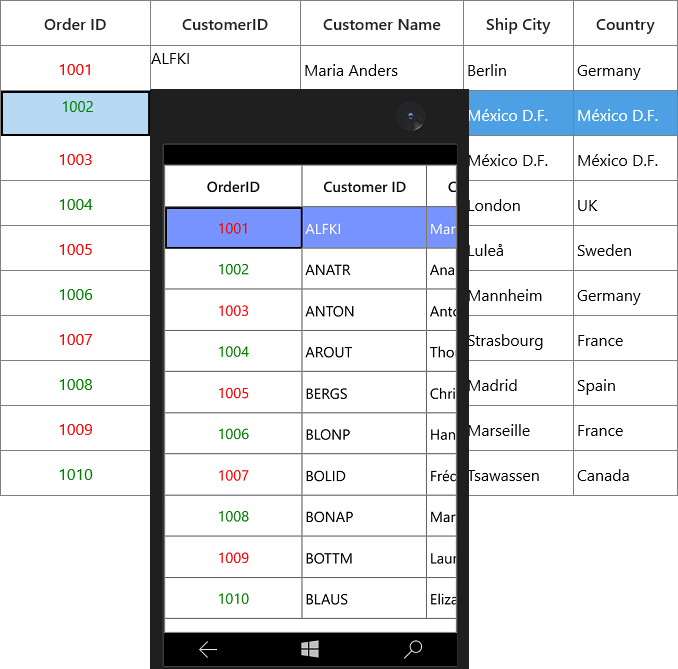
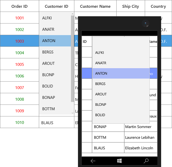
GridComboBoxColumn
GridComboBoxColumn derived from GridColumn which hosts ComboBox as edit element. The data source to ComboBox can be set by using GridComboBoxColumn.ItemsSource property.
By default, GridComboBoxColumn displays the value using MappingName property. You can set DisplayMemberPath which denotes the path to a value on the source object (GridComboBoxColumn.ItemsSource) to serve as the visual representation of object. You can set the SelectedValuePath which denotes the path to get the SelectedValue from the SelectedItem.
<syncfusion:SfDataGrid x:Name="dataGrid"
                       AutoGenerateColumns="False"
                       ItemsSource="{Binding Orders}">

    <syncfusion:SfDataGrid.Columns>
        <syncfusion:GridComboBoxColumn  HeaderText="Customer ID"
                                        ItemsSource="{Binding ComboItems, Source={StaticResource viewModel}}"
                                        MappingName=" Customer ID " />
    </syncfusion:SfDataGrid.Columns>
</syncfusion:SfDataGrid>this.dataGrid.Columns.Add(new GridComboBoxColumn() { HeaderText = " Customer ID ", MappingName = " Customer ID ", ItemsSource = viewModel.ComboItems });SfDataGrid triggers, CurrentCellDropDownSelectionChanged event, when the SelectedValue is changed. CurrentCellDropDownSelectionChangedEventArgs of CurrentCellDropDownSelectionChanged event provides the information about the changed cell value.
SelectedIndex property returns the index of selected item.
SelectedItem property returns the selected item from drop down list.
Improving dropdown opening time
You can improve the drop-down opening time on loading by setting VirtualizingStackPanel as ItemsPanelTemplate of ComboBox, when the large number of items loaded in it.
<Page.Resources>
    <Style TargetType="ComboBox">
        <Setter Property="ItemsPanel">
            <Setter.Value>
                <ItemsPanelTemplate>
                    <VirtualizingStackPanel />
                </ItemsPanelTemplate>
            </Setter.Value>
        </Setter>
    </Style>
</Page.Resources>
Opening dropdown popup in single-click
You can open the drop down within single click by setting ComboBox.IsDropDownOpen property to true in OnEditElementLoaded method by overriding existing renderer.
Below code, creates GridCellComboBoxRendererExt to set IsDropDownOpen property. Replace the default renderer with created renderer in SfDataGrid.CellRenderers collection.
this.dataGrid.CellRenderers.Remove("ComboBox");
this.dataGrid.CellRenderers.Add("ComboBox", new GridCellComboBoxRendererExt());

public class GridCellComboBoxRendererExt: GridCellComboBoxRenderer
{

    protected override void OnEditElementLoaded(object sender, Windows.UI.Xaml.RoutedEventArgs e)
    {
        (sender as ComboBox).IsDropDownOpen = true;
        base.OnEditElementLoaded(sender, e);
    }
}
NOTE
This is applicable when the
SfDataGrid.EditTriggeris set asOnTap.
Customizing GroupCaptionText based on DisplayMemberPath
By default, the GroupCaptionText will be displayed based on MappingName. You can display the GroupCaptionText based on DisplayMemberPath using GroupColumnDescription.Converter property.
<syncfusion:SfDataGrid x:Name="dataGrid"
                       AutoGenerateColumns="False"
                       ItemsSource="{Binding Orders}">
    <syncfusion:SfDataGrid.Columns>
        <syncfusion:GridComboBoxColumn DisplayMemberPath="CustomerID"
                                       HeaderText="Customer ID"
                                       ItemsSource="{Binding Orders, Source={StaticResource viewModel}}"
                                       MappingName="CustomerName"
                                       SelectedValuePath="CustomerName" />
    </syncfusion:SfDataGrid.Columns>
</syncfusion:SfDataGrid>
Below code returns the group caption based on GridComboBoxColumn.ItemsSource.
public class GroupCaptionConverter : IValueConverter
{
    object IValueConverter.Convert(object value, Type targetType, object parameter, string language)
    {

        if (!(parameter is GridComboBoxColumn))
            return value;
        var column = parameter as GridComboBoxColumn;
        var record = value as OrderInfo;

        foreach (var item in column.ItemsSource)
        {

            if (record.CustomerName == (item as OrderInfo).CustomerName)
                return (item as OrderInfo).CustomerID;
        }
        return null;
    }

    object IValueConverter.ConvertBack(object value, Type targetType, object parameter, string language)
    {
        throw new NotImplementedException();
    }
}
In the below code snippet, GroupCaptionConverter set to GroupColumnDescription.Converter while grouping.
this.dataGrid.GroupColumnDescriptions.CollectionChanged += GroupColumnDescriptions_CollectionChanged;
private void GroupColumnDescriptions_CollectionChanged(object sender, System.Collections.Specialized.NotifyCollectionChangedEventArgs e)
{
if (e.Action == NotifyCollectionChangedAction.Add)
{
var groupDescription = e.NewItems[0] as GroupColumnDescription;
if (groupDescription.ColumnName == "CustomerName")
groupDescription.Converter = new GroupCaptionConverter();
}
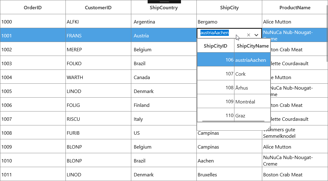
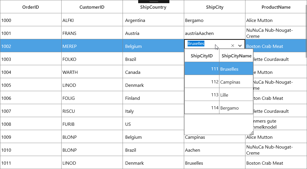
}Loading Different ItemSource for each row of GridComboBoxColumn
You can load the different ItemsSource to each row of GridComboBoxColumn by setting SfDataGrid.ItemsSourceSelector property.
Implementing IItemsSourceSelector
ItemsSourceSelector needs to implement IItemsSourceSelector interface which requires you to implement GetItemsSource method which receives the below parameters,
- Record – data object associated with row.
- Data Context – Data context of data grid.
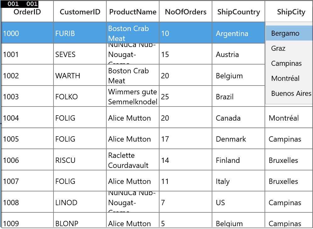
In the below code, ItemsSource for ShipCity column returned based on ShipCountry column value using the record and data context of data grid passed to GetItemsSource method.
<Page.Resources>
        <local:ItemsSourceSelector x:Key="itemsSourceSelector"/>
</Page.Resources>

<syncfusion:SfDataGrid x:Name="sfdatagrid"
                               AllowEditing="True"
                               AutoGenerateColumns="False"
                               CurrentCellEndEdit="CurrentCellEndEditEventAction"
                               ItemsSource="{Binding OrderDetails}"
                               ColumnSizer="Star">
    <syncfusion:SfDataGrid.Columns>
		<syncfusion:GridTextColumn MappingName="OrderID" />
		<syncfusion:GridTextColumn MappingName="CustomerID" />
		<syncfusion:GridTextColumn MappingName="ProductName" />
		<syncfusion:GridTextColumn MappingName="NoOfOrders" />
		<syncfusion:GridComboBoxColumn MappingName="ShipCountry"  ItemsSource="{Binding Path=DataContext.CountryList, ElementName=sfdatagrid}"/>
		<syncfusion:GridComboBoxColumn HeaderText="ShipCity"  DisplayMemberPath="ShipCityName"
								   ItemsSourceSelector="{StaticResource itemsSourceSelector}"
								   MappingName="ShipCityID" SelectedValuePath="ShipCityID" />
	</syncfusion:SfDataGrid.Columns>
</syncfusion:SfDataGrid>
/// <summary>
/// Implementation class for ItemsSourceSelector interface
/// </summary>
public class ItemsSourceSelector : IItemsSourceSelector
{
public IEnumerable GetItemsSource(object record, object dataContext)
{
if (record == null)
return null;
var orderDetails = record as OrderDetails;
var countryName = orderDetails.ShipCountry;
var viewModel = dataContext as ViewModel;
//Returns ShipCity collection based on ShipCountry.
if (viewModel.ShipCities.ContainsKey(countryName))
{
ObservableCollection<ShipCityDetails> shipCities = null;
viewModel.ShipCities.TryGetValue(countryName, out shipCities);
return shipCities.ToList();
}
return null;
}
}The following screenshot illustrates the different ShipCity ItemsSource bound to each row of the ComboBox based on the Country Name.
You can download the sample from here.
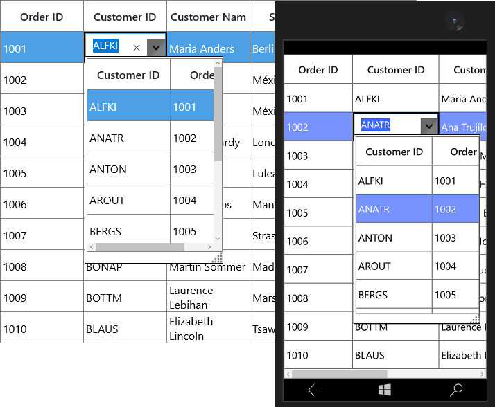
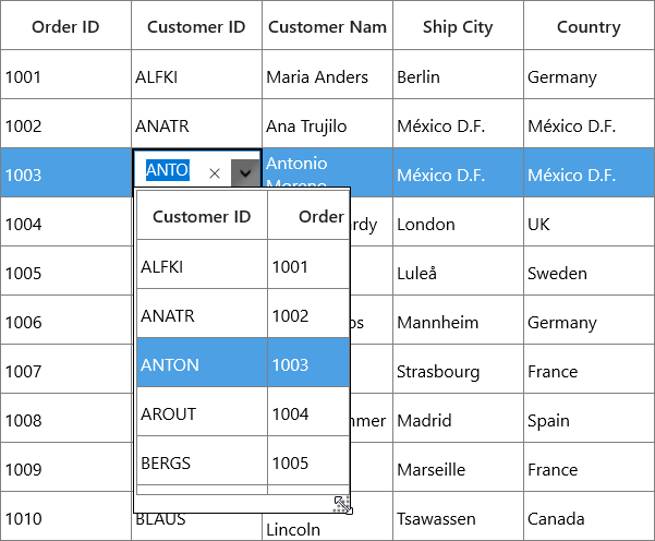
GridMultiColumnDropDownList
GridMultiColumnDropDownList derived from GridTextColumnBase and it displays enumeration as cell contents. It hosts SfMultiDropDownControl in editing mode. GridMultiColumnDropDownList allows you to define the predefined columns in its drop-down like SfDataGrid.
By default, ` GridMultiColumnDropDownList ` displays the value using MappingName property. You can set DisplayMember which denotes the property that is contained in the GridMultiColumnDropDownList.ItemsSource to serve as the visual representation of object.
You can set the property to ValueMember from which to get values that correspond to the selections in the drop-down list.
You can change the value by selecting the item from drop down or you can edit the SfMultiColumnDropDownControl.Editor. You can disable the editing by setting IsTextReadOnly.
<syncfusion:SfDataGrid x:Name="dataGrid"
                       AllowEditing="True"
                       AutoGenerateColumns="False"
                       ItemsSource="{Binding Orders}">
    <syncfusion:SfDataGrid.Columns>
        <syncfusion:GridMultiColumnDropDownList AutoGenerateColumns="False"
                                                DisplayMember="CustomerID"
                                                HeaderText="Customer ID"
                                                ItemsSource="{Binding Orders, Source={StaticResource viewModel}}"
                                                MappingName="OrderID"
                                                ValueMember="OrderID">
            <syncfusion:GridMultiColumnDropDownList.Columns>
                <syncfusion:Columns>
                    <syncfusion:GridTextColumn HeaderText="Customer ID" MappingName="CustomerID" />
                    <syncfusion:GridTextColumn HeaderText="Order ID" MappingName="OrderID" />
                </syncfusion:Columns>
            </syncfusion:GridMultiColumnDropDownList.Columns>
        </syncfusion:GridMultiColumnDropDownList>
    </syncfusion:SfDataGrid.Columns>
</syncfusion:SfDataGrid>
var viewModel = this.dataGrid.DataContext as ViewModel;
Columns columns = new Columns();
columns.Add(new GridTextColumn() { HeaderText = "Order ID", MappingName = "OrderID" });
columns.Add(new GridTextColumn() { HeaderText = "Customer ID", MappingName = "CustomerID" });
this.dataGrid.Columns.Add(new GridMultiColumnDropDownList() { ItemsSource = viewModel.Orders, MappingName = "OrderID", HeaderText = "Customer ID", DisplayMember = "CustomerID", ValueMember = "OrderID", AutoGenerateColumns = false, Columns = columns });SfDataGrid triggers, CurrentCellDropDownSelectionChanged event, when the SelectedValue is changed. CurrentCellDropDownSelectionChangedEventArgs of CurrentCellDropDownSelectionChanged event provides the information about the changed cell value.
SelectedIndex property returns the index of selected item.
SelectedItem property returns the selected item from drop down list.
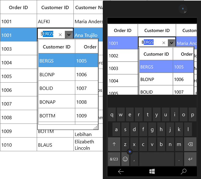
Auto complete support
You can allow SfMultiDropDownControl to complete the entered input value automatically by setting the AllowAutoComplete property to true.
AllowAutoComplete property will autocomplete the input value by comparing it to each item of the underlying data source of GridMultiColumnDropDownList and returns the matched value by DisplayMember.
Filtering
You can allow SfMultiDropDownControl to filter the drop-down list items dynamically based on the text typed on editor by setting AllowIncrementalFiltering property to true.
GridMultiColumnDropDownList allows you to filter the items based on case by setting AllowCasingforFilter to true. This will help users to select from large number of items.
Auto increment
You can increment or decrement the value via the Mouse-Wheel or Up and Down key by setting AllowSpinOnMouseWheel to true.
Null value support
You can allow the null values by setting the AllowNullInput property to true.
NOTE
The AllowNullInput will work only when the underlying property type is Nullable.
Popup customization
Size
You can allow change the size of drop-down popup by setting PopUpWidth and PopUpHeight property. The PopUpWidth will be set based on PopUpMinWidth and PopUpMaxWidth properties when the value is not between them. By default, the PopUpMinWidth value is 200.0.
Similarly, the PopUpHeight based on PopUpMinHeight and PopUpMaxHeight when the value is not between them. The default value of PopUpMinHeight is 300.0.
SfMultiDropDownControl can automatically adjust the popup width based on the actual size of SfDataGrid when setting IsAutoPopupSize to true.
Resizing drop-down popup
You can allow end-user to resize the drop-down popup by showing resizing thumb by setting ShowResizeThumb property to Visible.
Keep popup open on editing
You can open the drop-down popup, when the user start editing on text editor using AllowImmediatePopup property to true in OnEditElementLoaded method by overriding existing renderer.
Below code, creates GridCellMultiColumnDropDownRendererExt to set AllowImmediatePopup property. Replace the default renderer with created renderer in SfDataGrid.CellRenderers collection.
this.dataGrid.CellRenderers.Remove("MultiColumnDropDown");
this.dataGrid.CellRenderers.Add("MultiColumnDropDown", new GridCellMultiColumnDropDownRendererExt());
public class GridCellMultiColumnDropDownRendererExt: GridCellMultiColumnDropDownRenderer
{
protected override void OnEditElementLoaded(object sender, RoutedEventArgs e)
{
(sender as SfMultiColumnDropDownControl).AllowImmediatePopup = true;
(sender as SfMultiColumnDropDownControl).Text = PreviewInputText;
base.OnEditElementLoaded(sender, e);
}
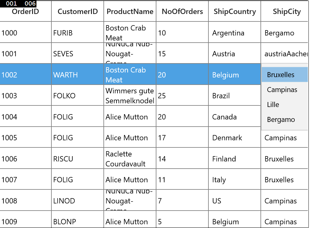
}Loading different ItemsSource for each row
You can load different ItemsSource to each row of GridMultiColumnDropDownList by setting the SfDataGrid.ItemsSourceSelector property.
Implementing IItemsSourceSelector
ItemsSourceSelector needs to implement the IItemsSourceSelector interface, which is required to implement the GetItemsSource method. The GetItemsSource method receives the following parameters:
- Record – Data object associated with row.
- Data Context – Data context of data grid.
In the following code, ItemsSource for ShipCity column is returned based on ShipCountry column value using the record and data context of data grid passed to the GetItemsSource method.
<Page.Resources>
        <local:ItemsSourceSelector x:Key="itemSourceSelector" />
</Page.Resources>

<syncfusion:SfDataGrid x:Name="sfdatagrid"
                                AllowEditing="True"
                                AutoGenerateColumns="False"
                                ItemsSource="{Binding OrderDetails}"
                                ColumnSizer="Star">
   <syncfusion:SfDataGrid.Columns>
                <syncfusion:GridTextColumn MappingName="OrderID" />
                <syncfusion:GridTextColumn MappingName="CustomerID" />
                <syncfusion:GridComboBoxColumn MappingName="ShipCountry"  ItemsSource="{Binding Path=DataContext.CountryList, ElementName=sfdatagrid}"/>
                <syncfusion:GridMultiColumnDropDownList AllowEditing="True"  HeaderText="ShipCity"  DisplayMember="ShipCityName"
                                         				ItemsSourceSelector="{StaticResource itemSourceSelector}"
														MappingName="ShipCityID"  ValueMember="ShipCityID"/>
                <syncfusion:GridTextColumn MappingName="ProductName" />
           </syncfusion:SfDataGrid.Columns>
 </syncfusion:SfDataGrid>
/// <summary>
/// Implementation class for ItemsSourceSelector interface
/// </summary>
public class ItemsSourceSelector : IItemsSourceSelector
{
public IEnumerable GetItemsSource(object record, object dataContext)
{
if (record == null)
return null;
var orderinfo = record as OrderDetails;
var countryName = orderinfo.ShipCountry;
var viewModel = dataContext as ViewModel;
//Returns ShipCity collection based on ShipCountry.
if (viewModel.ShipCities.ContainsKey(countryName))
{
ObservableCollection<ShipCityDetails> shipCities = null;
viewModel.ShipCities.TryGetValue(countryName, out shipCities);
return shipCities.ToList();
}
return null;
}
}The following screenshot illustrates the different ShipCity ItemsSource bound to each row of MultiColumnDropDownList based on the country name.
You can download the sample from the following link: Sample.
GridHyperlinkColumn
GridHyperlinkColumn derived from GridTextColumn and it displays columns data as hyperlink. It hosts HyperlinkButton element as GridCell content.
<syncfusion:SfDataGrid x:Name="dataGrid"
                       AutoGenerateColumns="False"
                       ItemsSource="{Binding Orders}">
    <syncfusion:SfDataGrid.Columns>
        <syncfusion:GridHyperlinkColumn HeaderText="Country" MappingName="Country" />
    </syncfusion:SfDataGrid.Columns>
</syncfusion:SfDataGrid>this.dataGrid.Columns.Add(new GridHyperlinkColumn() { HeaderText = "Country", MappingName = "Country" });
You can allow end-user to navigate the Uri when the cell value contains valid Uri address or using CurrentCellRequestNavigate event. The CurrentCellRequestNavigate occurs when the current cell in GridHyperlinkColumn is clicked for navigation.
CurrentCellRequestNavigateEventArgs of CurrentCellRequestNavigate event provide information about the hyperlink triggered this event. CurrentCellRequestNavigateEventArgs.NavigateText returns the value using ValueBinding or MappingName to navigate.
this.dataGrid.CurrentCellRequestNavigate += DataGrid_CurrentCellRequestNavigate;

private void DataGrid_CurrentCellRequestNavigate(object sender, CurrentCellRequestNavigateEventArgs args)
{
    var URI = string.Format("https://en.wikipedia.org/wiki/" + args.NavigateText);
    Windows.System.Launcher.LaunchUriAsync(new Uri(URI));
}
Cancel the navigation
You can cancel the navigation when clicking hyperlink by setting CurrentCellRequestNavigateEventArgs.Handled to false.
this.dataGrid.CurrentCellRequestNavigate += dataGrid_CurrentCellRequestNavigate;

void dataGrid_CurrentCellRequestNavigate(object sender, CurrentCellRequestNavigateEventArgs args)
{
    args.Handled = true;
}
Customize Hyperlink
Change the alignment
You can change the horizontal alignment of GridHyperlinkColumn using HorizontalAlignment property.
Change the foreground color
You can change the foreground color of GridHyperlinkColumn by writing the style with target type HyperlinkButton.
<Style TargetType="HyperlinkButton">
    <Setter Property="Foreground" Value="Green" />
</Style>
GridImageColumn
GridImageColumn derived from GridColumn and it displays columns data as Image. It hosts Image element as GridCell content.
<syncfusion:SfDataGrid x:Name="dataGrid"
                       AutoGenerateColumns="False"
                       ItemsSource="{Binding Orders}">
    <syncfusion:SfDataGrid.Columns>
        <syncfusion:GridImageColumn MappingName="ImageLink"
                                    HeaderText="Flag"
                                    Stretch="Uniform"
                                    TextAlignment="Center" />
    </syncfusion:SfDataGrid.Columns>
</syncfusion:SfDataGrid>this.dataGrid.Columns.Add(new GridImageColumn() { HeaderText = "Flag", MappingName = "ImageLink", Stretch = Stretch.Uniform });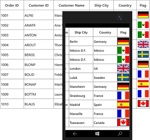
Read image from path using ValueBinding
You can use converter to read image from resource by setting Converter in ValueBinding definition.
Below code, returns the Image URI using ValueBinding property.
public class StringToImageConverter : IValueConverter
{
    object IValueConverter.Convert(object value, Type targetType, object parameter, string language)
    {
        string imageName = value as string + ".png";
        return new BitmapImage(new Uri("ms-appx:///Images/"+imageName, UriKind.Absolute));
    }

    object IValueConverter.ConvertBack(object value, Type targetType, object parameter, string language)
    {
        return null;
    }
}<Page.Resources>
<local:StringToImageConverter x:Key="converter" />
</Page.Resources>
<syncfusion:SfDataGrid x:Name="dataGrid"
AutoGenerateColumns="False"
ItemsSource="{Binding Orders}">
<syncfusion:SfDataGrid.Columns>
<syncfusion:GridImageColumn MappingName="Country"
HeaderText="Flag"
Stretch="Uniform"
TextAlignment="Center"
ValueBinding="{Binding Path=Country, Converter={StaticResource ImageConverter}}" />
</syncfusion:SfDataGrid.Columns>
</syncfusion:SfDataGrid>this.dataGrid.Columns.Add(new GridImageColumn() { HeaderText = "Flag", MappingName = "Country", ValueBinding = new Binding() { Path = new PropertyPath("Country"), Converter = new StringToImageConverter() }, TextAlignment = TextAlignment.Center, Stretch = Stretch.Uniform });Customize Image
GridImageColumn allows you to customize the image with below properties.
-
Width and Height- You can change the height and width of the image using GridImageColumn.ImageHeight and GridImageColumn.ImageWidth properties. -
Stretch - The image can be stretch by setting
Stretchproperty. -
Scale - You can scale the image using StretchDirection property.
GridUpDownColumn
GridUpDownColumn derived from GridColumn and it displays numeric data in its cell contents. It hosts SfNumericUpDown in editing mode.
<syncfusion:SfDataGrid x:Name="dataGrid"
                       AutoGenerateColumns="False"
                       ItemsSource="{Binding Orders}">
    <syncfusion:SfDataGrid.Columns>
        <syncfusion:GridUpDownColumn Width="150"
                                     HeaderText="Unit Price"
                                     MappingName="UnitPrice" />
    </syncfusion:SfDataGrid.Columns>

</syncfusion:SfDataGrid>this.dataGrid.Columns.Add(new GridUpDownColumn() { HeaderText = "Unit Price", MappingName = "UnitPrice", Width = 150 });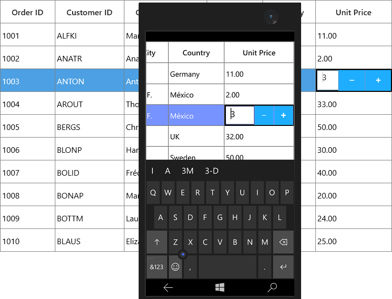
Parsing Mode
You can bind either Decimal or Double values with GridUpDownColumn by using ParsingMode property. The default parsing mode is Double.
Formatting
You can format the date time value by specifying the predefined format specifier or custom numeric format strings into GridUpDownColumn.FormatString property.
You can change the Number of decimal digits to be displayed after the decimal point using NumberDecimalDigits property.
Setting numeric value range
You can restrict and display the input value with in the range using MinValue and MaxValue properties.
AutoReverse
You can auto reset to MinValue and MaxValue when it exceeding the range by setting AutoReverse property. For example, after reach MaxValue if user clicks Up button the value gets reset to MinValue and vice versa.
Spin button alignment
You can change the alignment of spin button using SpinButtonsAlignment property.
SmallChange and LargeChange
You can specify the value to get increment or decrement when up and down arrow key is pressed by using SmallChange property.
If you want to increment or decrement the value when PageUp and PageDown key is pressed using LargeChange property.
GridToggleSwitchColumn
GridToggleSwitchColumn derived from GridColumn and it is used to display Boolean type data. It hosts ToggleSwitch element as GridCell content.
<syncfusion:SfDataGrid x:Name="sfDataGrid"
                       AutoGenerateColumns="False"
                       AllowEditing="True"
                       ItemsSource="{Binding OrderInfoCollection}">
    <syncfusion:SfDataGrid.Columns>
        <syncfusion:GridToggleSwitchColumn HeaderText="IsDelivered" MappingName="IsDelivered"/>
    </syncfusion:SfDataGrid.Columns>
</syncfusion:SfDataGrid>this.sfDataGrid.Columns.Add(new GridToggleSwitchColumn() { MappingName = "IsDelivered", HeaderText = "IsDelivered" });ToggleSwitch Content Settings
GridToggleSwitchColumn provides support to display the text, while ToggleSwitch is in ON/OFF state based on OnContent and OffContent properties.
GridCheckBoxSelectorColumn
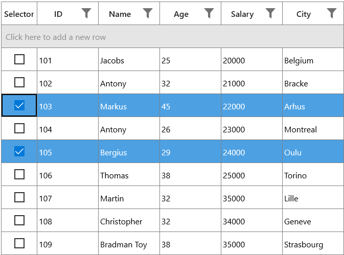
SfDataGrid allows you to select or deselect individual rows through CheckBox using the GridCheckBoxSelectorColumn, which is not bound with data object from underlying data source, and it can be added like normal columns. The selector column supports row selection alone, and selection in selector column works based on SelectionMode.
<syncfusion:SfDataGrid x:Name="dataGrid"
                       AutoGenerateColumns="False"
                       ItemsSource="{Binding Orders}">
      <syncfusion:SfDataGrid.Columns>
            <syncfusion:GridCheckBoxSelectorColumn MappingName="SelectorColumn"
                                                   Width="40"/>
      </syncfusion:SfDataGrid.Columns>
</syncfusion:SfDataGrid>this.dataGrid.Columns.Add(new GridCheckBoxSelectorColumn()
{
MappingName = "SelectorColumn",
Width = 40
});By default, check box is displayed in header of selector column, which is used to select or deselect all the rows in the datagrid.
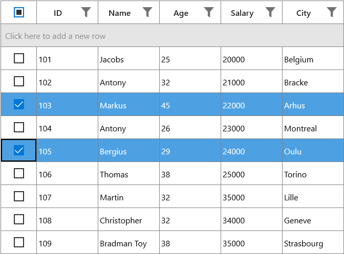
Text on column header
You can display text instead of check box in header of selector column by setting the AllowCheckBoxOnHeader property to False.
<syncfusion:SfDataGrid x:Name="dataGrid"
                       AutoGenerateColumns="False"
                       ItemsSource="{Binding Orders}">
      <syncfusion:SfDataGrid.Columns>
            <syncfusion:GridCheckBoxSelectorColumn MappingName="SelectorColumn"
                                                   AllowCheckBoxOnHeader="False"
                                                   HeaderText="Selector"
                                                   Width="70"/>
      </syncfusion:SfDataGrid.Columns>
</syncfusion:SfDataGrid>this.dataGrid.Columns.Add(new GridCheckBoxSelectorColumn()
{
HeaderText = "Selector",
MappingName = "SelectorColumn",
AllowCheckBoxOnHeader = false ,
Width = 70
});
Styling selector column
The style of check box in record cells and header can be customized by changing the default template of check box.
<syncfusion:SfDataGrid x:Name="dataGrid"
AutoGenerateColumns="False"
ItemsSource="{Binding Orders}">
<syncfusion:SfDataGrid.Columns>
<syncfusion:GridCheckBoxSelectorColumn MappingName="SelectorColumn"
Width="70"/>
</syncfusion:SfDataGrid.Columns>
<Syncfusion:SfDataGrid.Resources>
<Style TargetType="CheckBox">
<Setter Property="Background" Value="Transparent" />
<Setter Property="Foreground" Value="{ThemeResource SystemControlForegroundBaseHighBrush}"/>
<Setter Property="Padding" Value="8,5,0,0" />
<Setter Property="HorizontalAlignment" Value="Left" />
<Setter Property="VerticalAlignment" Value="Center" />
<Setter Property="HorizontalContentAlignment" Value="Left"/>
<Setter Property="VerticalContentAlignment" Value="Top"/>
<Setter Property="FontFamily" Value="{ThemeResource ContentControlThemeFontFamily}" />
<Setter Property="FontSize" Value="{ThemeResource ControlContentThemeFontSize}" />
<Setter Property="MinWidth" Value="120" />
<Setter Property="MinHeight" Value="32" />
<Setter Property="UseSystemFocusVisuals" Value="True" />
<Setter Property="Template">
<Setter.Value>
<ControlTemplate TargetType="CheckBox">
<Grid Background="{TemplateBinding Background}"
BorderBrush="{TemplateBinding BorderBrush}"
BorderThickness="{TemplateBinding BorderThickness}">
<VisualStateManager.VisualStateGroups>
<VisualStateGroup x:Name="CombinedStates">
<VisualState x:Name="UncheckedNormal" >
<Storyboard>
<ObjectAnimationUsingKeyFrames Storyboard.TargetName="NormalRectangle"
Storyboard.TargetProperty="Stroke">
<DiscreteObjectKeyFrame KeyTime="0" Value="Red" />
</ObjectAnimationUsingKeyFrames>
</Storyboard>
</VisualState>
<VisualState x:Name="UncheckedPointerOver">
<Storyboard>
<ObjectAnimationUsingKeyFrames Storyboard.TargetName="NormalRectangle"
Storyboard.TargetProperty="Stroke">
<DiscreteObjectKeyFrame KeyTime="0"
Value="{ThemeResource SystemControlHighlightBaseHighBrush}" />
</ObjectAnimationUsingKeyFrames>
</Storyboard>
</VisualState>
<VisualState x:Name="UncheckedPressed">
<Storyboard>
<ObjectAnimationUsingKeyFrames Storyboard.TargetName="NormalRectangle"
Storyboard.TargetProperty="Fill">
<DiscreteObjectKeyFrame KeyTime="0"
Value="{ThemeResource SystemControlBackgroundBaseMediumBrush}" />
</ObjectAnimationUsingKeyFrames>
<ObjectAnimationUsingKeyFrames Storyboard.TargetName="NormalRectangle"
Storyboard.TargetProperty="Stroke">
<DiscreteObjectKeyFrame KeyTime="0"
Value="{ThemeResource SystemControlHighlightTransparentBrush}" />
</ObjectAnimationUsingKeyFrames>
<DoubleAnimation Storyboard.TargetName="NormalRectangle"
Storyboard.TargetProperty="StrokeThickness"
To="{ThemeResource CheckBoxCheckedStrokeThickness}"
Duration="0" />
</Storyboard>
</VisualState>
<VisualState x:Name="UncheckedDisabled">
<Storyboard>
<ObjectAnimationUsingKeyFrames Storyboard.TargetName="NormalRectangle"
Storyboard.TargetProperty="Fill">
<DiscreteObjectKeyFrame KeyTime="0" Value="Transparent" />
</ObjectAnimationUsingKeyFrames>
<ObjectAnimationUsingKeyFrames Storyboard.TargetName="NormalRectangle"
Storyboard.TargetProperty="Stroke">
<DiscreteObjectKeyFrame KeyTime="0"
Value="{ThemeResource SystemControlDisabledBaseLowBrush}" />
</ObjectAnimationUsingKeyFrames>
<ObjectAnimationUsingKeyFrames Storyboard.TargetName="ContentPresenter"
Storyboard.TargetProperty="Foreground">
<DiscreteObjectKeyFrame KeyTime="0"
Value="{ThemeResource SystemControlDisabledBaseLowBrush}" />
</ObjectAnimationUsingKeyFrames>
</Storyboard>
</VisualState>
<VisualState x:Name="CheckedNormal">
<Storyboard>
<ObjectAnimationUsingKeyFrames Storyboard.TargetName="NormalRectangle"
Storyboard.TargetProperty="Fill">
<DiscreteObjectKeyFrame KeyTime="0" Value="Transparent" />
</ObjectAnimationUsingKeyFrames>
<ObjectAnimationUsingKeyFrames Storyboard.TargetName="NormalRectangle"
Storyboard.TargetProperty="Stroke">
<DiscreteObjectKeyFrame KeyTime="0" Value="Red" />
</ObjectAnimationUsingKeyFrames>
<ObjectAnimationUsingKeyFrames Storyboard.TargetName="CheckGlyph"
Storyboard.TargetProperty="Foreground">
<DiscreteObjectKeyFrame KeyTime="0" Value="Black" />
</ObjectAnimationUsingKeyFrames>
<DoubleAnimation Storyboard.TargetName="CheckGlyph"
Storyboard.TargetProperty="Opacity"
To="1" Duration="0" />
</Storyboard>
</VisualState>
<VisualState x:Name="CheckedPointerOver">
<Storyboard>
<ObjectAnimationUsingKeyFrames Storyboard.TargetName="NormalRectangle"
Storyboard.TargetProperty="Fill">
<DiscreteObjectKeyFrame KeyTime="0"
Value="{ThemeResource SystemControlHighlightAccentBrush}" />
</ObjectAnimationUsingKeyFrames>
<ObjectAnimationUsingKeyFrames Storyboard.TargetName="NormalRectangle"
Storyboard.TargetProperty="Stroke">
<DiscreteObjectKeyFrame KeyTime="0"
Value="{ThemeResource SystemControlHighlightBaseHighBrush}" />
</ObjectAnimationUsingKeyFrames>
<DoubleAnimation Storyboard.TargetName="CheckGlyph"
Storyboard.TargetProperty="Opacity"
To="1" Duration="0" />
</Storyboard>
</VisualState>
<VisualState x:Name="CheckedPressed">
<Storyboard>
<ObjectAnimationUsingKeyFrames Storyboard.TargetName="NormalRectangle"
Storyboard.TargetProperty="Fill">
<DiscreteObjectKeyFrame KeyTime="0"
Value="{ThemeResource SystemControlHighlightBaseMediumBrush}" />
</ObjectAnimationUsingKeyFrames>
<ObjectAnimationUsingKeyFrames Storyboard.TargetName="NormalRectangle"
Storyboard.TargetProperty="Stroke">
<DiscreteObjectKeyFrame KeyTime="0"
Value="{ThemeResource SystemControlHighlightTransparentBrush}" />
</ObjectAnimationUsingKeyFrames>
<DoubleAnimation Storyboard.TargetName="NormalRectangle"
Storyboard.TargetProperty="StrokeThickness"
To="{ThemeResource CheckBoxCheckedStrokeThickness}"
Duration="0" />
<DoubleAnimation Storyboard.TargetName="CheckGlyph"
Storyboard.TargetProperty="Opacity"
To="1" Duration="0" />
</Storyboard>
</VisualState>
<VisualState x:Name="CheckedDisabled">
<Storyboard>
<ObjectAnimationUsingKeyFrames Storyboard.TargetName="NormalRectangle"
Storyboard.TargetProperty="Fill">
<DiscreteObjectKeyFrame KeyTime="0" Value="Transparent" />
</ObjectAnimationUsingKeyFrames>
<ObjectAnimationUsingKeyFrames Storyboard.TargetName="NormalRectangle"
Storyboard.TargetProperty="Stroke">
<DiscreteObjectKeyFrame KeyTime="0"
Value="{ThemeResource SystemControlDisabledBaseLowBrush}" />
</ObjectAnimationUsingKeyFrames>
<ObjectAnimationUsingKeyFrames Storyboard.TargetName="CheckGlyph"
Storyboard.TargetProperty="Foreground">
<DiscreteObjectKeyFrame KeyTime="0"
Value="{ThemeResource SystemControlDisabledBaseLowBrush}" />
</ObjectAnimationUsingKeyFrames>
<ObjectAnimationUsingKeyFrames Storyboard.TargetName="ContentPresenter"
Storyboard.TargetProperty="Foreground">
<DiscreteObjectKeyFrame KeyTime="0"
Value="{ThemeResource SystemControlDisabledBaseLowBrush}" />
</ObjectAnimationUsingKeyFrames>
<DoubleAnimation Storyboard.TargetName="CheckGlyph"
Storyboard.TargetProperty="Opacity"
To="1" Duration="0" />
</Storyboard>
</VisualState>
<VisualState x:Name="IndeterminateNormal">
<Storyboard>
<ObjectAnimationUsingKeyFrames Storyboard.TargetName="NormalRectangle"
Storyboard.TargetProperty="Stroke">
<DiscreteObjectKeyFrame KeyTime="0" Value="Red" />
</ObjectAnimationUsingKeyFrames>
<ObjectAnimationUsingKeyFrames Storyboard.TargetName="NormalRectangle"
Storyboard.TargetProperty="Fill">
<DiscreteObjectKeyFrame KeyTime="0"
Value="{ThemeResource SystemControlHighlightTransparentBrush}" />
</ObjectAnimationUsingKeyFrames>
<ObjectAnimationUsingKeyFrames Storyboard.TargetName="CheckGlyph"
Storyboard.TargetProperty="Foreground">
<DiscreteObjectKeyFrame KeyTime="0" Value="Blue" />
</ObjectAnimationUsingKeyFrames>
<ObjectAnimationUsingKeyFrames Storyboard.TargetName="CheckGlyph"
Storyboard.TargetProperty="Glyph">
<DiscreteObjectKeyFrame KeyTime="0" Value="" />
</ObjectAnimationUsingKeyFrames>
<DoubleAnimation Storyboard.TargetName="CheckGlyph"
Storyboard.TargetProperty="Opacity"
To="1" Duration="0" />
</Storyboard>
</VisualState>
<VisualState x:Name="IndeterminatePointerOver">
<Storyboard>
<ObjectAnimationUsingKeyFrames Storyboard.TargetName="NormalRectangle"
Storyboard.TargetProperty="Stroke">
<DiscreteObjectKeyFrame KeyTime="0"
Value="{ThemeResource SystemControlHighlightAccentBrush}" />
</ObjectAnimationUsingKeyFrames>
<ObjectAnimationUsingKeyFrames Storyboard.TargetName="NormalRectangle"
Storyboard.TargetProperty="Fill">
<DiscreteObjectKeyFrame KeyTime="0"
Value="{ThemeResource SystemControlHighlightTransparentBrush}" />
</ObjectAnimationUsingKeyFrames>
<ObjectAnimationUsingKeyFrames Storyboard.TargetName="CheckGlyph"
Storyboard.TargetProperty="Foreground">
<DiscreteObjectKeyFrame KeyTime="0"
Value="{ThemeResource SystemControlForegroundBaseHighBrush}" />
</ObjectAnimationUsingKeyFrames>
<ObjectAnimationUsingKeyFrames Storyboard.TargetName="CheckGlyph"
Storyboard.TargetProperty="Glyph">
<DiscreteObjectKeyFrame KeyTime="0" Value="" />
</ObjectAnimationUsingKeyFrames>
<DoubleAnimation Storyboard.TargetName="CheckGlyph"
Storyboard.TargetProperty="Opacity"
To="1" Duration="0" />
</Storyboard>
</VisualState>
<VisualState x:Name="IndeterminatePressed">
<Storyboard>
<ObjectAnimationUsingKeyFrames Storyboard.TargetName="NormalRectangle"
Storyboard.TargetProperty="Stroke">
<DiscreteObjectKeyFrame KeyTime="0"
Value="{ThemeResource SystemControlHighlightBaseMediumBrush}" />
</ObjectAnimationUsingKeyFrames>
<ObjectAnimationUsingKeyFrames Storyboard.TargetName="NormalRectangle"
Storyboard.TargetProperty="Fill">
<DiscreteObjectKeyFrame KeyTime="0"
Value="{ThemeResource SystemControlHighlightTransparentBrush}" />
</ObjectAnimationUsingKeyFrames>
<ObjectAnimationUsingKeyFrames Storyboard.TargetName="CheckGlyph"
Storyboard.TargetProperty="Foreground">
<DiscreteObjectKeyFrame KeyTime="0"
Value="{ThemeResource SystemControlForegroundBaseMediumBrush}" />
</ObjectAnimationUsingKeyFrames>
<ObjectAnimationUsingKeyFrames Storyboard.TargetName="CheckGlyph"
Storyboard.TargetProperty="Glyph">
<DiscreteObjectKeyFrame KeyTime="0" Value="" />
</ObjectAnimationUsingKeyFrames>
<DoubleAnimation Storyboard.TargetName="CheckGlyph"
Storyboard.TargetProperty="Opacity"
To="1" Duration="0" />
</Storyboard>
</VisualState>
<VisualState x:Name="IndeterminateDisabled">
<Storyboard>
<ObjectAnimationUsingKeyFrames Storyboard.TargetName="NormalRectangle"
Storyboard.TargetProperty="Fill">
<DiscreteObjectKeyFrame KeyTime="0" Value="Transparent" />
</ObjectAnimationUsingKeyFrames>
<ObjectAnimationUsingKeyFrames Storyboard.TargetName="NormalRectangle"
Storyboard.TargetProperty="Stroke">
<DiscreteObjectKeyFrame KeyTime="0"
Value="{ThemeResource SystemControlDisabledBaseLowBrush}" />
</ObjectAnimationUsingKeyFrames>
<ObjectAnimationUsingKeyFrames Storyboard.TargetName="CheckGlyph"
Storyboard.TargetProperty="Foreground">
<DiscreteObjectKeyFrame KeyTime="0"
Value="{ThemeResource SystemControlDisabledBaseLowBrush}" />
</ObjectAnimationUsingKeyFrames>
<ObjectAnimationUsingKeyFrames Storyboard.TargetName="ContentPresenter"
Storyboard.TargetProperty="Foreground">
<DiscreteObjectKeyFrame KeyTime="0"
Value="{ThemeResource SystemControlDisabledBaseLowBrush}" />
</ObjectAnimationUsingKeyFrames>
<ObjectAnimationUsingKeyFrames Storyboard.TargetName="CheckGlyph"
Storyboard.TargetProperty="Glyph">
<DiscreteObjectKeyFrame KeyTime="0" Value="" />
</ObjectAnimationUsingKeyFrames>
<DoubleAnimation Storyboard.TargetName="CheckGlyph"
Storyboard.TargetProperty="Opacity"
To="1" Duration="0" />
</Storyboard>
</VisualState>
</VisualStateGroup>
</VisualStateManager.VisualStateGroups>
<Grid.ColumnDefinitions>
<ColumnDefinition Width="20" />
<ColumnDefinition Width="*" />
</Grid.ColumnDefinitions>
<Grid VerticalAlignment="Top" Height="32">
<Rectangle x:Name="NormalRectangle"
Fill="Transparent"
Stroke="{ThemeResource SystemControlForegroundBaseMediumHighBrush}"
StrokeThickness="{ThemeResource CheckBoxBorderThemeThickness}"
UseLayoutRounding="False"
Height="20"
Width="20" />
<FontIcon x:Name="CheckGlyph"
FontFamily="{ThemeResource SymbolThemeFontFamily}"
Glyph=""
FontSize="20"
Foreground="Green"
Opacity="0" />
</Grid>
<ContentPresenter x:Name="ContentPresenter"
ContentTemplate="{TemplateBinding ContentTemplate}"
ContentTransitions="{TemplateBinding ContentTransitions}"
Content="{TemplateBinding Content}"
Margin="{TemplateBinding Padding}"
HorizontalAlignment="{TemplateBinding HorizontalContentAlignment}"
VerticalAlignment="{TemplateBinding VerticalContentAlignment}"
Grid.Column="1"
AutomationProperties.AccessibilityView="Raw"
TextWrapping="Wrap" />
</Grid>
</ControlTemplate>
</Setter.Value>
</Setter>
</Style>
</Syncfusion:SfDataGrid.Resources>
</syncfusion:SfDataGrid>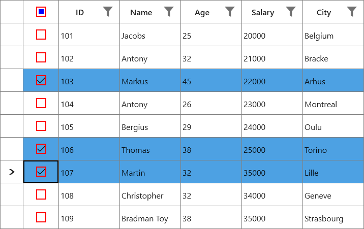
Limitations
The following are the limitations of GridCheckBoxSelectorColumn:
- Selector column does not support cell selection.
- Selector column does not support data operations like sorting, filtering, and grouping.
- Selector column will be excluded in operations like printing and exporting.
- Selector column does not have filter row support.
Custom column support
SfDataGrid allows you to create your own column by overriding predefined column type or creating a new custom column.
Creating column from existing column
You can create your own column by overriding the predefined column types in SfDataGrid.
For example, the GridDateTimeColumn loads the DateTime value by default. If you want to display DateTimeOffset value, you can create a new column by overriding the GridDateTimeColumn class.
In the below code snippet, converter created to format the DateTimeOffSet value to DateTime by defining ValueBinding (edit) and DisplayBinding (non-edit).
public class DateTimeOffsetFormatConverter : IValueConverter
{

    private GridDateTimeOffsetColumn cachedColumn;

    public DateTimeOffsetFormatConverter(GridDateTimeOffsetColumn column)
    {
        cachedColumn = column;
    }

    object IValueConverter.Convert(object value, Type targetType, object parameter, string language)
    {
        value = ((DateTimeOffset)value).DateTime;
        var column = cachedColumn as GridDateTimeColumn;

        if (value == null || DBNull.Value == value)
        {

            if (column.AllowNullValue && column.MaxDate != System.DateTime.MaxValue && column.WaterMark == string.Empty)
                return column.MaxDate;

            if (column.AllowNullValue && column.WaterMark != string.Empty)
                return column.WaterMark;

            if (column.MaxDate != System.DateTime.MaxValue)
                return column.MaxDate;
        }
        DateTime _columnValue;

        _columnValue = (DateTime)value;

        if (_columnValue < column.MinDate)
            _columnValue = column.MinDate;

        if (_columnValue > column.MaxDate)
            _columnValue = column.MaxDate;

        return _columnValue.ToString(column.FormatString, CultureInfo.CurrentUICulture);
    }

    object IValueConverter.ConvertBack(object value, Type targetType, object parameter, string language)
    {
        throw new NotImplementedException();
    }
}

public class DateTimeOffsetToDateTimeConverter : IValueConverter
{
    object IValueConverter.Convert(object value, Type targetType, object parameter, string language)
    {
        if (value == null)
            return null;
        return ((DateTimeOffset)value).DateTime;
    }

    object IValueConverter.ConvertBack(object value, Type targetType, object parameter, string language)
    {

        if (value == null)
            return null;
        return value is DateTimeOffset ? value : new DateTimeOffset((DateTime)value);

    }
}
In the below code snippet, GridDateTimeOffsetColumn column created from GridDateTimeColumn.
public class GridDateTimeOffsetColumn:GridDateTimeColumn
{

    protected override void SetDisplayBindingConverter()
    {

        if ((DisplayBinding as Binding).Converter == null)
            (DisplayBinding as Binding).Converter = new DateTimeOffsetFormatConverter(this);

        if ((ValueBinding as Binding).Converter == null)
            (ValueBinding as Binding).Converter = new DateTimeOffsetToDateTimeConverter();
    }
}
In the below code snippet, created GridDateTimeOffsetColumn added to SfDataGrid.Columns collection and specify the full date-time pattern in FormatString as F. Since the ShortDate is the default pattern of GridDateTimeColumn.
<syncfusion:SfDataGrid x:Name="dataGrid"
                       AutoGenerateColumns="False"
                       ItemsSource="{Binding Orders}">
    <syncfusion:SfDataGrid.Columns>
        <local:GridDateTimeOffsetColumn FormatString="F"
                                        HeaderText="Order Date"
                                        MappingName="OrderDate"
                                        AllowInlineEditing="True"
                                        UseBindingValue="True"/>
    </syncfusion:SfDataGrid.Columns>

</syncfusion:SfDataGrid>this.dataGrid.Columns.Add(new GridDateTimeOffsetColumn() { HeaderText = "Order Date", MappingName = "OrderDate", FormatString = "F" , AllowInlineEditing = true, UseBindingValue = true });You can get the sample from here.
Customize column renderer
SfDataGrid allows you to customize the column related operations like key navigation and UI related interactions by overriding the corresponding renderer associated with the column. Each column has its own renderer with set of virtual methods for handling the column level operations.
Below table lists the available cell types for columns and its renderers.
| Column Name | Renderer | Cell Type |
|---|---|---|
| GridTextColumn | TextBox | |
| GridNumericColumn | Numeric | |
| GridCheckBoxColumn | CheckBox | |
| GridTemplateColumn | Template | |
| GridImageColumn | Image | |
| GridUnBoundColumn | UnBoundTextColumn UnBoundTemplateColumn | |
| GridComboBoxColumn | ComboBox | |
| GridDateTimeColumn | DateTime | |
| GridHyperlinkColumn | HyperlinkButton | |
| GridMultiColumnDropDownList | MultiColumnDropDown | |
| GridUpDownColumn | UpDown | |
| GridCheckBoxSelectorColumn | Selector |
Below code, creates the GridCellTextBoxRendererExt to change the fore ground of CustomerID column and replacing created renderer to CellRenderers.
this.dataGrid.CellRenderers.Remove("TextBox");
this.dataGrid.CellRenderers.Add("TextBox", new GridCellTextBoxRendererExt());

public class GridCellTextBoxRendererExt: GridCellTextBoxRenderer
{

    public override void OnInitializeDisplayElement(DataColumnBase dataColumn, TextBlock uiElement, object dataContext)
    {
        base.OnInitializeDisplayElement(dataColumn, uiElement, dataContext);

        if (dataColumn.GridColumn.MappingName.Equals("CustomerID"))
            uiElement.Foreground = new SolidColorBrush(Colors.Blue);
    }

    public override void OnUpdateDisplayBinding(DataColumnBase dataColumn, TextBlock uiElement, object dataContext)
    {
        base.OnUpdateDisplayBinding(dataColumn, uiElement, dataContext);

        if (dataColumn.GridColumn.MappingName.Equals("CustomerID"))
            uiElement.Foreground = new SolidColorBrush(Colors.Blue);
    }
}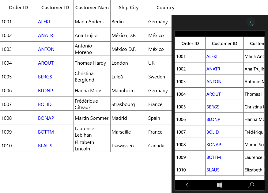
Create the renderer of existing column
You can change the renderer of existing column by removing the predefined cell type value from CellRenderers collection and add the newly derived renderer from GridVirtualizingCellRenderer.
Below code creates the new GridComboBoxRenderer with SfComboBox as edit element for GridComboBoxColumn and replacing created renderer to CellRenderers.
dataGrid.CellRenderers.Remove("ComboBox");
dataGrid.CellRenderers.Add("ComboBox", new GridComboBoxRenderer());

public class GridComboBoxRenderer: GridVirtualizingCellRenderer<ContentControl,SfComboBox>
{
    public GridComboBoxRenderer()
    {
    }
    /// <summary>
    /// Create new display element.
    /// </summary>
    /// <returns></returns>

    protected override ContentControl OnCreateDisplayUIElement()
    {
        return new ContentControl();
    }
    /// <summary>
    /// Create new edit element.
    /// </summary>
    /// <returns></returns>

    protected override SfComboBox OnCreateEditUIElement()
    {
        return new SfComboBox();
    }
    /// <summary>
    /// Initialize binding for display element.
    /// </summary>
    /// <param name="dataColumn"></param>
    /// <param name="uiElement"></param>
    /// <param name="dataContext"></param>

    public override void OnInitializeDisplayElement(DataColumnBase dataColumn, ContentControl uiElement, object dataContext)
    {
        SetDisplayBinding(uiElement, dataColumn.GridColumn, dataContext);
    }
    /// <summary>
    /// custom binding for display element.
    /// </summary>
    /// <param name="element"></param>
    /// <param name="column"></param>
    /// <param name="dataContext"></param>

    private static void SetDisplayBinding(ContentControl element, GridColumn column, object dataContext)
    {
        var comboBoxColumn = (GridComboBoxColumn)column;
        var binding = new Binding
        {
            Path = new PropertyPath(comboBoxColumn.MappingName),
            Mode = BindingMode.TwoWay,
            UpdateSourceTrigger = UpdateSourceTrigger.PropertyChanged,
            Converter = (comboBoxColumn.DisplayBinding as Binding).Converter,
        };
        element.SetBinding(ContentControl.ContentProperty, binding);
    }
    /// <summary>
    /// Update binding for display element.
    /// </summary>
    /// <param name="dataColumn"></param>
    /// <param name="uiElement"></param>
    /// <param name="dataContext"></param>

    public override void OnUpdateDisplayBinding(DataColumnBase dataColumn, ContentControl uiElement, object dataContext)
    {
        SetDisplayBinding(uiElement, dataColumn.GridColumn, dataContext);
    }
    /// <summary>
    /// Initialize binding for edit element.
    /// </summary>
    /// <param name="dataColumn"></param>
    /// <param name="uiElement"></param>
    /// <param name="dataContext"></param>

    public override void OnInitializeEditElement(DataColumnBase dataColumn, SfComboBox uiElement, object dataContext)
    {
        SetEditBinding(uiElement, dataColumn.GridColumn, dataContext);
    }
    /// <summary>
    /// Update binding for edit element.
    /// </summary>
    /// <param name="dataColumn"></param>
    /// <param name="uiElement"></param>
    /// <param name="dataContext"></param>

    public override void OnUpdateEditBinding(DataColumnBase dataColumn, SfComboBox element, object dataContext)
    {
        SetEditBinding(element, dataColumn.GridColumn, dataContext);
    }
    /// <summary>
    /// custom binding for display element.
    /// </summary>
    /// <param name="element"></param>
    /// <param name="column"></param>
    /// <param name="dataContext"></param>

    private static void SetEditBinding(SfComboBox element, GridColumn column, object dataContext)
    {
        var comboboxColumn = (GridComboBoxColumn)column;

        var binding = new Binding
        {
            Source = dataContext,
            Path = new PropertyPath(comboboxColumn.MappingName),
            Mode = BindingMode.TwoWay,
            UpdateSourceTrigger = UpdateSourceTrigger.PropertyChanged,
        };
        element.SetBinding(SfComboBox.SelectedValueProperty, binding);

        var itemsSourceBinding = new Binding { Path = new PropertyPath("ItemsSource"), Mode = BindingMode.TwoWay, Source = comboboxColumn };
        element.SetBinding(SfComboBox.ItemsSourceProperty, itemsSourceBinding);

        var displayMemberBinding = new Binding { Path = new PropertyPath("DisplayMemberPath"), Mode = BindingMode.TwoWay, Source = comboboxColumn };
        element.SetBinding(SfComboBox.DisplayMemberPathProperty, displayMemberBinding);

        var selectedValuePathBinding = new Binding { Path = new PropertyPath("SelectedValuePath"), Mode = BindingMode.TwoWay, Source = comboboxColumn };
        element.SetBinding(SfComboBox.SelectedValuePathProperty, selectedValuePathBinding);

        var itemTemplateBinding = new Binding { Path = new PropertyPath("ItemTemplate"), Mode = BindingMode.TwoWay, Source = comboboxColumn };
        element.SetBinding(SfComboBox.ItemTemplateProperty, itemTemplateBinding);

    }
    /// <summary>
    /// Let Renderer decide whether the parent grid should be allowed to handle keys and prevent
    /// the key event from being handled by the visual UIElement for this renderer.
    /// </summary>
    /// <param name="e">A <see cref="KeyRoutedEventArgs" /> object.</param>
    /// <returns>
    /// True if the parent grid should be allowed to handle keys; false otherwise.
    /// </returns>

    protected override bool ShouldGridTryToHandleKeyDown(KeyRoutedEventArgs e)
    {

        if (!HasCurrentCellState || !IsInEditing)
            return true;

        switch (e.Key)
        {
            case VirtualKey.End:
            case VirtualKey.Home:
            case VirtualKey.Enter:
            case VirtualKey.Escape:

                return !((SfComboBox)CurrentCellRendererElement).IsDropDownOpen;
            case VirtualKey.Down:
            case VirtualKey.Up:
            case VirtualKey.Left:
            case VirtualKey.Right:
                return !((SfComboBox)CurrentCellRendererElement).IsDropDownOpen;
        }
        return base.ShouldGridTryToHandleKeyDown(e);
    }
    /// <summary>
    /// Gets the control value.
    /// </summary>

    public override object GetControlValue()
    {

        if (!HasCurrentCellState)
            return base.GetControlValue();
        return CurrentCellRendererElement.GetValue(IsInEditing ? SfComboBox.SelectedValueProperty : ContentControl.ContentProperty);
    }
    /// <summary>
    /// Sets the control value.
    /// </summary>
    /// <param name="value">The value.</param>

    public override void SetControlValue(object value)
    {

        if (!HasCurrentCellState)
            return;

        if (IsInEditing)
            ((SfComboBox)CurrentCellRendererElement).SelectedValue = value;

        else
            throw new Exception("Value cannot be Set for Unloaded Editor");
    }
}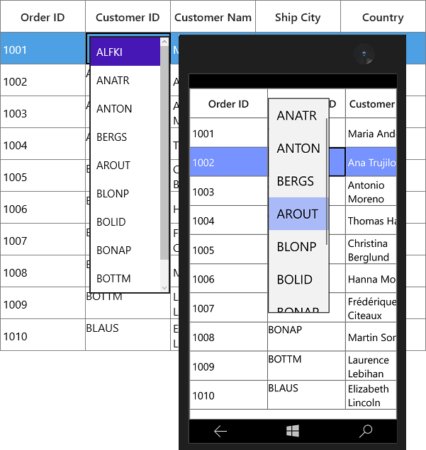
Creating new column and renderer
You can create a new column by deriving GridColumn, rendered in UI using customized CellType using GridVirtualizingCellRenderer.
Below steps to create custom column in SfDataGrid.
- Creating custom column
- Creating renderer
- Adding the custom renderer to SfDataGrid.CellRenderers collection
- Loading custom column
Creating custom column
You can create custom column by overriding a new class from GridColumn class.
In the below code, new column created with CellType as TimePicker.
public class TimePickerColumn:GridColumn
{

    public TimePickerColumn()
    {
        SetCellType("TimePicker");
    }
}
Creating renderer
After creating custom column, you need to create renderer for the custom column.
Below are the steps to create custom renderer. You can create custom renderer either by deriving GridVirtualizingCellRenderer class or overriding existing renderers.
In the below code snippet, display and edit UIElement defined via GridVirtualizingCellRenderer parameter.
/// <summary>
/// CustomRenderer Creation
/// </summary>
/// <param name="TextBlock">Display Control</param>
/// <param name="SfTimePicker">Edit Control</param>

public class TimePickerRenderer: GridVirtualizingCellRenderer<TextBlock, SfTimePicker>
{

    public TimePickerRenderer()
    {

    }
}
With the below code snippet, you can allow to create the display and edit element for renderer by overriding OnCreateDisplayUIElement and OnCreateEditUIElement methods.
/// <summary>
/// Creates new display element.
/// </summary>
/// <returns></returns>

protected override TextBlock OnCreateDisplayUIElement()
{
    return new TextBlock();
}
/// <summary>
/// Creates new edit element.
/// </summary>
/// <returns></returns>

protected override SfTimePicker OnCreateEditUIElement()
{
    return new SfTimePicker();
}
With the below code snippet, you can initialize the binding for display element by overriding the OnInitializeDisplayElement method.
/// <summary>
/// Initialize binding for display element.
/// </summary>
/// <param name="dataColumn"></param>
/// <param name="uiElement"></param>
/// <param name="dataContext"></param>

public override void OnInitializeDisplayElement(DataColumnBase dataColumn, TextBlock uiElement, object dataContext)
{
    SetDisplayBinding(uiElement, dataColumn.GridColumn, dataContext);
}
/// <summary>
/// custom binding for display element.
/// </summary>
/// <param name="element"></param>
/// <param name="column"></param>
/// <param name="dataContext"></param>

private static void SetDisplayBinding(TextBlock element, GridColumn column, object dataContext)
{

    var customColumn = (TimePickerColumn)column;
    var binding = new Binding
    {
        Path = new PropertyPath(customColumn.MappingName),
        Mode = BindingMode.TwoWay,
        Converter = (column.DisplayBinding as Binding).Converter, //Bind Custom converter for display.
    };
    element.SetBinding(TextBlock.TextProperty, binding);
}
With the below code snippet, updates the binding while UI interaction by overriding OnUpdateDisplayBinding method.
/// <summary>
/// Update binding for display element.
/// </summary>
/// <param name="dataColumn"></param>
/// <param name="uiElement"></param>
/// <param name="dataContext"></param>

public override void OnUpdateDisplayBinding(DataColumnBase dataColumn, TextBlock uiElement, object dataContext)
{
    SetDisplayBinding(uiElement, dataColumn.GridColumn, dataContext);
}
Similarly, you can initialize and update the binding for edit element by overriding OnInitializeEditElement and OnUpdateEditBinding methods.
/// <summary>
/// Initialize binding for edit element.
/// </summary>
/// <param name="dataColumn"></param>
/// <param name="uiElement"></param>
/// <param name="dataContext"></param>

public override void OnInitializeEditElement(DataColumnBase dataColumn, SfTimePicker uiElement, object dataContext)
{
    SetEditBinding(uiElement, dataColumn.GridColumn, dataContext);
}
/// <summary>
/// Update binding for edit element.
/// </summary>
/// <param name="dataColumn"></param>
/// <param name="uiElement"></param>
/// <param name="dataContext"></param>

public override void OnUpdateEditBinding(DataColumnBase dataColumn, SfTimePicker element, object dataContext)
{
    SetEditBinding(element, dataColumn.GridColumn, dataContext);
}
/// <summary>
/// custom binding for display element.
/// </summary>
/// <param name="element"></param>
/// <param name="column"></param>
/// <param name="dataContext"></param>

private static void SetEditBinding(SfTimePicker element, GridColumn column, object dataContext)
{

    var customColumn = (TimePickerColumn)column;
    var binding = new Binding
    {
        Path = new PropertyPath(customColumn.MappingName),
        Mode = BindingMode.TwoWay,
    };
    element.SetBinding(SfTimePicker.ValueProperty, binding);
}
You can customize the editor control while loading by overriding OnEditElementLoaded method.
/// <summary>
/// Handling operations on edit mode UIElement.
/// </summary>
/// <param name="sender"></param>
/// <param name="e"></param>

protected override void OnEditElementLoaded(object sender, RoutedEventArgs e)
{
    var timePicker = (sender as SfTimePicker);
    timePicker.Focus(FocusState.Programmatic);
}
With the below code snippet, you can customize the keyboard interactions for the custom column by overriding ShouldGridTryToHandleKeyDown method.
/// <summary>
/// Let Renderer decide whether the parent grid should be allowed to handle keys and prevent
/// the key event from being handled by the visual UIElement for this renderer.
/// </summary>
/// <param name="e">A <see cref="KeyEventArgs" /> object.</param>
/// <returns>
/// True if the parent grid should be allowed to handle keys; false otherwise.
/// </returns>

protected override bool ShouldGridTryToHandleKeyDown(Windows.UI.Xaml.Input.KeyRoutedEventArgs e)
{

    if (!HasCurrentCellState)
        return true;

    if (!IsInEditing)
    {

        if (!(CurrentCellRendererElement is SfTimePicker))
            return true;
    }
    return base.ShouldGridTryToHandleKeyDown(e);
}
You can handle the cell value for the custom renderer by overriding GetControlValue and SetControlValue methods.
/// <summary>
/// Gets the control value.
/// </summary>

public override object GetControlValue()
{

    if (!HasCurrentCellState)
        return base.GetControlValue();
    return CurrentCellRendererElement.GetValue(IsInEditing ? SfTimePicker.ValueProperty : TextBlock.TextProperty);
}
/// <summary>
/// Sets the control value.
/// </summary>
/// <param name="value">The value.</param>

public override void SetControlValue(object value)
{

    if (!HasCurrentCellState)
        return;

    if (IsInEditing)
        ((SfTimePicker)CurrentCellRendererElement).Value = value.ToString();

    else
        throw new Exception("Value cannot be Set for Unloaded Editor");
}
Adding the custom renderer to SfDataGrid.CellRenderers collection
By below code, you can add the previous created custom renderer to SfDataGrid.CellRenderers collection.
dataGrid.CellRenderers.Add("TimePicker", new DatePickerRenderer());Loading custom column
By below code, you can define the custom column in SfDataGrid.
<syncfusion:SfDataGrid x:Name="dataGrid"
                       AutoGenerateColumns="False"
                       ItemsSource="{Binding Orders}">
    <syncfusion:SfDataGrid.Columns>
        <local:TimePickerColumn HeaderText="Delivered Time" MappingName="DeliveredTime" />
    </syncfusion:SfDataGrid.Columns>

</syncfusion:SfDataGrid>this.dataGrid.Columns.Add(new TimePickerColumn() { HeaderText = "Delivered Time", MappingName = "Delivered Time" });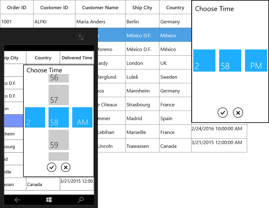
How To
Restrict the input content length
You can restrict the range of input using MaxLength property on GridColumn in below ways.
- Using Converter property in DisplayBinding and ValueBinding
- Using control style
- Overriding existing cell types
Using Converter
You can restrict the length of user input in both display and edit element using Converter using DisplayBinding and ValueBinding.
public class MaxLengthConverter : IValueConverter
{

    public object Convert(object value, Type targetType, object parameter, string language)
    {

        // Define maxLength for column
        int maxLength = 5;

        // Get the ColumnValue
        var columnValue = System.Convert.ToString(value);

        if (columnValue.Length < maxLength)
            return columnValue;

        else
            return columnValue.Substring(0, maxLength);
    }

    public object ConvertBack(object value, Type targetType, object parameter, string language)
    {
        return value;
    }
}<Page.Resources>
<local:MaxLengthConverter x:Key="converter" />
</Page.Resources>
<syncfusion:SfDataGrid x:Name="dataGrid"
AutoGenerateColumns="False"
ItemsSource="{Binding Orders}">
<syncfusion:SfDataGrid.Columns>
<syncfusion:GridTextColumn DisplayBinding="{Binding CustomerName,
Converter={StaticResource converter}}"
HeaderText="Customer Name"
MappingName="CustomerName"
ValueBinding="{Binding CustomerName,
Converter={StaticResource converter}}" />
</syncfusion:SfDataGrid.Columns>
</syncfusion:SfDataGrid>Using control style
You can set the MaxLength property in edit mode by writing style of TargetType edit element of the corresponding column.
NOTE
TextBlock does not have the MaxLength property. Therefore, you can use the converter to format in display.
<Page.Resources>
    <Style TargetType="TextBox">
        <Setter Property="MaxLength" Value="7" />
    </Style>
</Page.Resources>

<syncfusion:SfDataGrid x:Name="dataGrid"
                       AutoGenerateColumns="False"
                       ItemsSource="{Binding Orders}">
    <syncfusion:SfDataGrid.Columns>
        <syncfusion:GridTextColumn  MappingName="CustomerName"/>
    </syncfusion:SfDataGrid.Columns>
</syncfusion:SfDataGrid>
Overriding existing cell types
You can set the MaxLength property to the edit element of the particular column by overriding existing cell types.
Below code, overrides the OnInitializeEditElement method of the corresponding renderer and set the MaxLength to the UIElement and add the renderer to SfDataGrid.CellRenderers collection.
this.dataGrid.CellRenderers.Remove("TextBox");
this.dataGrid.CellRenderers.Add("TextBox", new GridCellTextBoxRendererExt());

public class GridCellTextBoxRendererExt : GridCellTextBoxRenderer
{

    public override void OnInitializeEditElement(DataColumnBase dataColumn, TextBox uiElement, object dataContext)
    {

        if (dataColumn.GridColumn != null && dataColumn.GridColumn.MappingName == "EmployeeName")
        {
            uiElement.MaxLength = 7;
        }

        else
        {
            uiElement.MaxLength = 0;
        }
        base.OnInitializeEditElement(dataColumn, uiElement, dataContext);
    }
}