How can I help you?
Getting started with Typescript Grid
Before we start with the Grid,for common getting started of TypeScript please refer this page provides general information regarding integrating Syncfusion widget’s.
To render the grid control in TypeScript platform, the important step you need to do is to copy the ej.web.all.d.ts file into your project and then need to refer it in your TypeScript application (grid.ts file), so that you will get the intellisense support and also the compile time type-checking.
You can find the ej.web.all.d.ts file in the following location,
(installed location)\Syncfusion\Essential Studio\33.1.44\JavaScript\assets\typescript
Apart from ej.web.all.d.ts file, it is also necessary to make use of the jquery.d.ts file in your TypeScript application, which can be downloaded from here.
In your TypeScript app folder, create “grid.ts” file and now refer these two files within the grid.ts file as shown below,
///
///
Script and CSS Reference
Add the scripts and CSS references to the “index.html” page as the order mentioned below and also define the Grid control.
The Grid control has the following list of external JavaScript dependencies.
Refer to the internal dependencies in the following table.
| File | Description/Usage |
|---|---|
| ej.core.min.js | It is referred always before using all the JS controls. |
| ej.data.min.js | Used to handle data operation and is used while binding data to the JS controls. |
| ej.touch.min.js | Used to handle touch operations in touch-enabled devices |
| ej.print.min.js | Used to handle print operation in JS controls. |
| ej.globalize.min.js | It is referred when using localization in Grid. |
| ej.draggable.min.js | Used for drag and drop an element in JS controls. |
| ej.grid.min.js | The grid's main file. |
| ej.pager.min.js | It is referred when paging is used in the Grid. |
| ej.scroller.min.js | It is referred when scrolling is used in the Grid. |
| ej.waitingpopup.min.js | It is referred when the remote data binding is used in the Grid. The waiting popup shows while requesting the server for data. |
| ej.dropdownlist.min.js | These files are used while enable the Editing and Filtering feature in the Grid. |
| ej.dialog.min.js | |
| ej.button.min.js | |
| ej.autocomplete.min.js | |
| ej.datepicker.min.js | |
| ej.datetimepicker.min.js | |
| ej.timepicker.min.js | |
| ej.checkbox.min.js | |
| ej.editor.min.js | |
| ej.tooltip.js | It is referred when toolbar is enabled in Grid. |
| ej.toolbar.min.js | |
| ej.menu.js | It is referred when excel like filter menu or context menu is enabled. |
| ej.radiobutton.js | It is referred when filtering is enabled. |
| ej.excelfilter.js | It is referred when excel like filter menu is enabled. |
To get started, you can use the ej.web.all.min.js file that encapsulates all the ej controls and frameworks in one single file. So the complete boilerplate code is
<!DOCTYPE html>
<html>
<head>
    <meta name="viewport" content="width=device-width, initial-scale=1.0">
    <meta name="description" content="Essential Studio for JavaScript">
    <meta name="author" content="Syncfusion">
    <title></title>
    <!-- Essential Studio for JavaScript  theme reference -->
    <link rel="stylesheet" href="http://cdn.syncfusion.com/14.4.0.15/js/web/flat-azure/ej.web.all.min.css" />

    <!-- Essential Studio for JavaScript  script references -->
    <script src="https://code.jquery.com/jquery-1.10.2.min.js"></script>
    <script src="http://cdn.syncfusion.com/js/assets/external/jsrender.min.js"></script>
    <script src="http://cdn.syncfusion.com/14.4.0.15/js/web/ej.web.all.min.js"> </script>

    <!-- Add your custom scripts here -->
    <script type="text/javascript" src="grid.js"></script>    <!--Also refer grid.js file here -->
</head>
<body>
    <div id="Grid"></div>       <!-- Define the Grid control-->
</body>
</html>
NOTE
In production, we highly recommend you to use our custom script generator to create custom script file with required controls and its dependencies only. Also to reduce the file size further please use GZip compression in your server.
For themes, you can use the ej.web.all.min.css CDN link from the code example given. To add the themes in your application, please refer to this link.In addition to that, refer the grid.js file in the script section.
Finally build your application, so that the “grid.js” file is automatically generated and got added to your project (User have nothing to do with this file). Now, whatever code changes that you make in grid.ts file will be reflected in grid.js file automatically.
Create a Grid
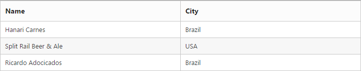
The TypeScript grid can be created from a HTML DIV element with the HTML id attribute set to it and define these steps in “index.html” page.
<!DOCTYPE html>
<html>
     <body>
         <div id="Grid"></div>
         <script>
	       var shipDetails = [
              { Name: 'Hanari Carnes', City: 'Brazil' },
              { Name: 'Split Rail Beer & Ale', City: 'USA' },
              { Name: 'Ricardo Adocicados', City: 'Brazil' }
           ];
        </script>
    </body>
</html>
Initialize the Grid in grid.ts file by using the ej.Grid method. Refer to the following code example.
/// <reference path="tsfiles/jquery.d.ts" />
/// <reference path="tsfiles/ej.web.all.d.ts" />

module GridComponent {
    $(function () {
        var gridInstance = new ej.Grid($("#Grid"), {
           dataSource: shipDetails,
         });
    });
}
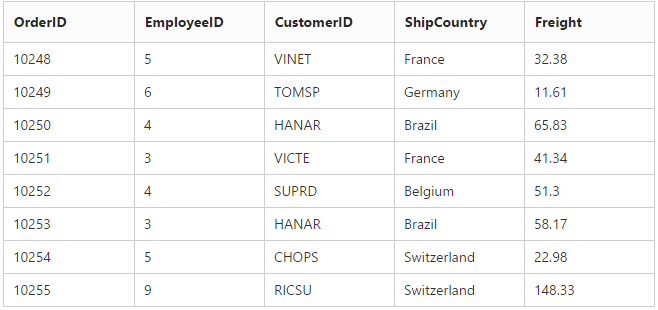
Data Binding
Data binding in the grid is achieved by assigning an array of JavaScript objects to the dataSource property. Refer to the following code example.
<!DOCTYPE html>
<html>
     <body>
         <div id="Grid"></div>
     </body>
</html>/// <reference path="tsfiles/jquery.d.ts" />
/// <reference path="tsfiles/ej.web.all.d.ts" />
module GridComponent {
$(function () {
var gridInstance = new ej.Grid($("#Grid"), {
//The datasource "window['gridData'] is referred from 'http://js.syncfusion.com/demos/web/scripts/jsondata.min.js'
dataSource: window["gridData"];
columns: ["OrderID", "EmployeeID", "CustomerID", "ShipCountry", "Freight"];
});
});
}
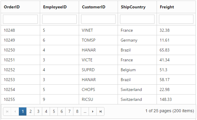
Enable Paging
Paging can be enabled by setting the allowPaging to true. The Paging feature in Grid offers complete navigation support to easily switch between the pages, using the page bar available at the bottom of the Grid control
<!DOCTYPE html>
<html>
     <body>
         <div id="Grid"></div>
     </body>
</html>/// <reference path="tsfiles/jquery.d.ts" />
/// <reference path="tsfiles/ej.web.all.d.ts" />
module GridComponent {
$(function () {
var gridInstance = new ej.Grid($("#Grid"), {
//The datasource "window['gridData'] is referred from 'http://js.syncfusion.com/demos/web/scripts/jsondata.min.js'
dataSource: window["gridData"],
columns : ["OrderID", "EmployeeID", "CustomerID", "ShipCountry", "Freight"],
allowPaging: true,
pageSettings: { pageSize: 8 }
});
});
}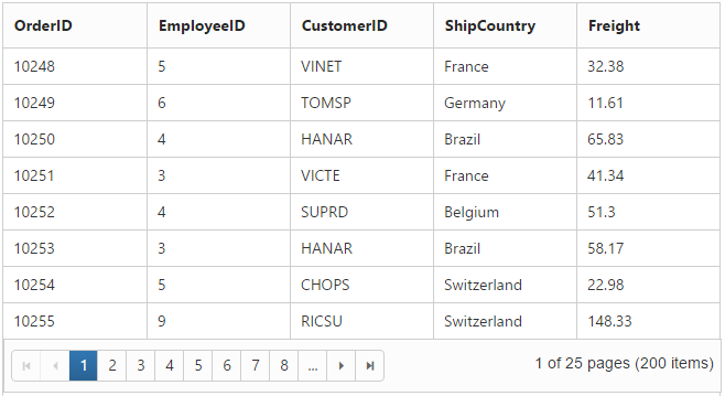
NOTE
Pager settings can be customized by using the
pageSizeofpageSettingsproperty. When it is not given the default values forpageSizeandpageCountare 12 and 8 respectively.
Enable Filtering
Filtering can be enabled by setting the [allowFiltering] (https://help.syncfusion.com/js/api/ejgrid#members:allowfiltering) to be true. By default, the filter bar row is displayed to perform filtering, you can change the filter type by using filterType of filterSetting property.
<!DOCTYPE html>
<html>
     <body>
         <div id="Grid"></div>
     </body>
</html>/// <reference path="tsfiles/jquery.d.ts" />
/// <reference path="tsfiles/ej.web.all.d.ts" />
module GridComponent {
$(function () {
var gridInstance = new ej.Grid($("#Grid"), {
//The datasource "window['gridData'] is referred from 'http://js.syncfusion.com/demos/web/scripts/jsondata.min.js'
dataSource: window["gridData"],
columns : ["OrderID", "EmployeeID", "CustomerID", "ShipCountry", "Freight"],
allowPaging: true,
pageSettings: { pageSize: 8 },
allowFiltering: true
});
});
}
Enable Grouping
Grouping can be enabled by setting the allowGrouping to true. Columns can be grouped dynamically by drag and drop the grid column header to the group drop area. The initial grouping can be done by adding required column names in the groupedColumns of groupSettings property.
<!DOCTYPE html>
<html>
     <body>
         <div id="Grid"></div>
     </body>
</html>/// <reference path="tsfiles/jquery.d.ts" />
/// <reference path="tsfiles/ej.web.all.d.ts" />
module GridComponent {
$(function () {
var gridInstance = new ej.Grid($("#Grid"), {
//The datasource "window['gridData'] is referred from 'http://js.syncfusion.com/demos/web/scripts/jsondata.min.js'
dataSource: window["gridData"],
columns : ["OrderID", "EmployeeID", "CustomerID", "ShipCountry", "Freight"],
allowPaging: true,
pageSettings: { pageSize: 8 },
allowGrouping: true
});
});
}
Refer to the following code example for initial grouping.
<!DOCTYPE html>
<html>
     <body>
         <div id="Grid"></div>
     </body>
</html>/// <reference path="tsfiles/jquery.d.ts" />
/// <reference path="tsfiles/ej.web.all.d.ts" />
module GridComponent {
$(function () {
var gridInstance = new ej.Grid($("#Grid"), {
//The datasource "window['gridData'] is referred from 'http://js.syncfusion.com/demos/web/scripts/jsondata.min.js'
dataSource: window["gridData"],
columns : ["OrderID", "EmployeeID", "CustomerID", "ShipCountry", "Freight"],
allowPaging: true,
pageSettings: { pageSize: 8 },
allowGrouping: true,
groupSettings: { groupedColumns: ["ShipCountry", "CustomerID"] }
});
});
}
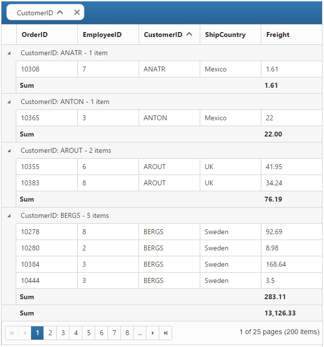
Add Summaries
Summaries can be added by setting the showSummary to true and adding required summary rows and columns in the summaryRows property. For demonstration, Freight column’s sum value is displayed as summary.
<!DOCTYPE html>
<html>
     <body>
         <div id="Grid"></div>
     </body>
</html>/// <reference path="tsfiles/jquery.d.ts" />
/// <reference path="tsfiles/ej.web.all.d.ts" />
module GridComponent {
$(function () {
var gridInstance = new ej.Grid($("#Grid"), {
//The datasource "window['gridData'] is referred from 'http://js.syncfusion.com/demos/web/scripts/jsondata.min.js'
dataSource: window["gridData"],
columns : ["OrderID", "EmployeeID", "CustomerID", "ShipCountry", "Freight"],
allowPaging: true,
pageSettings: { pageSize: 8 },
allowGrouping: true,
groupSettings: { groupedColumns: ["CustomerID"] },
showSummary: true,
summaryRows: [
{
title: "Sum",
summaryColumns: [
{ summaryType: ej.Grid.SummaryType.Sum, displayColumn: "Freight", dataMember: "Freight" }
]
}
]
});
});
}