How can I help you?
Columns in Essential TypeScript Grid
Column definitions are used as the dataSource schema in Grid and it plays vital role in rendering column values in required format. Grid operations such as sorting, filtering, editing would be performed based on the column definitions. The field property of the columns is necessary to map the datasource values in Grid columns.
NOTE
Column Template
HTML templates can be specified in the template property of the particular column as a string (HTML element) or ID of the template’s HTML element.
You can use JsRender syntax in the template. For more information about JsRender syntax, please refer this link.
NOTE
If
fieldis not specified, you will not able to perform editing, grouping, filtering, sorting, search and summary functionalities in particular column.
The following code example describes the above behavior.
<div id="Grid"></div>/// <reference path="tsfiles/jquery.d.ts" />
/// <reference path="tsfiles/ej.web.all.d.ts" />
module GridComponent {
$(function () {
var gridInstance = new ej.Grid($("#Grid"), {
//The datasource "window.employeeView" is referred from 'http://js.syncfusion.com/demos/web/scripts/jsondata.min.js'
dataSource: window["employeeView"],
allowPaging: true,
pageSettings: {
pageSize: 4
},
columns: [
{ headerText: "Photo", template: "<img style='width: 75px; height: 70px' src='Employees/{{:EmployeeID}}.png' />" },
{ field: "EmployeeID" },
{ field: "FirstName" },
{ field: "LastName" },
{ field: "Country" }
]
});
});
}The following output is displayed as a result of the above code example.
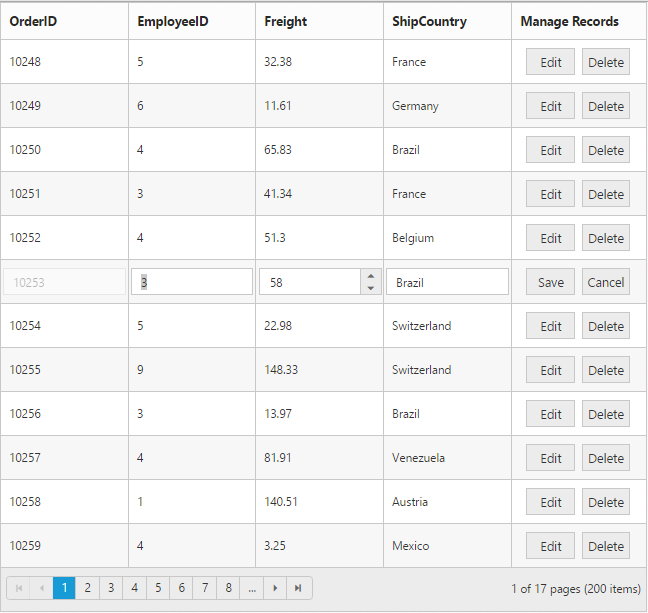
Command Column
Default action buttons
Using command column, you can add CRUD action buttons as one of the Grid column, through type property of commands. The type property supports the below default UnboundType buttons.
- edit
- save
- delete
- cancel
Through buttonOptions property of commands, you can specify all the button options which are supported by Essential Studio JavaScript Button control.
The following code example describes the above behavior.
<div id="Grid"></div>/// <reference path="tsfiles/jquery.d.ts" />
/// <reference path="tsfiles/ej.web.all.d.ts" />
module GridComponent {
$(function () {
var gridInstance = new ej.Grid($("#Grid"), {
//The datasource "window.gridData" is referred from 'http://js.syncfusion.com/demos/web/scripts/jsondata.min.js'
dataSource : window.gridData,
allowPaging : true,
editSettings : {
allowEditing : true,
allowAdding : true,
allowDeleting : true
},
columns : [
{ field: "OrderID", isPrimaryKey: true },
{ field: "EmployeeID" },
{ field: "Freight", editType: "numericedit"},
{ field: "ShipCountry" },
{
headerText : "Manage Records",
commands : [
{ type : "edit", buttonOptions : { text : "Edit" } },
{ type : "delete", buttonOptions : { text : "Delete" } },
{ type : "save", buttonOptions : { text : "Save" } },
{ type : "cancel", buttonOptions : { text : "Cancel" } }
],
width : 150
}
]
});
});
}The following output is displayed as a result of the above code example.
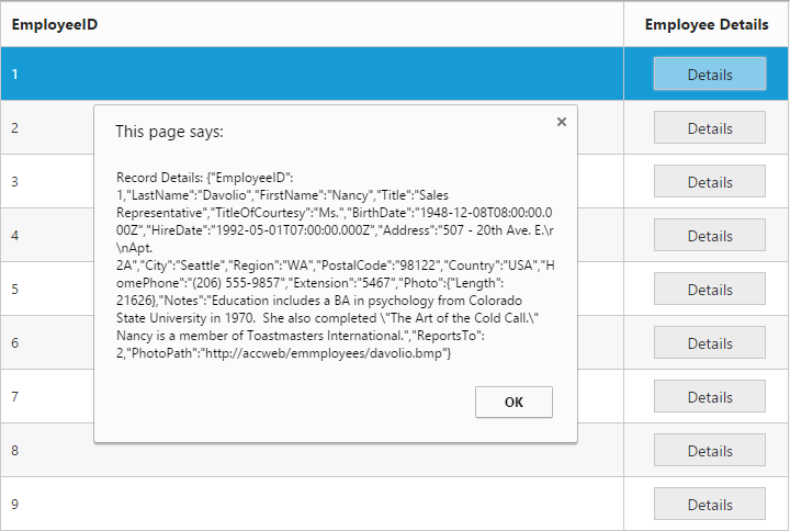
Custom buttons
You can add custom button in the command column by specifying the type property of commands as “empty” or any other string which does not corresponds to default UnboundType buttons.
NOTE
- For
typeproperty you can assign eitherstringvalue (“edit”) orenumvalue (ej.Grid.UnboundType.Edit).- In command column you can add only buttons.
The following code example describes the above behavior.
<div id="Grid"></div>/// <reference path="tsfiles/jquery.d.ts" />
/// <reference path="tsfiles/ej.web.all.d.ts" />
module GridComponent {
$(function () {
var gridInstance = new ej.Grid($("#Grid"), {
//The datasource "window.gridData" is referred from 'http://js.syncfusion.com/demos/web/scripts/jsondata.min.js'
dataSource: window["employeeView"],
columns: [
{ field: "EmployeeID" },
{
headerText: "Employee Details",
commands: [
{ type: "details", buttonOptions: { text: "Details", width: "100", click: "onClick" } }
],
textAlign: ej.TextAlign.Center,
width: 150
}
]
});
});
}
function onClick(args) {
let grid: ej.Grid = $("#Grid").ejGrid("instance");
let index = this.element.closest("tr").index();
let record = grid.getCurrentViewData()[index];
alert("Record Details: " + JSON.stringify(record));
}The following output is displayed as a result of the above code example.
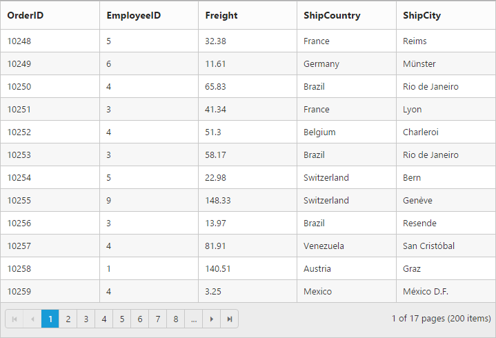
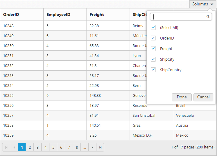
Column Chooser
Column chooser contains the list of all the columns which are defined in the columns property. Using this you can control the visibility of columns in Grid. You can prevent to show the particular column name in column chooser by setting showInColumnChooser property of columns as false.
Column Chooser would be shown in the top right corner of Grid. To enable column chooser, set showColumnChooser property as true.
The following code example describes the above behavior.
<div id="Grid"></div>/// <reference path="tsfiles/jquery.d.ts" />
/// <reference path="tsfiles/ej.web.all.d.ts" />
module GridComponent {
$(function () {
var gridInstance = new ej.Grid($("#Grid"), {
//The datasource "window.gridData" is referred from 'http://js.syncfusion.com/demos/web/scripts/jsondata.min.js'
dataSource: window["gridData"],
allowPaging: true,
showColumnChooser: true,
columns: [
{ field: "OrderID" },
{ field: "EmployeeID", showInColumnChooser: false },
{ field: "Freight" },
{ field: "ShipCity" },
{ field: "ShipCountry" }
]
});
});
}The following output is displayed as a result of the above code example.
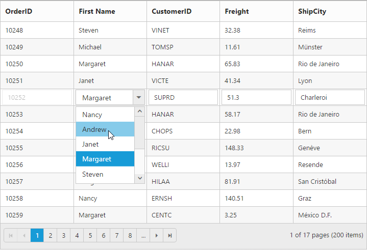
Foreign Key Column
Lookup data source can be bound to dataSource property of columns. Data field and text can be set using foreignKeyField and foreignKeyValue property of columns.
In the dataSource property, we can bound local and remote data.
IMPORTANT
For foreign key column the sorting and grouping is based on
foreignKeyFieldinstead offoreignKeyValue.
NOTE
In remote data, server should be configured to perform select and filter operations since the Grid will try to fetch required columns using select operation and required data using filter operation.
The following code example describes the above behavior.
<div id="Grid"></div>/// <reference path="tsfiles/jquery.d.ts" />
/// <reference path="tsfiles/ej.web.all.d.ts" />
module GridComponent {
$(function () {
var gridInstance = new ej.Grid($("#Grid"), {
//The datasource "window.gridData" and "window.employeeView" is referred from 'http://js.syncfusion.com/demos/web/scripts/jsondata.min.js'
dataSource: window["gridData"],
allowPaging: true,
editSettings: {
allowEditing: true,
allowAdding: true,
allowDeleting: true
},
columns: [
{ field: "OrderID", isPrimaryKey: true },
{ field: "EmployeeID", foreignKeyField: "EmployeeID", foreignKeyValue: "FirstName", dataSource: window["employeeView"], headerText: "First Name" },
//(or)
{ field: "EmployeeID", foreignKeyField: "EmployeeID", foreignKeyValue: "FirstName", dataSource: new ej.DataManager({ url: "http://mvc.syncfusion.com/Services/Northwnd.svc/Employees/" }), headerText: "First Name" },
{ field: "CustomerID" },
{ field: "Freight" },
{ field: "ShipCity" }
]
});
});
}The following output is displayed as a result of the above code example.