Row
20 Dec 201720 minutes to read
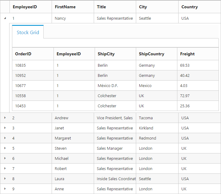
It represents the record details that are fetched from the datasource.
Details Template
It provides a detailed view /additional information about each row of the grid. You can render any type of JsRender template and assign the script template id in the detailsTemplate property. And also you can change the HTML elements in detail template row into JavaScript controls using the detailsDataBound event.
On enabling details template, new column will be added in grid with an expander button in it and that can be expanded or collapsed to show or hide the underlying details of row respectively.
NOTE
It’s a standard way to enclose the template within the
scripttag withtypeas “text/x-jsrender”.
The following code example describes the above behavior.
<div id="Grid"></div>
<script id="tabGridContents" type="text/x-jsrender">
   <div class="tabcontrol" id="Test">
   <ul>
   <li><a href="#gridTab{{:EmployeeID}}">Stock Grid</a></li>
   </ul>
   <div id="gridTab">
   <div id="detailGrid">
   </div>
   </div>
   </div>
</script>/// <reference path="tsfiles/jquery.d.ts" />
/// <reference path="tsfiles/ej.web.all.d.ts" />
module GridComponent {
$(function () {
var gridInstance = new ej.Grid($("#Grid"), {
//The datasource "window.employeeView" is referred from 'http://js.syncfusion.com/demos/web/scripts/jsondata.min.js'
dataSource: window["employeeView"],
detailsTemplate: "#tabGridContents",
detailsDataBound: detailGridData,
columns: ["EmployeeID", "FirstName", "Title", "City", "Country"]
});
});
}
function detailGridData(e: ej.Grid.DetailsDataBoundEventArgs) {
// Here you can get the parent details from "data". EmployeeID is the unique column value in parent row.
var filteredData = e.rowData["EmployeeID"];
// the datasource "window.ordersView" is referred from 'http://js.syncfusion.com/demos/web/scripts/jsondata.min.js'
var data = new ej.DataManager(window["ordersView"]).executeLocal(new ej.Query().where("EmployeeID", ej.FilterOperators.equal, parseInt(filteredData), true).take(5)); // form the query to filter the detail row data by using EmployeeID column value.
//detailsElement contains all the elements which are mentioned in the template.
// Here the detailGrid element is changed as ejGrid control
new ej.Grid($("#detailGrid"), {
dataSource: data,
columns: ["OrderID", "EmployeeID", "ShipCity", "ShipCountry", "Freight"]
});
// Here the element which has tabcontrol class is changed as ejTab control
new ej.Tab($(".tabcontrol"));
}The following output is displayed as a result of the above code example.
Row Template
Row template enables you to set the customized look and behavior to all Grid rows. The rowTemplate property can be used to bind the id of HTML template.
The following code example describes the above behavior.
<div id="Grid"></div>
<script id="templateData" type="text/x-jsrender">
   <tr>
   <td class="photo">
   <img style="width: 130px; height: 160px" src="/13.2.0.29/themes/web/images/employees/{{:EmployeeID}}.png" alt="{{:EmployeeID}}" />
   </td>
   <td class="details">
   <table class="CardTable" cellpadding="3" cellspacing="2">
   <colgroup>
   <col width="50%">
   <col width="50%">
   </colgroup>
   <tbody>
   <tr>
   <td class="CardHeader">First Name </td>
   <td></td>
   </tr>
   <tr>
   <td class="CardHeader">Last Name</td>
   <td></td>
   </tr>
   <tr>
   <td class="CardHeader">Title
   </td>
   <td></td>
   </tr>
   </tbody>
   </table>
   </td>
   </tr>
</script>.photo img {
width: 130px;
}
.photo, .details {
border-color: #c4c4c4;
border-style: solid;
}
.photo {
border-width: 1px 0px 0px 0px;
}
.details {
border-width: 1px 0px 0px 1px;
}
.details > table {
width: 100%;
}
.CardHeader {
font-weight: bolder;
}/// <reference path="tsfiles/jquery.d.ts" />
/// <reference path="tsfiles/ej.web.all.d.ts" />
module GridComponent {
$(function () {
var gridInstance = new ej.Grid($("#Grid"), {
//The datasource "window.employeeView" is referred from 'http://js.syncfusion.com/demos/web/scripts/jsondata.min.js'
dataSource: new ej.DataManager(window["employeeView"]).executeLocal(new ej.Query().take(2)),
rowTemplate: "#templateData", // row template
columns: [
{ headerText: "Photo", width: 30 },
{ headerText: 'Employee Details', width: 70 }
]
});
});
}The following output is displayed as a result of the above code example.

Drag-and-Drop
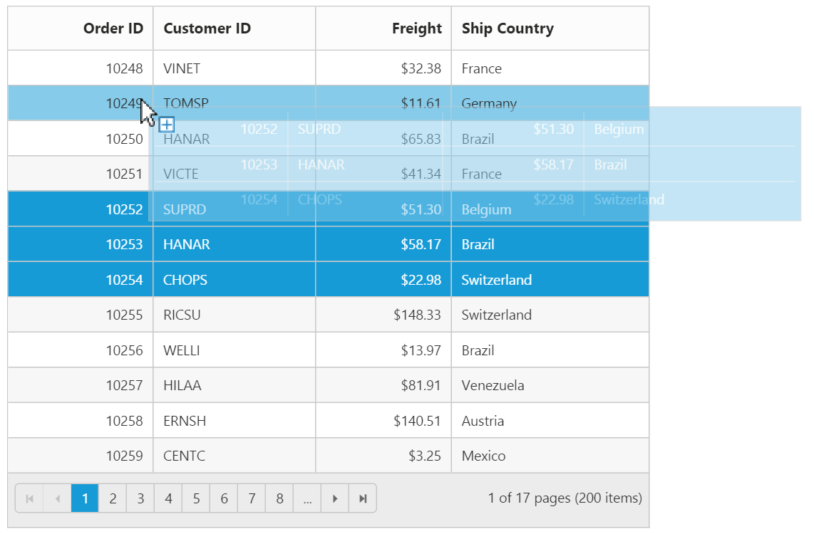
The Grid rows can be reordered, dropped to another Grid or custom control by enabling the allowRowDragAndDrop Grid property.
NOTE
To enable selection of multiple rows by mouse dragging on Grid rows, the
selectionTypeproperty of Grid must be set tomultiple.
Reorder
By simply enabling the property allowRowDragAndDrop, Grid rows can be reordered within the same Grid.
The following code example describes the above behavior.
<div id="Grid"></div>/// <reference path="tsfiles/jquery.d.ts" />
/// <reference path="tsfiles/ej.web.all.d.ts" />
module GridComponent {
$(function () {
var gridInstance = new ej.Grid($("#Grid"), {
// the datasource "window.gridData" is referred from 'http://js.syncfusion.com/demos/web/scripts/jsondata.min.js'
dataSource: window["gridData"],
allowPaging: true,
allowRowDragAndDrop: true,
selectionType: "multiple",
columns: [
{ field: "OrderID", headerText: "Order ID", isPrimaryKey: true, textAlign: ej.TextAlign.Right, width: 80 },
{ field: "CustomerID", headerText: "Customer ID", width: 90 },
{ field: "Freight", headerText: "Freight", textAlign: ej.TextAlign.Right, width: 75, format: "{0:C}" },
{ field: "ShipCountry", headerText: "Ship Country", width: 110 }
]
});
});
}The following output is displayed before reordering rows.
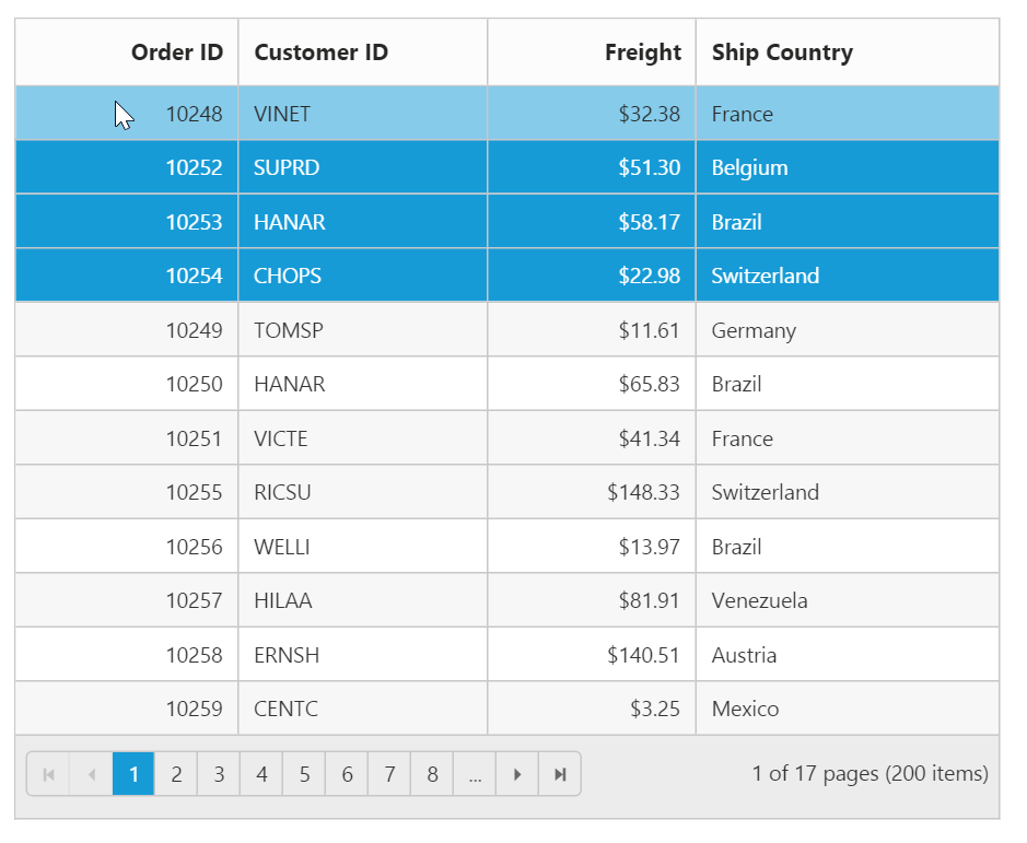
The following output is displayed after reordering rows.
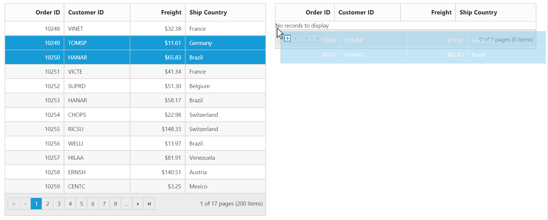
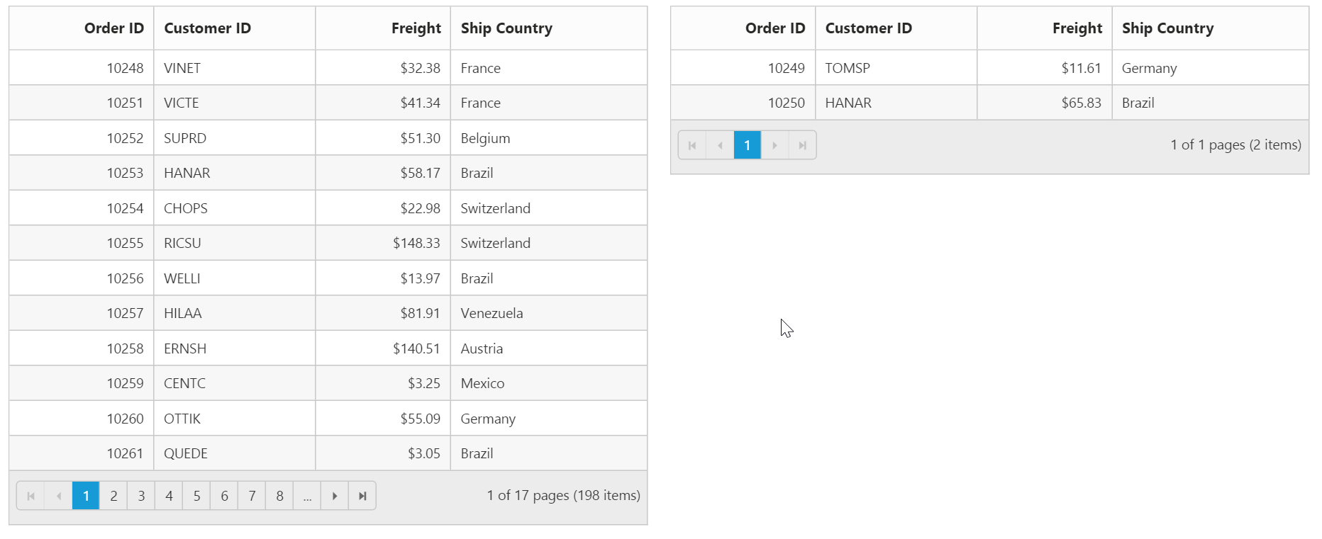
Grid-to-Grid
To drag and drop rows between two Grid, enable the Grid property allowRowDragAndDrop and specify the target Grid ID in dropTargetID property of the Grid rowDropSettings.
The following code example describes the above behavior.
<div id="Grid" style="float:left;width:49%"></div>
<div id="DestinationGrid" style="float:right;width:49%"></div>/// <reference path="tsfiles/jquery.d.ts" />
/// <reference path="tsfiles/ej.web.all.d.ts" />
module GridComponent {
$(function () {
var dataManager = new ej.DataManager("http://js.syncfusion.com/demos/ejServices/Wcf/Northwind.svc/Orders/");
var gridInstance = new ej.Grid($("#Grid"), {
// the datasource "window.gridData" is referred from 'http://js.syncfusion.com/demos/web/scripts/jsondata.min.js'
dataSource: window["gridData"],
allowPaging: true,
allowRowDragAndDrop: true,
selectionType: "multiple",
rowDropSettings: { dropTargetID: "#DestinationGrid" },
columns: [
{ field: "OrderID", headerText: "Order ID", isPrimaryKey: true, textAlign: ej.TextAlign.Right, width: 80 },
{ field: "CustomerID", headerText: "Customer ID", width: 90 },
{ field: "Freight", headerText: "Freight", textAlign: ej.TextAlign.Right, width: 75, format: "{0:C}" },
{ field: "ShipCountry", headerText: "Ship Country", width: 110 }
]
});
var destGridInstance = new ej.Grid($("#DestinationGrid"), {
dataSource: [],
allowPaging: true,
allowRowDragAndDrop: true,
rowDropSettings: { dropTargetID: "#Grid" },
selectionType: "multiple",
columns: [
{ field: "OrderID", headerText: "Order ID", isPrimaryKey: true, textAlign: ej.TextAlign.Right, width: 80 },
{ field: "CustomerID", headerText: "Customer ID", width: 90 },
{ field: "Freight", headerText: "Freight", textAlign: ej.TextAlign.Right, width: 75, format: "{0:C}" },
{ field: "ShipCountry", headerText: "Ship Country", width: 110 }
]
});
});
}The following output is displayed before dropping Grid rows.
The following output is displayed after dropping Grid rows.
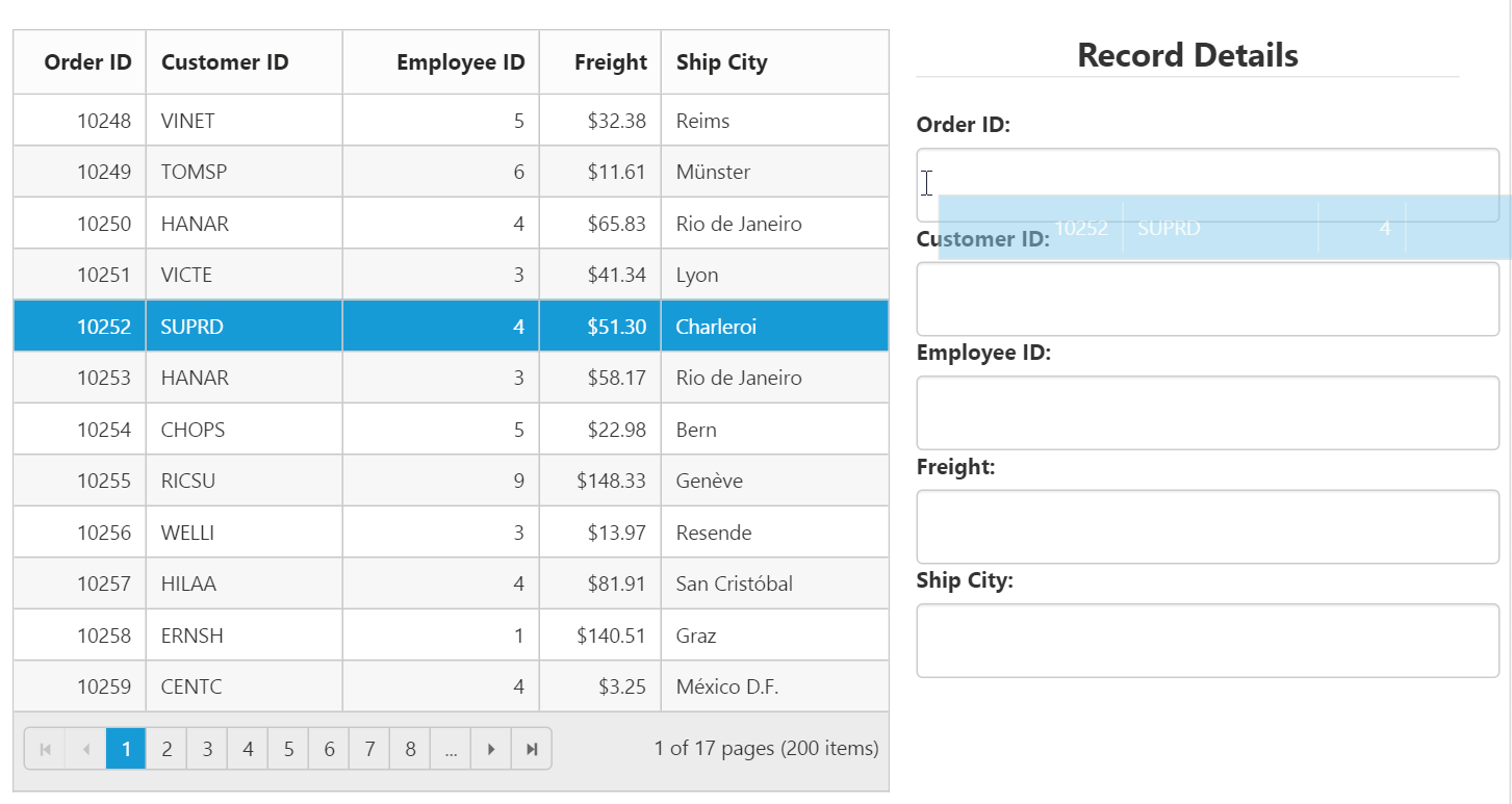
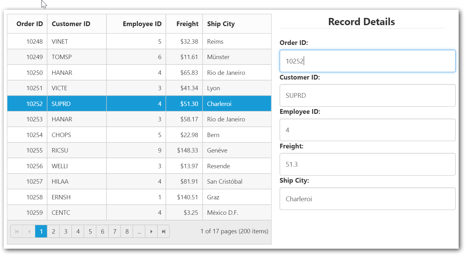
Grid-to-Custom control
You can also drag and drop Grid rows to any custom control. For instance, let it be a form.
Enable the Grid property allowRowDragAndDrop and specify the target form element ID in dropTargetID property of Grid rowDropSettings.
The following code example describes the above behavior.
<div id="Grid" style="float:left;width:60%"></div>
<div style="float:right;width:38%">
<form role="form" id="dropForm" style="width:98%">
                        <fieldset style="text-align:center; font-weight:700"><legend>Record Details</legend></fieldset>
                        <div class="form-group row">
                            <label for="OrderID">Order ID:</label>
                            <input class="form-control" name="OrderID">
                        </div>
                        <div class="form-group row">
                            <label for="CustomerID">Customer ID:</label>
                            <input name="CustomerID" class="form-control">
                        </div>
                        <div class="form-group row">
                            <label for="EmployeeID">Employee ID:</label>
                            <input name="EmployeeID" class="form-control">
                        </div>
                        <div class="form-group row">
                            <label for="Freight">Freight:</label>
                            <input name="Freight" class="form-control">
                        </div>
                        <div class="form-group row">
                            <label for="ShipCity">Ship City:</label>
                            <input name="ShipCity" class="form-control">
                        </div>
                        <br />
                    </form>
</div>/// <reference path="tsfiles/jquery.d.ts" />
/// <reference path="tsfiles/ej.web.all.d.ts" />
module GridComponent {
$(function () {
var gridInstance = new ej.Grid($("#Grid"), {
// the datasource "window.gridData" is referred from 'http://js.syncfusion.com/demos/web/scripts/jsondata.min.js'
dataSource: new ej.DataManager(window["gridData"]),
allowPaging: true,
allowRowDragAndDrop: true,
rowDropSettings: { dropTargetID: "#dropForm" },
rowDrop: rowDropHandler,
columns: [
{ field: "OrderID", headerText: "Order ID", isPrimaryKey: true, textAlign: ej.TextAlign.Right, width: 80 },
{ field: "CustomerID", headerText: "Customer ID", width: 120 },
{ field: "EmployeeID", headerText: "Employee ID", textAlign: ej.TextAlign.Right, width: 120 },
{ field: "Freight", headerText: "Freight", textAlign: ej.TextAlign.Right, width: 75, format: "{0:C}" },
{ field: "ShipCity", headerText: "Ship City", width: 140 }
]
});
});
}
function rowDropHandler(e: ej.Grid.RowDropEventArgs) {
for (var key in e.data[0]) {
$('#dropForm input[name=' + key + ']').val(e.data[0][key]);
}
}The following output is displayed before dropping the rows on Form.
The following output is displayed after dropping the rows on Form.
NOTE
The default behavior of drag and drop between Grid or any other controls is as cut and paste. For copy and paste behavior specify the drag behavior in
dragBehaviorproperty of therowDropSettingsas ej.Grid.DragBehavior.Copy.