Pointers
8 Jan 201824 minutes to read
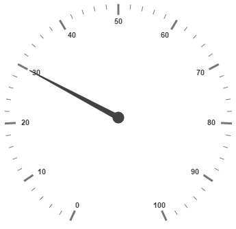
Pointer value points out the actual value set in the Circular Gauge. You can customize the pointers to improve the appearance of Gauge.
Adding Pointer Collection
Pointer collection is directly added to the scale object. To add pointer collection in a Gauge control refer the following code example.
<div id="CircularGauge1"></div>$(function () {
//For circular gauge rendering
$("#CircularGauge1").ejCircularGauge({
scales: [{
pointers: [{
value: 30
}]
}]
})
});Execute the above code to render the following output.
Adding Pointer Value
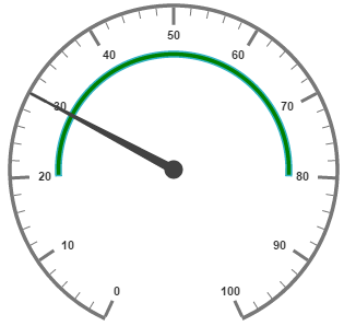
Pointer value is the important element in the Circular Gauge that indicates the Gauge value. Real purpose of the Circular Gauge is based on the pointer value. You can set the pointer value either directly during rendering the control or it can be achieved by public method too.
<div id="CircularGauge1"></div>$(function () {
// For Circular Gauge rendering
$("#CircularGauge1").ejCircularGauge({
scales: [{
showRanges: true,
showScaleBar: true,
radius: 150, size: 2,
ranges: [{
startValue: 20,
endValue: 80,
backgroundColor: "Green",
}],
pointers: [{
value: 30
}]
}]
});
});Execute the above code to render the following output.
Pointer Styles
Colors and Border
The Pointers border is modified with the object called border as in scales. It has two border property called color and width which are used to customize the border color of the pointer and border width of the pointer. You can set the background color to improve the look of the Circular Gauge and you can customize the background color of the scale using backgroundColor. The needle length of circular gauge can be customized using backNeedleLength property.
<div id="CircularGauge1"></div>$(function () {
// For Circular Gauge rendering
$("#CircularGauge1").ejCircularGauge({
scales: [{
showScaleBar: true,
width: 10, radius: 150,
pointers: [{
// For setting pointer border
border: { color: "green", width: 2 },
// For setting pointer background
backgroundColor: "yellow",
// For setting pointer back needle length
backNeedleLength: 10,
// For setting pointer value
value: 45,
// For setting pointer length
length: 100,
// For setting pointer width
width: 16,
// For setting pointer opacity
opacity: 0.6
}]
}]
});
});Execute the above code to render the following output.
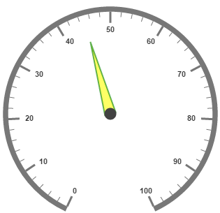
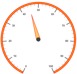
Appearance
Based on the value, thepointer point out the label value. You can set the pointer length and width using length and width property respectively. And you can also adjust the opacity of the pointer using the property opacity which holds the value between 0 and 1. You can add the gradient effects to the pointer using gradients object.
<div id="CircularGauge1"></div>$(function () {
// For Circular Gauge rendering
$("#CircularGauge1").ejCircularGauge({
scales: [{
showScaleBar: true,
backgroundColor: "orange",
border: { width: 2, color: "Red" },
width: 10, radius: 150,
pointers: [{
// For setting pointer border
border: { color: "red", width: 2 },
// For setting pointer background
backgroundColor: "orange",
// For setting pointer value
value: 45,
// For setting pointer length
length: 100,
// For setting pointer width
width: 16,
// For setting pointer opacity
opacity: 0.6
}]
}]
});
});Execute the above code to render the following output.
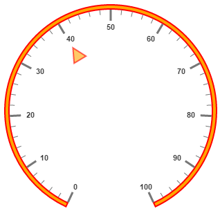
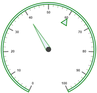
Position the pointer
Pointer can be positioned with the help of two properties such as distanceFromScale and placement. distanceFromScale property defines the distance between the scale and pointer. placement property is used to locate the pointer with respect to scale either inside the scale or outside the scale or along the scale. It is an enumerable data type. Both the property is applied only if pointer type is marker. For needleType marker, it renders with default position that is unchangeable.
<div id="CircularGauge1"></div>$(function() {
// For Circular Gauge rendering
$("#CircularGauge1").ejCircularGauge({
scales: [{
showScaleBar: true,
backgroundColor: "orange",
border: {
width: 2,
color: "red"
},
width: 10,
radius: 150,
pointers: [{
type: "marker",
// For setting marker type
markerType: "triangle",
// For setting pointer position
placement: "near",
// For setting pointer distance from scale
distanceFromScale: 10,
// For setting pointer border
border: {
color: "red",
width: 2
},
// For setting pointer background
backgroundColor: "orange",
// For setting pointer value
value: 40,
// For setting pointer length
length: 20,
// For setting pointer width
width: 20,
// For setting pointer opacity
opacity: 0.6
}]
}]
});
});Execute the above code to render the following output.
Types
-
Circular gauge pointer has two types such as,
-
Needle
-
Marker
-
-
Needle type pointers are the default pointers that cannot be positioned and that is located at the center of the gauge. There are four different shapes of needle pointers such as
-
Rectangle
-
Triangle
-
Trapezoid
-
Arrow
-
Image
-
-
For marker pointer, the available dimensions are
-
Rectangle
-
Triangle
-
Ellipse
-
Diamond
-
Pentagon
-
Circle
-
Slider
-
Pointer
-
Wedge
-
Trapezoid
-
Rounded Rectangle
-
Image
-
Pointer Images
In JavaScript circular gauge, it is possible to replace the pointer with images. We can use image instead of rendering the pointer.
Image with URL
- To implement the pointer image we need to give the API called
imageUrl. It is a string data type. -
Image type pointer is applicable for both marker as well as needle type pointers and it is possible with combine the normal marker pointer type wit image type. The three possibilities are
-
Needle Image
-
Marker Image
-
Marker pointer with Image
-
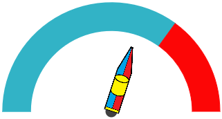
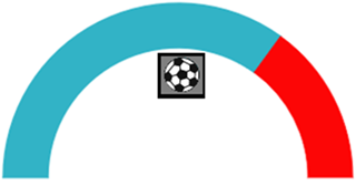
Needle Image
In needleType, needle pointer is completely replaced by image. We can implement it with the help of following snippet.
<div id="CoreCircularGauge"></div>$(function() {
$("#CoreCircularGauge").ejCircularGauge({
// To set frame type as half circle
frame: {
frameType: "halfcircle"
},
// To set scale options
scales: [{
// set basic appearance
showRanges: true,
showLabels: false,
startAngle: 180,
sweepAngle: 180,
radius: 130,
showScaleBar: false,
// To set pointer option
pointers: [{
// To set pointer type as needle
type: "needle",
// To set needle type as image
needleType: "image",
// To set image url for pointer image
ImageUrl: "nib.png",
// To set pointer value
value: 60,
// To set pointer dimension
length: 30,
width: 100,
}],
// To set tick options
ticks: [{
height: 0,
width: 0
}],
// To set range options
ranges: [{
distanceFromScale: -30,
startValue: 0,
endValue: 70,
size: 40,
}, {
distanceFromScale: -30,
startValue: 70,
endValue: 110,
backgroundColor: "#fc0606",
border: {
color: "#fc0606"
},
size: 40,
}]
}]
});
});Execute the above code to render the following output.
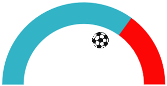
Marker Image
In markerType, marker pointer is completely replaced by image. We can implement it with the help of following snippet.
<div id="CoreCircularGauge"></div>$(function () {
$("#CoreCircularGauge").ejCircularGauge({
// To set frame type as half circle
frame: {
frameType: "halfcircle"
},
// To set scale options
scales: [{
// set basic appearance
showRanges: true,
showLabels: false,
startAngle: 180,
sweepAngle: 180,
radius: 130,
showScaleBar: false,
// To set pointer option
pointers: [{
// To set pointer type as marker
type: "marker",
// To set needle type as image
markerType: "image",
// To set image url for pointer image
ImageUrl: "ball.png",
// To set pointer value
value: 60,
// To set pointer dimension
length: 30,
width: 100,
}],
// To set tick options
ticks: [{
height: 0,
width: 0
}],
// To set range options
ranges: [{
distanceFromScale: -30,
startValue: 0,
endValue: 70,
size: 40,
}, {
distanceFromScale: -30,
startValue: 70,
endValue: 110,
backgroundColor: "#fc0606",
border: {
color: "#fc0606"
},
size: 40,
}]
}]
});
});Execute the above code to render the following output.
Marker Pointer with Image
In this type, marker pointer is drawn first and then image also loaded. We can implement it with the help of following snippet.
<div id="CoreCircularGauge"></div>$(function () {
$("#CoreCircularGauge").ejCircularGauge({
// To set frame type as half circle
frame: { frameType: "halfcircle" },
// To set scale options
scales: [{
// set basic appearance
showRanges: true, showLabels: false,
startAngle: 180, sweepAngle: 180, radius: 130,
showScaleBar: false,
// To set pointer option
pointers: [{
// To set pointer type as marker
type: "marker",
// To set needle type as rectangle
markerType: "rectangle",
// To set image url for pointer image
ImageUrl: "ball.png",
// To set pointer value
value: 50,
// To set pointer dimension
length: 30,
width: 100,
border: { color: "Black", width: 3 }
}],
// To set tick options
ticks: [{ height: 0, width: 0 }],
// To set range options
ranges: [{
distanceFromScale: -30,
startValue: 0,
endValue: 70, size: 40,
}, {
distanceFromScale: -30,
startValue: 70,
endValue: 110,
backgroundColor: "#fc0606",
border: { color: "#fc0606" }, size: 40,
}]
}]
});
});Execute the above code to render the following output.
Multiple Pointers
Circular Gauge can have multiple pointers on it. You can use any combination and any number of pointers in a Gauge. That is, a Gauge can contain any number of marker pointer and any number of needle pointers. Refer the following code example containing two pointers.
<div id="CircularGauge1"></div>$(function () {
// For Circular Gauge rendering
$("#CircularGauge1").ejCircularGauge({
scales: [{
showScaleBar: true,
backgroundColor: "#DCEBF9",
border: { width: 2, color: "Green" },
width: 10, radius: 150,
pointers: [
// For setting pointer1
{
border: { color: "Green", width: 2 },
backgroundColor: "#DCEBF9",
value: 40,
length: 100,
width: 16,
opacity: 0.6
},
// For setting pointer2
{
distanceFromScale: 20,
placement: "near",
type: "marker",
markerType: "triangle",
length: 20,
width: 20,
value: 60,
backgroundColor: "#DCEBF9",
border: { color: "Green", width: 2 },
}]
}]
});
});Execute the above code to render the following output.
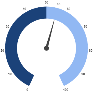
Pointer Value Text
Gauge pointerValueText is used to display the current value of the pointer in the Circular Gauge control.
Positioning the text
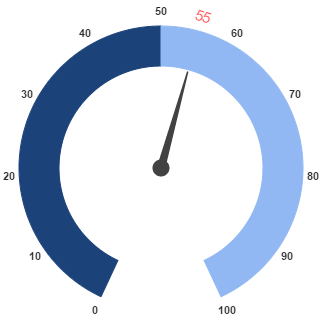
You can position the Circular Gauge pointer value with the gauge as center by using the API called distance. You can Disable/ Enable these pointers value by using the API showValue.
<div id="CircularGauge1"></div>$(function () {
$("#CircularGauge1").ejCircularGauge({
// Setting basic properties
radius: 100, value: 55, backgroundColor: "transparent",
// Setting scale values
scales: [{
showRanges: true,
// Setting tick properties
ticks: [{ height: 0, width: 0 }],
// Setting range properties
ranges: [
{ size: 40, startValue: 0, endValue: 50, backgroundColor: "#1B4279", border: { color: "#1B4279" } },
{ size: 40, startValue: 50, endValue: 100, backgroundColor: "#91B8F3", border: { color: "#91B8F3" } }
],
// Setting pointer properties
pointers: [{
// Setting pointer value text properties
pointerValueText: {
// enable showValue property
showValue: true,
// setting distance property
distance: 0,
color: "#8c8c8c" }
}],
}],
});
});Run the above code to render the output as follows.
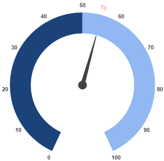
Appearance
Appearance of the Circular Gauge pointerValueText is adjusted by using four properties. Such as color, angle, autoAngle and opacity.
-
colorproperty is used to set the color of the pointer value text. -
angleproperty is used to set the angle in which the text is displayed. -
autoAngleis used to display the text in certain angle based on pointer position angle. -
opacityis used to customize the brightness of the text.
<div id="CircularGauge1"></div>$(function () {
$("#CircularGauge1").ejCircularGauge({
// Setting basic properties
radius: 100, value: 55, backgroundColor: "transparent",
// Setting scale values
scales: [{
showRanges: true,
// Setting tick properties
ticks: [{ height: 0, width: 0 }],
// Setting range properties
ranges: [
{ size: 40, startValue: 0, endValue: 50, backgroundColor: "#1B4279", border: { color: "#1B4279" } },
{ size: 40, startValue: 50, endValue: 100, backgroundColor: "#91B8F3", border: { color: "#91B8F3" } }
],
// Setting pointer properties
pointers: [{
// Setting pointer value text properties
pointerValueText: {
showValue: true,
distance: 0,
// Setting color property
color: "Red",
// Setting opacity property
opacity: 0.7,
// Setting angle property
angle: 20
}
}],
}],
});
});Run the above code to render the output as follows.
Font Options
Similar to other collection, font option is also available in this pointer value text such as size, fontFamily and fontStyle.
<div id="CircularGauge1"></div>$(function () {
$("#CircularGauge1").ejCircularGauge({
// Setting basic properties
radius: 100, value: 55, backgroundColor: "transparent",
// Setting scale values
scales: [{
showRanges: true,
// Setting tick properties
ticks: [{ height: 0, width: 0 }],
// Setting range properties
ranges: [
{ size: 40, startValue: 0, endValue: 50, backgroundColor: "#1B4279", border: { color: "#1B4279" } },
{ size: 40, startValue: 50, endValue: 100, backgroundColor: "#91B8F3", border: { color: "#91B8F3" } }
],
// Setting pointer properties
pointers: [{
// Setting pointer value text properties
pointerValueText: {
showValue: true,
distance: 0,
color: "Red",
opacity: 0.7,
angle: 20,
//setting font option
font: {
size: "15px",
fontStyle: "Normal",
fontFamily: "Arial",
}
}
}],
}],
});
});Run the above code to render the output as follows.