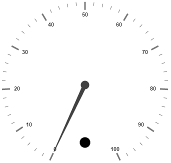
- Adding Indicator Collection
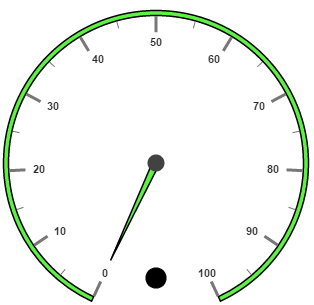
- Basic Customization
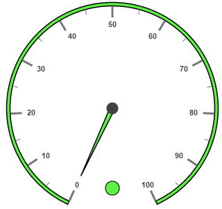
- State Ranges
- Multiple Indicators
Contact Support
Indicators
10 Aug 201820 minutes to read
Indicators simply indicates the current status of the pointer. indicators are in several formats such as in shape format, textual format and image format.
Adding Indicator Collection
Indicators collection is directly added to the scale object. Refer the following code to add indicator collection in a Gauge control.
<div id="CircularGauge1"></div>$(function () {
//For circular gauge rendering
$("#CircularGauge1").ejCircularGauge({
scales: [{
showIndicators: true,
indicators: [{
// For setting indicator height
height: 10,
// For setting indicator width
width: 10,
// For setting indicator type
type: "circle",
// For setting indicator value
value: 0,
// For setting indicator position
position: { x: 185, y: 300 },
}]
}]
});
});Execute the above code to render the following output.
Basic Customization
You can enable indicators by setting the showIndicators property to ‘true’. The height and width properties of the indicators are used to specify the area allocated to the indicator for the width and height. You can use the position collection to position the indicators along with x-axis and y-axis.
The indicator can be displayed in the following shapes in circular gauge: circle, rectangle, rounded rectangle, text, triangle, diamond, trapezoid, pentagon, wedge, star, ellipse,horizontal line, vertical line, cross, up arrow, down arrow, right arrow, left arrow, and right arrow. By using the type property, you can set the desired type to indicators.
For image type, the imageUrl property is used.
<div id="CircularGauge1"></div>$(function () {
// For Circular Gauge rendering
$("#CircularGauge1").ejCircularGauge({
scales: [{
showIndicators: true, minorIntervalValue: 5,
backgroundColor: "#5DF243",
border: { width: 1.5, color: "black" },
showScaleBar: true, radius: 150, size: 5,
pointers: [{
backgroundColor: "#5DF243",
border: { width: 1.5, color: "black" },
length: 110
}],
indicators: [{
// For setting indicator height
height: 10,
// For setting indicator width
width: 10,
// For setting indicator type
type: "circle",
// For setting indicator value
value: 0,
// For setting indicator position
position: { x: 185, y: 300 },
}],
}]
});
});Execute the above code to render the following output.
State Ranges
State Ranges are used to specify the indicator behavior in the specified region. Use startValue and endValue to set the range bound for the pointer. Whenever the pointer cross the specified region, the indicator attributes are applied for ranges.
The backgroundColor and borderColor sets the appearance behavior for the indicators. For text type indicators you can give value for text. And text can be changed whenever the pointer crosses its state range area. There are many basic font options available for the text in the state range such as size, fontStyle and fontFamily.
<div id="CircularGauge1"></div>$(function () {
// For Circular Gauge rendering
$("#CircularGauge1").ejCircularGauge({
scales: [{
showIndicators: true, minorIntervalValue: 5,
backgroundColor: "#5DF243",
border: { width: 1.5, color: "black" },
showScaleBar: true, radius: 150, size: 5,
pointers: [{
backgroundColor: "#5DF243",
border: { width: 1.5, color: "black" },
length: 110
}],
indicators: [{
// For setting indicator height
height: 10,
// For setting indicator width
width: 10,
// For setting indicator type
type: "circle",
// For setting indicator value
value: 0,
// For setting indicator position
position: { x: 185, y: 300 },
// For setting indicator state range collection
stateRanges: [{
// For setting state range end value height
endValue: 100,
// For setting state range start value
startValue: 0,
// For setting indicator background color
backgroundColor: "#5DF243",
// For setting indicator border color
borderColor: "Black",
// For setting indicator text
text: "",
// For setting indicator text color
textColor: "#870505"
}]
}],
}]
});
});Execute the above code to render the following output.
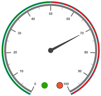
Multiple Indicators
You can use multiple indicators for a single Gauge. Each indicator have a list of stateRanges. Refer the following code example for multiple Indicators.
To specify value of the text as the indicator when the indicator style is set with the value text of circular gauge.
<div id="CircularGauge1"></div>$(function () {
// For Circular Gauge rendering
$("#CircularGauge1").ejCircularGauge({
scales: [{
readOnly: false,
showIndicators: true, showRanges: true,
minorIntervalValue: 5,
showScaleBar: true, radius: 150, size: 5,
pointers: [{
length: 110, value: 70
}],
ranges: [{
startValue: 0, endValue: 50,
backgroundColor: "Green",
placement: "far", distanceFromScale: -30
},
{
startValue: 50, endValue: 100,
backgroundColor: "red",
placement: "far", distanceFromScale: -30
}],
indicators: [
//Indicator1
{
height: 10,
width: 10,
type: "circle",
value: 0,
position: { x: 165, y: 300 },
stateRanges: [{
endValue: 50,
startValue: 0,
backgroundColor: "#24F92F",
borderColor: "Black"
}, {
endValue: 50,
startValue: 100,
backgroundColor: "#322C04",
borderColor: "Black"
}]
},
//Indicator2
{
height: 10,
width: 10,
type: "circle",
value: 0,
position: { x: 215, y: 300 },
stateRanges: [{
endValue: 50,
startValue: 0,
backgroundColor: "#600000",
borderColor: "Black"
}, {
endValue: 100,
startValue: 50,
backgroundColor: "#FF4F2A",
borderColor: "Black"
}]
}],
}]
});
});Execute the above code to render the following output.