- Adding Label Collection
- Label Customization
- Multiple Labels
Contact Support
Labels
16 Nov 201712 minutes to read
Labels are units that are used to display the values in the scales. You can customize labels with the properties like angle, color, font, opacity, etc.
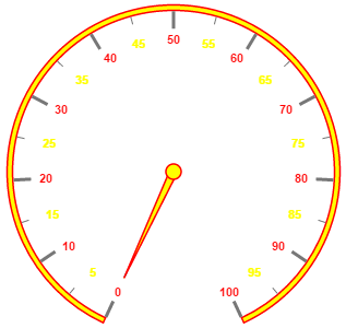
Adding Label Collection
Label collection is directly added to the scale object. Refer the following code example to add label collection in a Gauge.
<div id="CircularGauge1"></div>$(function () {
//For circular gauge rendering
$("#CircularGauge1").ejCircularGauge({
scales: [{
labels: [{
angle: 30
}]
}]
})
});Execute the above code to render the following output.
Label Customization
Appearance
The attribute angle is used to display the labels in the specified angles and color attribute is used to display the labels in specified color. You can adjust the opacity of the label with the property opacity and the values of it lies between 0 and 1. You can adjust the labels based on the tick’s direction by setting autoAngle as true. includeFirstValue is an special property especially used in some special scenarios such as in clock, where the value 0 needs to be replaced with that of 12. By enabling this property the first value of the label is not rendered.
Font option is also available on the labels. The basic three properties of font such as size, family and style can be achieved by size, fontStyle and fontFamily. Labels are two types such as major and minor.Major types labels are for major interval values and minor types labels are for minor interval values.
<div id="CircularGauge1"></div>$(function () {
// For Circular Gauge rendering
$("#CircularGauge1").ejCircularGauge({
scales: [{
showScaleBar: true,
backgroundColor: "#FAF4B5",
border: { width: 2, color: "Yellow" },
width: 10, radius: 150,
pointers: [{
border: { color: "Yellow", width: 2 },
backgroundColor: "#FAF4B5",
value: 40, length: 100,
width: 16,
opacity: 0.6
}],
labels: [{
// For setting label angle
angle: 10,
// For setting label opacity
opacity: 0.8,
// For disable the include first value property
includeFistValue: false,
// For setting label color
color: "Yellow",
// For setting label font
font: {
size: "15px",
fontFamily: "Arial",
fontStyle: "bold"
}
}]
}]
});
});Execute the above code to render the following output.
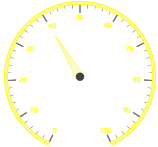
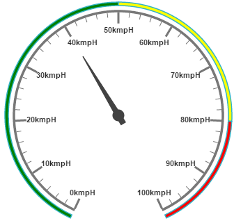
Unit text and Position
unitText is used to add some text along with the labels. For example, in speedometer, you need to mention the units in kph. You can also add the unit text in front of the labels. You can achieve this by using an enumerable property unitTextPosition. With this you can position the unit text in front or back.
Labels can be positioned with the help of two properties such as distanceFromScale and placement. distanceFromScale property defines the distance between the scale and labels. Placement property is used to locate the labels with respect to scale either inside the scale or outside the scale or along the scale. It is an enumerable data type.
<div id="CircularGauge1"></div>$(function () {
// For Circular Gauge rendering
$("#CircularGauge1").ejCircularGauge({
scales: [{
showRanges: true,
showScaleBar: true,
radius: 150, size: 2,
pointers: [{
value: 40,
showBackNeedle: true,
length: 100
}],
labels: [{
// For setting unit text
unitText: "kmpH",
// For setting unit text position
unitTextPosition: "back"
}],
ranges: [{ startValue: 0, endValue: 50, backgroundColor: "Green", placement: "far", distanceFromScale: -30 },
{ startValue: 50, endValue: 80, backgroundColor: "yellow", placement: "far", distanceFromScale: -30 },
{ startValue: 80, endValue: 100, backgroundColor: "red", placement: "far", distanceFromScale: -30 }]
}]
});
});Execute the above code to render the following output.
Multiple Labels
You can achieve multiple labels such as minor and major type in a Gauge sample scale. Refer the following code example for multiple labels variation.
<div id="CircularGauge1"></div>$(function () {
// For Circular Gauge rendering
$("#CircularGauge1").ejCircularGauge({
scales: [{
showRanges: true, minorIntervalValue: 5,
backgroundColor: "yellow",
border: { width: 1.5, color: "Red" },
showScaleBar: true, radius: 150, size: 5,
pointerCap: {
backgroundColor: "yellow",
borderColor: "Red", borderWidth: 1.5
},
labels: [
// For setting label1
{ type: "minor", color: "yellow" },
// For setting label2
{ type: "major", color: "Red" }],
pointers: [{
backgroundColor: "yellow",
border: { width: 1.5, color: "Red" },
length: 110
}]
}]
});
});Execute the above code to render the following output.