Contact Support
Interaction and Animation
8 Jan 20187 minutes to read
Interaction
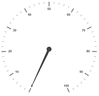
Circular Gauge control contains Interaction feature. You can use this interaction feature to change the pointer values manually. You can achieve this by clicking and dragging the pointer over the Gauge and you can see the value of pointer changes dynamically while dragging. To Enable/Disable the user interaction you can use the Boolean property called readOnly. The user interaction option is enabled when you set the value as false for the property readOnly.By default it holds the true value.That is by default it does not support interaction.
<div id="CircularGauge1"> </div>$(function () {
// For Circular Gauge rendering
$("#CircularGauge1").ejCircularGauge({
// For User interaction
readOnly: false,
})
});Execute the above code to render the following output.

Animations
Circular Gauge contains an attractive concept called Animation. The animation option enables the pointer to rotate from the minimum value to the current value with animation effects. By using this animation you can change the pointer value dynamically.You can apply the animation on pointer either by clockwise or counterclockwise based on the scale direction. You can enable / disable it using the property enableAnimation. Animation is enabled when you set enableAnimation as ‘true’. By default it holds the true value. You can control the speed of the pointer during animating by using the property animationSpeed. It is a numerical value that holds the time in milliseconds. That is when the value is given as 1000, it is considered as 1 second.
<div id="CircularGauge1"></div>$(function () {
// For Circular Gauge rendering
$("#CircularGauge1").ejCircularGauge({
// For enabling animation
enableAnimation: true,
// For setting animation speed
animationSpeed:1000
})
});Execute the above code to render the following output.

Gradient
You can change the interior gradient of circular gauge by using interiorGradient property. The isRadialGradient property is used to check whether the gradient is circular or not.
<div id="CircularGauge1"></div>$(function () {
$("#CircularGauge1").ejCircularGauge({
interiorGradient: { colorInfo:[{colorStop : 0, color:"#FFFFFF"},{colorStop : 1, color:"#AAAAAA"}] },
isRadialGradient : true,
})
});Distance From Corner
You can display the circular gauge from distance apart from the corner by specifying value for distanceFromCorner property.
<div id="CircularGauge1"></div>$(function () {
$("#CircularGauge1").ejCircularGauge({
distanceFromCorner :25
})
});Resize
Circular gauge can be responsive while resizing by specifying enableResize property as true.
<div id="CircularGauge1"></div>$(function () {
$("#CircularGauge1").ejCircularGauge({
enableResize: true
})
});Circular Gauge is made responsive when resizing the browser by using isResponsive property.
$("#CircularGauge1").ejCircularGauge({
                    isResponsive: true,
                });
Localization
The circular gauge can be localized based on name of culture specified in locale property.
<div id="CircularGauge1"></div>$(function () {
$("#CircularGauge1").ejCircularGauge({
locale : "en-US"
})
});Enable Group Separator is used to Convert the date object to string while using the locale settings, you can set enableGroupSeparator property as true.
<div id="CircularGauge1"></div>

<script>
        $("#CircularGauge1").ejCircularGauge({
            locale : "en-US" ,
            enableGroupSeparator: true
            });
</script>
Themes
CircularGauge theme is a set of pre-defined options that are applied to the control before CircularGauge is instantiated. Following predefined themes are available in JavaScript CircularGauge.
- flatlight
- flatdark
- gradientlight
- gradientdark
- azure
- azuredark
- lime
- limedark
- saffron
- saffrondark
- gradientazure
- gradientazuredark
- gradientlime
- gradientlimedark
- gradientsaffron
- gradientsaffrondark
The theme for circular gauge can be specified using theme property.
<div id="CircularGauge1"></div>$(function () {
$("#CircularGauge1").ejCircularGauge({
theme : "flatlight"
})
});Circular Gauge Values
The minimum, maximum, radius and value attributes of circular gauge are used to render the circular gauge with specified location.
<div id="CircularGauge1"></div>$(function () {
$("#CircularGauge1").ejCircularGauge({
maximum: 120,
minimum: 10,
value: 30,
radius: 100
})
});