Getting Started
4 Jan 201824 minutes to read
This section encompasses how to configure Circular Gauge. You can provide data to a Circular Gauge and make them to display in a required way.
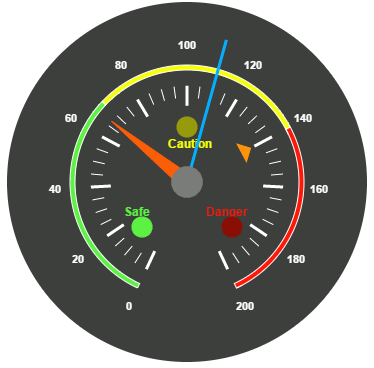
The following screen shot displays a Circular Gauge, which visually represents the functions of an Automobile speedometer with RPM (Rotation per Minute), kph (Kilometer per hour) and it denotes the speed level indicators (Safe, Caution and Danger).

Create a Circular Gauge
First create an HTML file and add references to the required libraries.
<!DOCTYPE html>
<html xmlns="http://www.w3.org/1999/xhtml">
<head>
    <meta name="viewport" content="width=device-width, initial-scale=1.0" />
    <meta charset="utf-8" />
    <link href="http://cdn.syncfusion.com/28.1.33/js/web/flat-azure/ej.web.all.min.css" rel="stylesheet" />
    <!--scripts-->
    <script src="http://cdn.syncfusion.com/js/assets/external/jquery-1.10.2.min.js"></script>
    <script src="http://cdn.syncfusion.com/28.1.33/js/web/ej.web.all.min.js">                                                               </script>
</head>
Add a div element that acts as a container for ejCircularGauge widget.
<body>
    <div id="CircularGauge1"></div>
</body>
</html>
Create the ejCircularGauge widget as follows,
$(function () {
$("#CircularGauge1").ejCircularGauge();
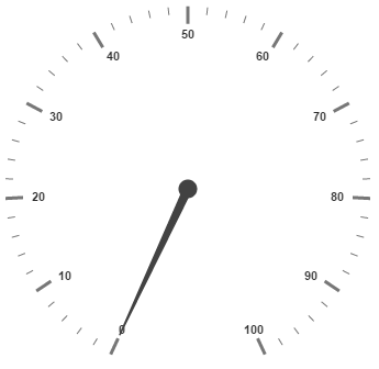
});On executing the above code, sample renders a default Circular Gauge with default values as follows.
Set Height and Width values
Pointers have different height and range. You can set the height and width of the gauge.
$("#CircularGauge1").ejCircularGauge({
        width: 500,
        height: 500,
    });
The following screenshot displays a Gauge in which height and width are set.

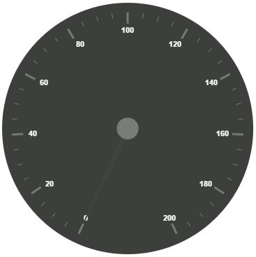
Set Background Color
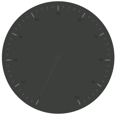
You can draw the speedometer with dark backgroundColor and to vary the speed of the pointer, set the readOnly option as False for user interaction.
$("#CircularGauge1").ejCircularGauge({
        width: 500,
        height: 500,
        backgroundColor: "#3D3F3D",
        readOnly: false,
    });
The above code example renders a Gauge as shown in the following screen shot.
Provide scale values
-
The
scalesvalues specifies the pointers, ticks, labels, indicators and ranges of Circular Gauge. -
You can customize the
pointerCapusing the following options- Capradius, CapborderColor, capbackgroundColor, pointer capborderWidth. -
Set the
maximumspeed limit in the Gauge as 200KmpH. -
Major Ticks and Minor Ticks have the
majorIntervalValue20 andminorIntervalValue5 respectively. TheshowRangesandshowIndicatorsare used to display the ranges and indicators in their respective positions.
$("#CircularGauge1").ejCircularGauge({
width: 500,
height: 500,
backgroundColor: "#3D3F3D",
readOnly: false,
scales: [{
showRanges: true,
showIndicators: true,
pointerCap: {
radius: 15,
borderWidth: 0,
backgroundColor: "#797C79",
borderColor: "#797C79"
},
maximum: 200,
majorIntervalValue: 20,
minorIntervalValue: 5,
//Add the labels customization code here
//Add the pointers customization code here
//Add the ticks customization code here
//Add the ranges customization code here
//Add the indicators customization code here
//Add the Custom labels customization code here
}]
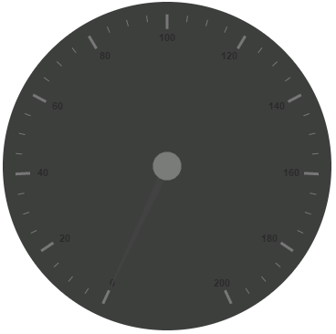
});On executing the above code, sample renders a Circular Gauge with customized labels as follows.
Add Label Customization
To display the values in the Gauge, scale labels are used. You can customize the label color.
$("#CircularGauge1").ejCircularGauge({
        width: 500,
        height: 500,
        backgroundColor: "#3D3F3D",
        readOnly: false,
        scales: [{
            //Add the labels customization code here
            labels: [{
                color: "#ffffff"
            }],
            //Add the pointers customization code here
            //Add the ticks customization code here
            //Add the ranges customization code here
            //Add the indicators customization code here
            //Add the Custom labels customization code here
        }]
    });
On executing the above code, sample renders a default Circular Gauge with customized labels as follows.
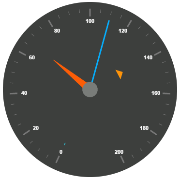
Add pointer data
You can use three pointers that denote kilometer value, rotation per minute value and torque value.The torque value pointer should not be similar to other two pointers. Set the torque pointer as marker pointer. You can set other attributes for pointer such as value, showBackNeedle, type, markerType, needleType, backgroundColor, border color, length, width, radius and distanceFromScale.
$("#CircularGauge1").ejCircularGauge({
        width: 500,
        height: 500,
        backgroundColor: "#3D3F3D",
        readOnly: false,
        scales: [{
            //Add the labels customization code here
            //Add the pointers customization code here
            pointers: [{
                value: 140,
                distanceFromScale: 60,
                showBackNeedle: false,
                length: 20,
                type: "marker",
                markerType: "triangle",
                width: 10,
                radius: 10,
                backgroundColor: "#FF940A",
                border: {
                    color: "#FF940A"
                },
            },
            {
                value: 110,
                showBackNeedle: false,
                length: 150,
                width: 2,
                radius: 10,
                needleType: "rectangle",
                backgroundColor: "#05AFFF",
                border: {
                    color: "#05AFFF"
                },
            }, {
                value: 67,
                showBackNeedle: false,
                length: 100,
                width: 15,
                radius: 10,
                backgroundColor: "#FC5D07",
                border: {
                    color: "#FC5D07"
                },
            }],
            //Add the ticks customization code here
            //Add the ranges customization code here
            //Add the indicators customization code here
            //Add the Custom labels customization code here
        }]
    });
On executing the above code, sample renders a customized Circular Gauge as follows.
Add Tick Details
You can display the tick value with customization as given in the following code example. You can set width and height of the Major ticks greater than the Minor ticks. You can set dark background for tick color to have a better visibility. You can specify the tick type either major or minor type tick and distanceFromScale values.
$("#CircularGauge1").ejCircularGauge({
        width: 500,
        height: 500,
        backgroundColor: "#3D3F3D",
        readOnly: false,
        scales: [{
            //Add the labels customization code here
            //Add the pointers customization code here
            //Add the ticks customization code here
            ticks: [{
                type: "major",
                distanceFromScale: 70,
                height: 20,
                width: 3,
                color: "#ffffff"
            }, {
                type: "minor",
                height: 12,
                width: 1,
                distanceFromScale: 70,
                color: "#ffffff"
            }],
            //Add the ranges customization code here
            //Add the indicators customization code here
            //Add the Custom labels customization code here
        }]
    });
On executing the above code, sample renders a Circular Gauge with customized labels as follows.

Add Range Values
Ranges denote the property of scale value in the speedometer. The color values of the ranges specify the speed variation. Set showRanges property to “true” to show the ranges in the Circular Gauge. Select safe zone for low speed, caution zone for moderate speed and high zone for high speed.You can customize the range with the properties such as startValue, endValue, startWidth, endWidth, backgroundColor, border color, distanceFromScale etc.,
$("#CircularGauge1").ejCircularGauge({
        width: 500,
        height: 500,
        backgroundColor: "#3D3F3D",
        readOnly: false,
        scales: [{
            //Add the labels customization code here
            //Add the pointers customization code here
            //Add the ticks customization code here
            //Add the ranges customization code here
            ranges: [{
                distanceFromScale: 30,
                startValue: 0,
                endValue: 70,
                backgroundColor: "#5DF243",
                border: {
                    color: "#FFFFFF"
                },
            }, {
                distanceFromScale: 30,
                startValue: 70,
                endValue: 140,
                backgroundColor: "#F6FF0A",
                border: {
                    color: "#FFFFFF"
                },
            },
            {
                distanceFromScale: 30,
                startValue: 140,
                endValue: 200,
                backgroundColor: "#FF1807",
                border: {
                    color: "#FFFFFF"
                },
            }],
            //Add the indicators customization code here
            //Add the Custom labels customization code here
        }]
    });
On executing the above code, sample renders a Circular Gauge with customized range as follows.

Add Indicator Details
Indicators denote whether the pointer values are placed in their respective zones. You can position the indicators on the respective range value for the required changes. You can set the location of the indicator using position property.You can also specify height, width and type for indicators. The stateRanges property defines how the indicator should behave when the pointer is in certain values. You can customize state ranges with properties like endValue, startValue, backgroundColor, borderColor, text, textColor, etc.
$("#CircularGauge1").ejCircularGauge({
        width: 500,
        height: 500,
        backgroundColor: "#3D3F3D",
        readOnly: false,
        scales: [{
            //Add the labels customization code here
            //Add the pointers customization code here
            //Add the ticks customization code here
            //Add the ranges customization code here
            //Add the indicators customization code here
            indicators: [
            {
                height: 10,
                width: 10,
                type: "circle",
                position: { x: 210, y: 300 },
                stateRanges: [{
                    endValue: 70,
                    startValue: 0,
                    backgroundColor: "#5DF243",
                    borderColor: "#5DF243",
                    text: "",
                    textColor: "#870505"
                }, {
                    endValue: 200,
                    startValue: 70,
                    backgroundColor: "#145608",
                    borderColor: "#145608",
                    text: "",
                    textColor: "#870505"
                }]
            },
            {
                height: 10,
                width: 10,
                type: "circle",
                position: { x: 255, y: 200 },
                stateRanges: [{
                    endValue: 140,
                    startValue: 70,
                    backgroundColor: "#F6FF0A",
                    borderColor: "#F6FF0A",
                    text: "",
                }, {
                    endValue: 70,
                    startValue: 0,
                    backgroundColor: "#969B0C",
                    borderColor: "#969B0C",
                    text: "",
                }, {
                    endValue: 200,
                    startValue: 140,
                    backgroundColor: "#969B0C",
                    borderColor: "#969B0C",
                    text: "",
                }]
            }, {
                height: 10,
                width: 10,
                type: "circle",
                position: { x: 300, y: 300 },
                stateRanges: [{
                    endValue: 140,
                    startValue: 0,
                    backgroundColor: "#890F06",
                    borderColor: "#890F06",
                    text: "",
                },
                {
                    endValue: 200,
                    startValue: 140,
                    backgroundColor: "#FF1807",
                    borderColor: "#FF1807",
                    text: "",
                }]
            }],
            //Add the Custom labels customization code here
        }]
    });
On executing the above code, sample renders a Circular Gauge with customized indicators as follows.
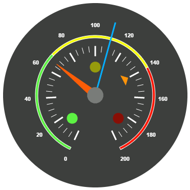
Add Custom Label Details
You can specify the text in the Gauge using customLabels and you can customize it through various properties such as value, position, color, font size, fontFamily and fontStyle. You can use custom texts to display the three range description.
$("#CircularGauge1").ejCircularGauge({
        width: 500,
        height: 500,
        backgroundColor: "#3D3F3D",
        readOnly: false,
        scales: [{
            //Add the labels customization code here
            //Add the pointers customization code here
            //Add the ticks customization code here
            //Add the ranges customization code here
            //Add the indicators customization code here
            //Add the Custom labels customization code here
            customLabels: [{
                value: "Safe",
                position: { x: 200, y: 280 },
                color: "#5DF243",
                font:
                {
                    size: "12px",
                    fontFamily: "Arial",
                    fontStyle: "Bold"
                }
            }, {
                value: "Caution",
                position: { x: 253, y: 212 },
                color: "#F6FF0A",
                font:
                {
                    size: "12px",
                    fontFamily: "Arial",
                    fontStyle: "Bold"
                }
            }, {
                value: "Danger",
                position: { x: 290, y: 280 },
                color: "#FF1807",
                font:
                {
                    size: "12px",
                    fontFamily: "Arial",
                    fontStyle: "Bold"
                }
            }]
        }]
    });
The following screenshot displays a Circular Gauge control with all customization properties.