- Built-in themes
- Pivot chart - area customization
Contact Support
Appearance
11 Feb 20191 minute to read
Built-in themes
Following are the built-in themes available in the pivot chart:
- Flat light
- Gradient light
- Gradient dark
- Azure
- Azure dark
- lime
- Lime dark
- Saffron
- Saffron dark
- Gradient light
- Gradient dark
- High contrast 01
- High contrast 02
- Material
- Office365
- Boot strap
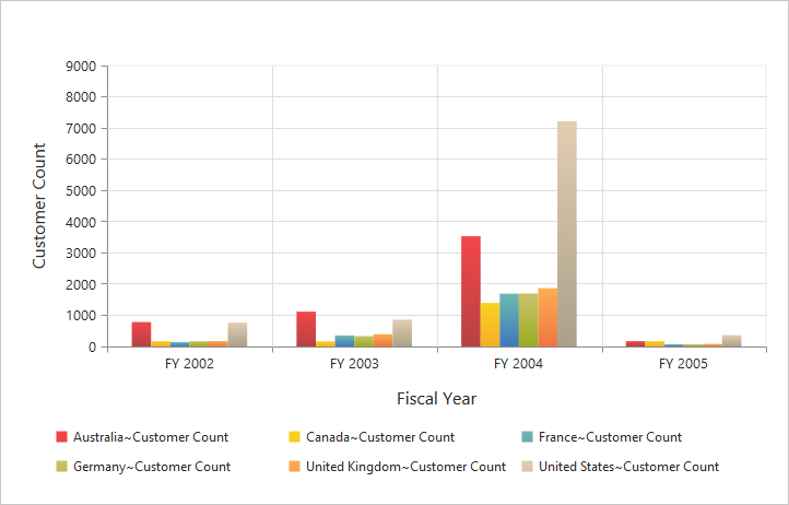
By using the theme property, you can set the desired theme in the pivot chart. By default, the “Flat Light” theme is applied to the pivot chart.
//Using gradient theme
<ej-pivot-chart id="PivotChart1" theme="LimeDark"></ej-pivot-chart>
Pivot chart - area customization
Border customization
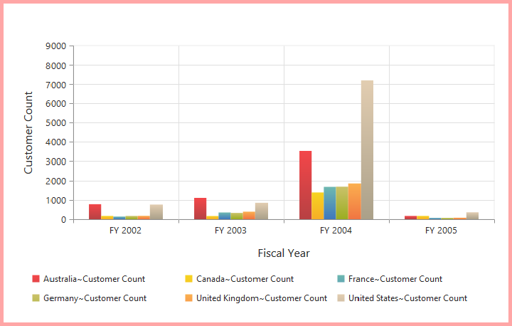
To customize the pivot chart border, use border property in the pivot chart.
//Customize the chart border and opacity
<ej-pivot-chart id="PivotChart1" border-width="2" border-color="#FF0000"></ej-pivot-chart>
Animation
You can enable the animation by using the enable-animation property under e-common-series-options of the pivot chart control. This animates the chart series on two occasions - when the chart is loaded for the first time and when the series type is changed by using the type property.
<ej-pivot-chart id="PivotChart1">
    <e-common-series-options enable-animation="true"></e-common-series-options>
    //Enabling animation in series
    <e-size width="100%" height="460px"></e-size>
</ej-pivot-chart>