Labels Customization in Xamarin Range Slider (SfRangeSlider)
11 Aug 20225 minutes to read
SfRangeSlider provides option to show or hide the label and position customization.
Show Value Label
This property allows us to display labels for the ticks. When it sets to true, it displays the label for all the ticks based on the ValuePlacement property.
NOTE
The default value of the
ShowValueLabelproperty is false.
<range:SfRangeSlider x:Name="rangeslider" ShowValueLabel="true"/>rangeSlider.ShowValueLabel= true;Set Custom Label
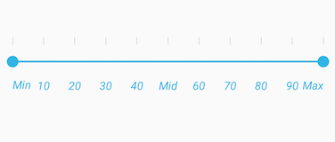
To display custom labels, ShowCustomLabel property should be set to true and need to populate the CustomLabels property with observable collection of items by specifying the custom labels for corresponding values.
<range:SfRangeSlider x:Name="rangeslider" HeightRequest="400" ShowCustomLabel="true" CustomLabels="customCollection"/>SfRangeSlider rangeSlider;
ObservableCollection<Items> customCollection;
public RangeSliderPage ()
{
customCollection = new ObservableCollection<Items> ();
customCollection.Add(new Items(){Label = "Min", Value= 0});
customCollection.Add(new Items() { Label = "Max", Value = 100 });
rangeSlider = new SfRangeSlider ();
rangeSlider.HeightRequest = 400;
rangeSlider.ShowCustomLabel = true;
rangeSlider.CustomLabels = customCollection
}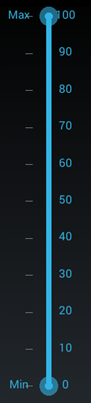
Value Placement
The ValuePlacement property describes the position of the Value respective to ticks.
Available options for this property are:
<range:SfRangeSlider x:Name="rangeslider" ValuePlacement="TopLeft"/>rangeSlider.ValuePlacement=ValuePlacement.TopLeft;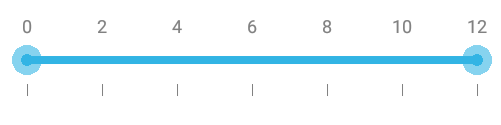
<range:SfRangeSlider x:Name="rangeslider" ValuePlacement="BottomRight"/>rangeSlider.ValuePlacement=ValuePlacement.BottomRight;
Label Placement
The LabelPlacement property describes the position of the custom labels respective to ticks.
Available options for this property are:
<range:SfRangeSlider x:Name="rangeslider" LabelPlacement="TopLeft"/>rangeSlider.LabelPlacement=LabelPlacement.TopLeft;Customizing label font
The range slider control provides the FontFamily, FontSize, and FontAttribute properties to customize the value text and custom label text.
<ContentPage xmlns="http://xamarin.com/schemas/2014/forms"
xmlns:x="http://schemas.microsoft.com/winfx/2009/xaml"
xmlns:Range="clr-namespace:Syncfusion.SfRangeSlider.XForms;assembly=Syncfusion.SfRangeSlider.XForms"
xmlns:Local="clr-namespace:GettingStarted;assembly=GettingStarted"
x:Class="GettingStarted.RangeSliderSample">
	<ContentPage.Content>
		<Range:SfRangeSlider FontFamily="Times New Roman" ShowCustomLabel="true" FontAttribute="Italic" FontSize="12"  Orientation="Horizontal">
			<Range:SfRangeSlider.CustomLabels>
				<Local:ObservableCollectionList>
					<Range:Items Label="Min" Value="0"/>
					<Range:Items Label="Mid" Value="50"/>
					<Range:Items Label="Max" Value="100"/>
				</Local:ObservableCollectionList>
			</Range:SfRangeSlider.CustomLabels>
		</Range:SfRangeSlider>
	</ContentPage.Content>
</ContentPage>
using System.Collections.ObjectModel;
using Syncfusion.XForms.SfRangeSlider;
using Xamarin.Forms;
namespace GettingStarted
{
/// <summary>
/// Range slider sample.
/// </summary>
public partial class RangeSliderSample : ContentPage
{
public RangeSliderSample()
{
InitializeComponent();
SfRangeSlider rangeSlider = new SfRangeSlider(){ FontFamily="Times New Roman",ShowCustomLabel=true, FontAttribute=FontAttributes.Italic, FontSize=12, Orientation=Orientation.Horizontal};
rangeSlider.CustomLabels = new ObservableCollection<Items>()
{
new Items(){Value=0,Label="Min"},
new Items(){Value=50,Label="Mid"},
new Items(){Value=100,Label="Max"}
};
this.Content = rangeSlider;
}
}
}using System.Collections.ObjectModel;
using Syncfusion.XForms.SfRangeSlider;
using Xamarin.Forms;
namespace GettingStarted
{
/// <summary>
/// Observable collection of Items list.
/// </summary>
public class ObservableCollectionList : ObservableCollection<Items>
{
}
/// <summary>
/// Range slider sample.
/// </summary>
public partial class RangeSliderSample : ContentPage
{
public RangeSliderSample()
{
InitializeComponent();
}
}
}
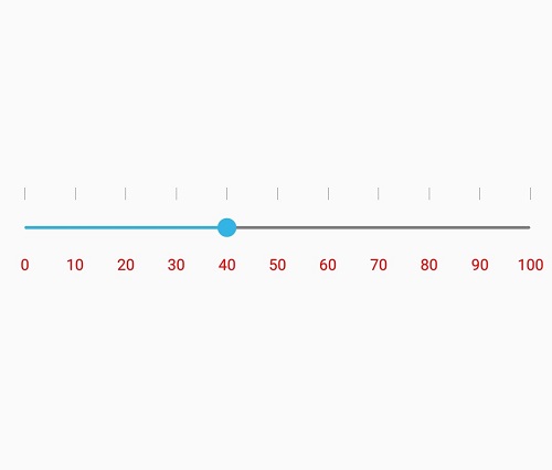
LabelColor
The LabelColor property used to change the color of the label.
<range:SfRangeSlider x:Name="rangeslider" LabelColor="Red" Minimum="0" Maximum="100"/>rangeslider.LabelColor = Color.Red;