Editors in Xamarin DataForm (SfDataForm)
8 Jan 202524 minutes to read
The data form supports several built-in editors as follows:
| Editor name | Editor class | Supported Data Type/Attribute | Input control loaded |
|---|---|---|---|
| Text | The String type property and any other type apart from the below specified cases. | ||
| MultilineText | The String type property with multi line text. [DataType(DataType.MultilineText)] | ||
| Numeric | The property of Int, Double, Float, Decimal, Long types and also its nullable property. | ||
| Percent | The property of Int, Double, Float, Decimal, Long types and also its nullable property with [DataType(“Percent”)] attribute. | ||
| Currency | The property of Int, Double, Float, Decimal, Long types and also its nullable property with [DataType(DataType.Currency)] attribute. | ||
| Date | DateTime type property and the property with [DataType(DataType.Date)] and [DataType(DataType.DateTime)] attributes. | ||
| Time | The property with [DataType(DataType.Time)] attribute. | ||
| NumericUpDown | Int or Double type property. | ||
| Segment | Enum type property. | ||
| Bool | Bool type property. | ||
| Switch | Bool type property. | ||
| Picker | Enum and List type property. [EnumDataTypeAttribute] | ||
| DropDown | Enum and List type property. [EnumDataTypeAttribute] | ||
| Password | The String type property and property with [DataType(DataType.Password)] attribute. | ||
| RadioGroup | Enum and List type property. [EnumDataTypeAttribute] | ||
| MaskedEditText | The property with [DataType(DataType.PhoneNumber)] attribute. | ||
| AutoComplete | Enum and List type property. [EnumDataTypeAttribute] |
Text editor
In the text editor, the Entry is loaded.
See also
How to change the text color of the editor in Xamarin.Forms DataForm (SfDataForm)
How to programmatically set focus to editor in Xamarin.Forms DataForm (SfDataForm)
Multiline Text editor
In the MultilineText editor, the Editor is loaded.
And MultilineText editor height will auto expand/reduce based on the line wraps in editor , which allowing text to be readable without scrolling the editor.
[DataType(DataType.MultilineText)]
public String Address { get; set; }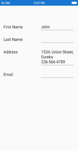
Numeric editor
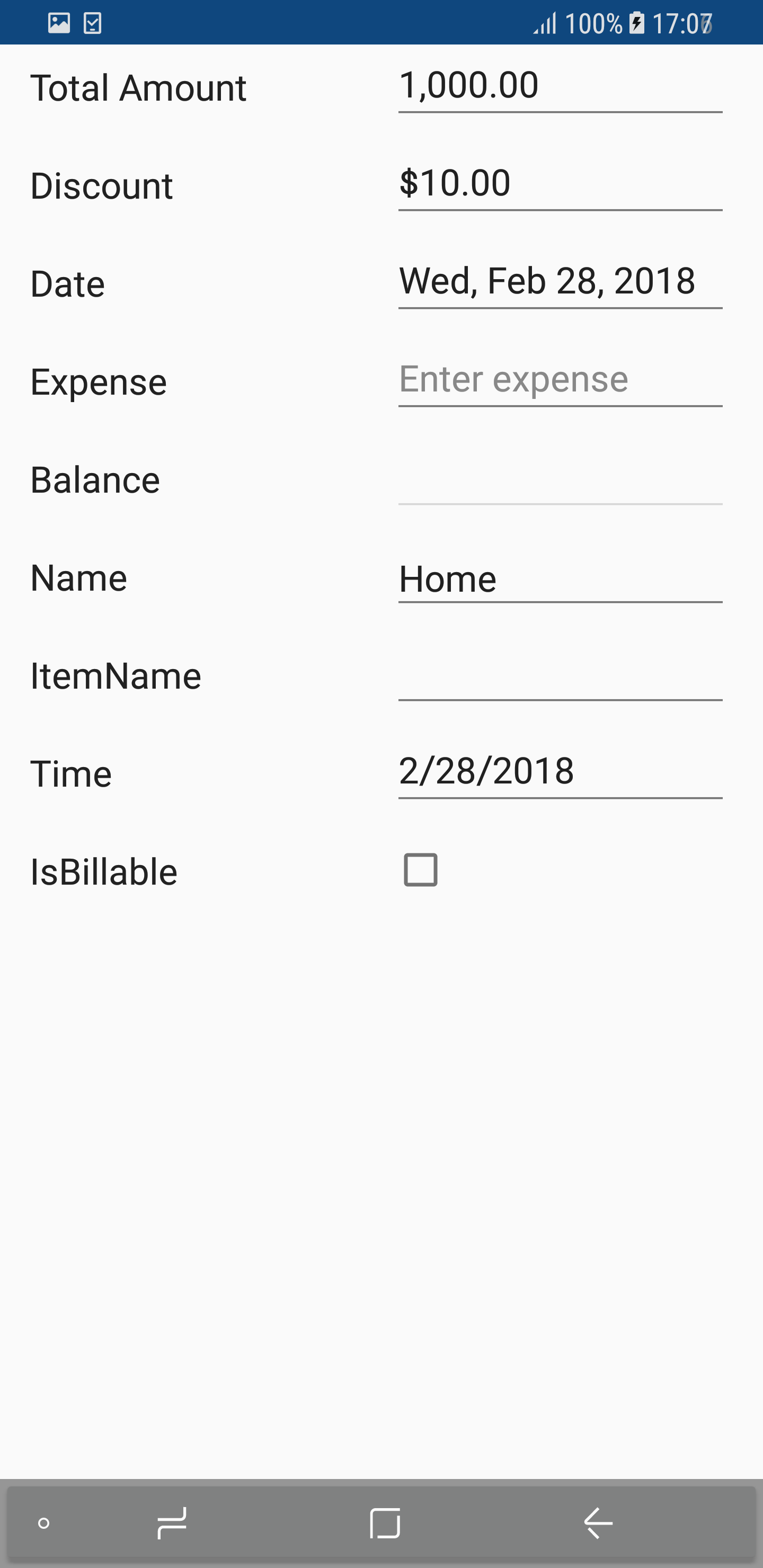
In the numeric editor, the SfNumericTextBox is loaded.
Change maximum NumberDecimalDigits in the numeric editor
In the SfNumericTextBox, two decimal digits will be displayed by default. You can change the number of decimal digits being displayed by setting the MaximumNumberDecimalDigits property in the DataFormNumericItem.
dataForm.AutoGeneratingDataFormItem += DataForm_AutoGeneratingDataFormItem;
private void DataForm_AutoGeneratingDataFormItem(object sender, AutoGeneratingDataFormItemEventArgs e)
{
    if (e.DataFormItem != null && e.DataFormItem.Name == "Amount")
    {
        (e.DataFormItem as DataFormNumericItem).MaximumNumberDecimalDigits = 3;
    }
}
See also
How to remove a thousand separators in the numeric text field in Xamarin.Forms DataForm (SfDataForm)
How to resolve missing decimal point issue on Samsung Devices (S6, S8) numeric keyboard in DataForm ?
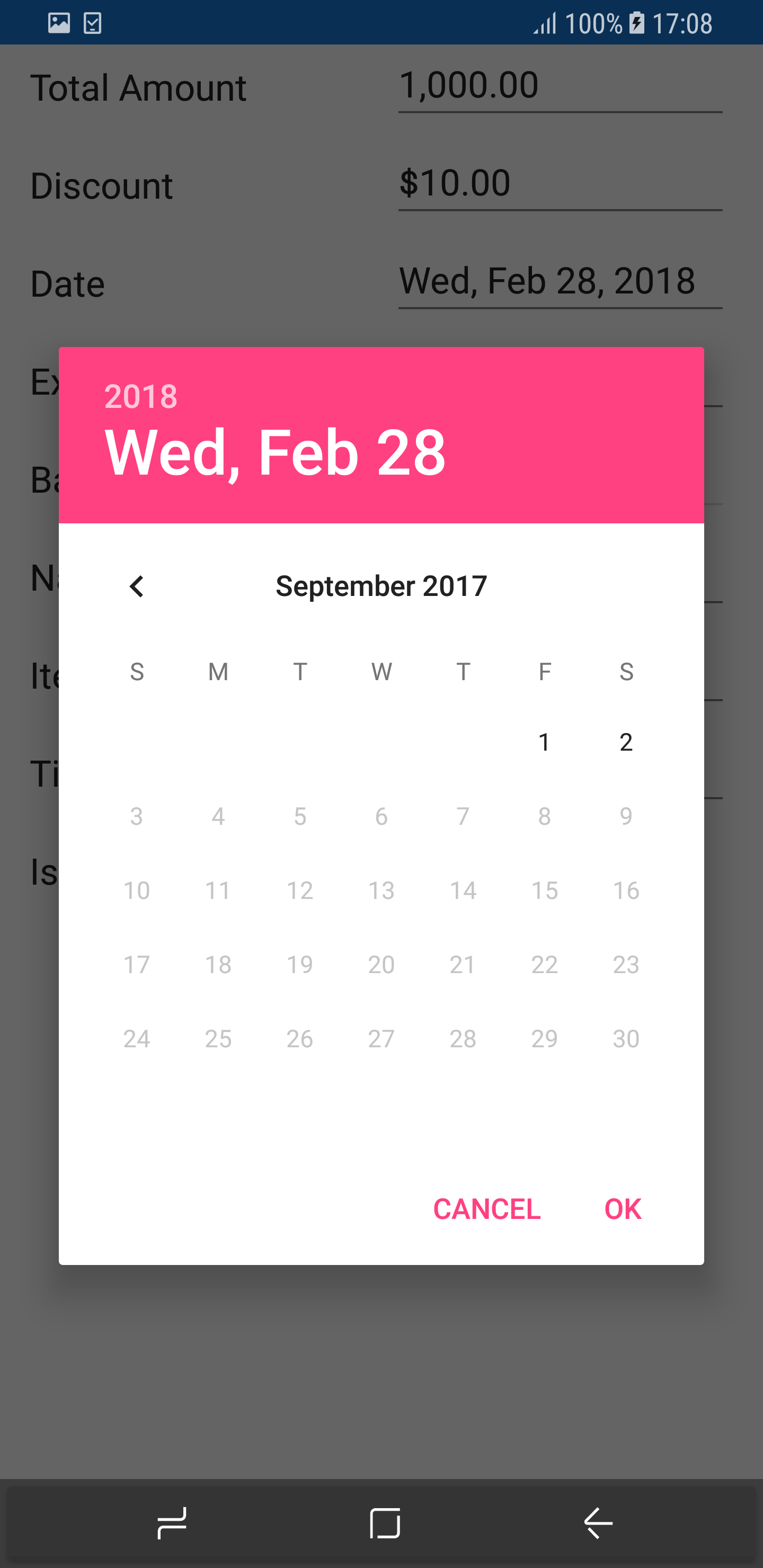
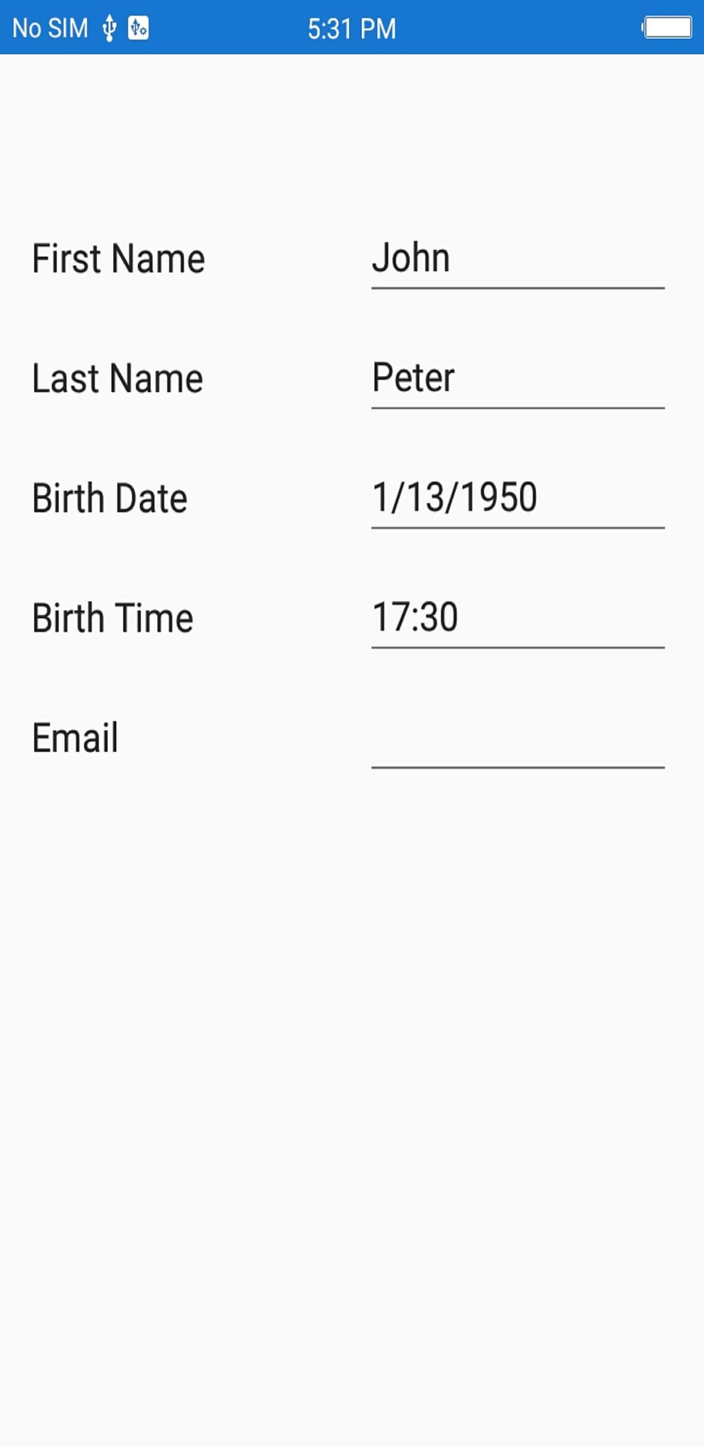
Date editor
In the date editor, the DatePicker will be loaded.
Setting null value in date editor
In DatePicker, the default date value (1/01/0001) is displayed by default. You can also set the null value by adding nullable DateTime data type for the date picker property in data form, which allows you to set the null value and display the empty value in date editor.
[DataType(DataType.Date)]
[Display(Name ="Birth Date")]
public DateTime? BirthDate { get; set; }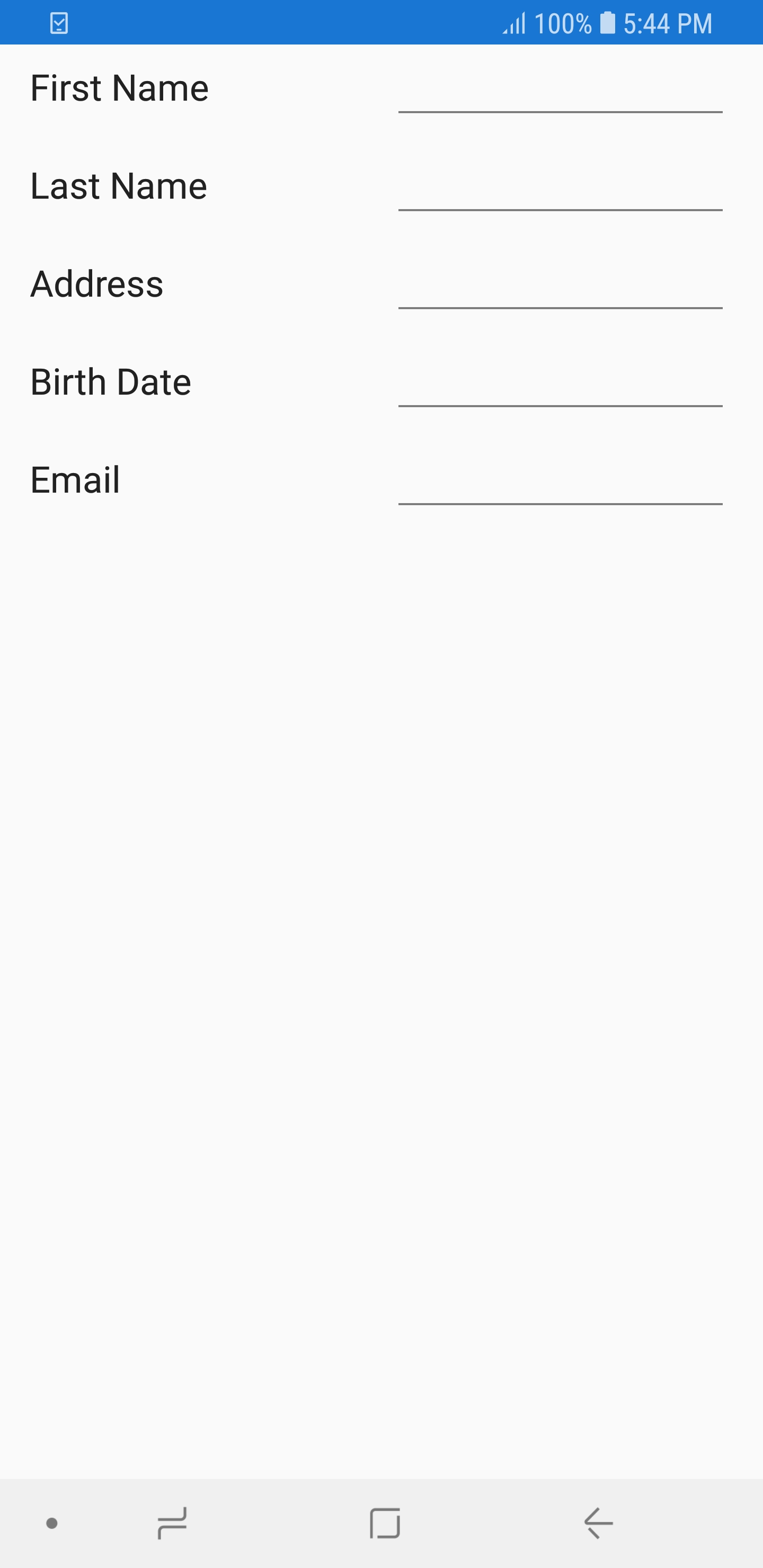
Customizing format in date editor
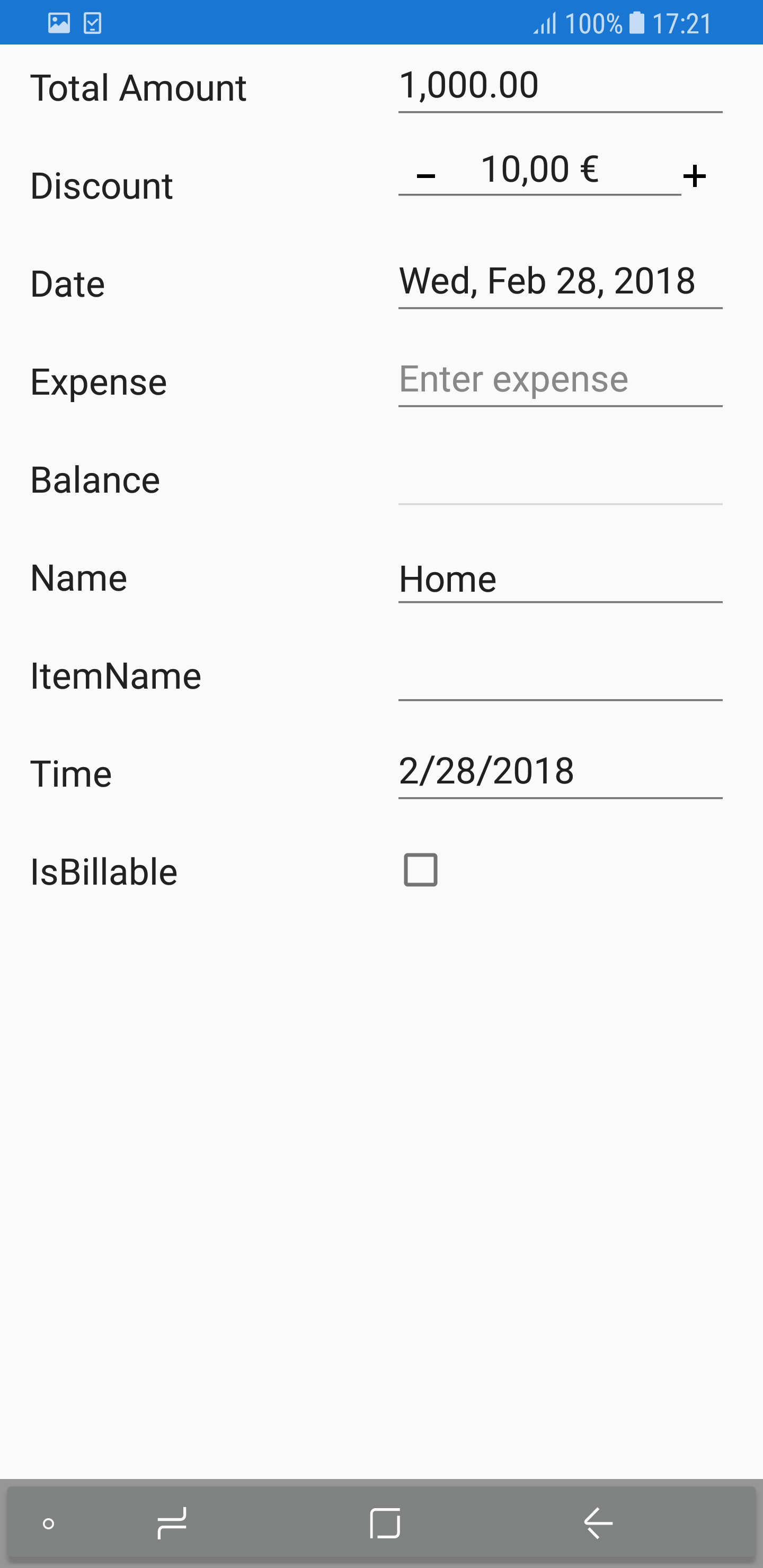
In the DatePicker, short date will be shown by default. You can change the applied format by setting the Format property in DataFormDateItem.
dataForm.AutoGeneratingDataFormItem += DataForm_AutoGeneratingDataFormItem;

private void DataForm_AutoGeneratingDataFormItem(object sender, AutoGeneratingDataFormItemEventArgs e)
{

    if (e.DataFormItem != null && e.DataFormItem.Name == "Date")
    {
        (e.DataFormItem as DataFormDateItem).Format = "ddd, MMM d, yyyy";
    }
}
Setting title for date editor
You can set title to the date editor by handling the Title property in DataFormDateItem. The default value of the property is Choose Date.
dataForm.AutoGeneratingDataFormItem += DataForm_AutoGeneratingDataFormItem;

private void DataForm_AutoGeneratingDataFormItem(object sender, AutoGeneratingDataFormItemEventArgs e)
{

    if (e.DataFormItem != null && e.DataFormItem.Name == "BirthDate")
    {
         if(Device.RuntimePlatform == Device.UWP)
        {
            (e.DataFormItem as DataFormDateItem).Title = "Select a date";
        }
    }
}
N
Titleproperty is applicable only for XForms UWP platform.
Setting MaximumDate and MinimumDate in date editor
You can customize the maximum and minimum allowable dates in the DatePicker by setting MaximumDate and MinimumDate in the DataFormDateItem respectively.
dataForm.AutoGeneratingDataFormItem += DataForm_AutoGeneratingDataFormItem;

private void DataForm_AutoGeneratingDataFormItem(object sender, AutoGeneratingDataFormItemEventArgs e)
{
    if (e.DataFormItem != null && e.DataFormItem.Name == "Date")
    {
        (e.DataFormItem as DataFormDateItem).MinimumDate = new DateTime(2017, 5, 5);
        (e.DataFormItem as DataFormDateItem).MaximumDate = new DateTime(2017, 9, 2);
    }
}
Time editor
In the time editor, the TimePicker will be loaded.
Setting null value in time editor
In TimePicker, the default time value (12:00 AM) is displayed by default. You can also set the null value by adding nullable DateTime data type for the time picker property in data form, which allows you to set the null value and display the empty value in time editor.
[DataType(DataType.Time)]
[Display(Name = "Birth Time")]
public DateTime? BirthTime { get; set; }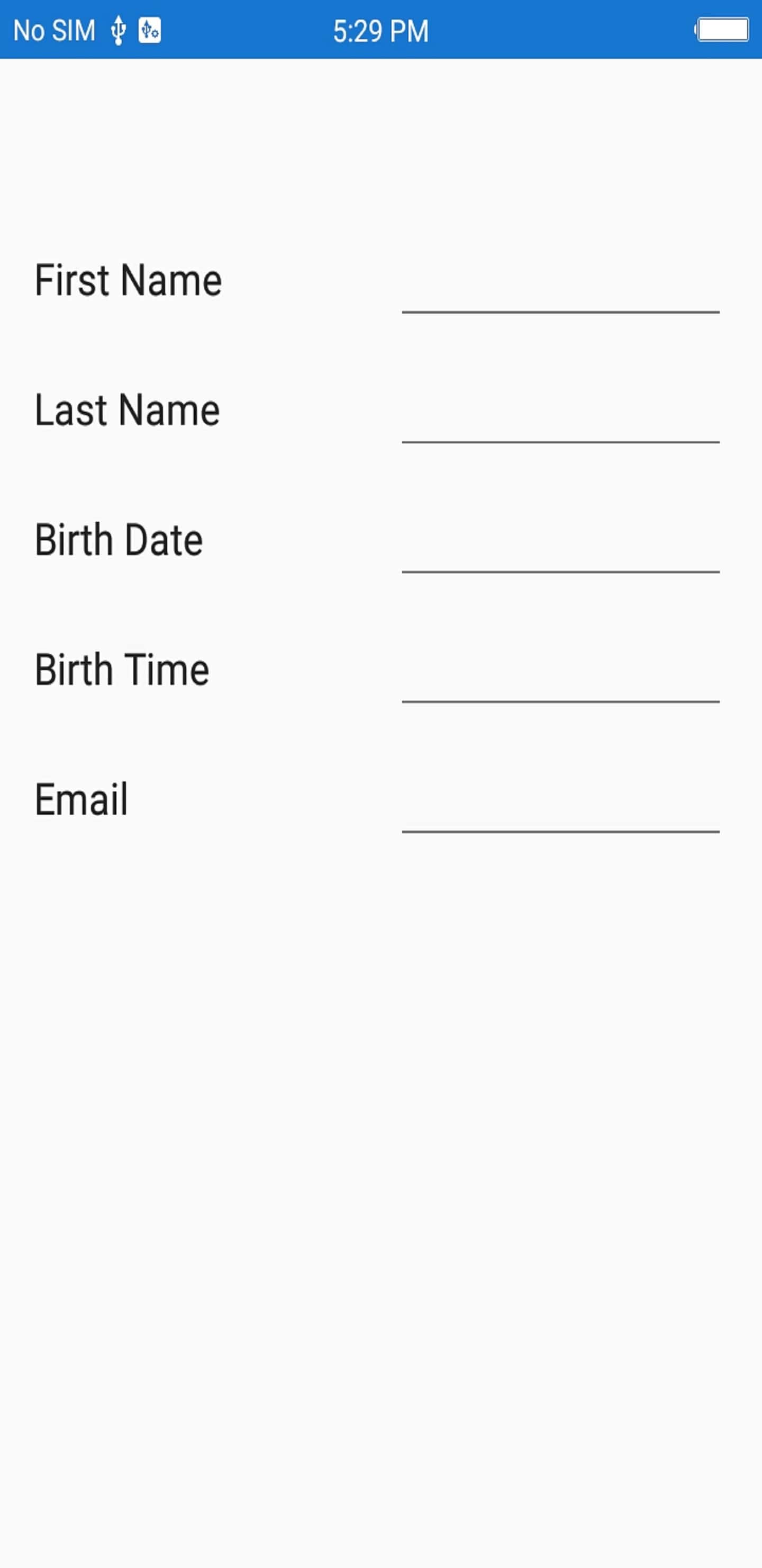
Customizing format in time editor
In the TimePicker, short time will be shown by default. You can change the applied format by setting the Format property in DataFormTimeItem.
dataForm.AutoGeneratingDataFormItem += DataForm_AutoGeneratingDataFormItem;

private void DataForm_AutoGeneratingDataFormItem(object sender, AutoGeneratingDataFormItemEventArgs e)
{
    if (e.DataFormItem != null && e.DataFormItem.Name == "BirthTime")
        (e.DataFormItem as DataFormTimeItem).Format = "HH:mm";
}
Setting title for time editor
You can set title to the time editor by handling the Title property in DataFormTimeItem. The default value of this property is Choose Time.
dataForm.AutoGeneratingDataFormItem += DataForm_AutoGeneratingDataFormItem;

private void DataForm_AutoGeneratingDataFormItem(object sender, AutoGeneratingDataFormItemEventArgs e)
{

    if (e.DataFormItem != null && e.DataFormItem.Name == "BirthTime")
    {
        if(Device.RuntimePlatform == Device.UWP)
        {
            (e.DataFormItem as DataFormTimeItem).Title = "Select time of birth";
        }
    }
}
NOTE
Titleproperty is applicable only for XForms UWP platform.
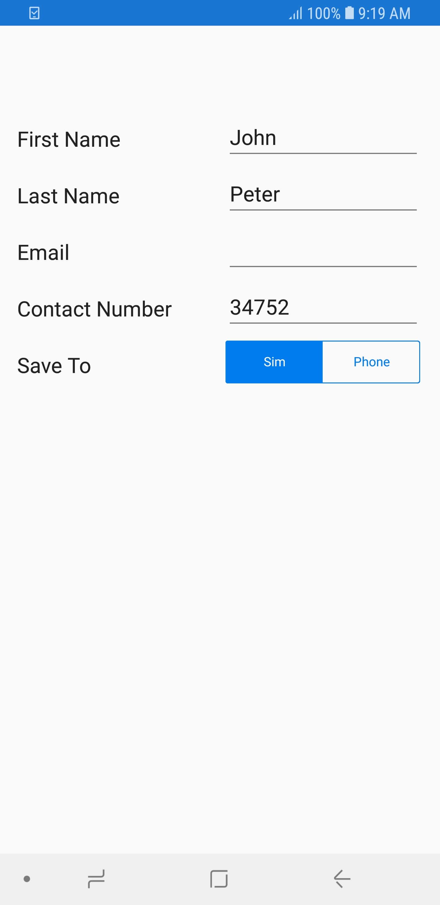
Segment editor
In segment editor, the SfSegmentedControl is loaded, and DataForm Segment editor supports to enum and List data type properties.
To add Segment editor in DataForm, register the editor as Segment for the required property using the RegisterEditor method.
Support for enum data type
By default, the ItemsSource for SfSegmentedControl is auto-generated for enum data types, if the property has been registered for Segment editor.
dataForm.RegisterEditor("SaveTo", "Segment");

private Location saveTo;

[Display(Name = "Save To")]
public Location SaveTo
{
    get { return saveTo; }
    set { this.saveTo = value; }
}
public enum Location
{
    Sim,
    Phone
}
Customizing ItemsSource of SfSegmentedControl
For List data types, you can set the ItemsSource for SfSegmentedControl by using the SourceProvider or using ItemsSource property of DataFormSegmentItem.
Using SourceProvider
private string saveTo;
[Display(Name ="Save To")]
public string SaveTo
{
    get { return saveTo; }
	set { this. saveTo = value; }
}

public class SourceProviderExt : SourceProvider
{
    public override IList GetSource(string sourceName)
    {
		var list = new List<string>();
		if(sourceName == "SaveTo")
		{
			list.Add("Sim");
			list.Add("Phone");
		}
		return list;
	}
}

dataForm.RegisterEditor("SaveTo", "Segment");
dataForm.SourceProvider = new SourceProviderExt();
Using ItemsSource property of DataFormSegmentItem
You can also set ItemsSource for segment editor by using the ItemsSource property in the DataFormSegmentItem.
dataForm.RegisterEditor("SaveTo", "Segment");
dataForm.AutoGeneratingDataFormItem += DataForm_AutoGeneratingDataFormItem;

private void DataForm_AutoGeneratingDataFormItem(object sender, AutoGeneratingDataFormItemEventArgs e)
{
    if (e.DataFormItem != null && e.DataFormItem.Name == "SaveTo")
    {
		var list = new List<string>();
		list.Add("Sim");
		list.Add("Phone");
		(e.DataFormItem as DataFormSegmentItem).ItemsSource = list;
    }
}
CheckBox editor
In CheckBox editor, the SfCheckBox control is loaded. By default, for bool data type property, the CheckBox editor will be loaded in data form.
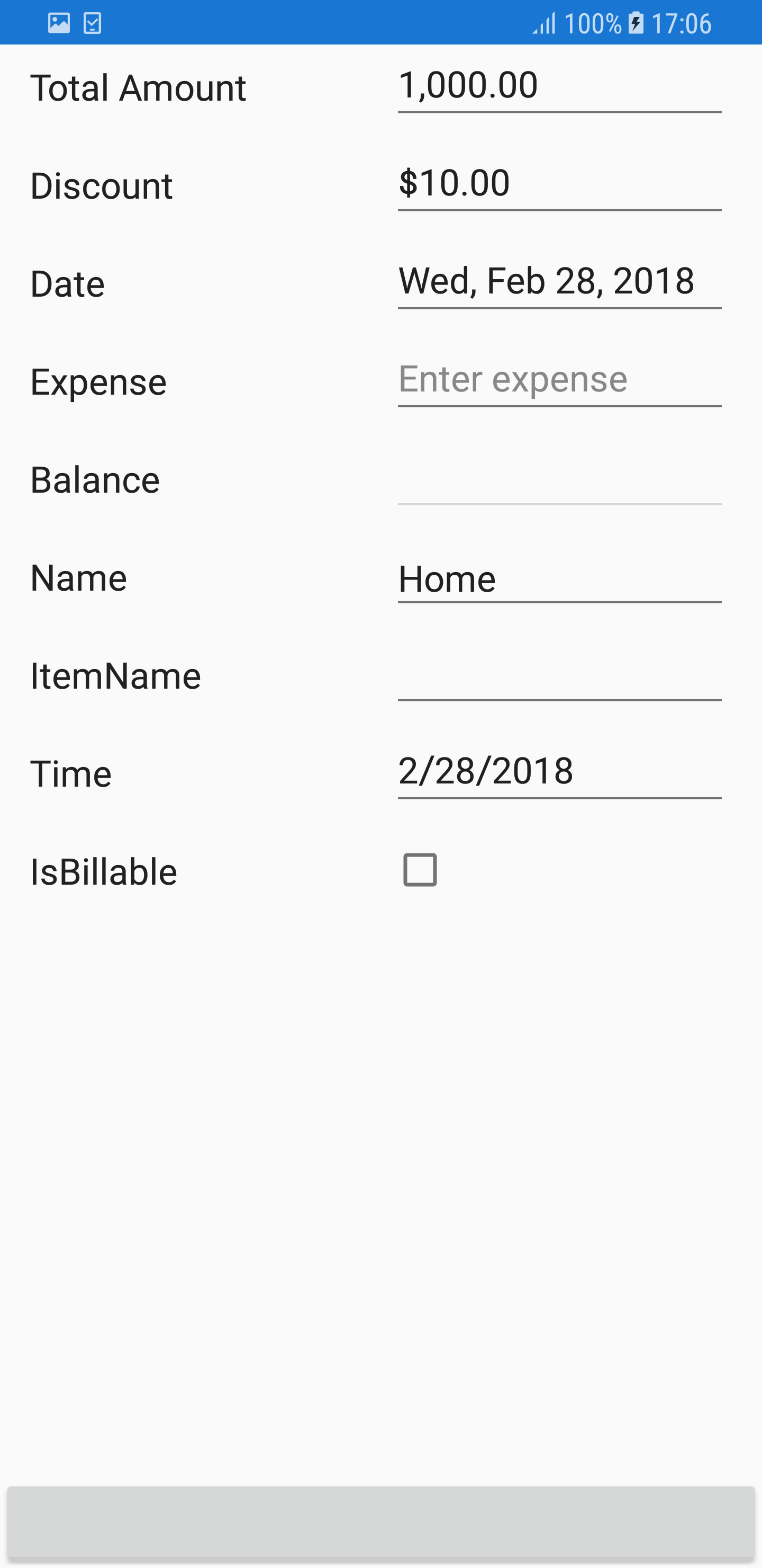
[Display(Name = "Is Billable")]
public bool IsBillable { get; set; } = true;

[Display(Name = "Registered Member")]
public bool RegisteredMember { get; set; }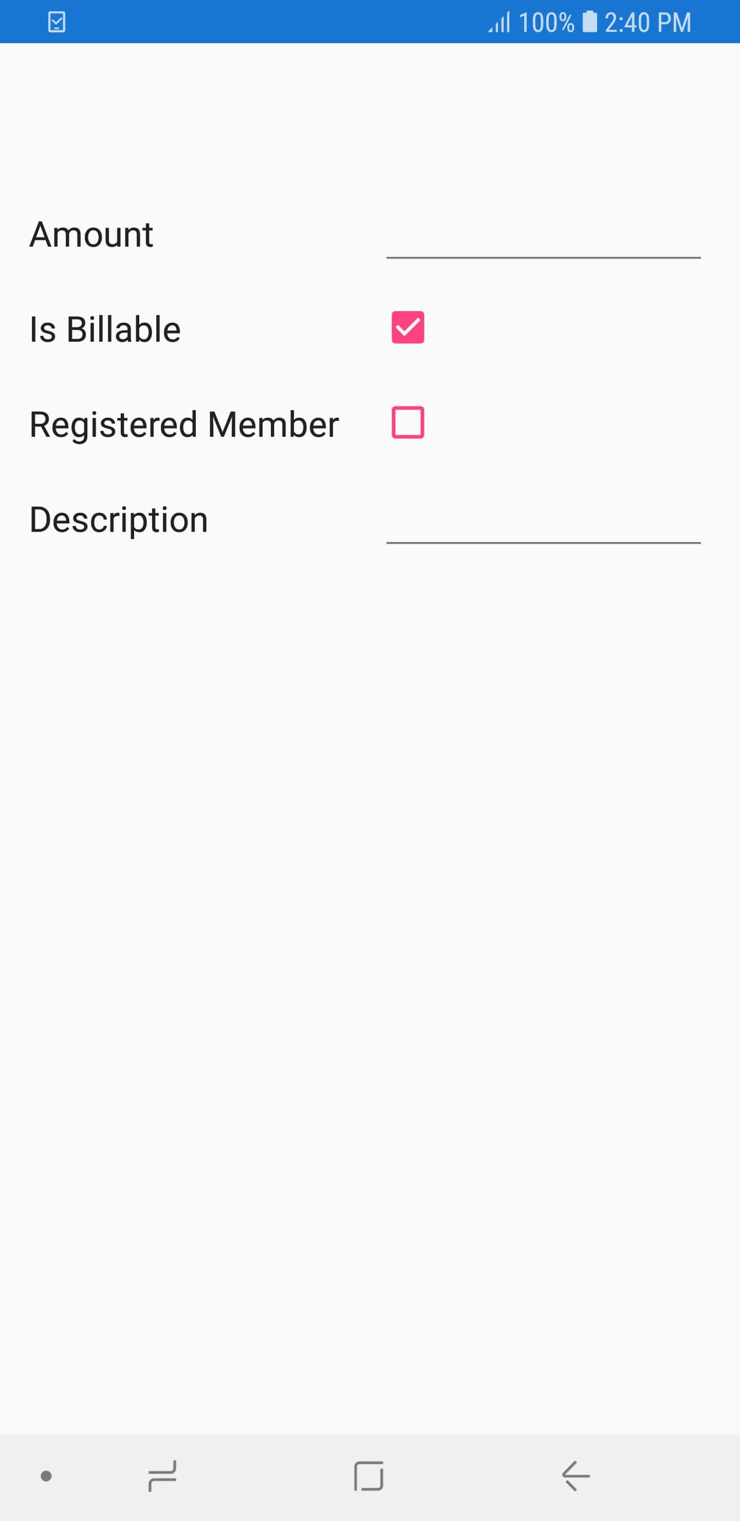
Visual states of SfCheckBox
SfCheckBox support three visual states.
- Checked
- UnChecked
- Intermediate
[Display(Name = "Is Billable")]
public bool IsBillable { get; set; } = true;

[Display(Name = "Registered Member")]
public bool RegisteredMember { get; set; } = false;

[Display( Name = "Is Refundable")]
public bool? IsRefundable { get; set; } = null;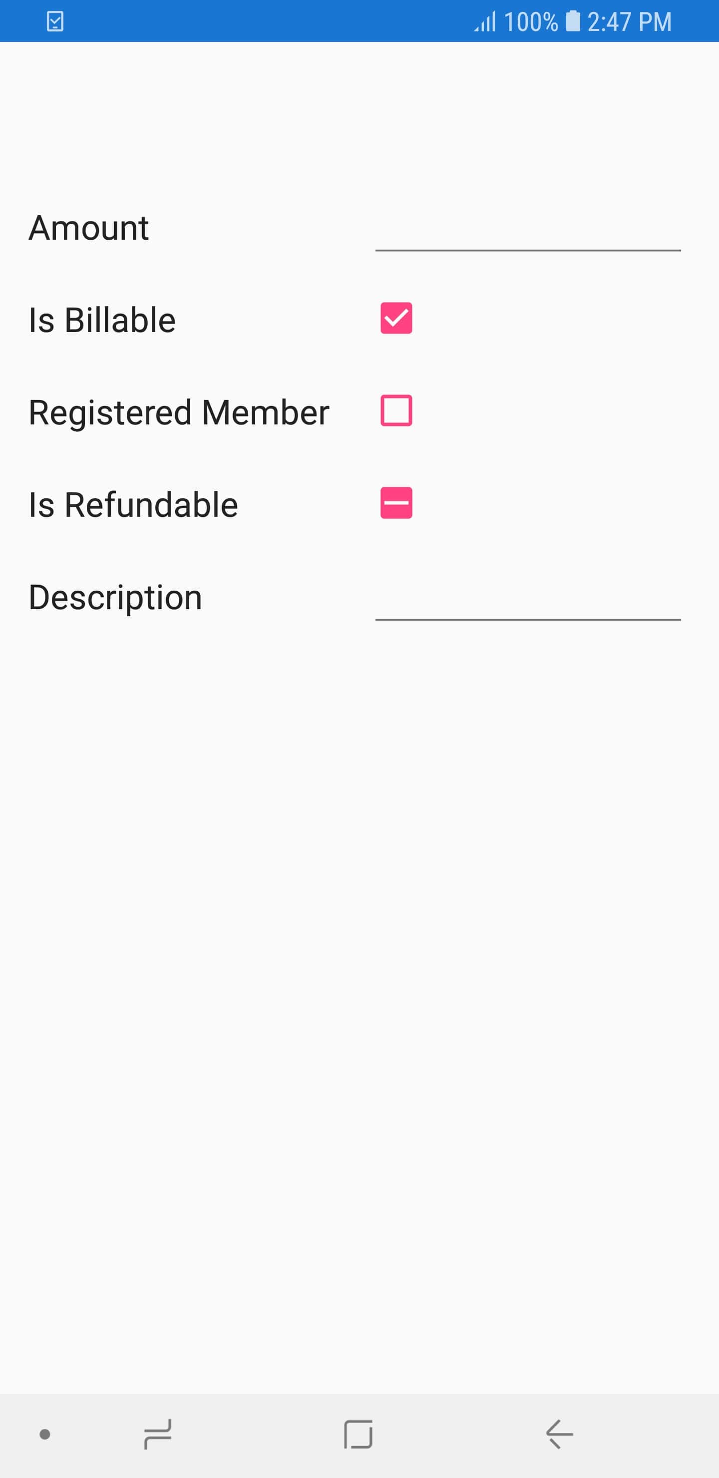
Customizing the SfCheckBox state color
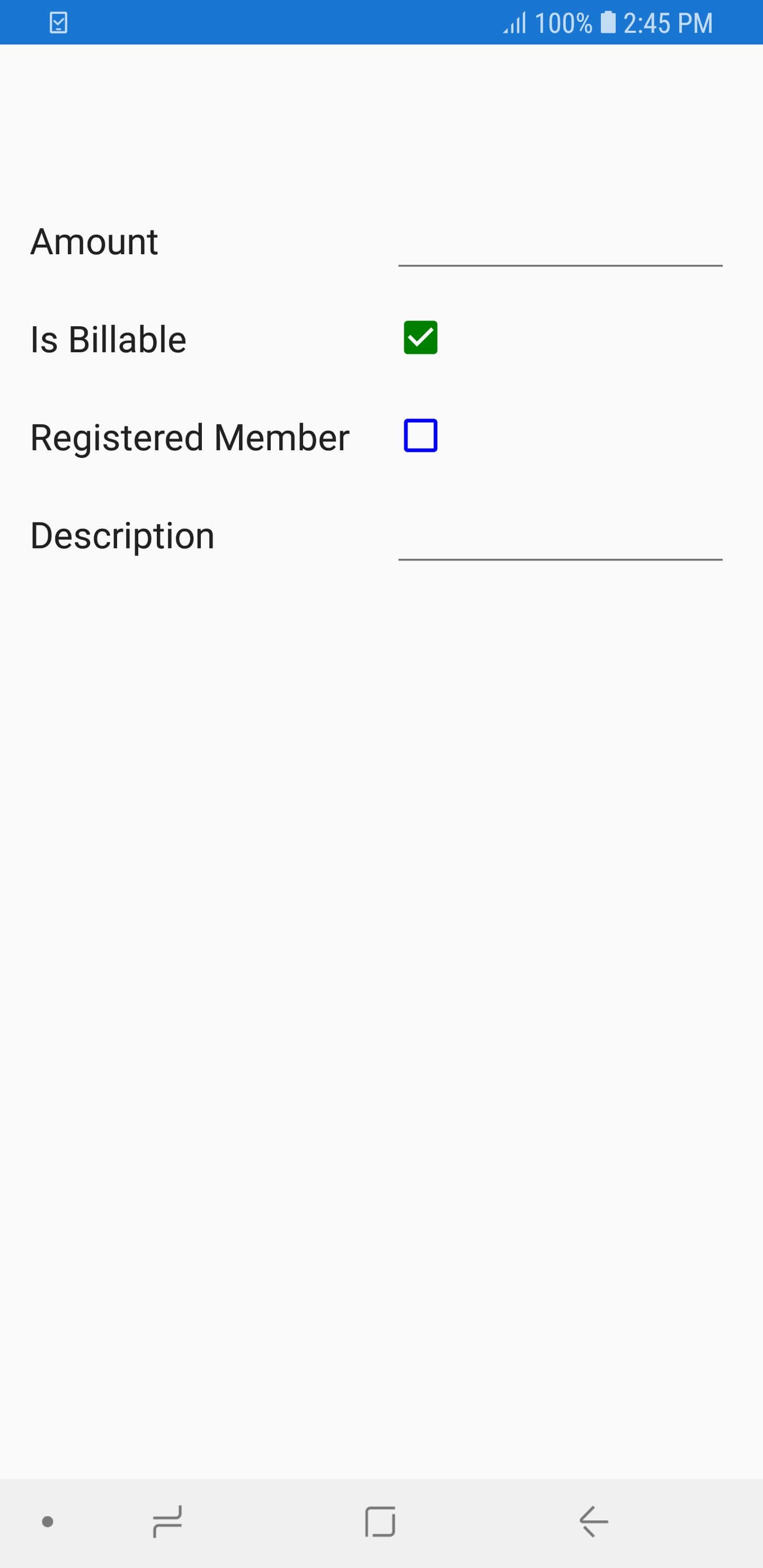
You can change the color of the checked/indeterminate state of SfCheckBox using the CheckedColor property and change the color of unchecked state using the UnCheckedColor property in DataFormCheckBoxItem in the AutoGeneratingDataFormItem event of data form.
dataForm.AutoGeneratingDataFormItem += DataForm_AutoGeneratingDataFormItem;

private void DataForm_AutoGeneratingDataFormItem(object sender, AutoGeneratingDataFormItemEventArgs e)
{
    if (e.DataFormItem != null)
    {
        if (e.DataFormItem.Name == "IsBillable")
        {
            (e.DataFormItem as DataFormCheckBoxItem).CheckedColor = Color.Green;
        }
        if (e.DataFormItem.Name == "RegisteredMember")
        {
            (e.DataFormItem as DataFormCheckBoxItem).UnCheckedColor = Color.Blue;
        }
    }
}
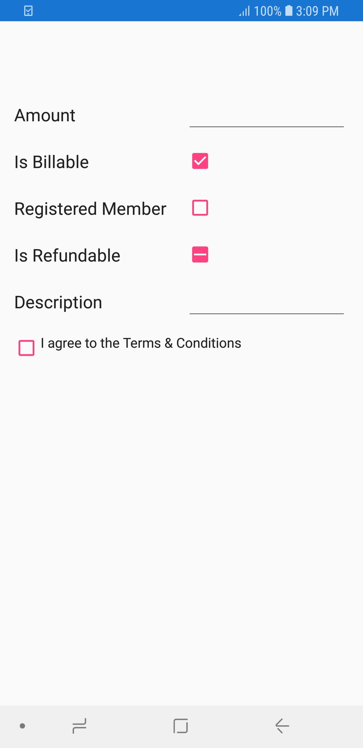
Setting SfCheckBox caption text
You can customize the appearance of display text in SfCheckBox using the Text property of the DataFormCheckBoxItem.
[DisplayOptions(ShowLabel = false)]
public bool Agree { get; set; }

dataForm.AutoGeneratingDataFormItem += DataForm_AutoGeneratingDataFormItem;

private void DataForm_AutoGeneratingDataFormItem(object sender, AutoGeneratingDataFormItemEventArgs e)
{
    if (e.DataFormItem != null)
    {
        if (e.DataFormItem.Name.Equals("Agree"))
        {
            (e.DataFormItem as DataFormCheckBoxItem).IsThreeState = false;
            (e.DataFormItem as DataFormCheckBoxItem).Text = "I agree to the Terms & Conditions";
        }
    }
}
Switch Editor
In switch editor, Switch is loaded, and DataForm Switch editor supports bool data type property.
To add Switch editor in DataForm, register the editor as Switch for the required property using the RegisterEditor method.
dataForm.RegisterEditor("CellularData", "Switch");
       dataForm.RegisterEditor("AirplaneMode", "Switch");

        [Display(Name ="Cellular Data")]
        public bool CellularData { get; set; } = true;

        [Display(Name = "Airplane Mode")]
        public bool AirplaneMode { get; set; }
Drop down editor
In the drop down editor, the SfComboBox will be loaded.
Customizing ItemsSource of SfComboBox
By default, the ItemsSource for SfComboBox is auto-generated for enum types and collection type properties. For other types, you can set the ItemsSource by using the SourceProvider.
Using SourceProvider
private string _ItemName;
public string ItemName
{
    get
    {
        return _ItemName;
    }
    set
    {
        _ItemName = value;
    }
}
public class SourceProviderExt : SourceProvider
{
    public override IList GetSource(string sourceName)
    {
        var list = new List<string>();
        if (sourceName == "ItemName")
        {
            list.Add("Item1");
            list.Add("Item2");
            list.Add("Item3");
        }
        return list;
    }
}
dataForm.SourceProvider = new SourceProviderExt();
dataForm.RegisterEditor("ItemName", "DropDown");
Using ItemsSource property
You can also set the ItemsSource for drop down editor by using the ItemsSource property in the DataFormDropDownItem.
dataForm.AutoGeneratingDataFormItem += DataForm_AutoGeneratingDataFormItem;

private void DataForm_AutoGeneratingDataFormItem(object sender, AutoGeneratingDataFormItemEventArgs e)
{
    if (e.DataFormItem != null && e.DataFormItem.Name == "Name")
    {
        var list = new List<string>();
        list.Add("Home");
        list.Add("Food");
        list.Add("Utilities");
        list.Add("Education");
        (e.DataFormItem as DataFormDropDownItem).ItemsSource = list;
    }
}
Changing ItemsSource of SfComboBox at run time
You can also change the ItemsSource at runtime.
private void Button_Click(object sender, EventArgs e)
{
    var dataFormItem = dataForm.ItemManager.DataFormItems["Name"];
    if (dataFormItem.Name == "Name")
    {
        var list = new List<string>();
        list.Add("Home");
        list.Add("Food");
        list.Add("Utilities");
        list.Add("Education");
        (dataFormItem as DataFormDropDownItem).ItemsSource = list;
    }
}
Loading complex type property values in drop down editor
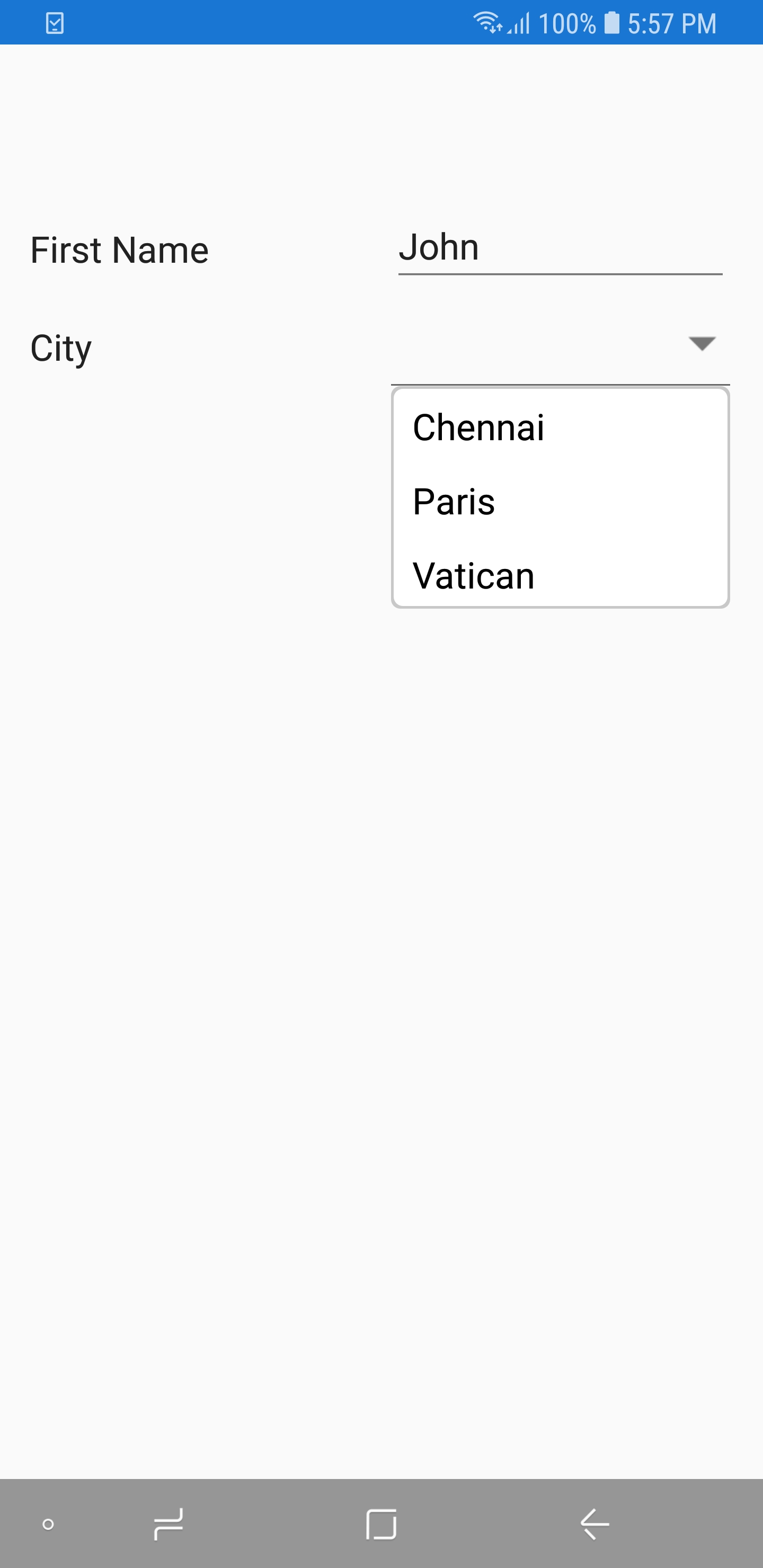
You can display the complex type property values in drop down editor by using the GetSource override method of SourceProvider class, which is used to get source list as complex property values for drop down editor and set it to SourceProvider property of SfDataForm. You need to use AutoGeneratingDataFormItem event to set DisplayMemberPath and SelectedValuePath property value of DataFormDropDownItem for complex type property.
NOTE
Class cannot be directly set as data type for drop down editor in this complex type scenario.
dataForm.SourceProvider = new SourceProviderExt();
dataForm.DataObject = new ContactInfo();
dataForm.AutoGeneratingDataFormItem += DataForm_AutoGeneratingDataFormItem;
dataForm.RegisterEditor("City", "DropDown");

private void DataForm_AutoGeneratingDataFormItem(object sender, AutoGeneratingDataFormItemEventArgs e)
{
    if (e.DataFormItem != null && e.DataFormItem.Name == "City")
    {
        if (Device.RuntimePlatform != Device.UWP)
        {
            (e.DataFormItem as DataFormDropDownItem).DisplayMemberPath = "City";
            (e.DataFormItem as DataFormDropDownItem).SelectedValuePath = "PostalCode";
        }
    }
}

public class SourceProviderExt : SourceProvider
{
    public override IList GetSource(string sourceName)
    {
        if (sourceName == "City")
        {
            List<Address> details = new List<Address>();
            details.Add(new Address() { City = "Chennai", PostalCode = 1 });
            details.Add(new Address() { City = "Paris", PostalCode = 2 });
            details.Add(new Address() { City = "Vatican", PostalCode = 3 });

            return details;
        }
       return new List<string>();
    }
}

public class ContactInfo
{
    [Display(Name ="First Name")]
    public String FirstName { get; set; }
    public string City { get; set; }
}

public class Address
{
    public int PostalCode { get; set; }
    public string City { get; set; }
}
Enable the multi-selection mode in dropdown editor
By default, the SfComboBox of drop down editor supports single selection in data form; however, you can enable the multi-selection by using the MultiSelectMode property of the SfComboBox when adding a custom editor.
By using the OnInitializeView override method, you can change the MultiSelectMode property to Token.
For the DropDown editor, this property is of type string or int, but because MultiSelection allows us to select more items from a list of items, these items cannot be stored in a single string property. To overcome this, commit and data validation can be handled manually by using the OnCommitValue, OnUpdateValue, and OnValidateValue override methods of DataFormDropDownEditor.
public class MultiSelectDropDownEditor : DataFormDropDownEditor
{
    private ContactInfo contactInfo;
    public MultiSelectDropDownEditor(SfDataForm dataForm) : base(dataForm)
    {
        this.contactInfo = this.DataForm.DataObject as ContactInfo;
    }
    protected override void OnInitializeView(DataFormItem dataFormItem, SfComboBox view)
    {
        base.OnInitializeView(dataFormItem, view);
        view.MultiSelectMode = MultiSelectMode.Token;
        view.TokensWrapMode = TokensWrapMode.Wrap;
    }

    protected override void OnCommitValue(SfComboBox view)
    {
        if (view.MultiSelectMode == MultiSelectMode.None)
        {
            // Use existing method for single selection.
            base.OnCommitValue(view);
        }
        else
        {
            // Multi Selection needs to be updated with all selected items.
            if (view != null && view.SelectedItem != null && view.SelectedItem is IList)
            {
                string country = string.Empty;
                foreach (Address address in (IList)view.SelectedItem)
                {
                    if (country.Contains(address.City))
                    {
                        continue;
                    }

                    country = string.IsNullOrEmpty(country) ? address.City : country + "," + address.City;
                }

                this.contactInfo.Country = country;
            }
        }
    }

    protected override void OnUpdateValue(DataFormItem dataFormItem, SfComboBox view)
    {
        if (view.MultiSelectMode == MultiSelectMode.None)
        {
            base.OnUpdateValue(dataFormItem, view);
        }
        else
        {
            var list = (dataFormItem as DataFormDropDownItem).ItemsSource;
            if (list != null)
            {
                view.DataSource = list.OfType<object>().ToList();
            }
            else
            {
                view.DataSource = null;
            }
        }
    }

    protected override bool OnValidateValue(SfComboBox view)
    {
        if (view.MultiSelectMode == MultiSelectMode.None)
        {
            return base.OnValidateValue(view);
        }
        else
        {
            this.OnCommitValue(view);

            // Here country is multi selection property.
            if (string.IsNullOrEmpty(this.contactInfo.Country))
            {
                return false;
            }

            return true;
        }
    }
}
NOTE
See also
How to make editable drop down in Xamarin.Forms DataForm (SfDataForm)
How to add entered text to the dropdown collection in Xamarin.Forms DataForm (SfDataForm)
Picker editor
In the picker editor, the Picker will be loaded.
Changing title in the Picker
You can show some text in the Picker popup by using the Title property in the DataFormPickerItem.
dataForm.AutoGeneratingDataFormItem += DataForm_AutoGeneratingDataFormItem;
private void DataForm_AutoGeneratingDataFormItem(object sender, AutoGeneratingDataFormItemEventArgs e)
{
if (e.DataFormItem != null && e.DataFormItem.Name == "Name")
{
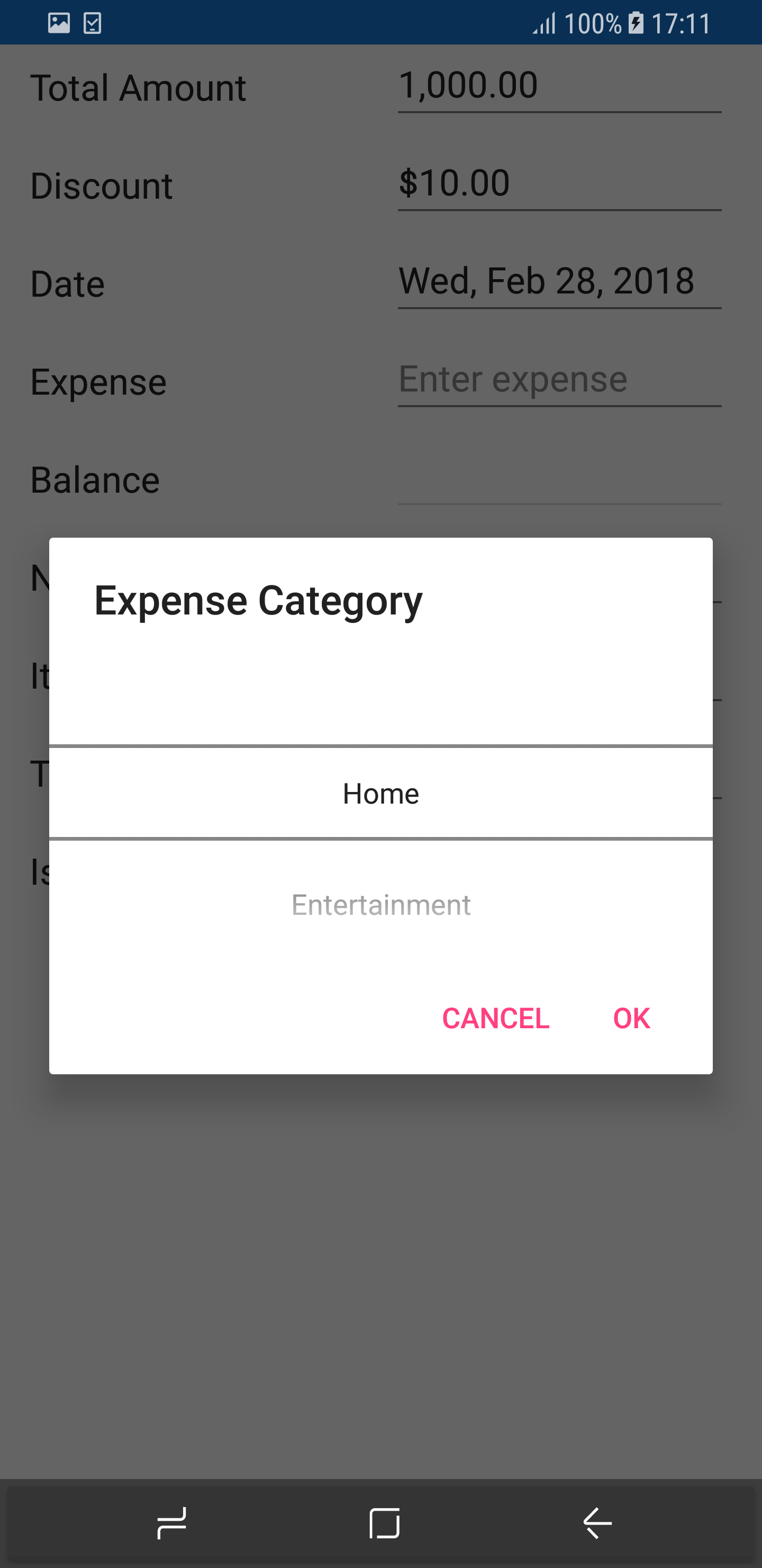
(e.DataFormItem as DataFormPickerItem).Title = "Expense Category";
}
}
Customizing ItemsSource of Picker
By default, the ItemsSource for picker is auto-generated for enum type and collection type properties. For other types, you can set the ItemsSource by using SourceProvider.
Using SourceProvider
private string _ItemName;
public string ItemName
{
    get
    {
        return _ItemName;
    }
    set
    {
        _ItemName = value;
    }
}
public class SourceProviderExt : SourceProvider
{
    public override IList GetSource(string sourceName)
    {
        var list = new List<string>();
        if (sourceName == "ItemName")
        {
            list.Add("Item1");
            list.Add("Item2");
            list.Add("Item3");
        }
        return list;
    }
}
dataForm.SourceProvider = new SourceProviderExt();
dataForm.RegisterEditor("ItemName", "Picker");
Using event
You can also set ItemsSource for picker editor by using the ItemsSource property in the DataFormPickerItem.
dataForm.AutoGeneratingDataFormItem += DataForm_AutoGeneratingDataFormItem;

private void DataForm_AutoGeneratingDataFormItem(object sender, AutoGeneratingDataFormItemEventArgs e)
{
    if (e.DataFormItem != null && e.DataFormItem.Name == "Name")
    {
        var list = new List<string>();
        list.Add("Home");
        list.Add("Food");
        list.Add("Utilities");
        list.Add("Education");
        (e.DataFormItem as DataFormPickerItem).ItemsSource = list;
    }
}
Changing ItemsSource of picker at run time
You can also change the ItemsSource at runtime.
private void Button_Click(object sender, EventArgs e)
{
    var dataFormItem = dataForm.ItemManager.DataFormItems["Name"];
    if (dataFormItem.Name == "Name")
    {
        var list = new List<string>();
        list.Add("Home");
        list.Add("Food");
        list.Add("Utilities");
        list.Add("Education");
        (dataFormItem as DataFormPickerItem).ItemsSource = list;
    }
}
Loading complex type property values in picker
You can display the complex type property values in picker editor by using the GetSource override method of SourceProvider class, which is used to get source list as complex property values for picker editor and set it to SourceProvider property of SfDataForm. You need to use AutoGeneratingDataFormItem event to set DisplayMemberPath and ValueMemberPath property value DataFormPickerItem for complex type property.
NOTE
Class cannot be directly set as data type for picker editor in this complex type scenario.
dataForm.SourceProvider = new SourceProviderExt();
dataForm.RegisterEditor("City", "Picker");
dataForm.DataObject = new ContactInfo();
dataForm.AutoGeneratingDataFormItem += DataForm_AutoGeneratingDataFormItem;

private void DataForm_AutoGeneratingDataFormItem(object sender, AutoGeneratingDataFormItemEventArgs e)
{
    if (e.DataFormItem != null && e.DataFormItem.Name == "City")
    {
        if (Device.RuntimePlatform != Device.UWP)
        {
            (e.DataFormItem as DataFormPickerItem).DisplayMemberPath = "City";
            (e.DataFormItem as DataFormPickerItem).ValueMemberPath = "PostalCode";
        }
    }
}

public class SourceProviderExt : SourceProvider
{
    public override IList GetSource(string sourceName)
    {
        if (sourceName == "City")
        {
            List<Address> details = new List<Address>();
            details.Add(new Address() { City = "Chennai", PostalCode = 1 });
            details.Add(new Address() { City = "Paris", PostalCode = 2 });
            details.Add(new Address() { City = "Vatican", PostalCode = 3 });

            return details;
        }
       return new List<string>();
    }
}

public class ContactInfo
{
    public String FirstName { get; set; }
    public string City { get; set; }
}

public class Address
{
    public int PostalCode { get; set; }
    public string City { get; set; }
}
You can download the entire source code of this demo for Xamarin.Forms from here DataFormPickerEditor
NOTE
PickerEditornot supported inXamarin.Forms.UWP.
See also
How to load the picker editor ItemsSource asynchronously in Xamarin DataForm ?
How to load the picker editor ItemsSource from SQLite offline database in Xamarin.Forms DataForm?
How to add SfDatePicker to Xamarin.Forms DataForm (SfDataForm)
How to set a blank value to a picker editor in Xamarin.Forms DataForm
How to add custom picker editor using SfPicker in Xamarin.Forms DataForm?
NumericUpDown editor
In the numeric editor, the SfNumericUpDown will be loaded.
Changing SpinButtonAlignment in NumericUpDown
By default, up down button will be displayed in right side. You can change its alignment by using the SpinButtonAlignment property in the DataFormNumericUpDownItem.
dataForm.AutoGeneratingDataFormItem += DataForm_AutoGeneratingDataFormItem;
private void DataForm_AutoGeneratingDataFormItem(object sender, AutoGeneratingDataFormItemEventArgs e)
{
    if (e.DataFormItem != null && e.DataFormItem.Name == "Quantity")
        (e.DataFormItem as DataFormNumericUpDownItem).SpinButtonAlignment = SpinButtonAlignment.Both;
}
Changing step value in numeric up down
You can change the next increment and decrement values by using the StepValue property in the DataFormNumericUpDownItem. The default value of step value is 1.
dataForm.AutoGeneratingDataFormItem += DataForm_AutoGeneratingDataFormItem;

private void DataForm_AutoGeneratingDataFormItem(object sender, AutoGeneratingDataFormItemEventArgs e)
{
    if (e.DataFormItem != null && e.DataFormItem.Name == "Quantity")
        (e.DataFormItem as DataFormNumericUpDownItem).StepValue = 2;
}
NOTE
StepValueproperty not supported in Xamarin.FormsUWP.
Setting Maximum and Minimum value in numeric up down
You can set minimum and maximum values for numeric up down by using Minimum and Maximum properties values respectively.
dataForm.AutoGeneratingDataFormItem += DataForm_AutoGeneratingDataFormItem;

private void DataForm_AutoGeneratingDataFormItem(object sender, AutoGeneratingDataFormItemEventArgs e)
{
    if (e.DataFormItem != null && e.DataFormItem.Name == "Quantity")
    {
        (e.DataFormItem as DataFormNumericUpDownItem).Maximum = 100;
        (e.DataFormItem as DataFormNumericUpDownItem).Minimum = 0;
    }
}
Enabling auto reverse in numeric up down
In the SfNumericUpDown, once maximum and minimum values reached, the value will be unchanged. You can enable the cyclic behavior by setting the AutoReverse to true in the DataFormNumericUpDownItem.
dataForm.AutoGeneratingDataFormItem += DataForm_AutoGeneratingDataFormItem;
private void DataForm_AutoGeneratingDataFormItem(object sender, AutoGeneratingDataFormItemEventArgs e)
{
if (e.DataFormItem != null && e.DataFormItem.Name == "Quantity")
{
(e.DataFormItem as DataFormNumericUpDownItem).AutoReverse = true;
}
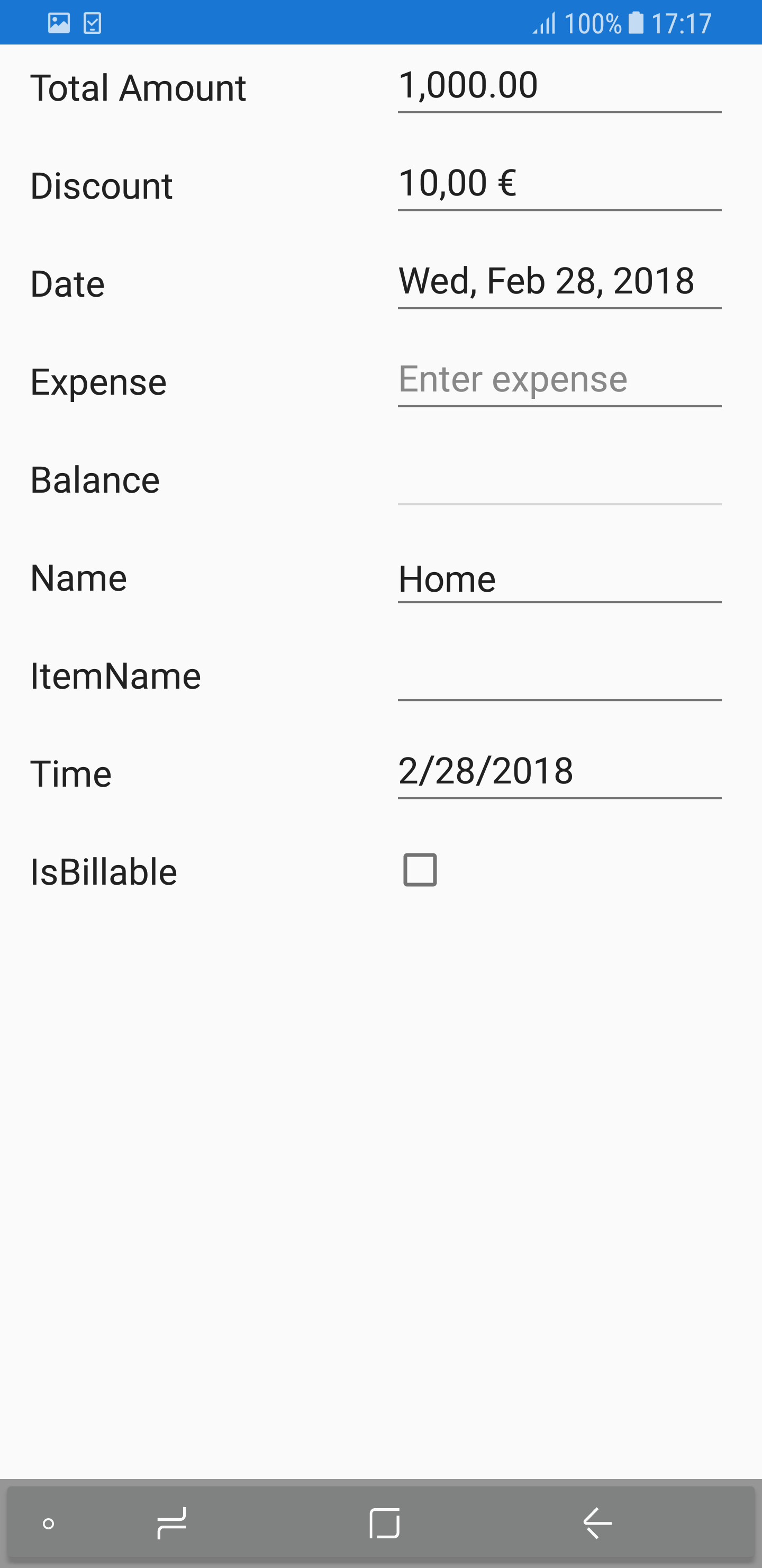
}Changing CultureInfo in numeric up down and numeric text box
You can change the culture in SfNumericTextBox and SfNumericUpDown by using the CultureInfo property in the DataFormNumericItemBase.
SfNumericTextBox
private double _discount = 10;

[DataType(DataType.Currency)]
public double Discount
{
    get
    {
        return _discount;
    }
    set
    {
        _discount = value;
        RaisePropertyChanged("Discount");
    }
}
dataForm.AutoGeneratingDataFormItem += DataForm_AutoGeneratingDataFormItem;

private void DataForm_AutoGeneratingDataFormItem(object sender, AutoGeneratingDataFormItemEventArgs e)
{
    if (e.DataFormItem != null && e.DataFormItem.Name == "Discount")
    {
        (e.DataFormItem as DataFormNumericUpDownItem).CultureInfo = new System.Globalization.CultureInfo("fr-FR");
    }
}
SfNumericUpDown
dataForm.RegisterEditor("Discount", "NumericUpDown");
dataForm.AutoGeneratingDataFormItem += DataForm_AutoGeneratingDataFormItem;
private void DataForm_AutoGeneratingDataFormItem(object sender, AutoGeneratingDataFormItemEventArgs e)
{
    if (e.DataFormItem != null && e.DataFormItem.Name == "Discount")
    {
        (e.DataFormItem as DataFormNumericUpDownItem).FormatString = "c";
        (e.DataFormItem as DataFormNumericUpDownItem).CultureInfo = new System.Globalization.CultureInfo("fr-FR");
    }
}
Password editor
In the password editor, the Entry is loaded.
private string password;

[Display(ShortName = "Transaction password", Prompt = "Enter password")]
[DataType(DataType.Password)]
public string Password
{
    get { return this.password; }
    set
    {
        this.password = value;
        RaisePropertyChanged("Password");
        this.RaiseErrorChanged("Password");
    }
}
See also
How to add custom Password editor in SfDataForm?
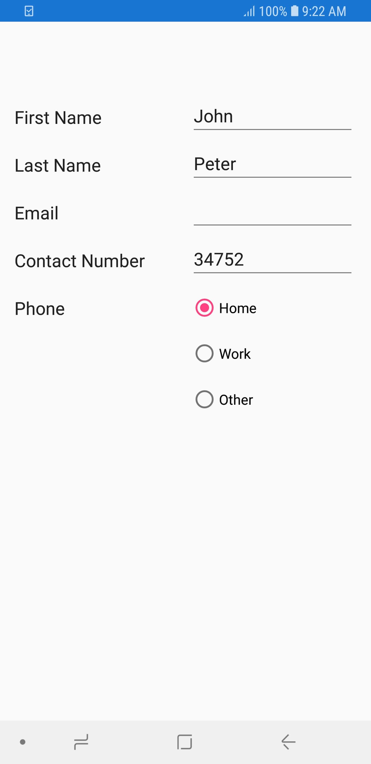
RadioGroup editor
In the RadioGroup editor, the SfRadioGroup control is loaded.
The items for SfRadioGroup is generated for enum and List data type properties. In order to add RadioGroup editor in the DataForm, you need to register editor as RadioGroup for the required property by using the RegisterEditor method.
Support for enum data type
For enum data type property, SfRadioGroup items will be added based on specified property enum values.
dataForm.RegisterEditor("Phone", "RadioGroup");

private Numbers phone;
public Numbers Phone
{
	get { return phone; }
	set { this.phone = value; }
}

public enum Numbers
{
	Home,
	Work,
	Other
}
Support for List data type
For List data type property, you have to set the ItemsSource by using the SourceProvider, based on that SfRadioGroup items will be added.
dataForm.RegisterEditor("Phone", "RadioGroup");
dataForm.SourceProvider = new SourceProviderExt();

private string phone;
public string Phone
{
    get { return phone; }
    set { this.phone = value; }
}

public class SourceProviderExt : SourceProvider
{
    public override IList GetSource(string sourceName)
    {
		var list = new List<string>();
		if(sourceName == "Phone")
		{
			list.Add("Home");
			list.Add("Work");
			list.Add("Other");
		}
		return list;
    }
}
MaskedEditText editor
In the MaskedEditText editor, the SfMaskedEdit control is loaded.
[Display(Name = "Contact Number")]
[DataType(DataType.PhoneNumber)]
public string ContactNumber { get; set; }
Setting the masked editor as int and double type
By default, the SfMaskedEdit includes prompt and literals along with your input value. The special characters are not allowed in int and double type, so you need to exclude prompt and literals using the ValueMaskFormat property in DataFormMaskedEditTextItem.
dataForm.AutoGeneratingDataFormItem += DataForm_AutoGeneratingDataFormItem;
…

private void DataForm_AutoGeneratingDataFormItem(object sender, AutoGeneratingDataFormItemEventArgs e)
{
    if (e.DataFormItem != null && e.DataFormItem.Name == "ContactNumber")
    {
        (e.DataFormItem as DataFormMaskedEditTextItem).ValueMaskFormat = Syncfusion.XForms.MaskedEdit.MaskFormat.ExcludePromptAndLiterals;
        }
}
Localizing special characters
The special symbols such as currency, date separator, decimal separator, and other symbols can be localized using the CultureInfo property of DataFormMaskedEditTextItem.
(e.DataFormItem as DataFormMaskedEditTextItem).CultureInfo = new CultureInfo("fr-FR");Customizing the clipboard text
By default, when you perform cut or copy operation, the clipboard text will be included with prompt and literals along with your input value. You can modify this and allow the clipboard to hold the value with or without prompt and literals by setting the CutCopyMaskFormat property of the DataFormMaskedEditTextItem.
(e.DataFormItem as DataFormMaskedEditTextItem).CutCopyMaskFormat = Syncfusion.XForms.MaskedEdit.MaskFormat.ExcludePromptAndLiterals;Mask and mask types
The mask and mask type of input can be customized using the Mask and MaskType properties of DataFormMaskedEditTextItem. Refer to this link to know more about the mask characters and mask types available in the masked editor.
(e.DataFormItem as DataFormMaskedEditTextItem).Mask = @"+1\(\d{3}\)\d{6}";
(e.DataFormItem as DataFormMaskedEditTextItem).MaskType = Syncfusion.XForms.MaskedEdit.MaskType.RegEx;
Customizing prompt character
The custom prompt character can be set using the PromptChar property of DataFormMaskedEditTextItem.
(e.DataFormItem as DataFormMaskedEditTextItem).PromptChar = '#';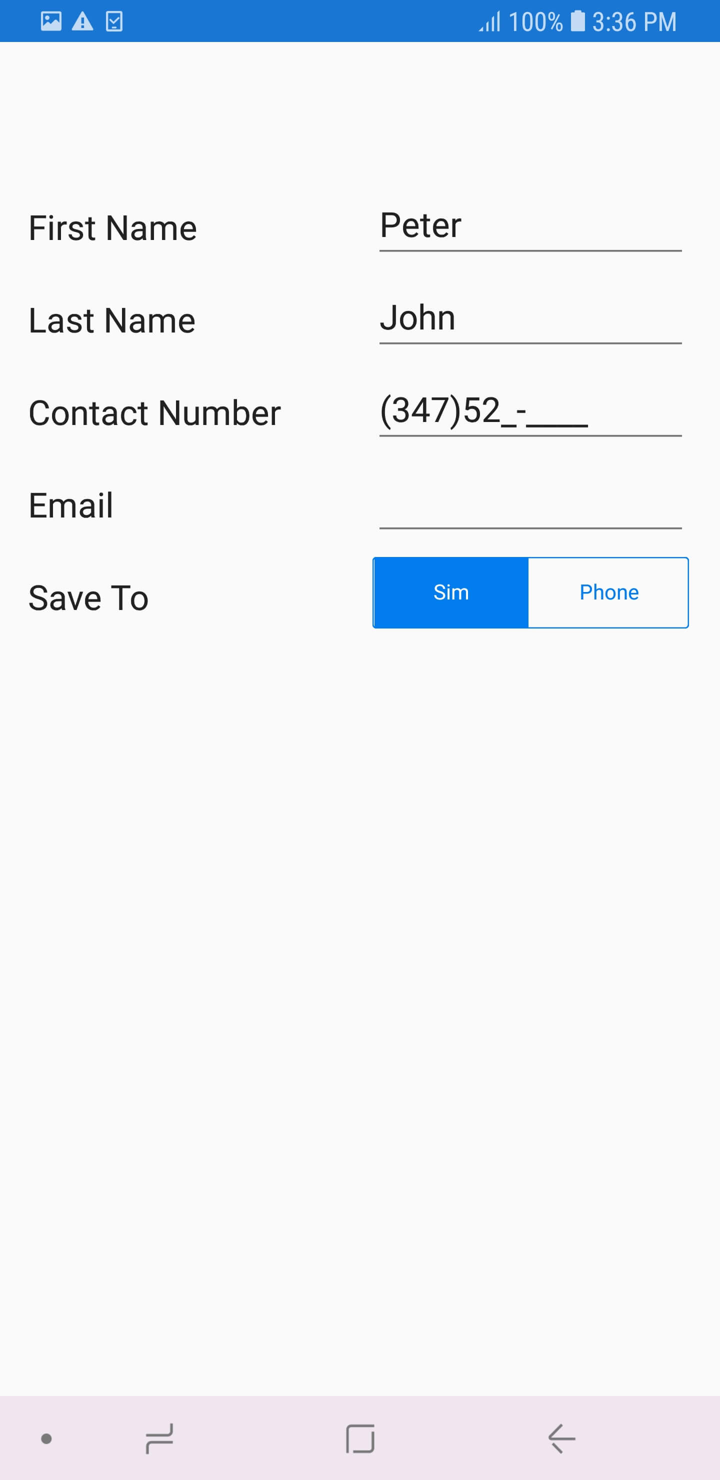
Show password character
The MaskedTextEditor supports to work as a password text box when setting a character to the PasswordChar property of DataFormMaskedEditTextItem.
(e.DataFormItem as DataFormMaskedEditTextItem).PasswordChar = '*';Password Delay
When providing password character, you can show the typed character with some delay using the EnablePasswordDelay property in DataFormMaskedEditTextItem. When enabling the EnablePasswordDelay property, the typed character will be displayed for a few seconds before it is converted to the password character.
(e.DataFormItem as DataFormMaskedEditTextItem).PasswordChar = '*';
(e.DataFormItem as DataFormMaskedEditTextItem).EnablePasswordDelay = true;
Password delay duration
When PasswordDelay is enabled, you can handle the duration of the displaying typed character using the PasswordDelayDuration property in DataFormMaskedEditTextItem.
(e.DataFormItem as DataFormMaskedEditTextItem).PasswordChar = '*';
(e.DataFormItem as DataFormMaskedEditTextItem).EnablePasswordDelay = true;
(e.DataFormItem as DataFormMaskedEditTextItem).PasswordDelayDuration  = 2;
See also
How to mask credit card number in Xamarin.Forms DataForm (SfDataForm)
AutoComplete editor
In the autocomplete editor, the SfAutoComplete is loaded.
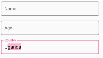
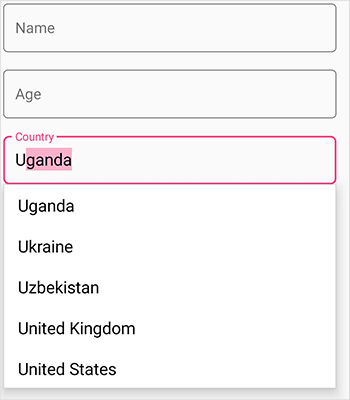
Customizing ItemsSource of autocomplete editor
By default, the ItemsSource for AutoComplete editor is auto-generated for enum types. For other types, you can set ItemsSource using SourceProvider.
Using SourceProvider
private string country;
public string Country
{
    get
    {
        return country;
    }
    set
    {
        country = value;
    }
}
public class SourceProviderExt : SourceProvider
{
    public override IList GetSource(string sourceName)
    {
        var list = new List<string>();
        if (sourceName == "Country")
        {
                list.Add("Indonesia");
                list.Add("Italy");
                list.Add("India");
                list.Add("Iran");
                list.Add("Iraq");
                list.Add("Uganda");
                list.Add("Ukraine");
                list.Add("Canada");
                list.Add("Australia");
                list.Add("Uzbekistan");
                list.Add("France");
                list.Add("United Kingdom");
                list.Add("United States");

        }
        return list;
    }
}
dataForm.SourceProvider = new SourceProviderExt();
dataForm.RegisterEditor("Country", "AutoComplete");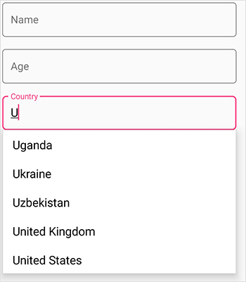
Using AutoGeneratingItem event
You can also set ItemsSource for autocomplete editor by using ItemsSource property in the DataFormAutoCompleteItem.
dataForm.RegisterEditor("Country", "AutoComplete");
dataForm.AutoGeneratingDataFormItem += DataForm_AutoGeneratingDataFormItem;

private void DataForm_AutoGeneratingDataFormItem(object sender, AutoGeneratingDataFormItemEventArgs e)
{
    if (e.DataFormItem != null && e.DataFormItem.Name == "Country")
    {
        var list = new List<string>();
                list.Add("Indonesia");
                list.Add("Italy");
                list.Add("India");
                list.Add("Iran");
                list.Add("Iraq");
                list.Add("Uganda");
                list.Add("Ukraine");
                list.Add("Canada");
                list.Add("Australia");
                list.Add("Uzbekistan");
                list.Add("France");
                list.Add("United Kingdom");
                list.Add("United States");
        (e.DataFormItem as DataFormAutoCompleteItem).ItemsSource = list;
    }
}
Dynamically changing the ItemsSource of autocomplete editor
You can also change the ItemsSource at runtime.
private void Button_Click(object sender, EventArgs e)
{
var dataFormItem = dataForm.ItemManager.DataFormItems["Country"];
if (dataFormItem.Name == "Country")
{
var list = new List<string>();
list.Add("Ukraine");
list.Add("Canada");
list.Add("Australia");
list.Add("Uzbekistan");
list.Add("France");
list.Add("United Kingdom");
list.Add("United States");
(dataFormItem as DataFormAutoCompleteItem).ItemsSource = list;
}
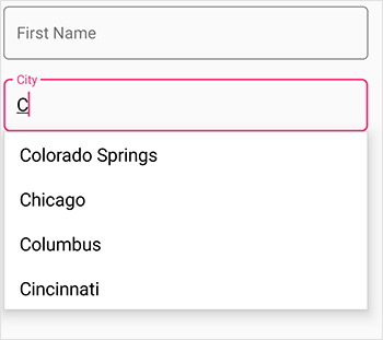
}Loading complex type property values in autocomplete editor
You can display the complex type property values in autocomplete editor by using GetSource override method of the SourceProvider class, which is used to get source list as complex property values for autocomplete editor and set it to the SourceProvider property of SfDataForm.Use the AutoGeneratingDataFormItem event to set [DisplayMemberPath] and [SelectedValuePath] property values of AutoComplete for complex type property.
NOTE
Class cannot be directly set as data type for autocomplete editor in this complex type scenario.
dataForm.SourceProvider = new SourceProviderExt();
dataForm.DataObject = new ContactInfo();
dataForm.RegisterEditor("City", "AutoComplete");
dataForm.AutoGeneratingDataFormItem += DataForm_AutoGeneratingDataFormItem;

private void DataForm_AutoGeneratingDataFormItem(object sender, AutoGeneratingDataFormItemEventArgs e)
{
    if (e.DataFormItem != null && e.DataFormItem.Name == "City")
    {
       (e.DataFormItem as DataFormAutoCompleteItem).DisplayMemberPath = "City";
       (e.DataFormItem as DataFormAutoCompleteItem).SelectedValuePath = "PostalCode";
    }
}

public class SourceProviderExt : SourceProvider
{
    public override IList GetSource(string sourceName)
    {
        if (sourceName == "City")
        {
            List<Address> details = new List<Address>();
            details.Add(new Address() { City = "Colorado Springs", PostalCode = 1 });
            details.Add(new Address() { City = "Chicago", PostalCode = 2 });
            details.Add(new Address() { City = "Columbus", PostalCode = 3 });
            details.Add(new Address() { City = "Portland", PostalCode = 4 });
            details.Add(new Address() { City = "Paris", PostalCode = 5 });
            details.Add(new Address() { City = "Las Vegas", PostalCode = 6 });
            details.Add(new Address() { City = "New York", PostalCode = 7 });
            details.Add(new Address() { City = "Cincinnati", PostalCode = 8 });
            details.Add(new Address() { City = "San Diego", PostalCode = 9 });

            return details;
        }
       return new List<string>();
    }
}

public class ContactInfo
{
    [Display(Name ="First Name")]
    public String FirstName { get; set; }
    public string City { get; set; }
}

public class Address
{
    public int PostalCode { get; set; }
    public string City { get; set; }
}
Customizing the appearance of autocomplete editor
AutoComplete editor modes
The DataFormAutoCompleteEditor provides the following three different ways to display the filtered suggestions.
-
Suggest - Displays suggestions in drop-down list
-
Append - Appends the first suggestion to text
-
SuggestAppend - Performs both suggest and append.
The AutoCompleteMode property is used to choose the suggestion display mode in the DataFormAutoCompleteItem class. The default value is Suggest.
Suggestion choices in list
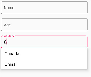
The filtered suggestions are displayed in a drop-down list. Users can pick an item from the list.
dataForm.DataObject = new ContactInfo();
dataForm.SourceProvider = new SourceProviderExt();
dataForm.RegisterEditor("Country", "AutoComplete");
dataForm.AutoGeneratingDataFormItem += DataForm_AutoGeneratingDataFormItem;

private void DataForm_AutoGeneratingDataFormItem(object sender, AutoGeneratingDataFormItemEventArgs e)
{
    if (e.DataFormItem != null && e.DataFormItem.Name == "Country")
    {
        var autoCompleteItem = (e.DataFormItem as DataFormAutoCompleteItem);
        autoCompleteItem.AutoCompleteMode = AutoCompleteMode.Suggest;
    }
}
public class SourceProviderExt : SourceProvider
{
    public override IList GetSource(string sourceName)
    {
        var list = new List<string>();
        if (sourceName == "Country")
        {
                list.Add("Indonesia");
                list.Add("Italy");
                list.Add("India");
                list.Add("Iran");
                list.Add("Iraq");
                list.Add("Uganda");
                list.Add("Ukraine");
                list.Add("Canada");
                list.Add("Australia");
                list.Add("Uzbekistan");
                list.Add("France");
                list.Add("United Kingdom");
                list.Add("United States");

        }
        return list;
    }
}
Appending suggestion to text
The first item in the filtered suggestions is appended to autocomplete editor text. In this mode,the drop down remains closed.
dataForm.DataObject = new ContactInfo();
dataForm.RegisterEditor("Country", "AutoComplete");
dataForm.AutoGeneratingDataFormItem += DataForm_AutoGeneratingDataFormItem;

private void DataForm_AutoGeneratingDataFormItem(object sender, AutoGeneratingDataFormItemEventArgs e)
{
    if (e.DataFormItem != null && e.DataFormItem.Name == "Country")
    {
        var autoCompleteItem = (e.DataFormItem as DataFormAutoCompleteItem);
        autoCompleteItem.AutoCompleteMode = AutoCompleteMode.Append;
    }
}
Suggesting choices and appending suggestions to Text
The text is appended to the first matched item in the suggestions collection, and the filtered suggestions are displayed in a drop-down list. The users can pick an item from a list directly or use the up and down keys for browsing the list.
dataForm.DataObject = new ContactInfo();
dataForm.RegisterEditor("Country", "AutoComplete");
dataForm.AutoGeneratingDataFormItem += DataForm_AutoGeneratingDataFormItem;

private void DataForm_AutoGeneratingDataFormItem(object sender, AutoGeneratingDataFormItemEventArgs e)
{
    if (e.DataFormItem != null && e.DataFormItem.Name == "Country")
    {
        var autoCompleteItem = (e.DataFormItem as DataFormAutoCompleteItem);
        autoCompleteItem.AutoCompleteMode = AutoCompleteMode.SuggestAppend;
    }
}
AutoComplete editor suggestion options
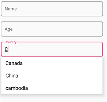
The phenomenon of string comparison for filtering suggestions can be changed using the SuggestionMode property. The default filtering strategy is “StartsWith”, and it is case insensitive. The available filtering modes are,
-
StartsWith
-
StartsWithCaseSensitive
-
Contains
-
ContainsWithCaseSensitive
-
Equals
-
EqualsWithCaseSensitive
-
EndsWith
-
EndsWithCaseSensitive
Filtering words that starts with input text
Displays all the matches that start with the typed characters in items source of autocomplete editor. This strategy is case in sensitive.
dataForm.DataObject = new ContactInfo();
dataForm.RegisterEditor("Country", "AutoComplete");
dataForm.AutoGeneratingDataFormItem += DataForm_AutoGeneratingDataFormItem;

private void DataForm_AutoGeneratingDataFormItem(object sender, AutoGeneratingDataFormItemEventArgs e)
{
    if (e.DataFormItem != null && e.DataFormItem.Name == "Country")
    {
        var autoCompleteItem = (e.DataFormItem as DataFormAutoCompleteItem);
        autoCompleteItem.SuggestionMode = Syncfusion.XForms.DataForm.SuggestionMode.StartsWith;
    }
}
Filtering words that starts with input text - CaseSensitive
Displays all the matches that start with the typed characters in items source of autocomplete editor. This strategy is case sensitive.
dataForm.DataObject = new ContactInfo();
dataForm.RegisterEditor("Country", "AutoComplete");
dataForm.AutoGeneratingDataFormItem += DataForm_AutoGeneratingDataFormItem;

private void DataForm_AutoGeneratingDataFormItem(object sender, AutoGeneratingDataFormItemEventArgs e)
{
    if (e.DataFormItem != null && e.DataFormItem.Name == "Country")
    {
        var autoCompleteItem = (e.DataFormItem as DataFormAutoCompleteItem);
        autoCompleteItem.SuggestionMode = Syncfusion.XForms.DataForm.SuggestionMode.StartsWithCaseSensitive;
    }
}
Filtering words that contains the input text
Displays all the matches that contain the typed characters in items source of autocomplete editor. This strategy is case in-sensitive.
Filtering words that contains the input text - CaseSensitive
Displays all the matches that contain the typed characters in items source of autocomplete editor. This strategy is case sensitive.
Filtering words that equals the input text
Displays all the words that completely matches with the typed characters in items source of autocomplete editor. This strategy is case in-sensitive.
Filtering words that equal the input text - CaseSensitive
Displays all the words that completely match with the typed characters in items source of autocomplete editor. This strategy is case sensitive.
Filtering words that end with the input text
Displays all the matches that end with the typed characters in items source of autocomplete editor. This strategy is case in-sensitive.
Filtering words that end with the input text - CaseSensitive
Displays all the matches that end with the typed characters in items source of autocomplete editor. This strategy is case sensitive.
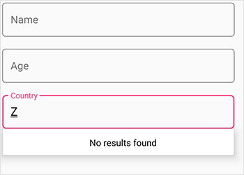
No results found text
When the entered item is not in the suggestion list, SfAutoComplete displays a text that indicates there is no search results found. You can set the desire text to be displayed for indicating no results found with the NoResultsFoundText property.
dataForm.DataObject = new ContactInfo();
dataForm.RegisterEditor("Country", "AutoComplete");
dataForm.AutoGeneratingDataFormItem += DataForm_AutoGeneratingDataFormItem;

private void DataForm_AutoGeneratingDataFormItem(object sender, AutoGeneratingDataFormItemEventArgs e)
{
    if (e.DataFormItem != null && e.DataFormItem.Name == "Country")
    {
        var autoCompleteItem = (e.DataFormItem as DataFormAutoCompleteItem);
        autoCompleteItem.NoResultsFoundText = "No result found";
    }
}
NOTE
The NoResultsFoundText works by default in the UWP platform without setting any property by showing the text “No result found”.
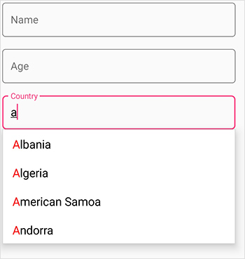
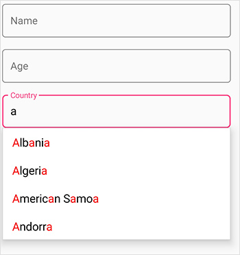
Highlighting match text
Highlights matching characters in a suggestion list to pick an item with more clarity. The text highlight can be indicated with various customizing colors by enabling the following property.
- HighlightedTextColor - Sets the color of the highlighted text for differentiating the highlighted characters.
TextHighlightMode
There are two ways to highlight the matching text:
-
First occurrence
dataForm.DataObject = new ContactInfo();
dataForm.RegisterEditor("Country", "AutoComplete");
dataForm.AutoGeneratingDataFormItem += DataForm_AutoGeneratingDataFormItem;

private void DataForm_AutoGeneratingDataFormItem(object sender, AutoGeneratingDataFormItemEventArgs e)
{
    if (e.DataFormItem != null && e.DataFormItem.Name == "Country")
    {
        var autoCompleteItem = (e.DataFormItem as DataFormAutoCompleteItem);
        autoCompleteItem.SuggestionMode = SuggestionMode.StartsWith;
        autoCompleteItem.HighlightedTextColor = Color.Red;
        autoCompleteItem.TextHighlightMode = OccurrenceMode.FirstOccurrence;
        autoCompleteItem.ItemsSource = new List<string>
        {
            "Albania",
            "Algeria",
            "American Samoa",
            "Andorra"
        };
    }
}
-
Multiple occurrence
dataForm.DataObject = new ContactInfo();
dataForm.RegisterEditor("Country", "AutoComplete");
dataForm.AutoGeneratingDataFormItem += DataForm_AutoGeneratingDataFormItem;

private void DataForm_AutoGeneratingDataFormItem(object sender, AutoGeneratingDataFormItemEventArgs e)
{
    if (e.DataFormItem != null && e.DataFormItem.Name == "Country")
    {
        var autoCompleteItem = (e.DataFormItem as DataFormAutoCompleteItem);
        autoCompleteItem.SuggestionMode = SuggestionMode.Contains;
        autoCompleteItem.HighlightedTextColor = Color.Red;
        autoCompleteItem.TextHighlightMode = OccurrenceMode.MultipleOccurrence;
        autoCompleteItem.ItemsSource = new List<string>
        {
            "Albania",
            "Algeria",
            "American Samoa",
            "Andorra"
        };
    }
}
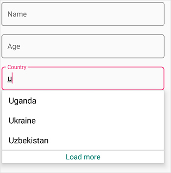
Maximum display item in dropdown column
Restrict the number of suggestions displayed and get the remaining items loaded by selecting LoadMore.You can restrict maximum suggestion to be displayed with the MaximumSuggestion property. You can set the desired text for displaying the Load more text using the LoadMoreText property.
dataForm.DataObject = new ContactInfo();
dataForm.RegisterEditor("Country", "AutoComplete");
dataForm.AutoGeneratingDataFormItem += DataForm_AutoGeneratingDataFormItem;

private void DataForm_AutoGeneratingDataFormItem(object sender, AutoGeneratingDataFormItemEventArgs e)
{
    if (e.DataFormItem != null && e.DataFormItem.Name == "Country")
    {
        var autoCompleteItem = (e.DataFormItem as DataFormAutoCompleteItem);
            autoCompleteItem.MaximumSuggestion = 3;
            autoCompleteItem.LoadMoreText = "Load more";
    }
}
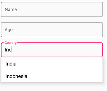
Minimum prefix character
Instead of displaying suggestion list on every character entry, matches can be filtered and displayed after a few character entries using the MinimumPrefixCharacters property. The default value is 1.
dataForm.DataObject = new ContactInfo();
dataForm.RegisterEditor("Country", "AutoComplete");
dataForm.AutoGeneratingDataFormItem += DataForm_AutoGeneratingDataFormItem;

private void DataForm_AutoGeneratingDataFormItem(object sender, AutoGeneratingDataFormItemEventArgs e)
{
    if (e.DataFormItem != null && e.DataFormItem.Name == "Country")
    {
        var autoCompleteItem = (e.DataFormItem as DataFormAutoCompleteItem);
            autoCompleteItem.MinimumPrefixCharacters = 3;
    }
}
Diacritic sensitivity
The control does not stick with one type of keyboard, so you can populate items from a language with letters containing diacritics, and search for them with the English characters from an en-US keyboard. Users can enable or disable the diacritic sensitivity using IgnoreDiacritic property. The following code example illustrates how to enable the diacritic sensitivity, so that items in the suggestion list can be populated by entering any diacritic character of that alphabet.
dataForm.DataObject = new Queries();
dataForm.RegisterEditor("RelatedQuestions", "AutoComplete");
dataForm.AutoGeneratingDataFormItem += DataForm_AutoGeneratingDataFormItem;

private void DataForm_AutoGeneratingDataFormItem(object sender, AutoGeneratingDataFormItemEventArgs e)
{
    if (e.DataFormItem != null && e.DataFormItem.Name == "RelatedQuestions")
    {
        var autoCompleteItem = (e.DataFormItem as DataFormAutoCompleteItem);
            autoCompleteItem.IgnoreDiacritic = false;
            autoCompleteItem.ItemsSource = new List<string>
                    {
                   "Hów tó gâin wéight?",
                   "Hów tó drâw ân éléphânt?",
                   "Whéré cân I buy â câmérâ?",
                   "Guidé mé âll thé wây",
                    };
    }
}
public class Queries
{
    [Display(ShortName = "Product Name")]
    public string ProductName { get; set; }
    public string Cost { get; set; }
    [Display(ShortName = "Related questions asked")]
    public string RelatedQuestions { get;set;}
}
Custom editor
The custom editor can be added to DataForm by overriding the DataFormEditor class for business models. You can create custom editor using Views and Layouts.
To add custom editor in DataForm, register the editor with custom registered type for the required property using RegisterEditor method. You can also customize editor settings by using specific override methods available in DataFormEditor.
- Creating custom editor using views.
- Creating custom editor using layouts.
Creating custom editor using views
Views such as labels, buttons, and sliders can be loaded to custom editor. Here, entry is loaded as custom editor for ContactName property.
public class CustomTextEditor : DataFormEditor<Entry>
{
    public CustomTextEditor(SfDataForm dataForm) : base(dataForm)
    {
    }

    protected override Entry OnCreateEditorView(DataFormItem dataFormItem)
    {
        return new Entry();
    }
}
…

dataForm.RegisterEditor("CustomTextEditor", new CustomTextEditor(dataForm));
dataForm.RegisterEditor("ContactName", "CustomTextEditor");
Creating custom editor using layouts
Layouts such as Grid, StackLayout, ContentView, and ScrollView can be added as custom editor. Here, the label and image view in Grid are loaded as custom editors for ContactName property.
<?xml version="1.0" encoding="utf-8" ?>
<ContentView xmlns="http://xamarin.com/schemas/2014/forms"
                        xmlns:x="http://schemas.microsoft.com/winfx/2009/xaml"
                        x:Class="DataForm_Forms.TextEditor">
    <ContentPage.Content>
        <Grid>
            <Grid.ColumnDefinitions>
                <ColumnDefinition Width="0.05*"/>
                <ColumnDefinition Width="Auto"/>
            </Grid.ColumnDefinitions>
            <Image Source="LabelContactName.png" />
            <Editor Grid.Column="1"/>
        </Grid>
    </ContentPage.Content>
</ContentView>public class CustomTextEditor : DataFormEditor<TextEditor>
{
public CustomTextEditor(SfDataForm dataForm) : base(dataForm)
{
}
protected override TextEditor OnCreateEditorView(DataFormItem dataFormItem)
{
return new TextEditor();
}
}
…
dataForm.RegisterEditor("CustomTextEditor", new CustomTextEditor(dataForm));
dataForm.RegisterEditor("ContactName", "CustomTextEditor");You should manually commit and validate the editor value of custom DataFormItem. Refer to this link to know more about custom editor.
See also
How to commit and validate the custom editor value to corresponding DataObject property in Xamarin.Forms SfDataForm
How to add custom image editor in Xamarin.Forms DataForm
How to add floating label text editor in DataForm Xamarin.Forms
How to raise dataform editor Touch event in Xamarin.Forms SfDataForm
How to add custom text editor in Xamarin.Forms DataForm and customize the default appearance in platform renderer