Multiple selection in Xamarin ComboBox (SfComboBox)
18 Nov 201817 minutes to read
Select multiple items from a suggestion list. There are two ways to perform multi selection in the combo box control.
-
Token Representation
-
Delimiter
Token representation
Selected items will be displayed with a customizable token representation. Users can remove each tokenized item with the close button. And IsSelectedItemsVisibleInDropDown property is used to restrict the selected items as visible or not in dropDown.
<StackLayout VerticalOptions="Start" HorizontalOptions="Start" Padding="30">
	<combobox:SfComboBox HeightRequest="40" x:Name="comboBox" MultiSelectMode="Token" TokensWrapMode="Wrap" IsSelectedItemsVisibleInDropDown="false" />
</StackLayout>
StackLayout layout = new StackLayout()
{
VerticalOptions = LayoutOptions.Start,
HorizontalOptions = LayoutOptions.Start,
Padding = new Thickness(30)
};
SfComboBox comboBox = new SfComboBox();
comboBox.DropDownItemHeight = 50;
comboBox.MultiSelectMode = MultiSelectMode.Token;
comboBox.TokensWrapMode = TokensWrapMode.Wrap;
comboBox.IsSelectedItemsVisibleInDropDown = false;
layout.Children.Add(comboBox);
Content = layout;Wrap mode of token
The selected item can be displayed as token inside the SfComboBox in two ways. They are
-
Wrap- When theTokensWrapModeis set toWrapthe selected items will be wrapped to the next line of theSfComboBox. -
None- When theTokensWrapModeis set toNonethe selected item will be wrapped in horizontal orientation.
Define a simple model class Employee with fields ID, Name and populate employee data in ViewModel.
// Create a Employee Class which holds the Name and image.
    public class Employee
    {
        private string image;
        public string Image
        {
            get { return image; }
            set { image = value; }
        }

        private string name;
        public string Name
        {
            get { return name; }
            set { name = value; }
        }
    }

    // Create EmployeeViewModel class holds the collection of employee data.
    public class EmployeeViewModel :INotifyPropertyChanged
    {
        private ObservableCollection<Employee> employeeCollection;
        public ObservableCollection<Employee> EmployeeCollection
        {
            get { return employeeCollection; }
            set { employeeCollection = value; }
        }
        public EmployeeViewModel()
        {
            employeeCollection = new ObservableCollection<Employee>();
            employeeCollection.Add(new Employee() { Image = "John.png", Name = "John" });
            employeeCollection.Add(new Employee() { Image = "Justin.png", Name = "Justin" });
            employeeCollection.Add(new Employee() { Image = "Jerome.png", Name = "Jerome" });
            employeeCollection.Add(new Employee() { Image = "Jessica.png", Name = "Jessica" });
            employeeCollection.Add(new Employee() { Image = "Victoria.png", Name = "Victoria" });
        }

        public event PropertyChangedEventHandler PropertyChanged;
        private void RaisePropertyChanged(String name)
        {
        if (PropertyChanged != null)
            this.PropertyChanged(this, new PropertyChangedEventArgs(name));
        }
    }
Now populate this EmployeeViewModel data in SfComboBox control by binding with DataSource property.
<ContentPage xmlns="http://xamarin.com/schemas/2014/forms"
             xmlns:x="http://schemas.microsoft.com/winfx/2009/xaml"
             xmlns:combobox="clr-namespace:Syncfusion.XForms.ComboBox;assembly=Syncfusion.SfComboBox.XForms"
             xmlns:local="clr-namespace:NamespaceName"
             x:Class="NamespaceName.ClassName">
    <ContentPage.BindingContext>
        <local:EmployeeViewModel/>
    </ContentPage.BindingContext>
    <StackLayout VerticalOptions="Start" HorizontalOptions="Start" Padding="30">
        <combobox:SfComboBox HeightRequest="40" x:Name="comboBox" DropDownItemHeight="50" DisplayMemberPath="Name" ImageMemberPath="Image" MultiSelectMode="Token" DataSource="{Binding EmployeeCollection}"/>
    </StackLayout>
</ContentPage>
StackLayout layout = new StackLayout()
{
VerticalOptions = LayoutOptions.Start,
HorizontalOptions = LayoutOptions.Start,
Padding = new Thickness(30)
};
SfComboBox comboBox = new SfComboBox();
comboBox.DropDownItemHeight = 50;
comboBox.DisplayMemberPath = "Name";
comboBox.ImageMemberPath = "Image";
comboBox.MultiSelectMode = MultiSelectMode.Token;
this.BindingContext = new EmployeeViewModel();
// Set TokensWrapMode to Wrap
comboBox.TokensWrapMode = TokensWrapMode.Wrap;
comboBox.SetBinding(SfComboBox.DataSourceProperty, "EmployeeCollection", BindingMode.TwoWay);
layout.Children.Add(comboBox);
Content = layout;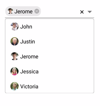
Token customization
Token can be customized in the following ways:
-
TextColor- Sets the color of the text inside the token. -
FontSize- Sets the size of the font inside the token. -
FontFamily- Sets the font family for the text inside the token. -
BackgroundColor- Sets the background color for token. -
SelectedBackgroundColor- Sets the background color of the token when it is selected. -
IsCloseButtonVisible- Enables and disables the close button inside theSfComboBox. -
DeleteButtonColor- Sets the color of the close button inside theSfComboBox. -
CornerRadius- Sets the corner radius for the token. -
DeleteButtonPlacement- sets the placement of delete button.LeftandRightare the placement options. By default, it is set placed at right side of the token.
CornerRadiussupport has enhanced only on iOS and Android platform.
<ContentPage xmlns="http://xamarin.com/schemas/2014/forms"
             xmlns:x="http://schemas.microsoft.com/winfx/2009/xaml"
             xmlns:combobox="clr-namespace:Syncfusion.XForms.ComboBox;assembly=Syncfusion.SfComboBox.XForms"
             xmlns:local="clr-namespace:NamespaceName"
             x:Class="NamespaceName.ClassName">
    <ContentPage.BindingContext>
        <local:EmployeeViewModel/>
    </ContentPage.BindingContext>
    <StackLayout VerticalOptions="Start" HorizontalOptions="Start" Padding="30">
        <combobox:SfComboBox HeightRequest="40" x:Name="comboBox" DropDownItemHeight="50" DisplayMemberPath="Name" ImageMemberPath="Image"                             MultiSelectMode="Token" TokensWrapMode="Wrap" DataSource="{Binding EmployeeCollection}">
            <combobox:SfComboBox.TokenSettings>
                <combobox:TokenSettings FontSize="16" BackgroundColor="#66ccff"
                                        TextColor="White" SelectedBackgroundColor="#ffffe0"
                                        DeleteButtonColor="Color.Brown" IsCloseButtonVisible="true"
                                        CornerRadius="15" DeleteButtonPlacement="Right">
                </combobox:TokenSettings>
            </combobox:SfComboBox.TokenSettings>
      </combobox:SfComboBox>
    </StackLayout>
</ContentPage>
StackLayout layout = new StackLayout()
{
VerticalOptions = LayoutOptions.Start,
HorizontalOptions = LayoutOptions.Start,
Padding = new Thickness(30)
};
SfComboBox comboBox = new SfComboBox();
comboBox.DropDownItemHeight = 50;
comboBox.DisplayMemberPath = "Name";
comboBox.ImageMemberPath = "Image";
comboBox.MultiSelectMode = MultiSelectMode.Token;
this.BindingContext = new EmployeeViewModel();
// Token Customization
TokenSettings token = new TokenSettings();
token.FontSize = 16;
token.BackgroundColor = Color.FromHex("#66ccff");
token.TextColor = Color.White;
token.SelectedBackgroundColor = Color.FromHex("#ffffe0");
token.DeleteButtonColor = Color.Brown;
token.IsCloseButtonVisible = true;
token.CornerRadius = 15;
token.DeleteButtonPlacement = DeleteButtonPlacement.Right;
comboBox.TokenSettings = token;
comboBox.TokensWrapMode = TokensWrapMode.Wrap;
comboBox.SetBinding(SfComboBox.DataSourceProperty, "EmployeeCollection", BindingMode.TwoWay);
layout.Children.Add(comboBox);
Content = layout;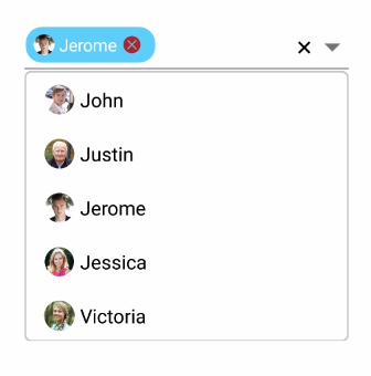
Delimiter
When selecting multiple items, the selected items can be divided with a desired character given for a delimiter. You can set delimiter character using the Delimiter property.
Delimiter support has enhanced only on iOS and Android platform.
<StackLayout VerticalOptions="Start" HorizontalOptions="Start" Padding="30">
    <combobox:SfComboBox HeightRequest="40" x:Name="comboBox" MultiSelectMode="Delimiter"  Delimiter=",">
        <combobox:SfComboBox.DataSource>
            <ListCollection:List x:TypeArguments="x:String">
                <x:String> Afghanistan </x:String>
                <x:String> Albania </x:String>
                <x:String> Mexico </x:String>
                <x:String> Norway </x:String>
                <x:String> Singapore </x:String>
                <x:String> Thailand </x:String>
                <x:String> China </x:String>
                <x:String> United States </x:String>
                <x:String> Zimbabwe </x:String>
            </ListCollection:List>
        </combobox:SfComboBox.DataSource>
    </combobox:SfComboBox>
</StackLayout>
StackLayout layout = new StackLayout()
{
VerticalOptions = LayoutOptions.Start,
HorizontalOptions = LayoutOptions.Start,
Padding = new Thickness(30)
};
List<String> countryNames = new List<String>();
countryNames.Add("Afghanistan");
countryNames.Add("Albania");
countryNames.Add("Mexico");
countryNames.Add("Norway");
countryNames.Add("Singapore");
countryNames.Add("Thailand");
countryNames.Add("China");
countryNames.Add("United States");
countryNames.Add("Zimbabwe");
SfComboBox comboBox = new SfComboBox();
comboBox.HeightRequest = 40;
combobox.MultiSelectMode = MultiSelectMode.Delimiter;
combobox.Delimiter = ",";
layout.Children.Add(comboBox);
Content = layout;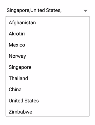
Selection indicator
The combobox enables the user to indicate the selected item from the datasource when selecting multiple items from the dropdown. It can be performed by enabling EnableSelectionIndicator property.
<combobox:SfComboBox HeightRequest="40" ShowSuggestionsOnFocus="true" IsSelectedItemsVisibleInDropDown="true" IndicatorText="A" IndicatorFontFamily="sample.ttf" IndicatorTextSize="15" IndicatorTextColor="Red" EnableSelectionIndicator="true" MultiSelectMode="Token" x:Name="comboBox" DataSource="{Binding EmployeeCollection}"/>comboBox.MultiSelectMode=MultiSelectMode.Token;
comboBox.ShowSuggestionsOnFocus=true;
comboBox.IsSelectedItemsVisibleInDropDown=true;
comboBox.IndicatorText= "A";
comboBox.IndicatorFontFamily= "sample.ttf";
comboBox.IndicatorTextSize= "15";
comboBox.IndicatorTextColor = Color.Red;
comboBox.EnableSelectionIndicator= true;Item padding
The autocomplete enables the user to provide padding for the items inside dropdown using ItemPadding property.
<combobox:SfComboBox ShowSuggestionsOnFocus="true" ItemPadding="20,10,0,0" MultiSelectMode="Token" x:Name="comboBox" DataSource="{Binding EmployeeCollection}"/>comboBox.MultiSelectMode=MultiSelectMode.Token;
comboBox.ShowSuggestionsOnFocus=true;
comboBox.ItemPadding= new Thickness(20,10,0,0);;