Data Markers in Xamarin.Android Chart(SfChart)
25 Nov 20228 minutes to read
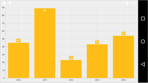
Data markers are used to provide information about the data points to the user. You can add a shape and label to adorn each data point. DataMarker can be enabled using following code snippet,
[C#]

lineSeries.DataMarker.ShowLabel = true;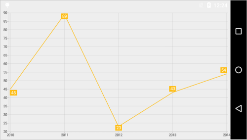
Customizing Labels
The DataMarkerLabel appearance can be customized using LabelStyle property.
-
TextColor– used to change the color of the label. -
BackgroundColor– used to change the label background color. -
StrokeColor– used to change the border color. -
StrokeWidth– used to change the width of the border. -
TextSize– used to change the text size. -
Typeface– used to change the font family and font weight. -
MarginTop- used to change the top margin of the labels. -
MarginBottom- used to change the bottom margin of the labels. -
MarginLeft- used to change the left margin of the labels. -
MarginRight- used to change the right margin of the labels. -
Angle– used to rotate the labels. -
LabelPadding- used to change the padding value of label. -
OffsetX- used to set the offset value of X. -
OffsetY- used to set the offset value of Y. -
UseSeriesPalette- used to bind the series color to the background color of data marker labels.
Following code snippet illustrates the customization of label and its background,
[C#]

lineSeries.DataMarker.ShowLabel = true;
lineSeries.DataMarker.LabelStyle.TextColor = Color.Blue;
lineSeries.DataMarker.LabelStyle.BackgroundColor = Color.Cyan;
lineSeries.DataMarker.LabelStyle.StrokeColor = Color.Red;
lineSeries.DataMarker.LabelStyle.StrokeWidth = 2;
lineSeries.DataMarker.LabelStyle.TextSize = 18;
lineSeries.DataMarker.LabelStyle.Typeface = Typeface.DefaultFromStyle(TypefaceStyle.Italic);
lineSeries.DataMarker.LabelStyle.Angle = 315;
lineSeries.DataMarker.LabelStyle.MarginLeft = 5;
lineSeries.DataMarker.LabelStyle.MarginTop = 5;
lineSeries.DataMarker.LabelStyle.MarginRight = 5;
lineSeries.DataMarker.LabelStyle.MarginBottom = 5;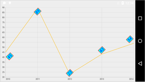
Formatting Label Content
You can customize the content of the label using LabelContent property. Following are the two options that are supported now,
-
Percentage– This will show the percentage value of corresponding data point Y value, this is often used in pie, doughnut, funnel and pyramid series types. -
YValue– This will show the corresponding Y value.
[C#]

pieSeries.DataMarker.LabelContent = LabelContent.Percentage;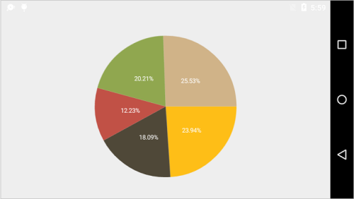
Label Position
The LabelPosition property is used to position the data marker labels at the Center, Inner and Outer positions.
The following screenshot illustrates the default position of data marker labels,
The following code sample illustrates the center position of data marker labels,
[C#]

columnSeries.DataMarker.LabelStyle.LabelPosition = DataMarkerLabelPosition.Center;
The following code sample illustrates the Inner position of data marker labels,
[C#]

columnSeries.DataMarker.LabelStyle.LabelPosition = DataMarkerLabelPosition.Inner;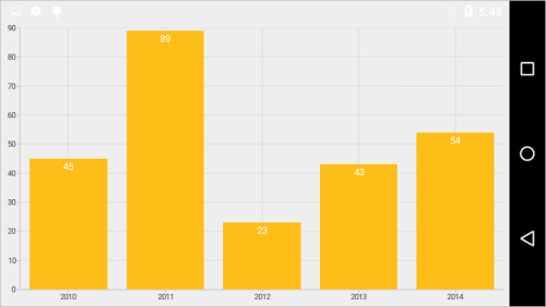
The following code sample illustrates the outer position of data marker labels,
[C#]

columnSeries.DataMarker.LabelStyle.LabelPosition = DataMarkerLabelPosition.Outer;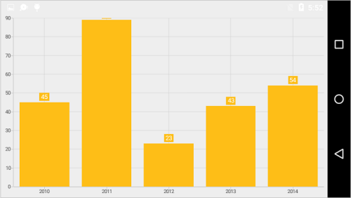
Smart Labels
In Pie and Doughnut series, overlapping of data labels can be avoided by setting SmartLabelsEnabled property to true.
[C#]

SfChart chart = new SfChart();

PieSeries pieSeries = new PieSeries()
{

    DataSource = Data,
    StartAngle = 45,
    EndAngle = 405,
    SmartLabelsEnabled = true,
    ConnectorType = ConnectorType.Bezier,
    DataMarkerPosition = CircularSeriesDataMarkerPosition.OutsideExtended,

};

pieSeries.DataMarker.ShowLabel = true;

chart.Series.Add(pieSeries);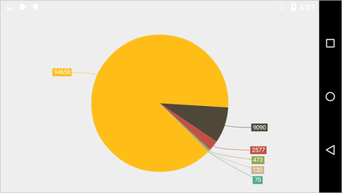
Customizing Marker Shapes
Shapes can be added to chart data marker by setting the ShowMarker property to true. There are different shapes you can set to the chart using MarkerType property such as Cross, Ellipse, Diamond etc. Following properties are used to customize marker appearance,
-
MarkerWidth- used to change the width of the marker. -
MarkerHeight- used to change the height of the marker. -
MarkerColor- used to change the color of the marker. -
MarkerStrokeColor- used to change the border color of the shape. -
MarkerStrokeWidth– used to change the marker border width.
The following code example shows how to enable marker and specify its types,
[C#]

lineSeries.DataMarker.ShowLabel = false;
lineSeries.DataMarker.ShowMarker = true;
lineSeries.DataMarker.MarkerType = DataMarkerType.Hexagon;
lineSeries.DataMarker.MarkerWidth = 20;
lineSeries.DataMarker.MarkerHeight = 20;
lineSeries.DataMarker.MarkerColor = Color.Cyan;
lineSeries.DataMarker.MarkerStrokeColor = Color.Red;
lineSeries.DataMarker.MarkerStrokeWidth = 2;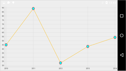
Connector Line
This feature is used to connect label and data point using a line. It can be enabled for any chart types but this is often used with Pie and Doughnut chart types. The ConnectorLineStyle property is used to customize the connector line.
-
StrokeColor– used to change the color of the line. -
StrokeWidth– used to change the stroke thickness of the line. -
PathEffect– used to set the dashes for the line. -
ConnectorHeight– used to change the connector line height. -
ConnectorRotationAngle– used to change the connector line rotation angle.
The following code illustrates how to specify the connector height and its angle,
[C#]

lineSeries.DataMarker.ShowLabel = true;
lineSeries.DataMarker.ConnectorLineStyle.ConnectorHeight = 50;
lineSeries.DataMarker.ConnectorLineStyle.ConnectorRotationAngle = 175;
lineSeries.DataMarker.ConnectorLineStyle.StrokeColor = Color.Blue;
lineSeries.DataMarker.ConnectorLineStyle.StrokeWidth = 3;
lineSeries.DataMarker.ConnectorLineStyle.PathEffect = new DashPathEffect(new float[] { 3, 3 }, 3);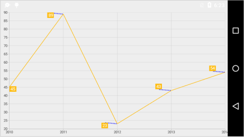
NOTE
For Pie and Doughnut series, you can set the
Beziercurve for connector line usingConnectorTypeproperty of Pie and Doughnut series.
Event
DataMarkerLabelCreated
The DataMarkerLabelCreated event occurs when the data marker label is created. This argument contains object of the DataMarkerLabel. The following properties are available in DataMarkerLabel to customize the appearance of data markers based on condition.
-
Label– Gets or sets the text of data marker. -
BackgroundColor– Gets or sets the background color of data marker label. -
Index– Gets the data point index of data marker label. -
XPosition– Gets the x-position of data marker label. -
YPosition– Gets the y-position of data marker label. -
LabelStyle– Gets or sets the label style to customize the appearance of individual data marker label. -
MarkerWidth– Gets or sets the marker width. -
MarkerHeight– Gets or sets the marker height. -
MarkerBorderWidth– Gets or sets the border width of marker symbol. -
MarkerBorderColor– Gets or sets the border color of marker symbol. -
MarkerColor– Gets or sets the marker color. -
MarkerType– Gets or sets the shape type of marker. The available shapes areEllipse, diamond, hexagon, cross, HorizontalLine, VerticalLine, InvertedTriangle, triangle, pentagon, plus, and square. -
ViewGets or sets the view. -
GrandTotal- Gets the sum of y-values data.
See also
How to customize the data marker of charts in Xamarin.Android