Tooltip in Xamarin.Android Chart(SfChart)
25 Nov 20225 minutes to read
Tooltip for data points, can be enabled by setting TooltipEnabled property as true.
[C#]

SfChart chart = new SfChart();
...

ColumnSeries columnSeries = new ColumnSeries();

columnSeries.ItemsSource = Data;

columnSeries.XBindingPath = "XValue";

columnSeries.YBindingPath = "YValue";

columnSeries.TooltipEnabled = true;

chart.Series.Add(columnSeries);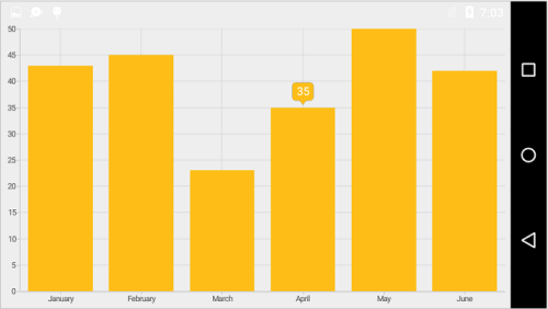
Customizing appearance
For customizing the tooltip appearance, you need to add an instance of ChartTooltipBehavior to the Behaviors collection property of SfChart. You can use the following properties available in the ChartTooltipBehavior.
-
StrokeColor– used to change the label border color. -
StrokeWidth– used to change the label border width. -
BackgroundColor– used to change the label background color. -
MarginBottom– specifies the bottom margin for tooltip text. -
MarginTop– specifies the top margin for tooltip text. -
MarginLeft– specifies the left margin for tooltip text. -
MarginRight– specifies the right margin for tooltip text. -
TextColor– used to change the text color. -
TextSize– used to change label font size, family and weight. -
LabelFormat– used to provide numeric or date time format of the tooltip text. -
Duration– used to set the duration of the tooltip. -
OffsetX- used to move the label horizontally. -
OffsetY- used to move the label vertically. -
PointerLength- used to change the pointer length of the tooltip. -
TooltipPosition- used to change the position of the tooltip(Left,Top,Right,Bottom. -
AnimationType- used to change the animation type of the tooltip(Fade,None,Pop. -
TypeFace- used to change the font family and font weight.
[C#]

SfChart chart = new SfChart();
...

ColumnSeries columnSeries = new ColumnSeries();

columnSeries.ItemsSource = Data;

columnSeries.XBindingPath = "XValue";

columnSeries.YBindingPath = "YValue";

columnSeries.TooltipEnabled = true;

ChartTooltipBehavior chartTooltipBehavior = new ChartTooltipBehavior();

chartTooltipBehavior.BackgroundColor = Color.Blue;

chartTooltipBehavior.StrokeColor = Color.Cyan;

chartTooltipBehavior.StrokeWidth = 3;

chartTooltipBehavior.TextSize = 15;

chartTooltipBehavior.TextColor = Color.White;

chartTooltipBehavior.Duration = 10;

chart.Behaviors.Add(chartTooltipBehavior);

chart.Series.Add(columnSeries);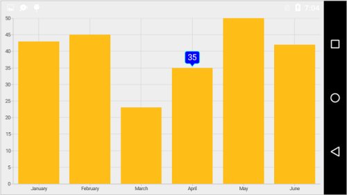
Customizing the appearance of tooltip view
The following properties are used to customize the appearance of tooltip view. You can customize the appearance of a tooltip by overriding the GetView method of ChartTooltipBehavior.
-
Series- Returns the series at the tapped location. -
XPosition- Returns the x position of the tooltip. -
YPosition- Returns the y position of the tooltip. -
LabelRect- Returns the tooltip label rect. -
CornerRadius- Changes the corner radius of the tooltip. -
Label- Changes the text for tooltip label.
Methods
You can show or hide the chart tooltip programmatically by using the show or hide method.
Show method
The Show method is used to activate the tooltip at the specified location.
public class MainActivity : Activity
{
    ChartTooltipBehavior tooltipBehavior;

    protected override void OnCreate(Bundle bundle)
    {
        . . .

        Button button = new Button(this);
        button.Click += Button_Click;

        tooltipBehavior = new ChartTooltipBehavior();
        chart.Behaviors.Add(tooltipBehavior);

        . . .
    }

    private void Button_Click(object sender, System.EventArgs e)
    {
	    //pointX - determines the x position of tooltip, pointY - determines the y position of tooltip and bool value determines whether the tooltip should be animated while displaying.
        tooltipBehavior.Show(pointX, pointY, true);
    }
}
NOTE
The tooltip will be activated at the specified location only if there is any data point under the specified location.
Hide method
The Hide method is used to hide the tooltip programmatically.
//The argument determines whether the tooltip should be animated while hiding.

tooltip.Hide(true);
Event
TooltipCreated
The TooltipCreated event occurs when a tooltip is activated. This argument contains P1, which is the object of TooltipView. You can customize the appearance of tooltip view using the properties of P1, which is referred in this link.
TooltipDismiss
The TooltipDismiss event occurs when a tooltip is hidden. This argument contains P1 which is the object of TooltipView.