Month View in WPF Scheduler (SfScheduler)
30 Jun 202624 minutes to read
The month view of the scheduler displays the days of a specific month and current month, by default initially. The current date color is differentiated from other dates of the current month.
Month agenda view
The scheduler month view displays a divided agenda view that is used to show the selected date’s appointments below the month. Show the agenda view by setting the ShowAgendaView property to true in the MonthViewSettings.
<syncfusion:SfScheduler x:Name="Schedule"
                        ViewType="Month" >
    <syncfusion:SfScheduler.MonthViewSettings>
        <syncfusion:MonthViewSettings ShowAgendaView="True"/>
    </syncfusion:SfScheduler.MonthViewSettings>
</syncfusion:SfScheduler>this.Schedule.ViewType = SchedulerViewType.Month;
this.Schedule.MonthViewSettings.ShowAgendaView = true;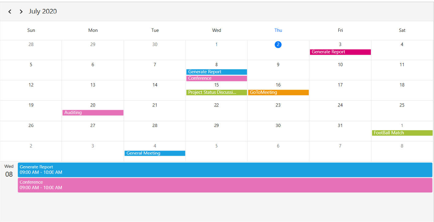
NOTE
- An agenda view displays text as No Selected Date until a date is selected.
- If there is no appointment on a selected day, the agenda view displays the text as No Events.
Agenda view height
Customize the month agenda view height from the Scheduler by using the AgendaViewHeight property of MonthViewSettings. By default, the agenda view will occupy 30% of the Scheduler height.
<syncfusion:SfScheduler x:Name="Schedule"
                        ViewType="Month" >
    <syncfusion:SfScheduler.MonthViewSettings>
        <syncfusion:MonthViewSettings AppointmentDisplayMode="Indicator"
        ShowAgendaView="True"
        AgendaViewHeight="300"/>
    </syncfusion:SfScheduler.MonthViewSettings>
</syncfusion:SfScheduler>this.Schedule.ViewType = SchedulerViewType.Month;
this.Schedule.MonthViewSettings.AppointmentDisplayMode = AppointmentDisplayMode.Indicator;
this.Schedule.MonthViewSettings.ShowAgendaView = true;
this.Schedule.MonthViewSettings.AgendaViewHeight = 300;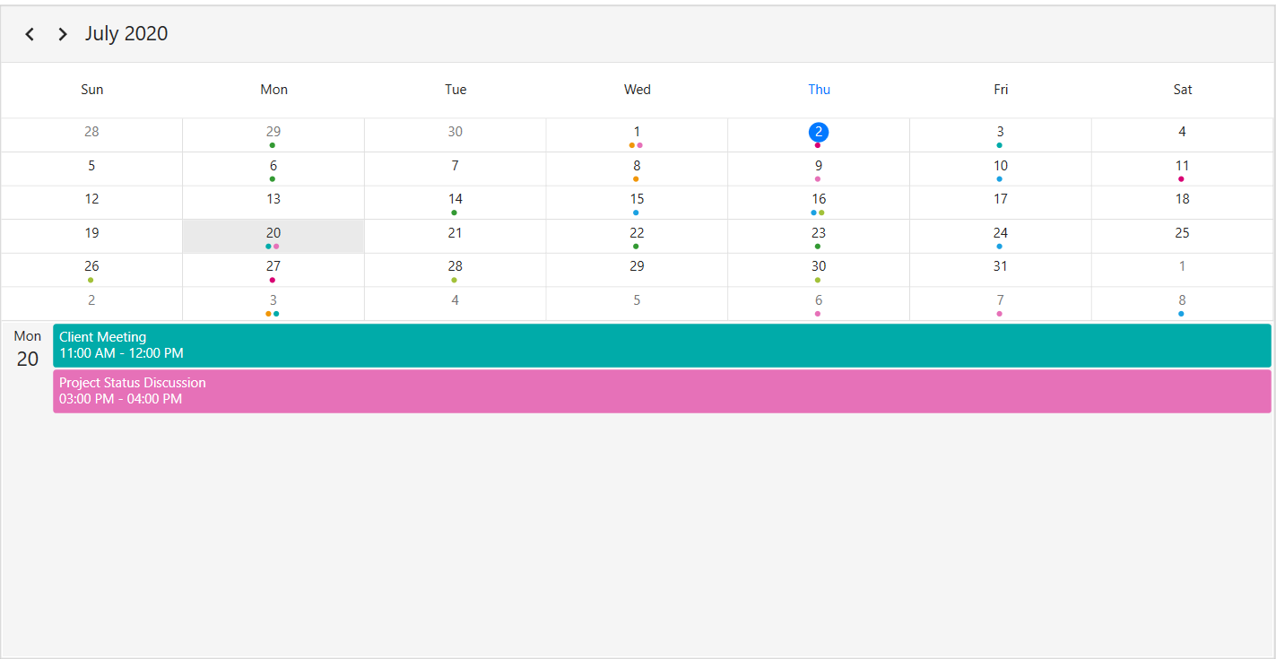
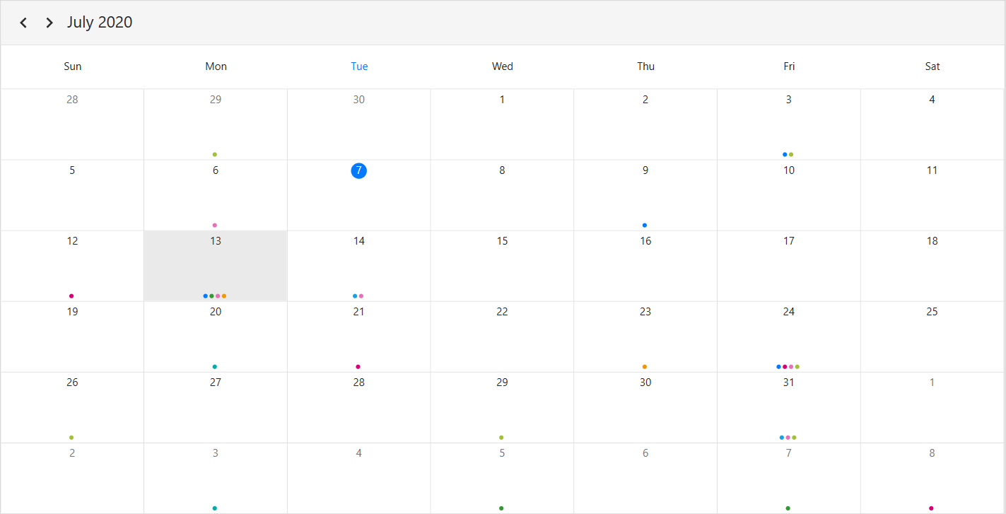
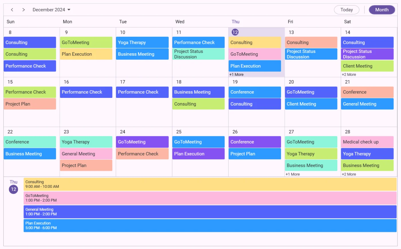
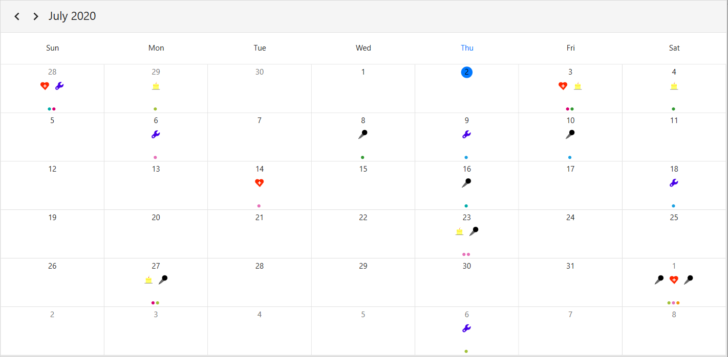
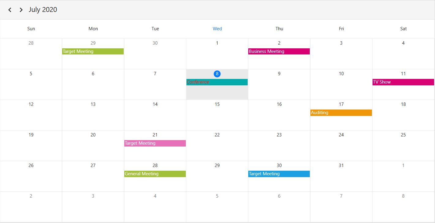
Appointment display mode
Handle the Scheduler month view appointment display by using the AppointmentDisplayMode property of MonthViewSettings. By default, the AppointmentDisplayMode is set to Appointment. By using the AppointmentDisplayMode, set the month view appointments display as follows.
-
None: Appointment will not be displayed. -
Indicator: Appointment will be denoted as the circle. -
Appointment: Appointment subject will be displayed in the month cell.
<syncfusion:SfScheduler x:Name="Schedule"
                        ViewType="Month" >
       <syncfusion:SfScheduler.MonthViewSettings>
            <syncfusion:MonthViewSettings AppointmentDisplayMode="Appointment"/>
       </syncfusion:SfScheduler.MonthViewSettings>
</syncfusion:SfScheduler>this.Schedule.ViewType = SchedulerViewType.Month;
this.Schedule.MonthViewSettings.AppointmentDisplayMode = AppointmentDisplayMode.Appointment;
Appointment display count
Customize the number of appointments displayed in a month cell using the AppointmentDisplayCount property of a MonthViewSettings in the Scheduler. By default, the appointment display count is 3, and the month cell has more than 3 appointments, 3 appointments will be displayed and the remaining appointments in the month cell will be displayed as more appointments.
<syncfusion:SfScheduler x:Name="Schedule"
                        ViewType="Month" >
    <syncfusion:SfScheduler.MonthViewSettings>
        <syncfusion:MonthViewSettings AppointmentDisplayMode="Indicator"
                                      AppointmentDisplayCount="4"/>
    </syncfusion:SfScheduler.MonthViewSettings>
</syncfusion:SfScheduler>this.Schedule.ViewType = SchedulerViewType.Month;
this.Schedule.MonthViewSettings.AppointmentDisplayMode = AppointmentDisplayMode.Indicator;
this.Schedule.MonthViewSettings.AppointmentDisplayCount = 4;NOTE
- By clicking more option, the scheduler navigates to the day view.
- Appointment height will be changed based on the
AppointmentDisplayCountproperty.
Month navigation direction
The month view of a Scheduler can be navigated in both horizontal and vertical directions. Change the direction of the navigation using the MonthNavigationDirection property of MonthViewSettings. By default, the month navigation direction is set to Horizontal.
<syncfusion:SfScheduler x:Name="Schedule"
                        ViewType="Month" >
    <syncfusion:SfScheduler.MonthViewSettings>
        <syncfusion:MonthViewSettings MonthNavigationDirection="Vertical"/>
    </syncfusion:SfScheduler.MonthViewSettings>
</syncfusion:SfScheduler>this.Schedule.ViewType = SchedulerViewType.Month;
this.Schedule.MonthViewSettings.MonthNavigationDirection = MonthNavigationDirection.Vertical;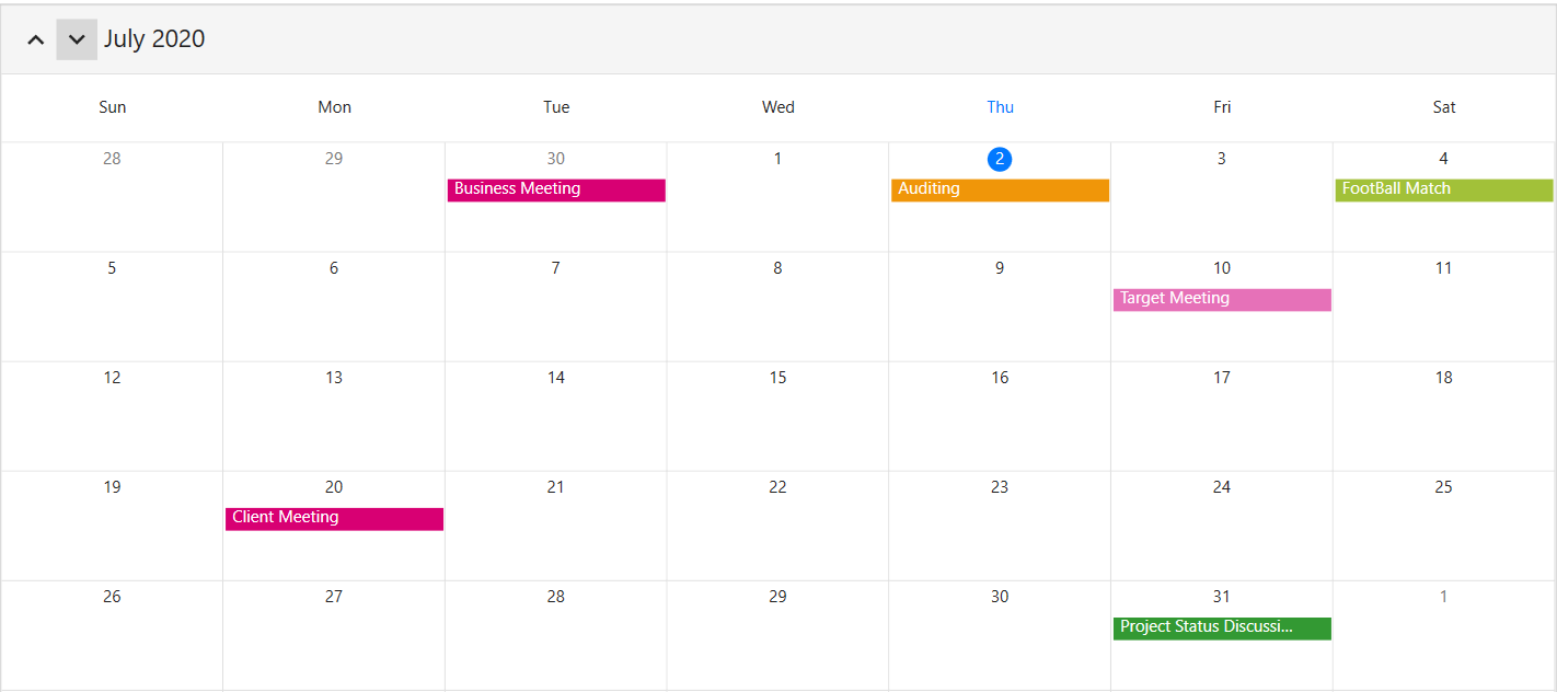
Date format
Customize the date format of the scheduler month view by using the DateFormat property of MonthViewSettings. By default, the month date format is %d.
<syncfusion:SfScheduler x:Name="Schedule"
                        ViewType="Month" >
    <syncfusion:SfScheduler.MonthViewSettings>
        <syncfusion:MonthViewSettings DateFormat="dd"/>
    </syncfusion:SfScheduler.MonthViewSettings>
</syncfusion:SfScheduler>this.Schedule.ViewType = SchedulerViewType.Month;
this.Schedule.MonthViewSettings.DateFormat = "dd";
View header
Customize the default appearance of view header in month view by setting ViewHeaderDayFormat, DateFormat ,ViewHeaderHeight and ViewHeaderTemplate of TimelineViewSettings.
View header text formatting
Customize the day format of the Scheduler view header by using the ViewHeaderDayFormat property of MonthViewSettings. By default, the month view header day format is ddd.
<syncfusion:SfScheduler x:Name="Schedule"
                        ViewType="Month" >
    <syncfusion:SfScheduler.MonthViewSettings>
        <syncfusion:MonthViewSettings ViewHeaderDayFormat="dddd"/>
    </syncfusion:SfScheduler.MonthViewSettings>
</syncfusion:SfScheduler>this.Schedule.ViewType = SchedulerViewType.Month;
this.Schedule.MonthViewSettings.ViewHeaderDayFormat = "dddd";
View header height
Customize the view header height by using the ViewHeaderHeight property of MonthViewSettings. By default, the ViewHeaderHeight is set to 50.
<syncfusion:SfScheduler x:Name="Schedule"
                        ViewType="Month" >
    <syncfusion:SfScheduler.MonthViewSettings>
        <syncfusion:MonthViewSettings ViewHeaderHeight="100"/>
    </syncfusion:SfScheduler.MonthViewSettings>
</syncfusion:SfScheduler>this.Schedule.ViewType = SchedulerViewType.Month;
this.Schedule.MonthViewSettings.ViewHeaderHeight = 100;
View header appearance customization
Customize the default appearance of the month view header by using the ViewHeaderTemplate property of MonthViewSettings.
<Window.Resources>
    <Style TargetType="syncfusion:ViewHeaderControl">
        <Setter Property="Background" Value="Blue"/>
    </Style>
</Window.Resources>
<syncfusion:SfScheduler x:Name="Schedule"
                        ViewType="Month" >
    <syncfusion:SfScheduler.MonthViewSettings>
        <syncfusion:MonthViewSettings>
            <syncfusion:MonthViewSettings.ViewHeaderTemplate>
                <DataTemplate>
                    <TextBlock FontFamily="Segoe UI"
                                FontSize="20"
                                FontStyle="Italic"
                                Foreground="Red"
                                Background="AntiqueWhite"
                                Text="{Binding DayText}"/>
                </DataTemplate>
            </syncfusion:MonthViewSettings.ViewHeaderTemplate>
        </syncfusion:MonthViewSettings>
    </syncfusion:SfScheduler.MonthViewSettings>
</syncfusion:SfScheduler>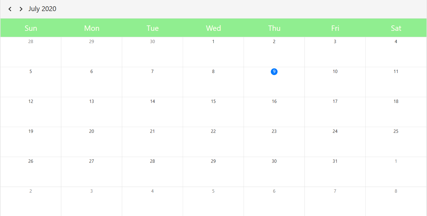
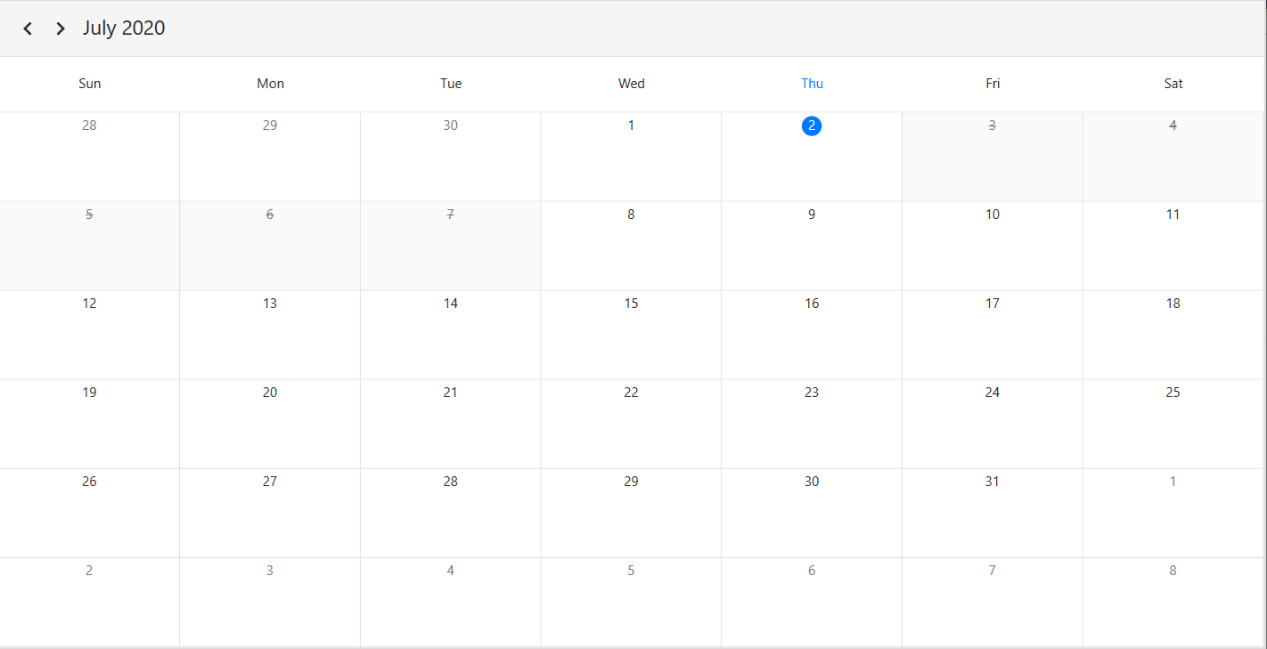
Leading and Trailing days visibility
Customize the leading and trailing days visibility of the scheduler month view by using the LeadingDaysVisibility and the TrailingDaysVisibility properties of MonthViewSettings. By default, the LeadingDaysVisibility and TrailingDaysVisibility are set to Visible.
<syncfusion:SfScheduler x:Name="Schedule"
                        ViewType="Month" >
    <syncfusion:SfScheduler.MonthViewSettings>
        <syncfusion:MonthViewSettings
         LeadingDaysVisibility="Collapsed"
         TrailingDaysVisibility="Collapsed"/>
    </syncfusion:SfScheduler.MonthViewSettings>
</syncfusion:SfScheduler>this.Schedule.ViewType = SchedulerViewType.Month;
this.Schedule.MonthViewSettings.LeadingDaysVisibility = Visibility.Collapsed;
this.Schedule.MonthViewSettings.TrailingDaysVisibility = Visibility.Collapsed;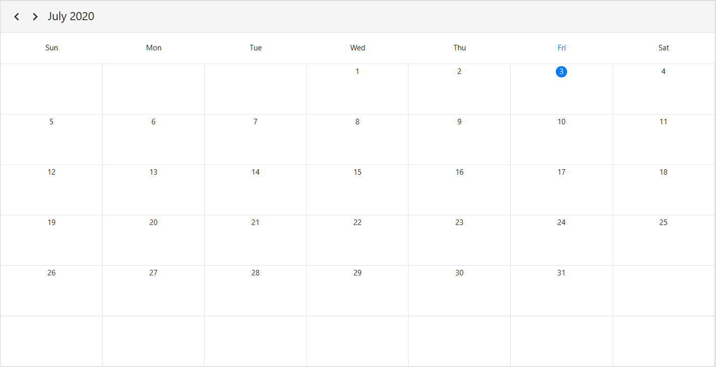
Change the number of visible weeks
The number of weeks visible in the month view can be changed by setting the NumberOfVisibleWeeks property of MonthViewSettings in the SfScheduler. By default, 6 weeks are visible.
<syncfusion:SfScheduler x:Name="Schedule"
                        ViewType="Month">
    <syncfusion:SfScheduler.MonthViewSettings>
        <syncfusion:MonthViewSetting NumberOfVisibleWeeks="3"/>
    </syncfusion:SfScheduler.MonthViewSettings>
</syncfusion:SfScheduler>this.Schedule.ViewType = SchedulerViewType.Month;
this.Schedule.MonthViewSettings.NumberOfVisibleWeeks = 3;
NOTE
- The week number range is limited to values between 1 and 6. Any value outside this range will cause the
NumberOfVisibleWeeksto default to 6.- The
NumberOfVisibleWeeksproperty dynamically controls the number of weeks displayed in the scheduler’s month view.- The DisplayDate property defines the first row of dates shown in the scheduler’s month view.
- The LeadingDaysVisibility and TrailingDaysVisibility properties are applicable only when the number of visible weeks is set to 6.
Blackout dates
Disable the interaction for certain dates in the scheduler month view by adding those specific dates to the BlackoutDates collection property of the SfScheduler. Using this, allocate or restrict specific dates for the predefined events.
this.Schedule.ViewType = SchedulerViewType.Month;
this.Schedule.BlackoutDates = GetBlackoutDates();

private ObservableCollection<DateTime> GetBlackoutDates()
        {
            var blackoutDateCollection = new ObservableCollection<DateTime>()
            {
                DateTime.Now.Date.AddDays(1),
                DateTime.Now.Date.AddDays(2),
                DateTime.Now.Date.AddDays(3),
                DateTime.Now.Date.AddDays(4),
                DateTime.Now.Date.AddDays(5)
            };
            return blackoutDateCollection;
        }
Customize blackout dates appearance
Customize the blacked out dates (trailing, leading, normal days, and current date) by using the setting style.
<Window.Resources>
    <Style TargetType="syncfusion:MonthCell">
        <Style.Triggers>
            <Trigger Property="DayType" Value="NormalDay, BlockOutDay">
                <Setter Property="Foreground" Value="Black"/>
                <Setter Property="Background" Value="Gray"/>
            </Trigger>
            <Trigger Property="DayType" Value="LeadingDay, BlockoutDay">
                <Setter Property="Foreground" Value="Black"/>
                <Setter Property="Background" Value="Green"/>
            </Trigger>
            <Trigger Property="DayType" Value="TrailingDay, BlockoutDay">
                <Setter Property="Foreground" Value="Red"/>
                <Setter Property="Background" Value="Yellow"/>
            </Trigger>
            <Trigger Property="DayType" Value="Today, BlockoutDay">
                <Setter Property="Foreground" Value="Red"/>
                <Setter Property="Background" Value="Green"/>
            </Trigger>
        </Style.Triggers>
    </Style>
</Window.Resources>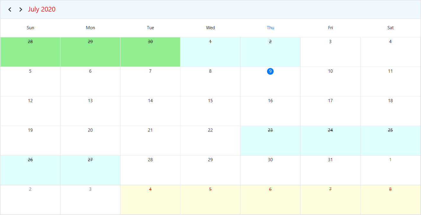
Show week number
Display the week number of a year in the scheduler month view by setting the ShowWeekNumber property of MonthViewSettings to true. By default, it is set to false.
<syncfusion:SfScheduler x:Name="Schedule"
                        ViewType="Month" >
    <syncfusion:SfScheduler.MonthViewSettings>
        <syncfusion:MonthViewSettings ShowWeekNumber="True"/>
    </syncfusion:SfScheduler.MonthViewSettings>
</syncfusion:SfScheduler>this.Schedule.ViewType = SchedulerViewType.Month;
this.Schedule.MonthViewSettings.ShowWeekNumber = true;
Customize week number template
Customize the default appearance of a week number template in the month view by using the WeekNumberTemplate property of MonthViewSettings.
<syncfusion:SfScheduler x:Name="Schedule"
                        ViewType="Month" >
    <syncfusion:SfScheduler.MonthViewSettings>
                <syncfusion:MonthViewSettings ShowWeekNumber="True">
                    <syncfusion:MonthViewSettings.WeekNumberTemplate>
                        <DataTemplate>
                             <Grid >
                                <Label  Foreground="Red"
                                        Content="{Binding}"
                                        VerticalAlignment="Center"
                                        HorizontalAlignment="Center"/>
                            </Grid>
                        </DataTemplate>
                    </syncfusion:MonthViewSettings.WeekNumberTemplate>
                </syncfusion:MonthViewSettings>
    </syncfusion:SfScheduler.MonthViewSettings>
</syncfusion:SfScheduler>
Customize month cell appearance
Using the DataTemplate
Customize the default appearance of the month cell by using the MonthCellTemplate property of MonthViewSettings.
<syncfusion:SfScheduler x:Name="Schedule"
                        ViewType="Month">
    <syncfusion:SfScheduler.MonthViewSettings>
        <syncfusion:MonthViewSettings>
             <syncfusion:MonthViewSettings.MonthCellTemplate>
                <DataTemplate>
                    <Border Background="BlueViolet">
                        <TextBlock HorizontalAlignment="Center" Foreground="White" Text="{Binding DateTime.Day}"/>
                    </Border>
                </DataTemplate>
             </syncfusion:MonthViewSettings.MonthCellTemplate>
        </syncfusion:MonthViewSettings>
    </syncfusion:SfScheduler.MonthViewSettings>
</syncfusion:SfScheduler>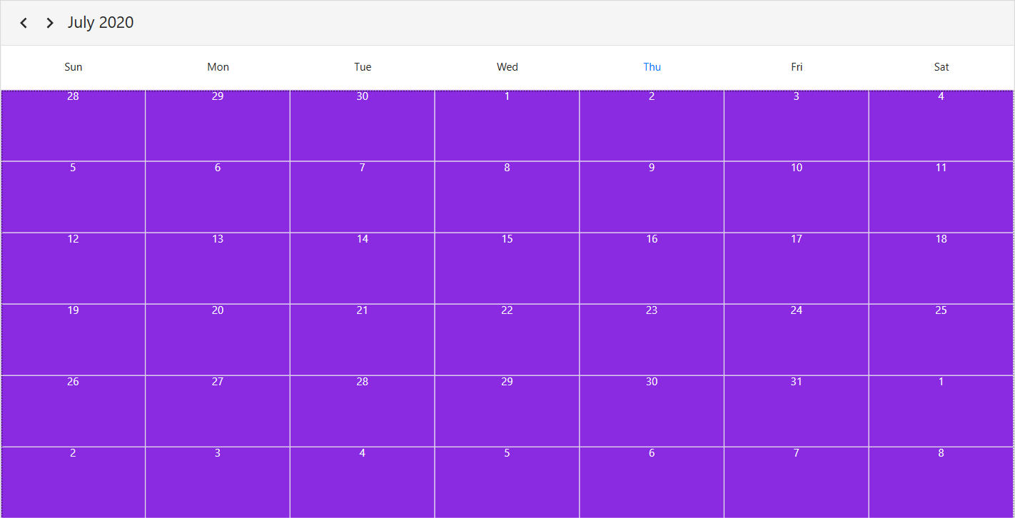
Using the DataTemplateSelector
Customize the default appearance of the month cell by using the MonthCellTemplateSelector property of MonthViewSettings.
The DataTemplateSelector can choose a DataTemplate at runtime based on the value of a data-bound to Scheduler month cell using the MonthCellTemplate. It allows to choose a different data template for each month’s cell, customizing the appearance of a particular month cell based on certain conditions.
<Window.Resources>
        <local:MonthCellTemplateSelector x:Key="monthCellTemplateSelector"/>
</Window.Resources>
<syncfusion:SfScheduler x:Name="Schedule"
                        ViewType="Month"
                        ItemsSource="{Binding Appointments}">
    <syncfusion:SfScheduler.MonthViewSettings>
        <syncfusion:MonthViewSettings AppointmentDisplayMode="Indicator"
                                      MonthCellTemplateSelector="{StaticResource monthCellTemplateSelector}">
        </syncfusion:MonthViewSettings>
    </syncfusion:SfScheduler.MonthViewSettings>
</syncfusion:SfScheduler>
public class MonthCellTemplateSelector : DataTemplateSelector
{
public MonthCellTemplateSelector()
{
var mainWindow = App.Current.MainWindow as Window;
this.MonthAppointmentTemplate = mainWindow.Resources["monthAppointmentTemplate"] as DataTemplate;
this.MonthCellDatesTemplate = mainWindow.Resources["monthCellTemplate"] as DataTemplate;
}
public DataTemplate MonthAppointmentTemplate { get; set; }
public DataTemplate MonthCellDatesTemplate { get; set; }
public override DataTemplate SelectTemplate(object item, DependencyObject container)
{
var appointments = item as List<ScheduleAppointment>;
var cell = container as MonthCell;
if (cell.DateTime.Date == DateTime.Now.Date)
cell.Foreground = Brushes.Black;
if (appointments == null || appointments.Count == 0)
{
cell.DataContext = cell;
return MonthCellDatesTemplate;
}
else
{
MonthCellViewModel monthCellViewModel = new MonthCellViewModel();
monthCellViewModel.Foreground = cell.Foreground;
monthCellViewModel.DateText = cell.DateText;
monthCellViewModel.MonthCellAppointments = appointments;
cell.DataContext = monthCellViewModel;
return MonthAppointmentTemplate;
}
}
}
Customize month view appointments
Using the DataTemplate
Customize the default appearance of the month cell appointment by using the AppointmentTemplate property of MonthViewSettings.
<syncfusion:SfScheduler x:Name="Schedule" ViewType="Month" ItemsSource="{Binding Appointments}">
            <syncfusion:SfScheduler.MonthViewSettings>
                <syncfusion:MonthViewSettings>
                    <syncfusion:MonthViewSettings.AppointmentTemplate>
                        <DataTemplate>
                        <TextBlock
                        Background="{Binding Data.BackgroundColor}"
                        Text="{Binding Data.EventName}"
                        HorizontalAlignment="Stretch"
                        TextTrimming="CharacterEllipsis"
                        Foreground="{Binding Data.ForegroundColor}"
                        TextWrapping="Wrap"
                        FontStyle="Italic" />
                        </DataTemplate>
                    </syncfusion:MonthViewSettings.AppointmentTemplate>
                </syncfusion:MonthViewSettings>
            </syncfusion:SfScheduler.MonthViewSettings>
</syncfusion:SfScheduler>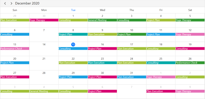
Using the DataTemplateSelector
Customize the default appearance of the month view appointments by using the AppointmentTemplateSelector property of MonthViewSettings.
The DataTemplateSelector can choose a DataTemplate at runtime based on the value of a data-bound to Scheduler month appointments using the AppointmentTemplate. It allows to choose a different data template for each month’s cell, customizing the appearance of a particular appointment based on certain conditions.
<Window.Resources>
    <local:MonthViewAppointmentTemplateSelector x:Key="appointmentTemplateSelector">
        <local:MonthViewAppointmentTemplateSelector.CurrentDayAppointmentTemplate>
             <DataTemplate>
                <Border>
                    <TextBlock Text="{Binding Subject}"
                                FontStyle="Italic"
                                Foreground="Red"
                                TextWrapping="Wrap"
                                TextTrimming="WordEllipsis"/>
                </Border>
            </DataTemplate>
        </local:MonthViewAppointmentTemplateSelector.CurrentDayAppointmentTemplate>
        <local:MonthViewAppointmentTemplateSelector.DefaultAppointmentTemplate>
            <DataTemplate>
                <TextBlock Text="{Binding Subject}"
                            TextWrapping="Wrap"
                            TextTrimming="WordEllipsis"/>
            </DataTemplate>
        </local:MonthViewAppointmentTemplateSelector.DefaultAppointmentTemplate>
    </local:MonthViewAppointmentTemplateSelector>
</Window.Resources>

<syncfusion:SfScheduler x:Name="Schedule"
                        ViewType="Month" >
    <syncfusion:SfScheduler.MonthViewSettings>
        <syncfusion:MonthViewSettings AppointmentTemplateSelector="{StaticResource appointmentTemplateSelector}"/>
    </syncfusion:SfScheduler.MonthViewSettings>
</syncfusion:SfScheduler>
public class MonthViewAppointmentTemplateSelector : DataTemplateSelector
{
public DataTemplate CurrentDayAppointmentTemplate { get; set; }
public DataTemplate DefaultAppointmentTemplate { get; set; }
public override DataTemplate SelectTemplate(object item, DependencyObject container)
{
var app = item as ScheduleAppointment;
if (app.StartTime.Date == DateTime.Today.Date)
return this.CurrentDayAppointmentTemplate;
else
return this.DefaultAppointmentTemplate;
}
}
Customize more appointments indicator in month cell
You can customize the default appearance of more appointments indicator in a month cell by using the MoreAppointmentsIndicatorTemplate property of the MonthViewSettings.
<syncfusion:SfScheduler x:Name="Schedule" ViewType="Month">
    <syncfusion:SfScheduler.MonthViewSettings>
        <syncfusion:MonthViewSettings>
            <syncfusion:MonthViewSettings.MoreAppointmentsIndicatorTemplate>
                <DataTemplate>
                    <TextBlock Text = "{Binding StringFormat=+{0}}" Background = "#EAEAEA" Foreground = "Black" Padding="0,5,0,0">
                    </TextBlock>
                </DataTemplate>
            </syncfusion:MonthViewSettings.MoreAppointmentsIndicatorTemplate>
         </syncfusion:MonthViewSettings>
    </syncfusion:SfScheduler.MonthViewSettings>
</syncfusion:SfScheduler>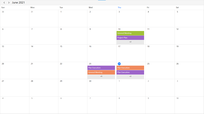
Cell right padding
To enhance interaction with a scheduler’s appointments, you can customize the spacing between appointments and the right border of their cells using the CellRightPadding property of MonthViewSettings in the SfScheduler.
<syncfusion:SfScheduler x:Name="Schedule"
                        ViewType="Month">
 <syncfusion:SfScheduler.MonthViewSettings>
     <syncfusion:MonthViewSettings CellRightPadding="30" />
 </syncfusion:SfScheduler.MonthViewSettings>
</syncfusion:SfScheduler>this.Schedule.ViewType = SchedulerViewType.Month;
this.Schedule.MonthViewSettings.CellRightPadding = 30;
NOTE
- This customization will apply only when the scheduler has an appointment.
NOTE
You can refer to our WPF Scheduler feature tour page for its groundbreaking feature representations. You can also explore our WPF Scheduler example to knows how to schedule and manage appointments through an intuitive user interface, similar to the Outlook calendar.