Styling and Appearance in WPF Range Slider (SfRangeSlider)
6 Feb 202524 minutes to read
SfRangeSlider makes it possible to change the appearance by providing certain properties.
InactiveTrackStyle
Modify the appearance of the inactive track using the InactiveTrackStyle property.
<Grid>
        <Grid.Resources>
            <ResourceDictionary>
                <Style x:Key="InactiveTrackStyle" TargetType="Rectangle">
                    <Setter Property="Height" Value="3" />
                    <Setter Property="Fill" Value="#a8a8a8" />
                    <Setter Property="RadiusX" Value="2" />
                    <Setter Property="RadiusY" Value="2" />
                </Style>
            </ResourceDictionary>
        </Grid.Resources>
        <editors:SfRangeSlider
            Width="300"
            InactiveTrackStyle="{StaticResource InactiveTrackStyle}"
            Maximum="100"
            Minimum="0" />
    </Grid>
Grid parentGrid = new Grid();
Style inactiveTrackStyle = new Style(typeof(Rectangle));
inactiveTrackStyle.Setters.Add(new Setter(Rectangle.FillProperty, new SolidColorBrush((Color)ColorConverter.ConvertFromString("#a8a8a8"))));
inactiveTrackStyle.Setters.Add(new Setter(Rectangle.HeightProperty, (double)3));
inactiveTrackStyle.Setters.Add(new Setter(Rectangle.RadiusXProperty, (double)2));
inactiveTrackStyle.Setters.Add(new Setter(Rectangle.RadiusYProperty, (double)2));
Resources.Add("inactiveTrackStyle", inactiveTrackStyle);
SfRangeSlider rangeSlider = new SfRangeSlider()
{
Width = 300,
Minimum = 0,
Maximum = 100,
InactiveTrackStyle = inactiveTrackStyle
};
parentGrid.Children.Add(rangeSlider);
this.Content = parentGrid;
ActiveTrackStyle
Modify the appearance of the active track by using the ActiveTrackStyle property.
<Grid>
        <Grid.Resources>
            <ResourceDictionary>
                <Style x:Key="InactiveTrackStyle" TargetType="Rectangle">
                    <Setter Property="Height" Value="3" />
                    <Setter Property="Fill" Value="#a8a8a8" />
                    <Setter Property="RadiusX" Value="2" />
                    <Setter Property="RadiusY" Value="2" />
                </Style>
                <Style x:Key="ActiveTrackStyle" TargetType="Rectangle">
                    <Setter Property="Height" Value="3" />
                    <Setter Property="Fill" Value="#505050" />
                </Style>
            </ResourceDictionary>
        </Grid.Resources>
        <editors:SfRangeSlider
            Width="300"
            ActiveTrackStyle="{StaticResource ActiveTrackStyle}"
            InactiveTrackStyle="{StaticResource InactiveTrackStyle}"
            Maximum="100"
            Minimum="0"
            RangeEnd="60"
            RangeStart="20"
            ShowRange="True" />
    </Grid>
Grid parentGrid = new Grid();
Style inactiveTrackStyle = new Style(typeof(Rectangle));
inactiveTrackStyle.Setters.Add(new Setter(Rectangle.FillProperty, new SolidColorBrush((Color)ColorConverter.ConvertFromString("#a8a8a8"))));
inactiveTrackStyle.Setters.Add(new Setter(Rectangle.HeightProperty, (double)3));
inactiveTrackStyle.Setters.Add(new Setter(Rectangle.RadiusXProperty, (double)2));
inactiveTrackStyle.Setters.Add(new Setter(Rectangle.RadiusYProperty, (double)2));
Resources.Add("inactiveTrackStyle", inactiveTrackStyle);
Style activeTrackStyle = new Style(typeof(Rectangle));
activeTrackStyle.Setters.Add(new Setter(Rectangle.FillProperty, new SolidColorBrush((Color)ColorConverter.ConvertFromString("#505050"))));
activeTrackStyle.Setters.Add(new Setter(Rectangle.HeightProperty, (double)3));
Resources.Add("activeTrackStyle", activeTrackStyle);
SfRangeSlider rangeSlider = new SfRangeSlider()
{
Width = 300,
Minimum = 0,
Maximum = 100,
ShowRange = true,
RangeStart = 20,
RangeEnd = 60,
ActiveTrackStyle = activeTrackStyle,
InactiveTrackStyle = inactiveTrackStyle
};
parentGrid.Children.Add(rangeSlider);
this.Content = parentGrid;
ThumbStyle
Modify the appearance of the thumb by using the ThumbStyle property.
<Grid>
        <Grid.Resources>
            <ResourceDictionary>
                <Style x:Key="InactiveTrackStyle" TargetType="Rectangle">
                    <Setter Property="Height" Value="3" />
                    <Setter Property="Fill" Value="#a8a8a8" />
                    <Setter Property="RadiusX" Value="2" />
                    <Setter Property="RadiusY" Value="2" />
                </Style>
                <Style x:Key="ActiveTrackStyle" TargetType="Rectangle">
                    <Setter Property="Height" Value="3" />
                    <Setter Property="Fill" Value="#505050" />
                </Style>
                <Style x:Key="ThumbStyle" TargetType="Thumb">
                    <Setter Property="Width" Value="13" />
                    <Setter Property="Height" Value="13" />
                    <Setter Property="Background" Value="#0095ff" />
                    <Setter Property="Template">
                        <Setter.Value>
                            <ControlTemplate TargetType="Thumb">
                                <Border
                                    x:Name="ThumbBorder"
                                    Background="{TemplateBinding Background}"
                                    BorderBrush="{TemplateBinding BorderBrush}"
                                    CornerRadius="12" />
                            </ControlTemplate>
                        </Setter.Value>
                    </Setter>
                </Style>
            </ResourceDictionary>
        </Grid.Resources>
        <editors:SfRangeSlider
            Width="300"
            ActiveTrackStyle="{StaticResource ActiveTrackStyle}"
            InactiveTrackStyle="{StaticResource InactiveTrackStyle}"
            Maximum="100"
            Minimum="0"
            RangeEnd="60"
            RangeStart="20"
            ShowRange="True"
            ThumbStyle="{StaticResource ThumbStyle}" />
    </Grid>
Grid parentGrid = new Grid();
Style inactiveTrackStyle = new Style(typeof(Rectangle));
inactiveTrackStyle.Setters.Add(new Setter(Rectangle.FillProperty, new SolidColorBrush((Color)ColorConverter.ConvertFromString("#a8a8a8"))));
inactiveTrackStyle.Setters.Add(new Setter(Rectangle.HeightProperty, (double)3));
inactiveTrackStyle.Setters.Add(new Setter(Rectangle.RadiusXProperty, (double)2));
inactiveTrackStyle.Setters.Add(new Setter(Rectangle.RadiusYProperty, (double)2));
Resources.Add("inactiveTrackStyle", inactiveTrackStyle);
Style activeTrackStyle = new Style(typeof(Rectangle));
activeTrackStyle.Setters.Add(new Setter(Rectangle.FillProperty, new SolidColorBrush((Color)ColorConverter.ConvertFromString("#505050"))));
activeTrackStyle.Setters.Add(new Setter(Rectangle.HeightProperty, (double)3));
Resources.Add("activeTrackStyle", activeTrackStyle);
ControlTemplate template = new ControlTemplate(typeof(Thumb));
FrameworkElementFactory elemFactory = new FrameworkElementFactory(typeof(Border));
elemFactory.Name = "Border";
elemFactory.SetValue(Border.CornerRadiusProperty, new CornerRadius(12));
elemFactory.SetValue(Border.BackgroundProperty, new SolidColorBrush((Color)ColorConverter.ConvertFromString("#0095ff")));
elemFactory.SetValue(Border.BorderBrushProperty, new SolidColorBrush((Color)ColorConverter.ConvertFromString("#0095ff")));
template.VisualTree = elemFactory;
Style thumbStyle = new Style(typeof(Thumb));
thumbStyle.Setters.Add(new Setter(Thumb.BackgroundProperty, new SolidColorBrush((Color)ColorConverter.ConvertFromString("#0095ff"))));
thumbStyle.Setters.Add(new Setter(Thumb.HeightProperty, (double)13));
thumbStyle.Setters.Add(new Setter(Thumb.WidthProperty, (double)13));
thumbStyle.Setters.Add(new Setter(Thumb.TemplateProperty, template));
Resources.Add("thumbStyle", thumbStyle);
SfRangeSlider rangeSlider = new SfRangeSlider()
{
Width = 300,
Minimum = 0,
Maximum = 100,
ShowRange = true,
RangeStart = 20,
RangeEnd = 60,
ActiveTrackStyle = activeTrackStyle,
InactiveTrackStyle = inactiveTrackStyle,
ThumbStyle = thumbStyle
};
parentGrid.Children.Add(rangeSlider);
this.Content = parentGrid;
Tick Customization
Modify the appearance of the ticks by using the following properties:
- TickStroke
- ActiveTickStroke
- TickLength
- TickStrokeThickness
- MinorTickStroke
- ActiveMinorTickStroke
- MinorTickLength
- MinorTickStrokeThickness
TickStroke
Use the TickStroke property, to change the color of major ticks.
<editors:SfRangeSlider
            Width="300"
            Maximum="100"
            Minimum="0"
            RangeEnd="60"
            RangeStart="20"
            ShowRange="True"
            TickFrequency="10"
            TickPlacement="BottomRight"
            TickStroke="#FF0000" />
    </Grid>
Grid parentGrid = new Grid();
SfRangeSlider rangeSlider = new SfRangeSlider()
{
Width = 300,
Maximum = 100,
Minimum = 0,
RangeEnd = 60,
RangeStart = 20,
ShowRange = true,
TickFrequency = 10,
TickPlacement = Syncfusion.Windows.Controls.Input.TickPlacement.BottomRight,
TickStroke = new SolidColorBrush((Color)ColorConverter.ConvertFromString("#FF0000"))
};
parentGrid.Children.Add(rangeSlider);
this.Content = parentGrid;
ActiveTickStroke
Use the ActiveTickStroke property, to change the active major ticks color.
<editors:SfRangeSlider
            Width="300"
            Maximum="100"
            Minimum="0"
            RangeEnd="60"
            RangeStart="20"
            ShowRange="True"
            TickFrequency="10"
            TickPlacement="BottomRight"
            TickStroke="#FF0000"
            ActiveTickStroke="#02C9F3"/>
    </Grid>
Grid parentGrid = new Grid();
SfRangeSlider rangeSlider = new SfRangeSlider()
{
Width = 300,
Maximum = 100,
Minimum = 0,
RangeEnd = 60,
RangeStart = 20,
ShowRange = true,
TickFrequency = 10,
TickPlacement = Syncfusion.Windows.Controls.Input.TickPlacement.BottomRight,
TickStroke = new SolidColorBrush((Color)ColorConverter.ConvertFromString("#FF0000")),
ActiveTickStroke = new SolidColorBrush((Color)ColorConverter.ConvertFromString("#02C9F3"))
};
parentGrid.Children.Add(rangeSlider);
this.Content = parentGrid;
TickLength
Use the TickLength property, to change the height of the major ticks.
<Grid>
        <editors:SfRangeSlider
            Width="300"
            Maximum="100"
            Minimum="0"
            RangeEnd="60"
            RangeStart="20"
            ShowRange="True"
            TickLength="8"
            TickFrequency="10"
            TickPlacement="BottomRight"
            TickStroke="#FF0000" />
    </Grid>
Grid parentGrid = new Grid();
SfRangeSlider rangeSlider = new SfRangeSlider()
{
Width = 300,
Maximum = 100,
Minimum = 0,
RangeEnd = 60,
RangeStart = 20,
ShowRange = true,
TickFrequency = 10,
TickLength = 8,
TickPlacement = Syncfusion.Windows.Controls.Input.TickPlacement.BottomRight,
TickStroke = new SolidColorBrush((Color)ColorConverter.ConvertFromString("#FF0000"))
};
parentGrid.Children.Add(rangeSlider);
this.Content = parentGrid;
TickStrokeThickness
Use the TickStrokeThickness property, to change the thickness of the major ticks.
<Grid>
        <editors:SfRangeSlider
            Width="300"
            Maximum="100"
            Minimum="0"
            RangeEnd="60"
            RangeStart="20"
            ShowRange="True"
            TickFrequency="10"
            TickLength="8"
            TickPlacement="BottomRight"
            TickStroke="#FF0000"
            TickStrokeThickness="2" />
    </Grid>
Grid parentGrid = new Grid();
SfRangeSlider rangeSlider = new SfRangeSlider()
{
Width = 300,
Maximum = 100,
Minimum = 0,
RangeEnd = 60,
RangeStart = 20,
ShowRange = true,
TickFrequency = 10,
TickLength = 8,
TickStrokeThickness = 2,
TickPlacement = Syncfusion.Windows.Controls.Input.TickPlacement.BottomRight,
TickStroke = new SolidColorBrush((Color)ColorConverter.ConvertFromString("#FF0000"))
};
parentGrid.Children.Add(rangeSlider);
this.Content = parentGrid;
MinorTickStroke
Use the MinorTickStroke property, to change the minor ticks color.
<editors:SfRangeSlider
            Width="300"
            Maximum="100"
            Minimum="0"
            RangeEnd="60"
            RangeStart="20"
            ShowRange="True"
            TickFrequency="10"
            MinorTickFrequency="3"
            TickPlacement="BottomRight"
            MinorTickStroke ="#FF0000" />
    </Grid>
Grid parentGrid = new Grid();
SfRangeSlider rangeSlider = new SfRangeSlider()
{
Width = 300,
Maximum = 100,
Minimum = 0,
RangeEnd = 60,
RangeStart = 20,
ShowRange = true,
TickFrequency = 10,
MinorTickFrequency=3,
TickPlacement = Syncfusion.Windows.Controls.Input.TickPlacement.BottomRight,
MinorTickStroke = new SolidColorBrush((Color)ColorConverter.ConvertFromString("#FF0000"))
};
parentGrid.Children.Add(rangeSlider);
this.Content = parentGrid;
ActiveMinorTickStroke
Use the ActiveMinorTickStroke property, to change the color of the active minor ticks.
<editors:SfRangeSlider
            Width="300"
            Maximum="100"
            Minimum="0"
            RangeEnd="60"
            RangeStart="20"
            ShowRange="True"
            TickFrequency="10"
            MinorTickFrequency="3"
            TickPlacement="BottomRight"
            ActiveMinorTickStroke ="#FF0000" />
    </Grid>
Grid parentGrid = new Grid();
SfRangeSlider rangeSlider = new SfRangeSlider()
{
Width = 300,
Maximum = 100,
Minimum = 0,
RangeEnd = 60,
RangeStart = 20,
ShowRange = true,
TickFrequency = 10,
MinorTickFrequency=3,
TickPlacement = Syncfusion.Windows.Controls.Input.TickPlacement.BottomRight,
ActiveMinorTickStroke = new SolidColorBrush((Color)ColorConverter.ConvertFromString("#FF0000"))
};
parentGrid.Children.Add(rangeSlider);
this.Content = parentGrid;
MinorTickLength
Use the MinorTickLength property, to change the height of the minor ticks.
<Grid>
        <editors:SfRangeSlider
            Width="300"
            Maximum="100"
            Minimum="0"
            RangeEnd="60"
            RangeStart="20"
            ShowRange="True"
            MinorTickLength ="6"
            TickLength ="10"
            TickFrequency="10"
            MinorTickFrequency="2"
            TickPlacement="BottomRight" />
    </Grid>
Grid parentGrid = new Grid();
SfRangeSlider rangeSlider = new SfRangeSlider()
{
Width = 300,
Maximum = 100,
Minimum = 0,
RangeEnd = 60,
RangeStart = 20,
ShowRange = true,
MinorTickLength = 6,
TickLength = 10,
TickFrequency= 10,
MinorTickFrequency= 2,
TickPlacement = Syncfusion.Windows.Controls.Input.TickPlacement.BottomRight
};
parentGrid.Children.Add(rangeSlider);
this.Content = parentGrid;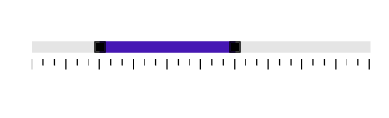
MinorTickStrokeThickness
Use the MinorTickStrokeThickness property, to change the thickness of the minor ticks.
<Grid>
        <editors:SfRangeSlider
            Width="300"
            Maximum="100"
            Minimum="0"
            RangeEnd="60"
            RangeStart="20"
            ShowRange="True"
            TickFrequency="10"
            MinorTickFrequency="2"
            TickLength="8"
            MinorTickLength="5"
            TickPlacement="BottomRight"
            TickStroke="#FF0000"
            MinorTickStroke="#FF0000"
            ActiveTickStroke="#02C9F3"
            ActiveMinorTickStroke="#02C9F3"
            MinorTickStrokeThickness ="2" />
    </Grid>
Grid parentGrid = new Grid();
SfRangeSlider rangeSlider = new SfRangeSlider()
{
Width = 300,
Maximum = 100,
Minimum = 0,
RangeEnd = 60,
RangeStart = 20,
ShowRange = true,
TickFrequency = 10,
MinorTickFrequency= 2,
TickLength = 8,
MinorTickStrokeThickness = 2,
MinorTickLength= 5,
TickPlacement = Syncfusion.Windows.Controls.Input.TickPlacement.BottomRight,
TickStroke = new SolidColorBrush((Color)ColorConverter.ConvertFromString("#FF0000"))
MinorTickStroke = new SolidColorBrush((Color)ColorConverter.ConvertFromString("#FF0000"))
ActiveMinorTickStroke = new SolidColorBrush((Color)ColorConverter.ConvertFromString("#02C9F3"))
ActiveTickStroke = new SolidColorBrush((Color)ColorConverter.ConvertFromString("#02C9F3"))
};
parentGrid.Children.Add(rangeSlider);
this.Content = parentGrid;
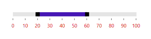
Value label customization
Customize the value label using the TickBarItem style.
<Grid>
        <Grid.Resources>
            <ResourceDictionary>
                <Style TargetType="editors:TickBarItem">
                    <Setter Property="FontSize" Value="12" />
                    <Setter Property="Foreground" Value="Red" />
                </Style>
            </ResourceDictionary>
        </Grid.Resources>
        <editors:SfRangeSlider
            Width="300"
            Maximum="100"
            Minimum="0"
            RangeEnd="60"
            RangeStart="20"
            ShowRange="True"
            ShowValueLabels="True"
            TickFrequency="10"
            TickLength="4"
            TickPlacement="BottomRight"
            TickStroke="#505050"
            TickStrokeThickness="1" />
    </Grid>
Grid parentGrid = new Grid();
SfRangeSlider rangeSlider = new SfRangeSlider()
{
Width = 300,
Maximum = 100,
Minimum = 0,
RangeEnd = 60,
ShowValueLabels = true,
RangeStart = 20,
ShowRange = true,
TickFrequency = 10,
TickLength = 4,
TickStrokeThickness = 1,
TickPlacement = Syncfusion.Windows.Controls.Input.TickPlacement.BottomRight,
TickStroke = new SolidColorBrush((Color)ColorConverter.ConvertFromString("#505050"))
};
parentGrid.Children.Add(rangeSlider);
this.Content = parentGrid;