WPF Navigation Drawer (SfNavigationDrawer) Overview
6 Feb 20251 minute to read
The WPF Navigation Drawer control is a sidebar navigation view that is used to create a navigation menu for easy navigation. It provides compact and extended display modes with built-in navigation view items with ability to switch between both modes based on available size. It also provides default mode which allows to have a custom pane view.
SfNavigationDrawer
Use case scenarios
The Navigation Drawers are used in applications where navigating to the major module or page is a basic requirement. The Navigation Drawer is available in the following apps that signify the importance of navigating through pages:
- Play Store
- e-Commerce Apps
- Banking Apps
Key features
- A sidebar menu to provide Modern UI navigation for application.
- Navigation menu can be placed on any side of the screen.
- Compact and extended display modes with support to best fit the content based on available size.
- Built-in navigation menu items: tab, button, header, multi-level hierarchal items and footer items.
- Custom views also can be added as the header and footer of the drawer.
Visual Structure
This section describes the visual elements of the NavigationDrawer control and defines terms and concepts used in the DisplayMode.
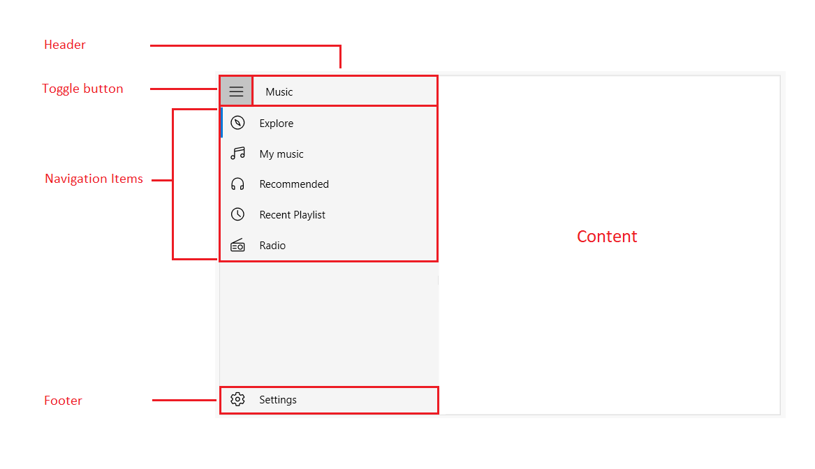
- Header — Represents the header of the drawer
- Footer — Represents the footer of the drawer.
- NavigationDrawer Items — Built-in items used to populate the items in the drawer pane body and footer.
- ToggleButton — Built-in toggle button used to collapse and expand the drawer menu.