Custom views in WPF Navigation Drawer (SfNavigationDrawer)
6 Feb 202524 minutes to read
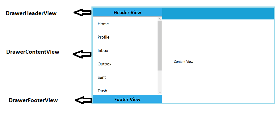
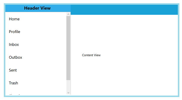
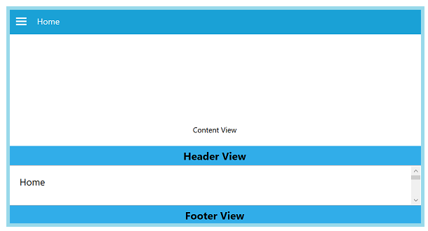
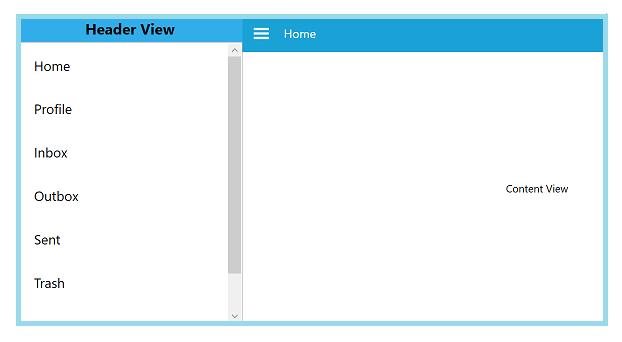
Populating the with custom views
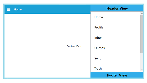
The WPF Navigation Drawer sidebar can be populated with custom views by setting the DisplayMode as Default. In this mode the sidebar can be customized as three parts.
Basically the sidebar will be in hidden state and can be displayed by swipe gestures.
-
DrawerHeaderView - A custom view can be provided to be displayed as a header part of the navigation menu. This can be set to the DrawerHeaderView property.
-
DrawerContentView - A custom view can be provided to be displayed in the body of the navigation menu. This can be set to the DrawerContentView property.
-
DrawerFooterView - A custom view can be provided to be displayed as a footer part of the navigation menu. This can be set to the DrawerFooterView property.
<Window x:Class="NavigationDrawerWPF.MainWindow"
        xmlns="http://schemas.microsoft.com/winfx/2006/xaml/presentation"
        xmlns:x="http://schemas.microsoft.com/winfx/2006/xaml"
        xmlns:d="http://schemas.microsoft.com/expression/blend/2008"
        xmlns:mc="http://schemas.openxmlformats.org/markup-compatibility/2006"
        xmlns:syncfusion="http://schemas.syncfusion.com/wpf"
        xmlns:local="clr-namespace:NavigationDrawerWPF"
        mc:Ignorable="d"
        Title="MainWindow" Height="450" Width="800">
    <Window.DataContext>
        <local:ViewModel/>
    </Window.DataContext>
    <syncfusion:SfNavigationDrawer x:Name="navigationDrawer" DrawerWidth="300">
        <syncfusion:SfNavigationDrawer.ContentView>
            <Grid x:Name="mainContentView"
                  Background="White">
                <Grid.RowDefinitions>
                    <RowDefinition Height="auto"/>
                    <RowDefinition/>
                </Grid.RowDefinitions>
                <StackPanel Background="#1aa1d6"
                            Orientation="Horizontal">
                    <Button x:Name="hamburgerButton"
                            BorderBrush="Transparent"
                            Height="50" Width="50"
                            Background="#1aa1d6" Foreground="White"
                            Click="HamburgerButton_Click">
                        <Image Source="hamburger_icon.png"
                               Height="20"
                               Width="20"
                               HorizontalAlignment="Center"
                               VerticalAlignment="Center"/>
                    </Button>
                    <Label x:Name="headerLabel"
                           Height="50"
                           HorizontalContentAlignment="Center"
                           VerticalContentAlignment="Center"
                           Content="Home"
                           Foreground="White"
                           Background="#1aa1d6"/>
                </StackPanel>
                <Label Grid.Row="1"
                       x:Name="contentLabel"
                       VerticalContentAlignment="Center"
                       HorizontalContentAlignment="Center"
                       Content="Content View"
                       Foreground="Black"/>
            </Grid>
        </syncfusion:SfNavigationDrawer.ContentView>
        <syncfusion:SfNavigationDrawer.DrawerHeaderView>
            <Grid Background="#31ade9">
                <Label Content="Header View"
                       HorizontalContentAlignment="Center"
                       VerticalContentAlignment="Center"/>
            </Grid>
        </syncfusion:SfNavigationDrawer.DrawerHeaderView>
        <syncfusion:SfNavigationDrawer.DrawerContentView>
            <Grid>
                <ListBox x:Name="list"
                         ItemsSource="{Binding Contents}">
                    <ListBox.ItemTemplate>
                        <DataTemplate>
                            <TextBlock  Text="{Binding Name}"
                                        Foreground="Black"/>
                        </DataTemplate>
                    </ListBox.ItemTemplate>
                </ListBox>
            </Grid>
        </syncfusion:SfNavigationDrawer.DrawerContentView>
        <syncfusion:SfNavigationDrawer.DrawerFooterView>
            <Grid Background="#31ade9">
                <Label Content="Footer View"
                       HorizontalContentAlignment="Center"
                       VerticalContentAlignment="Center"/>
            </Grid>
        </syncfusion:SfNavigationDrawer.DrawerFooterView>
    </syncfusion:SfNavigationDrawer>
</Window>
using System.Collections.Generic;
using System.Windows;
namespace NavigationDrawerWPF
{
/// <summary>
/// Interaction logic for MainWindow.xaml
/// </summary>
public partial class MainWindow : Window
{
public MainWindow()
{
InitializeComponent();
}
private void HamburgerButton_Click(object sender, RoutedEventArgs e)
{
navigationDrawer.ToggleDrawer();
}
}
public class ViewModel
{
public ViewModel()
{
Contents = new List<Model>();
Contents.Add(new Model() { Name = "Home" });
Contents.Add(new Model() { Name = "Profile" });
Contents.Add(new Model() { Name = "Inbox" });
Contents.Add(new Model() { Name = "Outbox" });
Contents.Add(new Model() { Name = "Sent" });
Contents.Add(new Model() { Name = "Trash" });
Contents.Add(new Model() { Name = "Sign Out" });
}
public List<Model> Contents { get; set; }
}
public class Model
{
public string Name { get; set; }
}
}
Customizing the drawer
Customize Panel size
The size of sidebar can be adjusted using the DrawerHeight and DrawerWidth properties.
DrawerHeight
The DrawerHeight property is used to change the height of side pane when the Position is Top or Bottom.
NOTE
The DrawerHeight property is applicable only when the DisplayMode is Default.
<Window x:Class="NavigationDrawerWPF.MainWindow"
        xmlns="http://schemas.microsoft.com/winfx/2006/xaml/presentation"
        xmlns:x="http://schemas.microsoft.com/winfx/2006/xaml"
        xmlns:d="http://schemas.microsoft.com/expression/blend/2008"
        xmlns:mc="http://schemas.openxmlformats.org/markup-compatibility/2006"
        xmlns:syncfusion="http://schemas.syncfusion.com/wpf"
        xmlns:local="clr-namespace:NavigationDrawerWPF"
        mc:Ignorable="d"
        Title="MainWindow" Height="450" Width="800">
    <syncfusion:SfNavigationDrawer x:Name="navigationDrawer"
                                   DrawerHeight="200"
                                   Position="Top">
        <syncfusion:SfNavigationDrawer.DrawerHeaderView>
            <Grid Background="#31ade9">
                <Label Content="This is a very short content used to demonstrate the DrawerHeight property "/>
            </Grid>
        </syncfusion:SfNavigationDrawer.DrawerHeaderView>
    </syncfusion:SfNavigationDrawer>
</Window>
using Syncfusion.UI.Xaml.NavigationDrawer;
using System.Windows;
using System.Windows.Controls;
using System.Windows.Media;
namespace NavigationDrawerWPF
{
/// <summary>
/// Interaction logic for MainWindow.xaml
/// </summary>
public partial class MainWindow : Window
{
public MainWindow()
{
InitializeComponent();
SfNavigationDrawer navigationDrawer = new SfNavigationDrawer()
{
DrawerHeight = 200,
Position = Position.Top
};
Grid grid = new Grid()
{
Background = new SolidColorBrush((Color)ColorConverter.ConvertFromString("#31ade9"))
};
Label label = new Label()
{
Content = "This is a very short content used to demonstrate the DrawerHeight property "
};
grid.Children.Add(label);
navigationDrawer.DrawerHeaderView = grid;
this.Content = navigationDrawer;
}
}
}DrawerWidth
The DrawerWidth property is used to change the width of side pane when the Position is Left or Right.
NOTE
The DrawerWidth property is applicable only when the DisplayMode is Default.
<Window x:Class="NavigationDrawerWPF.MainWindow"
        xmlns="http://schemas.microsoft.com/winfx/2006/xaml/presentation"
        xmlns:x="http://schemas.microsoft.com/winfx/2006/xaml"
        xmlns:d="http://schemas.microsoft.com/expression/blend/2008"
        xmlns:mc="http://schemas.openxmlformats.org/markup-compatibility/2006"
        xmlns:syncfusion="http://schemas.syncfusion.com/wpf"
        xmlns:local="clr-namespace:NavigationDrawerWPF"
        mc:Ignorable="d"
        Title="MainWindow" Height="450" Width="800">
    <syncfusion:SfNavigationDrawer x:Name="navigationDrawer"
                                   DrawerWidth="200"
                                   Position="Left">
        <syncfusion:SfNavigationDrawer.DrawerHeaderView>
            <Grid Background="#31ade9">
                <TextBlock Text="This is a very short content used to demonstrate the DrawerHeight property "
                           TextWrapping="Wrap"/>
            </Grid>
        </syncfusion:SfNavigationDrawer.DrawerHeaderView>
    </syncfusion:SfNavigationDrawer>
</Window>
using Syncfusion.UI.Xaml.NavigationDrawer;
using System.Windows;
using System.Windows.Controls;
using System.Windows.Media;
namespace NavigationDrawerWPF
{
/// <summary>
/// Interaction logic for MainWindow.xaml
/// </summary>
public partial class MainWindow : Window
{
public MainWindow()
{
InitializeComponent();
SfNavigationDrawer navigationDrawer = new SfNavigationDrawer()
{
DrawerWidth = 200,
Position = Position.Left,
IsOpen = true
};
Grid grid = new Grid()
{
Background = new SolidColorBrush((Color)ColorConverter.ConvertFromString("#31ade9"))
};
TextBlock label = new TextBlock()
{
Text = "This is a very short content used to demonstrate the DrawerHeight property",
TextWrapping = TextWrapping.Wrap
};
grid.Children.Add(label);
navigationDrawer.DrawerHeaderView = grid;
this.Content = navigationDrawer;
}
}
}Navigation Pane Sides
The supplemental pane can be drawn in and out from all the four sides. The Position property is used to change the side of pane and the values are:
- Left
- Right
- Top
- Bottom
NOTE
The Position property is applicable only when the DisplayMode is Default.
The default position is Left.
<Window x:Class="NavigationDrawerWPF.MainWindow"
        xmlns="http://schemas.microsoft.com/winfx/2006/xaml/presentation"
        xmlns:x="http://schemas.microsoft.com/winfx/2006/xaml"
        xmlns:d="http://schemas.microsoft.com/expression/blend/2008"
        xmlns:mc="http://schemas.openxmlformats.org/markup-compatibility/2006"
        xmlns:syncfusion="http://schemas.syncfusion.com/wpf"
        xmlns:local="clr-namespace:NavigationDrawerWPF"
        mc:Ignorable="d"
        Title="MainWindow" Height="450" Width="800">
    <Window.DataContext>
        <local:ViewModel/>
    </Window.DataContext>
    <syncfusion:SfNavigationDrawer x:Name="navigationDrawer"
                                   DrawerWidth="300"
                                   Position="Left">
        <syncfusion:SfNavigationDrawer.ContentView>
            <Grid x:Name="mainContentView"
                  Background="White">
                <Grid.RowDefinitions>
                    <RowDefinition Height="auto"/>
                    <RowDefinition/>
                </Grid.RowDefinitions>
                <StackPanel Background="#1aa1d6"
                            Orientation="Horizontal">
                    <Button x:Name="hamburgerButton"
                            BorderBrush="Transparent"
                            Height="50" Width="50"
                            HorizontalAlignment="Left"
                            Background="#1aa1d6" Foreground="White"
                            Click="HamburgerButton_Click">
                        <Image Source="hamburger_icon.png"
                               Height="20"
                               Width="20"
                               HorizontalAlignment="Center"
                               VerticalAlignment="Center"/>
                    </Button>
                    <Label x:Name="headerLabel"
                           Height="50"
                           HorizontalContentAlignment="Center"
                           VerticalContentAlignment="Center"
                           Content="Home"
                           Foreground="White"
                           Background="#1aa1d6"/>
                </StackPanel>
                <Label Grid.Row="1"
                       x:Name="contentLabel"
                       VerticalContentAlignment="Center"
                       HorizontalContentAlignment="Center"
                       Content="Content View"
                       Foreground="Black"/>
            </Grid>
        </syncfusion:SfNavigationDrawer.ContentView>
        <syncfusion:SfNavigationDrawer.DrawerHeaderView>
            <Grid Background="#31ade9">
                <Label Content="Header View"
                       HorizontalContentAlignment="Center"
                       VerticalContentAlignment="Center"/>
            </Grid>
        </syncfusion:SfNavigationDrawer.DrawerHeaderView>
        <syncfusion:SfNavigationDrawer.DrawerContentView>
            <Grid>
                <ListBox x:Name="list"
                         ItemsSource="{Binding Contents}">
                    <ListBox.ItemTemplate>
                        <DataTemplate>
                            <TextBlock  Text="{Binding Name}"
                                        Foreground="Black"/>
                        </DataTemplate>
                    </ListBox.ItemTemplate>
                </ListBox>
            </Grid>
        </syncfusion:SfNavigationDrawer.DrawerContentView>
        <syncfusion:SfNavigationDrawer.DrawerFooterView>
            <Grid Background="#31ade9">
                <Label Content="Footer View"
                       HorizontalContentAlignment="Center"
                       VerticalContentAlignment="Center"/>
            </Grid>
        </syncfusion:SfNavigationDrawer.DrawerFooterView>
    </syncfusion:SfNavigationDrawer>
</Window>
using System.Collections.Generic;
using System.Windows;
namespace NavigationDrawerWPF
{
/// <summary>
/// Interaction logic for MainWindow.xaml
/// </summary>
public partial class MainWindow : Window
{
public MainWindow()
{
InitializeComponent();
navigationDrawer.Position = Syncfusion.UI.Xaml.NavigationDrawer.Position.Left;
}
private void HamburgerButton_Click(object sender, RoutedEventArgs e)
{
navigationDrawer.ToggleDrawer();
}
}
public class ViewModel
{
public ViewModel()
{
Contents = new List<Model>();
Contents.Add(new Model() { Name = "Home" });
Contents.Add(new Model() { Name = "Profile" });
Contents.Add(new Model() { Name = "Inbox" });
Contents.Add(new Model() { Name = "Outbox" });
Contents.Add(new Model() { Name = "Sent" });
Contents.Add(new Model() { Name = "Trash" });
Contents.Add(new Model() { Name = "Sign Out" });
}
public List<Model> Contents { get; set; }
}
public class Model
{
public string Name { get; set; }
}
}
The following code example shows how to set the SfNavigationDrawer to the right.
<Window x:Class="NavigationDrawerWPF.MainWindow"
        xmlns="http://schemas.microsoft.com/winfx/2006/xaml/presentation"
        xmlns:x="http://schemas.microsoft.com/winfx/2006/xaml"
        xmlns:d="http://schemas.microsoft.com/expression/blend/2008"
        xmlns:mc="http://schemas.openxmlformats.org/markup-compatibility/2006"
        xmlns:syncfusion="http://schemas.syncfusion.com/wpf"
        xmlns:local="clr-namespace:NavigationDrawerWPF"
        mc:Ignorable="d"
        Title="MainWindow" Height="450" Width="800">
    <Window.DataContext>
        <local:ViewModel/>
    </Window.DataContext>
    <syncfusion:SfNavigationDrawer x:Name="navigationDrawer"
                                   DrawerWidth="300"
                                   Position="Right">
        <syncfusion:SfNavigationDrawer.ContentView>
            <Grid x:Name="mainContentView"
                  Background="White">
                <Grid.RowDefinitions>
                    <RowDefinition Height="auto"/>
                    <RowDefinition/>
                </Grid.RowDefinitions>
                <StackPanel Background="#1aa1d6"
                            Orientation="Horizontal">
                    <Button x:Name="hamburgerButton"
                            BorderBrush="Transparent"
                            Height="50" Width="50"
                            HorizontalAlignment="Left"
                            Background="#1aa1d6" Foreground="White"
                            Click="HamburgerButton_Click">
                        <Image Source="hamburger_icon.png"
                               Height="20"
                               Width="20"
                               HorizontalAlignment="Center"
                               VerticalAlignment="Center"/>
                    </Button>
                    <Label x:Name="headerLabel"
                           Height="50"
                           HorizontalContentAlignment="Center"
                           VerticalContentAlignment="Center"
                           Content="Home"
                           Foreground="White"
                           Background="#1aa1d6"/>
                </StackPanel>
                <Label Grid.Row="1"
                       x:Name="contentLabel"
                       VerticalContentAlignment="Center"
                       HorizontalContentAlignment="Center"
                       Content="Content View"
                       Foreground="Black"/>
            </Grid>
        </syncfusion:SfNavigationDrawer.ContentView>
        <syncfusion:SfNavigationDrawer.DrawerHeaderView>
            <Grid Background="#31ade9">
                <Label Content="Header View"
                       HorizontalContentAlignment="Center"
                       VerticalContentAlignment="Center"/>
            </Grid>
        </syncfusion:SfNavigationDrawer.DrawerHeaderView>
        <syncfusion:SfNavigationDrawer.DrawerContentView>
            <Grid>
                <ListBox x:Name="list"
                         ItemsSource="{Binding Contents}">
                    <ListBox.ItemTemplate>
                        <DataTemplate>
                            <TextBlock  Text="{Binding Name}"
                                        Foreground="Black"/>
                        </DataTemplate>
                    </ListBox.ItemTemplate>
                </ListBox>
            </Grid>
        </syncfusion:SfNavigationDrawer.DrawerContentView>
        <syncfusion:SfNavigationDrawer.DrawerFooterView>
            <Grid Background="#31ade9">
                <Label Content="Footer View"
                       HorizontalContentAlignment="Center"
                       VerticalContentAlignment="Center"/>
            </Grid>
        </syncfusion:SfNavigationDrawer.DrawerFooterView>
    </syncfusion:SfNavigationDrawer>
</Window>
using System.Collections.Generic;
using System.Windows;
namespace NavigationDrawerWPF
{
/// <summary>
/// Interaction logic for MainWindow.xaml
/// </summary>
public partial class MainWindow : Window
{
public MainWindow()
{
InitializeComponent();
navigationDrawer.Position = Syncfusion.UI.Xaml.NavigationDrawer.Position.Right;
}
private void HamburgerButton_Click(object sender, RoutedEventArgs e)
{
navigationDrawer.ToggleDrawer();
}
}
public class ViewModel
{
public ViewModel()
{
Contents = new List<Model>();
Contents.Add(new Model() { Name = "Home" });
Contents.Add(new Model() { Name = "Profile" });
Contents.Add(new Model() { Name = "Inbox" });
Contents.Add(new Model() { Name = "Outbox" });
Contents.Add(new Model() { Name = "Sent" });
Contents.Add(new Model() { Name = "Trash" });
Contents.Add(new Model() { Name = "Sign Out" });
}
public List<Model> Contents { get; set; }
}
public class Model
{
public string Name { get; set; }
}
}
The following code example shows how to set the SfNavigationDrawer at the top.
<Window x:Class="NavigationDrawerWPF.MainWindow"
        xmlns="http://schemas.microsoft.com/winfx/2006/xaml/presentation"
        xmlns:x="http://schemas.microsoft.com/winfx/2006/xaml"
        xmlns:d="http://schemas.microsoft.com/expression/blend/2008"
        xmlns:mc="http://schemas.openxmlformats.org/markup-compatibility/2006"
        xmlns:syncfusion="http://schemas.syncfusion.com/wpf"
        xmlns:local="clr-namespace:NavigationDrawerWPF"
        mc:Ignorable="d"
        Title="MainWindow" Height="450" Width="800">
    <Window.DataContext>
        <local:ViewModel/>
    </Window.DataContext>
    <syncfusion:SfNavigationDrawer x:Name="navigationDrawer"
                                   DrawerHeight="200"
                                   Position="Top">
        <syncfusion:SfNavigationDrawer.ContentView>
            <Grid x:Name="mainContentView"
                  Background="White">
                <Grid.RowDefinitions>
                    <RowDefinition Height="auto"/>
                    <RowDefinition/>
                </Grid.RowDefinitions>
                <StackPanel Background="#1aa1d6"
                            Orientation="Horizontal">
                    <Button x:Name="hamburgerButton"
                            BorderBrush="Transparent"
                            Height="50" Width="50"
                            HorizontalAlignment="Left"
                            Background="#1aa1d6" Foreground="White"
                            Click="HamburgerButton_Click">
                        <Image Source="hamburger_icon.png"
                               Height="20"
                               Width="20"
                               HorizontalAlignment="Center"
                               VerticalAlignment="Center"/>
                    </Button>
                    <Label x:Name="headerLabel"
                           Height="50"
                           HorizontalContentAlignment="Center"
                           VerticalContentAlignment="Center"
                           Content="Home"
                           Foreground="White"
                           Background="#1aa1d6"/>
                </StackPanel>
                <Label Grid.Row="1"
                       x:Name="contentLabel"
                       VerticalContentAlignment="Center"
                       HorizontalContentAlignment="Center"
                       Content="Content View"
                       Foreground="Black"/>
            </Grid>
        </syncfusion:SfNavigationDrawer.ContentView>
        <syncfusion:SfNavigationDrawer.DrawerHeaderView>
            <Grid Background="#31ade9">
                <Label Content="Header View"
                       HorizontalContentAlignment="Center"
                       VerticalContentAlignment="Center"/>
            </Grid>
        </syncfusion:SfNavigationDrawer.DrawerHeaderView>
        <syncfusion:SfNavigationDrawer.DrawerContentView>
            <Grid>
                <ListBox x:Name="list"
                         ItemsSource="{Binding Contents}">
                    <ListBox.ItemTemplate>
                        <DataTemplate>
                            <TextBlock  Text="{Binding Name}"
                                        Foreground="Black"/>
                        </DataTemplate>
                    </ListBox.ItemTemplate>
                </ListBox>
            </Grid>
        </syncfusion:SfNavigationDrawer.DrawerContentView>
        <syncfusion:SfNavigationDrawer.DrawerFooterView>
            <Grid Background="#31ade9">
                <Label Content="Footer View"
                       HorizontalContentAlignment="Center"
                       VerticalContentAlignment="Center"/>
            </Grid>
        </syncfusion:SfNavigationDrawer.DrawerFooterView>
    </syncfusion:SfNavigationDrawer>
</Window>
using System.Collections.Generic;
using System.Windows;
namespace NavigationDrawerWPF
{
/// <summary>
/// Interaction logic for MainWindow.xaml
/// </summary>
public partial class MainWindow : Window
{
public MainWindow()
{
InitializeComponent();
navigationDrawer.Position = Syncfusion.UI.Xaml.NavigationDrawer.Position.Top;
}
private void HamburgerButton_Click(object sender, RoutedEventArgs e)
{
navigationDrawer.ToggleDrawer();
}
}
public class ViewModel
{
public ViewModel()
{
Contents = new List<Model>();
Contents.Add(new Model() { Name = "Home" });
Contents.Add(new Model() { Name = "Profile" });
Contents.Add(new Model() { Name = "Inbox" });
Contents.Add(new Model() { Name = "Outbox" });
Contents.Add(new Model() { Name = "Sent" });
Contents.Add(new Model() { Name = "Trash" });
Contents.Add(new Model() { Name = "Sign Out" });
}
public List<Model> Contents { get; set; }
}
public class Model
{
public string Name { get; set; }
}
}
The following code example shows how to set the SfNavigationDrawer at the bottom.
<Window x:Class="NavigationDrawerWPF.MainWindow"
        xmlns="http://schemas.microsoft.com/winfx/2006/xaml/presentation"
        xmlns:x="http://schemas.microsoft.com/winfx/2006/xaml"
        xmlns:d="http://schemas.microsoft.com/expression/blend/2008"
        xmlns:mc="http://schemas.openxmlformats.org/markup-compatibility/2006"
        xmlns:syncfusion="http://schemas.syncfusion.com/wpf"
        xmlns:local="clr-namespace:NavigationDrawerWPF"
        mc:Ignorable="d"
        Title="MainWindow" Height="450" Width="800">
    <Window.DataContext>
        <local:ViewModel/>
    </Window.DataContext>
    <syncfusion:SfNavigationDrawer x:Name="navigationDrawer"
                                   DrawerHeight="150"
                                   Position="Bottom">
        <syncfusion:SfNavigationDrawer.ContentView>
            <Grid x:Name="mainContentView"
                  Background="White">
                <Grid.RowDefinitions>
                    <RowDefinition Height="auto"/>
                    <RowDefinition/>
                </Grid.RowDefinitions>
                <StackPanel Background="#1aa1d6"
                            Orientation="Horizontal">
                    <Button x:Name="hamburgerButton"
                            BorderBrush="Transparent"
                            Height="50" Width="50"
                            HorizontalAlignment="Left"
                            Background="#1aa1d6" Foreground="White"
                            Click="HamburgerButton_Click">
                        <Image Source="hamburger_icon.png"
                               Height="20"
                               Width="20"
                               HorizontalAlignment="Center"
                               VerticalAlignment="Center"/>
                    </Button>
                    <Label x:Name="headerLabel"
                           Height="50"
                           HorizontalContentAlignment="Center"
                           VerticalContentAlignment="Center"
                           Content="Home"
                           Foreground="White"
                           Background="#1aa1d6"/>
                </StackPanel>
                <Label Grid.Row="1"
                       x:Name="contentLabel"
                       VerticalContentAlignment="Center"
                       HorizontalContentAlignment="Center"
                       Content="Content View"
                       Foreground="Black"/>
            </Grid>
        </syncfusion:SfNavigationDrawer.ContentView>
        <syncfusion:SfNavigationDrawer.DrawerHeaderView>
            <Grid Background="#31ade9">
                <Label Content="Header View"
                       HorizontalContentAlignment="Center"
                       VerticalContentAlignment="Center"/>
            </Grid>
        </syncfusion:SfNavigationDrawer.DrawerHeaderView>
        <syncfusion:SfNavigationDrawer.DrawerContentView>
            <Grid>
                <ListBox x:Name="list"
                         ItemsSource="{Binding Contents}">
                    <ListBox.ItemTemplate>
                        <DataTemplate>
                            <TextBlock  Text="{Binding Name}"
                                        Foreground="Black"/>
                        </DataTemplate>
                    </ListBox.ItemTemplate>
                </ListBox>
            </Grid>
        </syncfusion:SfNavigationDrawer.DrawerContentView>
        <syncfusion:SfNavigationDrawer.DrawerFooterView>
            <Grid Background="#31ade9">
                <Label Content="Footer View"
                       HorizontalContentAlignment="Center"
                       VerticalContentAlignment="Center"/>
            </Grid>
        </syncfusion:SfNavigationDrawer.DrawerFooterView>
    </syncfusion:SfNavigationDrawer>
</Window>
using System.Collections.Generic;
using System.Windows;
namespace NavigationDrawerWPF
{
/// <summary>
/// Interaction logic for MainWindow.xaml
/// </summary>
public partial class MainWindow : Window
{
public MainWindow()
{
InitializeComponent();
navigationDrawer.Position = Syncfusion.UI.Xaml.NavigationDrawer.Position.Bottom;
}
private void HamburgerButton_Click(object sender, RoutedEventArgs e)
{
navigationDrawer.ToggleDrawer();
}
}
public class ViewModel
{
public ViewModel()
{
Contents = new List<Model>();
Contents.Add(new Model() { Name = "Home" });
Contents.Add(new Model() { Name = "Profile" });
Contents.Add(new Model() { Name = "Inbox" });
Contents.Add(new Model() { Name = "Outbox" });
Contents.Add(new Model() { Name = "Sent" });
Contents.Add(new Model() { Name = "Trash" });
Contents.Add(new Model() { Name = "Sign Out" });
}
public List<Model> Contents { get; set; }
}
public class Model
{
public string Name { get; set; }
}
}
Swipe gesture and sensitivity
The NavigationDrawer supports swipe gesture for opening and closing the drawer.
Enabling swipe gesture
It can be enabled or disabled using the EnableSwipeGesture property.
NOTE
This property is applicable only when the DisplayMode is Default.
<Window x:Class="NavigationDrawerWPF.MainWindow"
        xmlns="http://schemas.microsoft.com/winfx/2006/xaml/presentation"
        xmlns:x="http://schemas.microsoft.com/winfx/2006/xaml"
        xmlns:d="http://schemas.microsoft.com/expression/blend/2008"
        xmlns:mc="http://schemas.openxmlformats.org/markup-compatibility/2006"
        xmlns:syncfusion="http://schemas.syncfusion.com/wpf"
        xmlns:local="clr-namespace:NavigationDrawerWPF"
        mc:Ignorable="d"
        Title="MainWindow" Height="450" Width="800">
    <syncfusion:SfNavigationDrawer x:Name="navigationDrawer"
                                   EnableSwipeGesture="True">
        <syncfusion:SfNavigationDrawer.DrawerHeaderView>
            <Grid Background="#31ade9">
                <Label Content="Header View"
                       HorizontalContentAlignment="Center"
                       VerticalContentAlignment="Center"/>
            </Grid>
        </syncfusion:SfNavigationDrawer.DrawerHeaderView>
    </syncfusion:SfNavigationDrawer>
</Window>
using Syncfusion.UI.Xaml.NavigationDrawer;
using System.Windows;
using System.Windows.Controls;
using System.Windows.Media;
namespace NavigationDrawerWPF
{
/// <summary>
/// Interaction logic for MainWindow.xaml
/// </summary>
public partial class MainWindow : Window
{
public MainWindow()
{
InitializeComponent();
SfNavigationDrawer navigationDrawer = new SfNavigationDrawer()
{
EnableSwipeGesture = true
};
Grid grid = new Grid()
{
Background = new SolidColorBrush((Color)ColorConverter.ConvertFromString("#31ade9"))
};
Label label = new Label()
{
Content = "Header View",
HorizontalContentAlignment = HorizontalAlignment.Center,
VerticalContentAlignment = VerticalAlignment.Center
};
grid.Children.Add(label);
navigationDrawer.DrawerHeaderView = grid;
this.Content = navigationDrawer;
}
}
}Swipe sensitivity
In smaller screens, may find it difficult to swipe the drawer from the edge, in such cases it can increase the swipe region using the TouchThreshold property. It can be set as below:
NOTE
The TouchThreshold property is applicable only when the DisplayMode is Default.
<Window x:Class="NavigationDrawerWPF.MainWindow"
        xmlns="http://schemas.microsoft.com/winfx/2006/xaml/presentation"
        xmlns:x="http://schemas.microsoft.com/winfx/2006/xaml"
        xmlns:d="http://schemas.microsoft.com/expression/blend/2008"
        xmlns:mc="http://schemas.openxmlformats.org/markup-compatibility/2006"
        xmlns:syncfusion="http://schemas.syncfusion.com/wpf"
        xmlns:local="clr-namespace:NavigationDrawerWPF"
        mc:Ignorable="d"
        Title="MainWindow" Height="450" Width="800">
    <syncfusion:SfNavigationDrawer x:Name="navigationDrawer"
                                   EnableSwipeGesture="True"
                                   TouchThreshold="70">
        <syncfusion:SfNavigationDrawer.DrawerHeaderView>
            <Grid Background="#31ade9">
                <Label Content="Header View"
                       HorizontalContentAlignment="Center"
                       VerticalContentAlignment="Center"/>
            </Grid>
        </syncfusion:SfNavigationDrawer.DrawerHeaderView>
    </syncfusion:SfNavigationDrawer>
</Window>
using Syncfusion.UI.Xaml.NavigationDrawer;
using System.Windows;
using System.Windows.Controls;
using System.Windows.Media;
namespace NavigationDrawerWPF
{
/// <summary>
/// Interaction logic for MainWindow.xaml
/// </summary>
public partial class MainWindow : Window
{
public MainWindow()
{
InitializeComponent();
SfNavigationDrawer navigationDrawer = new SfNavigationDrawer()
{
EnableSwipeGesture = true,
TouchThreshold = 70
};
Grid grid = new Grid()
{
Background = new SolidColorBrush((Color)ColorConverter.ConvertFromString("#31ade9"))
};
Label label = new Label()
{
Content = "Header View",
HorizontalContentAlignment = HorizontalAlignment.Center,
VerticalContentAlignment = VerticalAlignment.Center
};
grid.Children.Add(label);
navigationDrawer.DrawerHeaderView = grid;
this.Content = navigationDrawer;
}
}
}Customize animations
The Transition property specifies the animations for the DrawerView panel. The Transition property has the following options:
- SlideOnTop
- Push
- Reveal
The default transition is SlideOnTop that draws the DrawerContent on top of the main content.
NOTE
The Transition property is applicable only when the DisplayMode is Default.
<Window x:Class="NavigationDrawerWPF.MainWindow"
        xmlns="http://schemas.microsoft.com/winfx/2006/xaml/presentation"
        xmlns:x="http://schemas.microsoft.com/winfx/2006/xaml"
        xmlns:d="http://schemas.microsoft.com/expression/blend/2008"
        xmlns:mc="http://schemas.openxmlformats.org/markup-compatibility/2006"
        xmlns:syncfusion="http://schemas.syncfusion.com/wpf"
        xmlns:local="clr-namespace:NavigationDrawerWPF"
        mc:Ignorable="d"
        Title="MainWindow" Height="450" Width="800">
    <Window.DataContext>
        <local:ViewModel/>
    </Window.DataContext>
    <syncfusion:SfNavigationDrawer x:Name="navigationDrawer"
                                   Transition="SlideOnTop"
                                   DrawerWidth="300"
                                   IsOpen="True">
        <syncfusion:SfNavigationDrawer.ContentView>
            <Grid x:Name="mainContentView"
                  Background="White">
                <Grid.RowDefinitions>
                    <RowDefinition Height="auto"/>
                    <RowDefinition/>
                </Grid.RowDefinitions>
                <StackPanel Background="#1aa1d6"
                            Orientation="Horizontal">
                    <Button x:Name="hamburgerButton"
                            BorderBrush="Transparent"
                            Height="50" Width="50"
                            HorizontalAlignment="Left"
                            Background="#1aa1d6" Foreground="White"
                            Click="HamburgerButton_Click">
                        <Image Source="hamburger_icon.png"
                               Height="20"
                               Width="20"
                               HorizontalAlignment="Center"
                               VerticalAlignment="Center"/>
                    </Button>
                    <Label x:Name="headerLabel"
                           Height="50"
                           HorizontalContentAlignment="Center"
                           VerticalContentAlignment="Center"
                           Content="Home"
                           Foreground="White"
                           Background="#1aa1d6"/>
                </StackPanel>
                <Label Grid.Row="1"
                       x:Name="contentLabel"
                       VerticalContentAlignment="Center"
                       HorizontalContentAlignment="Center"
                       Content="Content View"
                       Foreground="Black"/>
            </Grid>
        </syncfusion:SfNavigationDrawer.ContentView>
        <syncfusion:SfNavigationDrawer.DrawerHeaderView>
            <Grid Background="#31ade9">
                <Label Content="Header View"
                       HorizontalContentAlignment="Center"
                       VerticalContentAlignment="Center"/>
            </Grid>
        </syncfusion:SfNavigationDrawer.DrawerHeaderView>
        <syncfusion:SfNavigationDrawer.DrawerContentView>
            <Grid>
                <ListBox x:Name="list"
                         ItemsSource="{Binding Contents}">
                    <ListBox.ItemTemplate>
                        <DataTemplate>
                            <TextBlock  Text="{Binding Name}"
                                        Foreground="Black"/>
                        </DataTemplate>
                    </ListBox.ItemTemplate>
                </ListBox>
            </Grid>
        </syncfusion:SfNavigationDrawer.DrawerContentView>
    </syncfusion:SfNavigationDrawer>
</Window>
using Syncfusion.UI.Xaml.NavigationDrawer;
using System.Collections.Generic;
using System.Windows;
using System.Windows.Controls;
using System.Windows.Media;
namespace NavigationDrawerWPF
{
/// <summary>
/// Interaction logic for MainWindow.xaml
/// </summary>
public partial class MainWindow : Window
{
public MainWindow()
{
InitializeComponent();
navigationDrawer.Transition = Transition.SlideOnTop;
}
private void HamburgerButton_Click(object sender, RoutedEventArgs e)
{
navigationDrawer.ToggleDrawer();
}
}
public class ViewModel
{
public ViewModel()
{
Contents = new List<Model>();
Contents.Add(new Model() { Name = "Home" });
Contents.Add(new Model() { Name = "Profile" });
Contents.Add(new Model() { Name = "Inbox" });
Contents.Add(new Model() { Name = "Outbox" });
Contents.Add(new Model() { Name = "Sent" });
Contents.Add(new Model() { Name = "Trash" });
Contents.Add(new Model() { Name = "Sign Out" });
}
public List<Model> Contents { get; set; }
}
public class Model
{
public string Name { get; set; }
}
}
The following code example shows how to set Transition as Push to SfNavigationDrawer. This transition moves the Drawer and main content simultaneously.
<Window x:Class="NavigationDrawerWPF.MainWindow"
        xmlns="http://schemas.microsoft.com/winfx/2006/xaml/presentation"
        xmlns:x="http://schemas.microsoft.com/winfx/2006/xaml"
        xmlns:d="http://schemas.microsoft.com/expression/blend/2008"
        xmlns:mc="http://schemas.openxmlformats.org/markup-compatibility/2006"
        xmlns:syncfusion="http://schemas.syncfusion.com/wpf"
        xmlns:local="clr-namespace:NavigationDrawerWPF"
        mc:Ignorable="d"
        Title="MainWindow" Height="450" Width="800">
    <Window.DataContext>
        <local:ViewModel/>
    </Window.DataContext>
    <syncfusion:SfNavigationDrawer x:Name="navigationDrawer"
                                   Transition="Push"
                                   DrawerWidth="300"
                                   IsOpen="True">
        <syncfusion:SfNavigationDrawer.ContentView>
            <Grid x:Name="mainContentView"
                  Background="White">
                <Grid.RowDefinitions>
                    <RowDefinition Height="auto"/>
                    <RowDefinition/>
                </Grid.RowDefinitions>
                <StackPanel Background="#1aa1d6"
                            Orientation="Horizontal">
                    <Button x:Name="hamburgerButton"
                            BorderBrush="Transparent"
                            Height="50" Width="50"
                            HorizontalAlignment="Left"
                            Background="#1aa1d6" Foreground="White"
                            Click="HamburgerButton_Click">
                        <Image Source="hamburger_icon.png"
                               Height="20"
                               Width="20"
                               HorizontalAlignment="Center"
                               VerticalAlignment="Center"/>
                    </Button>
                    <Label x:Name="headerLabel"
                           Height="50"
                           HorizontalContentAlignment="Center"
                           VerticalContentAlignment="Center"
                           Content="Home"
                           Foreground="White"
                           Background="#1aa1d6"/>
                </StackPanel>
                <Label Grid.Row="1"
                       x:Name="contentLabel"
                       VerticalContentAlignment="Center"
                       HorizontalContentAlignment="Center"
                       Content="Content View"
                       Foreground="Black"/>
            </Grid>
        </syncfusion:SfNavigationDrawer.ContentView>
        <syncfusion:SfNavigationDrawer.DrawerHeaderView>
            <Grid Background="#31ade9">
                <Label Content="Header View"
                       HorizontalContentAlignment="Center"
                       VerticalContentAlignment="Center"/>
            </Grid>
        </syncfusion:SfNavigationDrawer.DrawerHeaderView>
        <syncfusion:SfNavigationDrawer.DrawerContentView>
            <Grid>
                <ListBox x:Name="list"
                         ItemsSource="{Binding Contents}">
                    <ListBox.ItemTemplate>
                        <DataTemplate>
                            <TextBlock  Text="{Binding Name}"
                                        Foreground="Black"/>
                        </DataTemplate>
                    </ListBox.ItemTemplate>
                </ListBox>
            </Grid>
        </syncfusion:SfNavigationDrawer.DrawerContentView>
    </syncfusion:SfNavigationDrawer>
</Window>
using Syncfusion.UI.Xaml.NavigationDrawer;
using System.Collections.Generic;
using System.Windows;
using System.Windows.Controls;
using System.Windows.Media;
namespace NavigationDrawerWPF
{
/// <summary>
/// Interaction logic for MainWindow.xaml
/// </summary>
public partial class MainWindow : Window
{
public MainWindow()
{
InitializeComponent();
navigationDrawer.Transition = Transition.Push;
}
private void HamburgerButton_Click(object sender, RoutedEventArgs e)
{
navigationDrawer.ToggleDrawer();
}
}
public class ViewModel
{
public ViewModel()
{
Contents = new List<Model>();
Contents.Add(new Model() { Name = "Home" });
Contents.Add(new Model() { Name = "Profile" });
Contents.Add(new Model() { Name = "Inbox" });
Contents.Add(new Model() { Name = "Outbox" });
Contents.Add(new Model() { Name = "Sent" });
Contents.Add(new Model() { Name = "Trash" });
Contents.Add(new Model() { Name = "Sign Out" });
}
public List<Model> Contents { get; set; }
}
public class Model
{
public string Name { get; set; }
}
}
The following code example shows how to set Transition as Reveal to SfNavigationDrawer. In this transition, the Drawer content is stable and the main content is moved to reveal the drawer content.
<Window x:Class="NavigationDrawerWPF.MainWindow"
        xmlns="http://schemas.microsoft.com/winfx/2006/xaml/presentation"
        xmlns:x="http://schemas.microsoft.com/winfx/2006/xaml"
        xmlns:d="http://schemas.microsoft.com/expression/blend/2008"
        xmlns:mc="http://schemas.openxmlformats.org/markup-compatibility/2006"
        xmlns:syncfusion="http://schemas.syncfusion.com/wpf"
        xmlns:local="clr-namespace:NavigationDrawerWPF"
        mc:Ignorable="d"
        Title="MainWindow" Height="450" Width="800">
    <Window.DataContext>
        <local:ViewModel/>
    </Window.DataContext>
    <syncfusion:SfNavigationDrawer x:Name="navigationDrawer"
                                   Transition="Reveal"
                                   DrawerWidth="300"
                                   IsOpen="True">
        <syncfusion:SfNavigationDrawer.ContentView>
            <Grid x:Name="mainContentView"
                  Background="White">
                <Grid.RowDefinitions>
                    <RowDefinition Height="auto"/>
                    <RowDefinition/>
                </Grid.RowDefinitions>
                <StackPanel Background="#1aa1d6"
                            Orientation="Horizontal">
                    <Button x:Name="hamburgerButton"
                            BorderBrush="Transparent"
                            Height="50" Width="50"
                            HorizontalAlignment="Left"
                            Background="#1aa1d6" Foreground="White"
                            Click="HamburgerButton_Click">
                        <Image Source="hamburger_icon.png"
                               Height="20"
                               Width="20"
                               HorizontalAlignment="Center"
                               VerticalAlignment="Center"/>
                    </Button>
                    <Label x:Name="headerLabel"
                           Height="50"
                           HorizontalContentAlignment="Center"
                           VerticalContentAlignment="Center"
                           Content="Home"
                           Foreground="White"
                           Background="#1aa1d6"/>
                </StackPanel>
                <Label Grid.Row="1"
                       x:Name="contentLabel"
                       VerticalContentAlignment="Center"
                       HorizontalContentAlignment="Center"
                       Content="Content View"
                       Foreground="Black"/>
            </Grid>
        </syncfusion:SfNavigationDrawer.ContentView>
        <syncfusion:SfNavigationDrawer.DrawerHeaderView>
            <Grid Background="#31ade9">
                <Label Content="Header View"
                       HorizontalContentAlignment="Center"
                       VerticalContentAlignment="Center"/>
            </Grid>
        </syncfusion:SfNavigationDrawer.DrawerHeaderView>
        <syncfusion:SfNavigationDrawer.DrawerContentView>
            <Grid>
                <ListBox x:Name="list"
                         ItemsSource="{Binding Contents}">
                    <ListBox.ItemTemplate>
                        <DataTemplate>
                            <TextBlock  Text="{Binding Name}"
                                        Foreground="Black"/>
                        </DataTemplate>
                    </ListBox.ItemTemplate>
                </ListBox>
            </Grid>
        </syncfusion:SfNavigationDrawer.DrawerContentView>
    </syncfusion:SfNavigationDrawer>
</Window>
using Syncfusion.UI.Xaml.NavigationDrawer;
using System.Collections.Generic;
using System.Windows;
using System.Windows.Controls;
using System.Windows.Media;
namespace NavigationDrawerWPF
{
/// <summary>
/// Interaction logic for MainWindow.xaml
/// </summary>
public partial class MainWindow : Window
{
public MainWindow()
{
InitializeComponent();
navigationDrawer.Transition = Transition.Reveal;
}
private void HamburgerButton_Click(object sender, RoutedEventArgs e)
{
navigationDrawer.ToggleDrawer();
}
}
public class ViewModel
{
public ViewModel()
{
Contents = new List<Model>();
Contents.Add(new Model() { Name = "Home" });
Contents.Add(new Model() { Name = "Profile" });
Contents.Add(new Model() { Name = "Inbox" });
Contents.Add(new Model() { Name = "Outbox" });
Contents.Add(new Model() { Name = "Sent" });
Contents.Add(new Model() { Name = "Trash" });
Contents.Add(new Model() { Name = "Sign Out" });
}
public List<Model> Contents { get; set; }
}
public class Model
{
public string Name { get; set; }
}
}
Animation duration
The AnimationDuration property sets the time span value, by which the DrawerContent can be brought to view.
NOTE
The AnimationDuration property is applicable only when the DisplayMode is Default.
<Window x:Class="NavigationDrawerWPF.MainWindow"
        xmlns="http://schemas.microsoft.com/winfx/2006/xaml/presentation"
        xmlns:x="http://schemas.microsoft.com/winfx/2006/xaml"
        xmlns:d="http://schemas.microsoft.com/expression/blend/2008"
        xmlns:mc="http://schemas.openxmlformats.org/markup-compatibility/2006"
        xmlns:syncfusion="http://schemas.syncfusion.com/wpf"
        xmlns:local="clr-namespace:NavigationDrawerWPF"
        mc:Ignorable="d"
        Title="MainWindow" Height="450" Width="800">
    <syncfusion:SfNavigationDrawer x:Name="navigationDrawer"
                                   AnimationDuration="100">
        <syncfusion:SfNavigationDrawer.DrawerHeaderView>
            <Grid Background="#31ade9">
                <Label Content="Header View"
                       HorizontalContentAlignment="Center"
                       VerticalContentAlignment="Center"/>
            </Grid>
        </syncfusion:SfNavigationDrawer.DrawerHeaderView>
    </syncfusion:SfNavigationDrawer>
</Window>
using Syncfusion.UI.Xaml.NavigationDrawer;
using System.Windows;
using System.Windows.Controls;
using System.Windows.Media;
namespace NavigationDrawerWPF
{
/// <summary>
/// Interaction logic for MainWindow.xaml
/// </summary>
public partial class MainWindow : Window
{
public MainWindow()
{
InitializeComponent();
SfNavigationDrawer navigationDrawer = new SfNavigationDrawer()
{
AnimationDuration = new System.TimeSpan(100)
};
Grid grid = new Grid()
{
Background = new SolidColorBrush((Color)ColorConverter.ConvertFromString("#31ade9"))
};
Label label = new Label()
{
Content = "Header View",
HorizontalContentAlignment = HorizontalAlignment.Center,
VerticalContentAlignment = VerticalAlignment.Center
};
grid.Children.Add(label);
navigationDrawer.DrawerHeaderView = grid;
this.Content = navigationDrawer;
}
}
}DrawerBackground
The DrawerBackground property is used to change the background color of the SfNavigationDrawer’s side pane.
<Window x:Class="NavigationDrawerWPF.MainWindow"
        xmlns="http://schemas.microsoft.com/winfx/2006/xaml/presentation"
        xmlns:x="http://schemas.microsoft.com/winfx/2006/xaml"
        xmlns:d="http://schemas.microsoft.com/expression/blend/2008"
        xmlns:mc="http://schemas.openxmlformats.org/markup-compatibility/2006"
        xmlns:syncfusion="http://schemas.syncfusion.com/wpf"
        xmlns:local="clr-namespace:NavigationDrawerWPF"
        mc:Ignorable="d"
        Title="MainWindow" Height="450" Width="800">
           <syncfusion:SfNavigationDrawer
            x:Name="navigationDrawer"
            AutoChangeDisplayMode="True"
            DisplayMode="Expanded"
            ExpandedModeThresholdWidth="700"
            DrawerBackground="Red"/>
</Window>
using Syncfusion.UI.Xaml.NavigationDrawer;
using System.Windows;
using System.Windows.Controls;
using System.Windows.Media;
namespace NavigationDrawerWPF
{
/// <summary>
/// Interaction logic for MainWindow.xaml
/// </summary>
public partial class MainWindow : Window
{
public MainWindow()
{
InitializeComponent();
SfNavigationDrawer navigationDrawer = new SfNavigationDrawer()
{
AutoChangeDisplayMode = true,
DisplayMode = DisplayMode.Expanded,
ExpandedModeThresholdWidth= 700,
DrawerBackground = new SolidColorBrush(Colors.Red)
};
this.Content = navigationDrawer;
}
}
}
NOTE
View sample in GitHub