Different display modes in WPF Navigation Drawer (SfNavigationDrawer)
6 Feb 202524 minutes to read
The WPF Navigation drawer provides default, compact and extended display modes to create navigation menu for an application. Compact and Extended display modes support to populate the navigation menu using built items with different types.
See also different item types topic in Navigation Drawer.
Compact display mode
A navigation sidebar is shown as a narrow bar to the width set to the CompactModeWidth property. The navigation menu gets expanded on clicking the built-in toggle button and appears as an overlay above the main content to the width set to the ExpandedModeWidth property.
NOTE
The navigation menu will get toggled back to compact width when any interaction performed on the main content area.
<syncfusion:SfNavigationDrawer x:Name="navigationDrawer" DisplayMode="Compact">
        <syncfusion:NavigationItem Header="Inbox">
            <syncfusion:NavigationItem.Icon>
                <Path Data="M32.032381, 16.445429 L25.410999,... />
            </syncfusion:NavigationItem.Icon>
        </syncfusion:NavigationItem>
        <syncfusion:NavigationItem Header="Sent mail">
            <syncfusion:NavigationItem.Icon>
                <Path Data="M42.128046,6.7269681 L18.53705,...../>
            </syncfusion:NavigationItem.Icon>
        </syncfusion:NavigationItem>
        <syncfusion:NavigationItem Header="Drafts">
            <syncfusion:NavigationItem.Icon>
                <Path Data="M6.9999996,48.353 L19,...../>
            </syncfusion:NavigationItem.Icon>
        </syncfusion:NavigationItem>
        <syncfusion:SfNavigationDrawer.ContentView>
            <Label
                Content="Content View" .../>
        </syncfusion:SfNavigationDrawer.ContentView>
    </syncfusion:SfNavigationDrawer>
SfNavigationDrawer navigationDrawer = new SfNavigationDrawer();
navigationDrawer.DisplayMode = DisplayMode.Compact;
navigationDrawer.Items.Add(new NavigationItem()
{
Header = "Inbox",
Icon = new Path()
{
Data = Geometry.Parse("M32.032381, 16.445429 L25.410999,.....),
.....
}
});
navigationDrawer.Items.Add(new NavigationItem()
{
Header = "Sent mail",
Icon = new Path()
{
Data = Geometry.Parse("M42.128046,6.7269681 L18.53705,......),
........
}
});
navigationDrawer.Items.Add(new NavigationItem()
{
Header = "Drafts",
Icon = new Path()
{
Data = Geometry.Parse("M6.9999996,48.353 L19,.......),
.....
}
});
Label label = new Label();
label.Content = "Content View";
label.HorizontalAlignment = HorizontalAlignment.Center;
label.VerticalAlignment = VerticalAlignment.Center;
label.Height = 30;
label.Width = 150;
navigationDrawer.ContentView = label;
this.Content = navigationDrawer;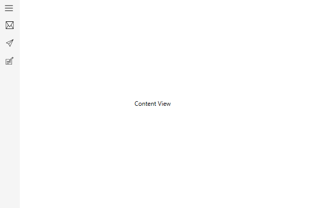
Expanded display mode
The navigation sidebar stays open to the left or right of the window based on the Position property pushing the main content alongside. The ExpandedModeWidth property defines the width of the drawer.
When the drawer menu is toggled using the built-in toggle button, the drawer menu gets collapsed and shown as a narrow bar to the width set to the CompactModeWidth property.
<syncfusion:SfNavigationDrawer x:Name="navigationDrawer" DisplayMode="Expanded">
        <syncfusion:NavigationItem Header="Inbox">
            <syncfusion:NavigationItem.Icon>
                <Path Data="M32.032381, 16.445429 L25.410999,..../>
            </syncfusion:NavigationItem.Icon>
        </syncfusion:NavigationItem>
        <syncfusion:NavigationItem Header="Sent mail">
            <syncfusion:NavigationItem.Icon>
                <Path Data="M42.128046,6.7269681 L18.53705,.../>
            </syncfusion:NavigationItem.Icon>
        </syncfusion:NavigationItem>
        <syncfusion:NavigationItem Header="Drafts">
            <syncfusion:NavigationItem.Icon>
                <Path Data="M6.9999996,48.353 L19,...../>
            </syncfusion:NavigationItem.Icon>
        </syncfusion:NavigationItem>
        <syncfusion:SfNavigationDrawer.ContentView>
            <Label
                Content="Content View" ....../>
        </syncfusion:SfNavigationDrawer.ContentView>
    </syncfusion:SfNavigationDrawer>
SfNavigationDrawer navigationDrawer = new SfNavigationDrawer();
navigationDrawer.DisplayMode = DisplayMode.Expanded;
navigationDrawer.Items.Add(new NavigationItem()
{
Header = "Inbox",
Icon = new Path()
{
Data = Geometry.Parse("M32.032381, 16.445429 L25.410999,.........),
..............
}
});
navigationDrawer.Items.Add(new NavigationItem()
{
Header = "Sent mail",
Icon = new Path()
{
Data = Geometry.Parse("M42.128046,6.7269681 L18.53705,..........),
..........
}
});
navigationDrawer.Items.Add(new NavigationItem()
{
Header = "Drafts",
Icon = new Path()
{
Data = Geometry.Parse("M6.9999996,48.353 L19,48.353 19,..........),
...............
}
});
Label label = new Label();
label.Content = "Content View";
label.HorizontalAlignment = HorizontalAlignment.Center;
label.VerticalAlignment = VerticalAlignment.Center;
label.Height = 30;
label.Width = 150;
navigationDrawer.ContentView = label;
this.Content = navigationDrawer;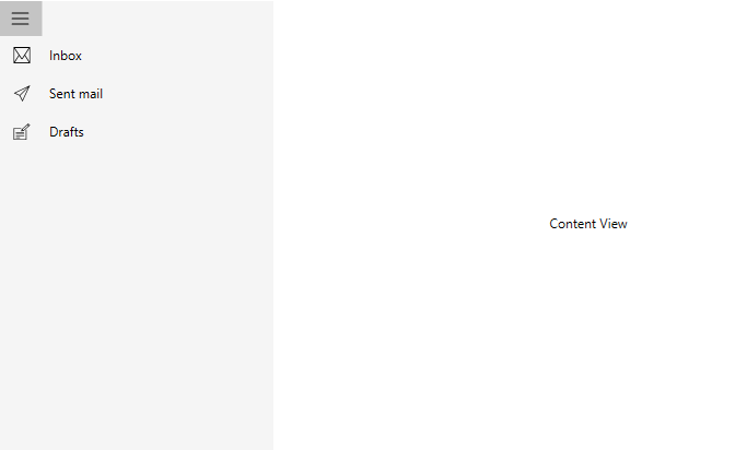
Auto display mode change
The Navigation Drawer handles its display mode based on the values set to the ExpandedModeThresholdWidth property. This can be enabled by setting the AutoChangeDisplayMode property to True.
This switches the display mode to compact when the application window size is less than the ExpandedModeThresholdWidth and switches to expanded mode when the application window size is larger.
<syncfusion:SfNavigationDrawer x:Name="navigationDrawer" DisplayMode="Expanded" AutoChangeDisplayMode="True" ExpandedModeThresholdWidth="600">
        <syncfusion:NavigationItem Header="Inbox">
            <syncfusion:NavigationItem.Icon>
                <Path
                    Data="M32.032381, 16.445429 L25.410999,...... />
            </syncfusion:NavigationItem.Icon>
        </syncfusion:NavigationItem>
        <syncfusion:NavigationItem Header="Sent mail">
            <syncfusion:NavigationItem.Icon>
                <Path
                    Data="M42.128046,6.7269681 L18.53705,.../>
            </syncfusion:NavigationItem.Icon>
        </syncfusion:NavigationItem>
        <syncfusion:NavigationItem Header="Drafts">
            <syncfusion:NavigationItem.Icon>
                <Path Data="M6.9999996,48.353 L19,.../>
            </syncfusion:NavigationItem.Icon>
        </syncfusion:NavigationItem>
        <syncfusion:SfNavigationDrawer.ContentView>
            <Label
                Content="Content View" ....../>
        </syncfusion:SfNavigationDrawer.ContentView>
    </syncfusion:SfNavigationDrawer>
SfNavigationDrawer navigationDrawer = new SfNavigationDrawer();
navigationDrawer.DisplayMode = DisplayMode.Expanded;
navigationDrawer.AutoChangeDisplayMode = true;
navigationDrawer.ExpandedModeThresholdWidth = 600;
navigationDrawer.Items.Add(new NavigationItem()
{
Header = "Inbox",
Icon = new Path()
{
Data = Geometry.Parse("M32.032381, 16.445429 L25.410999,.....),
.............
}
});
navigationDrawer.Items.Add(new NavigationItem()
{
Header = "Sent mail",
Icon = new Path()
{
Data = Geometry.Parse("M42.128046,6.7269681 L18.53705,....),
.....
}
});
navigationDrawer.Items.Add(new NavigationItem()
{
Header = "Drafts",
Icon = new Path()
{
Data = Geometry.Parse("M6.9999996,48.353 L19,......),
........
}
});
Label label = new Label();
label.Content = "Content View";
label.HorizontalAlignment = HorizontalAlignment.Center;
label.VerticalAlignment = VerticalAlignment.Center;
label.Height = 30;
label.Width = 150;
navigationDrawer.ContentView = label;
this.Content = navigationDrawer;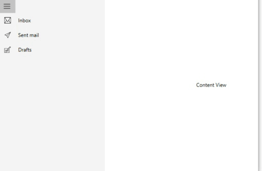
NOTE
View sample in GitHub
Collapsible drawer mode
A collapsible drawer can be achieved using the Navigation Drawer by setting the display mode to Default mode. In this display mode, the drawer menu is populated using custom views.
See also Custom Views topic in Navigation Drawer.
<Window x:Class="NavigationDrawerWPF.MainWindow"
        xmlns="http://schemas.microsoft.com/winfx/2006/xaml/presentation"
        xmlns:x="http://schemas.microsoft.com/winfx/2006/xaml"
        xmlns:d="http://schemas.microsoft.com/expression/blend/2008"
        xmlns:mc="http://schemas.openxmlformats.org/markup-compatibility/2006"
        xmlns:syncfusion="http://schemas.syncfusion.com/wpf"
        xmlns:local="clr-namespace:NavigationDrawerWPF"
        mc:Ignorable="d"
        Title="MainWindow" Height="450" Width="800">
    <Window.DataContext>
        <local:ViewModel/>
    </Window.DataContext>
    <syncfusion:SfNavigationDrawer x:Name="navigationDrawer" DrawerWidth="300">
        <syncfusion:SfNavigationDrawer.ContentView>
            <Grid x:Name="mainContentView"
                  Background="White">
                <Grid.RowDefinitions>
                    <RowDefinition Height="auto"/>
                    <RowDefinition/>
                </Grid.RowDefinitions>
                <StackPanel Background="#1aa1d6"
                            Orientation="Horizontal">
                    <Button x:Name="hamburgerButton"
                            Height="50" Width="50"
                            HorizontalAlignment="Left"
                            Click="HamburgerButton_Click">
                        <Image Source="hamburger_icon.png"
                               Height="20"
                               Width="20" />
                    </Button>
                    <Label x:Name="headerLabel"
                           Height="50"
                           Content="Home"
                           Background="#1aa1d6"/>
                </StackPanel>
                <Label Grid.Row="1"
                       x:Name="contentLabel"
                       Content="Content View"
                       Foreground="Black"/>
            </Grid>
        </syncfusion:SfNavigationDrawer.ContentView>
        <syncfusion:SfNavigationDrawer.DrawerHeaderView>
            <Grid Background="#31ade9">
                <Label Content="Header View" />
            </Grid>
        </syncfusion:SfNavigationDrawer.DrawerHeaderView>
        <syncfusion:SfNavigationDrawer.DrawerContentView>
            <Grid>
                <ListBox x:Name="list"
                         ItemsSource="{Binding Contents}">
                    <ListBox.ItemTemplate>
                        <DataTemplate>
                            <TextBlock  Text="{Binding Name}"
                                        Foreground="Black"/>
                        </DataTemplate>
                    </ListBox.ItemTemplate>
                </ListBox>
            </Grid>
        </syncfusion:SfNavigationDrawer.DrawerContentView>
        <syncfusion:SfNavigationDrawer.DrawerFooterView>
            <Grid Background="#31ade9">
                <Label Content="Footer View" />
            </Grid>
        </syncfusion:SfNavigationDrawer.DrawerFooterView>
    </syncfusion:SfNavigationDrawer>
</Window>
using System.Collections.Generic;
using System.Windows;
namespace NavigationDrawerWPF
{
public partial class MainWindow : Window
{
public MainWindow()
{
InitializeComponent();
}
private void HamburgerButton_Click(object sender, RoutedEventArgs e)
{
navigationDrawer.ToggleDrawer();
}
}
public class ViewModel
{
public ViewModel()
{
Contents = new List<Model>();
Contents.Add(new Model() { Name = "Home" });
Contents.Add(new Model() { Name = "Profile" });
Contents.Add(new Model() { Name = "Inbox" });
Contents.Add(new Model() { Name = "Outbox" });
Contents.Add(new Model() { Name = "Sent" });
Contents.Add(new Model() { Name = "Trash" });
Contents.Add(new Model() { Name = "Sign Out" });
}
public List<Model> Contents { get; set; }
}
public class Model
{
public string Name { get; set; }
}
}