Getting Started with WPF color picker (ColorPicker)
18 Feb 202510 minutes to read
This section explains how to create a WPF ColorPicker and explains about its structure and features.
Structure of ColorPicker
Assembly deployment
Refer to the Control Dependencies section to get the list of assemblies or NuGet package that needs to be added as a reference to use the control in any application.
Refer to this documentation to find more details about installing nuget packages in a WPF application.
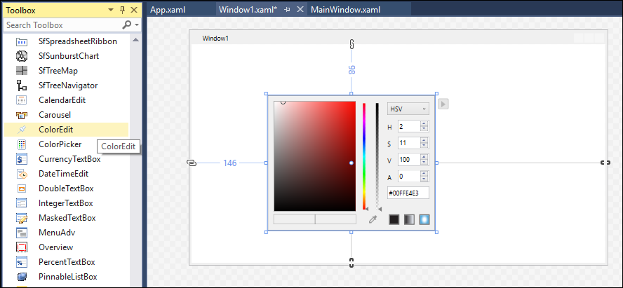
Adding WPF ColorPicker via designer
ColorPicker can be added to an application by dragging it from the toolbox to a designer view. The following dependent assemblies will be added automatically:
-
Syncfusion.Shared.WPF
Adding WPF ColorPicker via XAML
To add the ColorPicker manually in XAML, follow these steps:
-
Create a new WPF project in Visual Studio.
-
Add the following required assembly reference to the project:
- Syncfusion.Shared.WPF
-
Import Syncfusion® WPF schema http://schemas.syncfusion.com/wpf, and declare the
ColorPickerin WPF XAML page.<Window x:Class="ColorPicker_sample.MainWindow" xmlns="http://schemas.microsoft.com/winfx/2006/xaml/presentation" xmlns:x="http://schemas.microsoft.com/winfx/2006/xaml" xmlns:d="http://schemas.microsoft.com/expression/blend/2008" xmlns:mc="http://schemas.openxmlformats.org/markup-compatibility/2006" xmlns:local="clr-namespace:ColorPicker_sample" xmlns:syncfusion="http://schemas.syncfusion.com/wpf" mc:Ignorable="d" Title="MainWindow" Height="450" Width="800"> <Grid Name="grid"> <syncfusion:ColorPicker Name="colorPicker" Height="100" Width="280"/> </Grid>
Adding WPF ColorPicker via C#
To add the ColorPicker manually in C#, follow these steps:
-
Create a new WPF application via Visual Studio.
-
Add the following required assembly references to the project:
- Syncfusion.Shared.WPF
-
Include the required namespace.
using Syncfusion.Windows.Shared; -
Create an instance of
ColorPicker, and add it to the window.ColorPicker colorPicker = new ColorPicker(); colorPicker.Width = 300; colorPicker.Height=100;
Select a Color
We can select a solid color or gradient color from a ColorPicker using the Color and Brush properties.
Select Solid Color
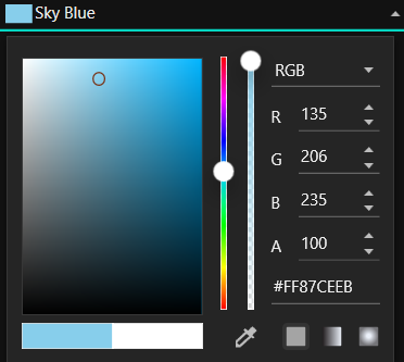
We can select the solid color by using the Color property.
<syncfusion:ColorPicker x:Name="colorPicker"
                         Color="Yellow"/>
ColorPicker colorPicker = new ColorPicker();
colorPicker.Color = Colors.Yellow;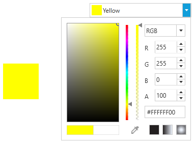
Select a Gradient Color
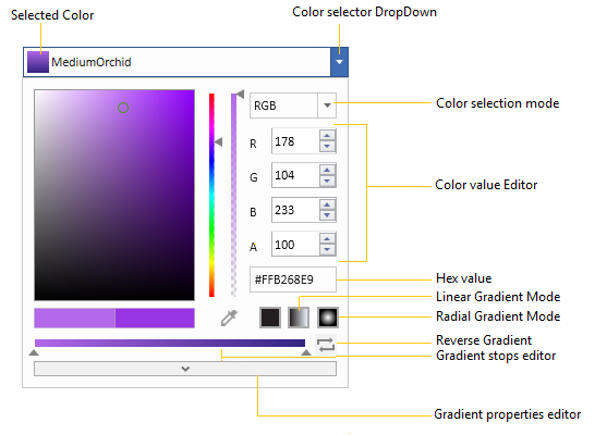
We can select a linear or radial gradient color which holds the multiple colors from the ColorPicker.
Linear Gradient
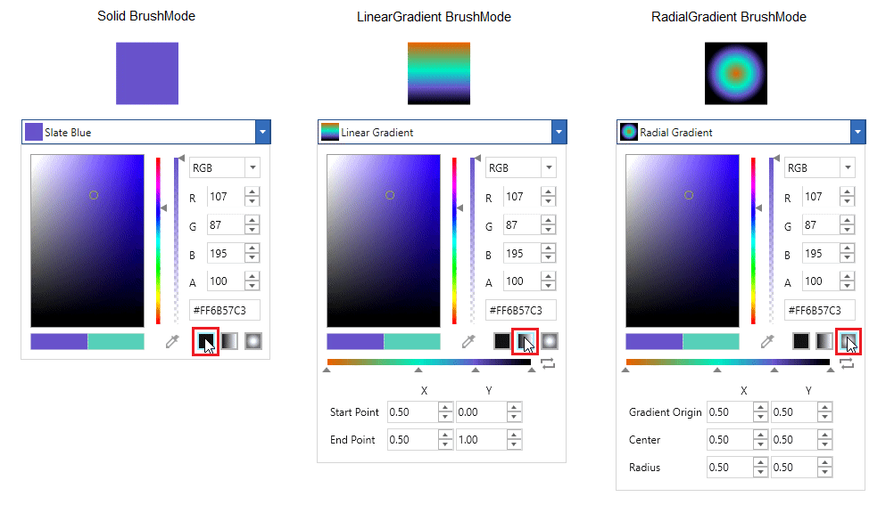
Linear Gradient color can be selected by the multiple colors and their location along the gradient axis using the GradientStops objects and StartPoint and EndPoint properties. Based on the StartPoint and EndPoint, the selected colors will be combined in linear manner.
<syncfusion:ColorPicker x:Name="colorPicker" Width="200">
   <syncfusion:ColorPicker.Brush>
        <LinearGradientBrush StartPoint="0,0" EndPoint="1,1">
             <GradientStop Color="Yellow" Offset="0.0" />
             <GradientStop Color="Red" Offset="0.25" />
             <GradientStop Color="Blue" Offset="0.75" />
             <GradientStop Color="LimeGreen" Offset="1.0" />
        </LinearGradientBrush>
    </syncfusion:ColorPicker.Brush>
 </syncfusion:ColorPicker>
//Creating the linear gradient brush
LinearGradientBrush linearGradient = new LinearGradientBrush();
linearGradient.StartPoint = new Point(0, 0);
linearGradient.EndPoint = new Point(1, 1);
linearGradient.GradientStops.Add(new GradientStop(Colors.Yellow, 0.0));
linearGradient.GradientStops.Add(new GradientStop(Colors.Red, 0.25));
linearGradient.GradientStops.Add(new GradientStop(Colors.Blue, 0.75));
linearGradient.GradientStops.Add(new GradientStop(Colors.LimeGreen, 1.0));
//Assigning a linear gradient brush to ColorPicker
ColorPicker colorPicker= new ColorPicker();
colorPicker.Brush = linearGradient;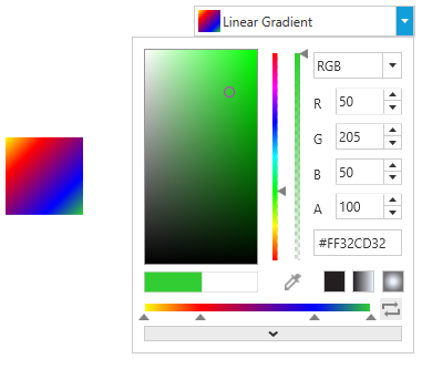
Radial Gradient
Radial Gradient color is similar to Linear Gradient color, except for the axis defined by the circle. Based on the GradientOrigin, Center and RadiusPoint properties values, the selected gradient colors are combined in a circle manner.
<syncfusion:ColorPicker x:Name="colorPicker" Width="200">
     <syncfusion:ColorPicker.Brush>
         <RadialGradientBrush GradientOrigin="0.5,0.5" Center="0.5,0.5" RadiusX="0.5" RadiusY="0.5">
            <GradientStop Color="Yellow" Offset="0" />
            <GradientStop Color="Red" Offset="0.25" />
            <GradientStop Color="Blue" Offset="0.75" />
            <GradientStop Color="LimeGreen" Offset="1" />
        </RadialGradientBrush>
     </syncfusion:ColorPicker.Brush>
 </syncfusion:ColorPicker>
//Creating a
RadialGradientBrush radialGradient = new RadialGradientBrush();
radialGradient.GradientOrigin = new Point(0.5, 0.5);
radialGradient.Center = new Point(0.5, 0.5);
radialGradient.RadiusX = 0.5;
radialGradient.RadiusY = 0.5;
radialGradient.GradientStops.Add(new GradientStop(Colors.Yellow, 0.0));
radialGradient.GradientStops.Add(new GradientStop(Colors.Red, 0.25));
radialGradient.GradientStops.Add(new GradientStop(Colors.Blue, 0.75));
radialGradient.GradientStops.Add(new GradientStop(Colors.LimeGreen, 1.0));
colorPicker.Brush = radialGradient;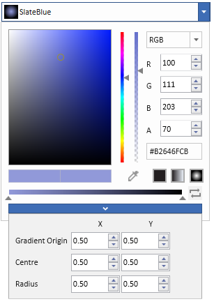
Change Selected Color at runtime
ColorPicker consist of bunch of input components to select color and edit its properties at runtime.
Color and Brush changed notification
Selected Color and Brush changed in ColorPicker can be examined using SelectedBrushChanged and ColorChanged events.
<syncfusion:ColorPicker ColorChanged="ColorPicker_ColorChanged"
                        SelectedBrushChanged="ColorPicker_SelectedBrushChanged"
                        Name="colorPicker"/>
ColorPicker colorPicker = new ColorPicker();
colorPicker.SelectedBrushChanged += ColorPicker_SelectedBrushChanged;
colorPicker.ColorChanged += ColorPicker_ColorChanged;//Invoked when the selected color is changed
private void ColorPicker_ColorChanged(DependencyObject d, DependencyPropertyChangedEventArgs e)
{
// Enter your code here
}
//Invoked when the selected brush is changed
private void ColorPicker_SelectedBrushChanged(DependencyObject d, DependencyPropertyChangedEventArgs e)
{
// Enter your code here
}Change opacity of the color
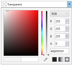
We can change the opacity of the selected color by using the A-Alpha value editor or delicate slider in the ColorPicker. We can hide the A-Alpha value editor and delicate slider by using the IsAlphaVisible property value as false. The default value of the IsAlphaVisible property is true.
<syncfusion:ColorPicker IsAlphaVisible="False" x:Name="colorPicker" />ColorPicker colorPicker = new ColorPicker();
colorPicker.IsAlphaVisible = false;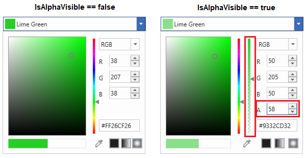
Switch between Solid, Linear and Gradient brush mode
We can change the color selection mode directly by clicking on the corresponding Solid, Linear or Gradient brush mode buttons which are placed in the bottom right corner of the ColorPicker.
Restrict the brush mode from Solid to Gradient
We can restrict color selection mode switching at runtime by setting the EnableSolidToGradientSwitch property value as false. It will hide the Solid, Linear and Gradient brush switch buttons.
<syncfusion:ColorPicker x:Name="colorPicker" EnableSolidToGradientSwitch="false"/>ColorPicker colorPicker = new ColorPicker ();
colorPicker.EnableSolidToGradientSwitch = false;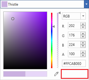
Click here to download the sample that showcases the ColorPicker overall features.
Theme
ColorPicker supports various built-in themes. Refer to the below links to apply themes for the ColorPicker,