Select Gradient Color in WPF ColorPicker
18 Nov 201811 minutes to read
This section gives a brief note on how to create gradient color, modify their colors and modify their properties.
What is a gradient color?
A gradient color paints an area with multiple colors that blend along an axis. WPF ColorPicker includes gradient tools that return a brush of type LinearGradientBrush or RadialGradientBrush. Offsets can be added or removed dynamically, and their positions can be changed to produce different color combinations.
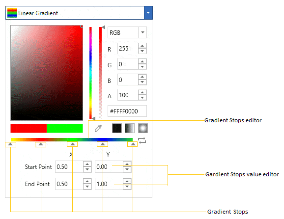
Create Gradient colors using GradientStops Editor
You can add a multiple-color combination for the gradient color using the GradientStopsEditor. You can add new gradient stops, change the offset, and change the color of the gradient stops at runtime. The created gradient stops are combined together to provide a gradient color.
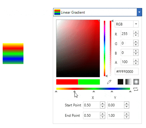
Add or Remove GradientStops
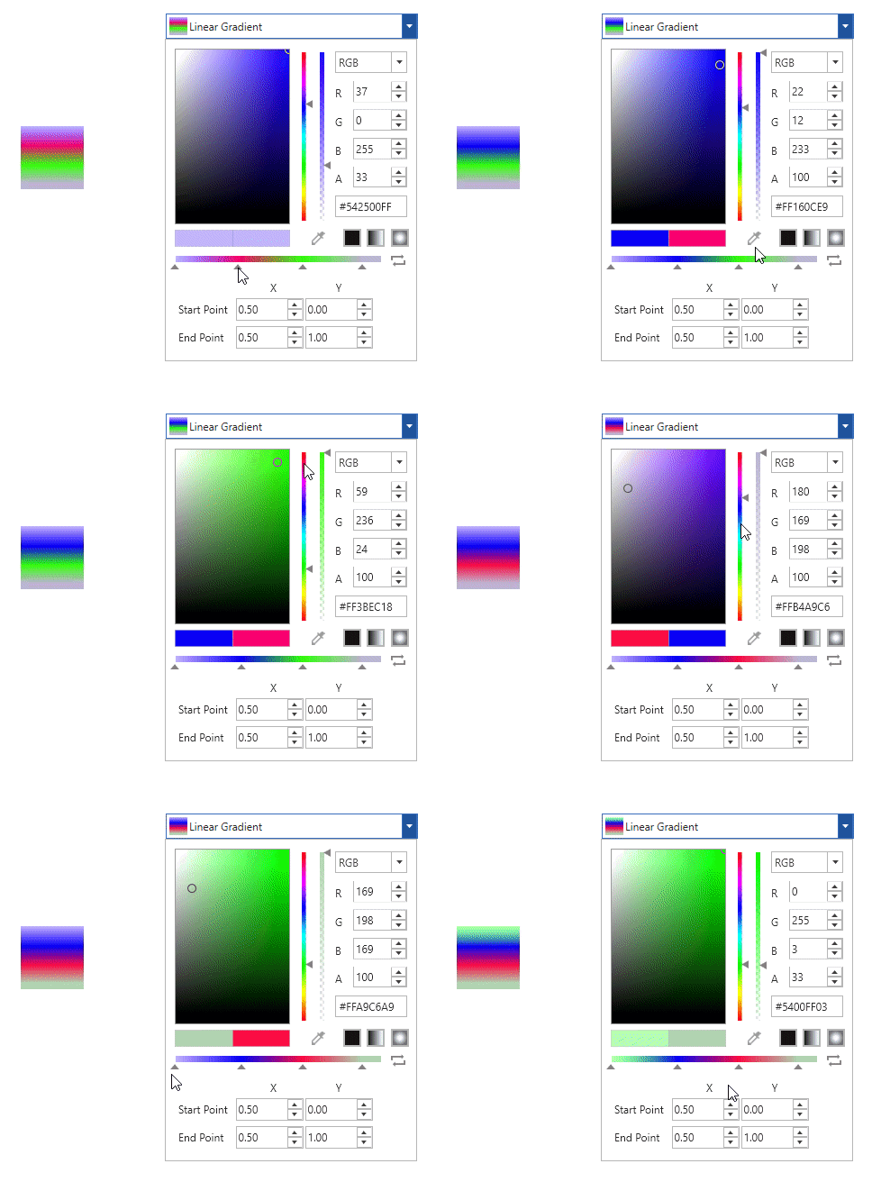
You can add more colors to the gradient by using gradient stops. Gradient stops can be added to an existing gradient by clicking the GradientStopEditor.
To remove a gradient stop, select the gradient stop you want to remove and press the Delete key, or drag it away with the mouse so that it is removed from the GradientStopEditor.
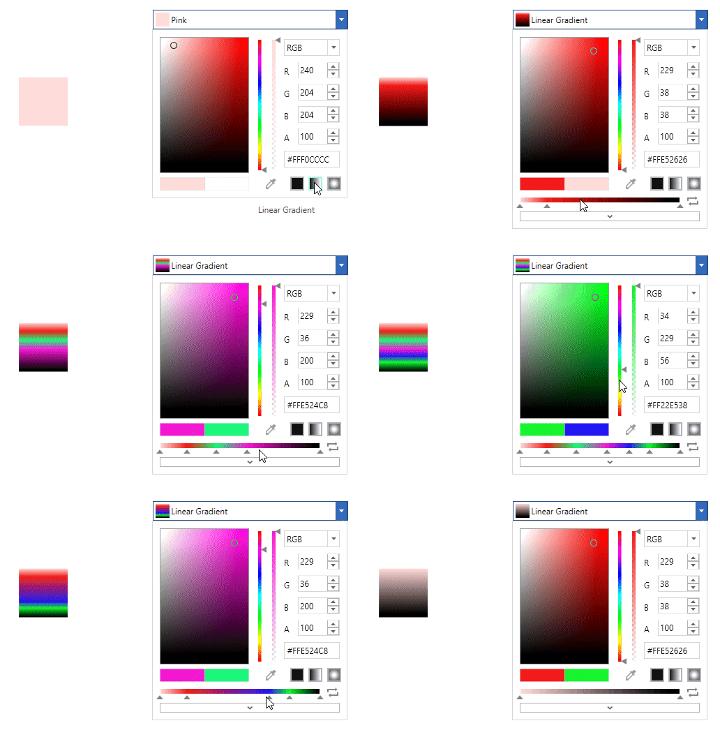
Rearrange GradientStops
You can rearrange the color combination of the gradient by adjusting the gradient stops. Gradient-stop positions can be changed by dragging them along the GradientStopEditor. The gradient color is generated based on the order of the gradient stops.
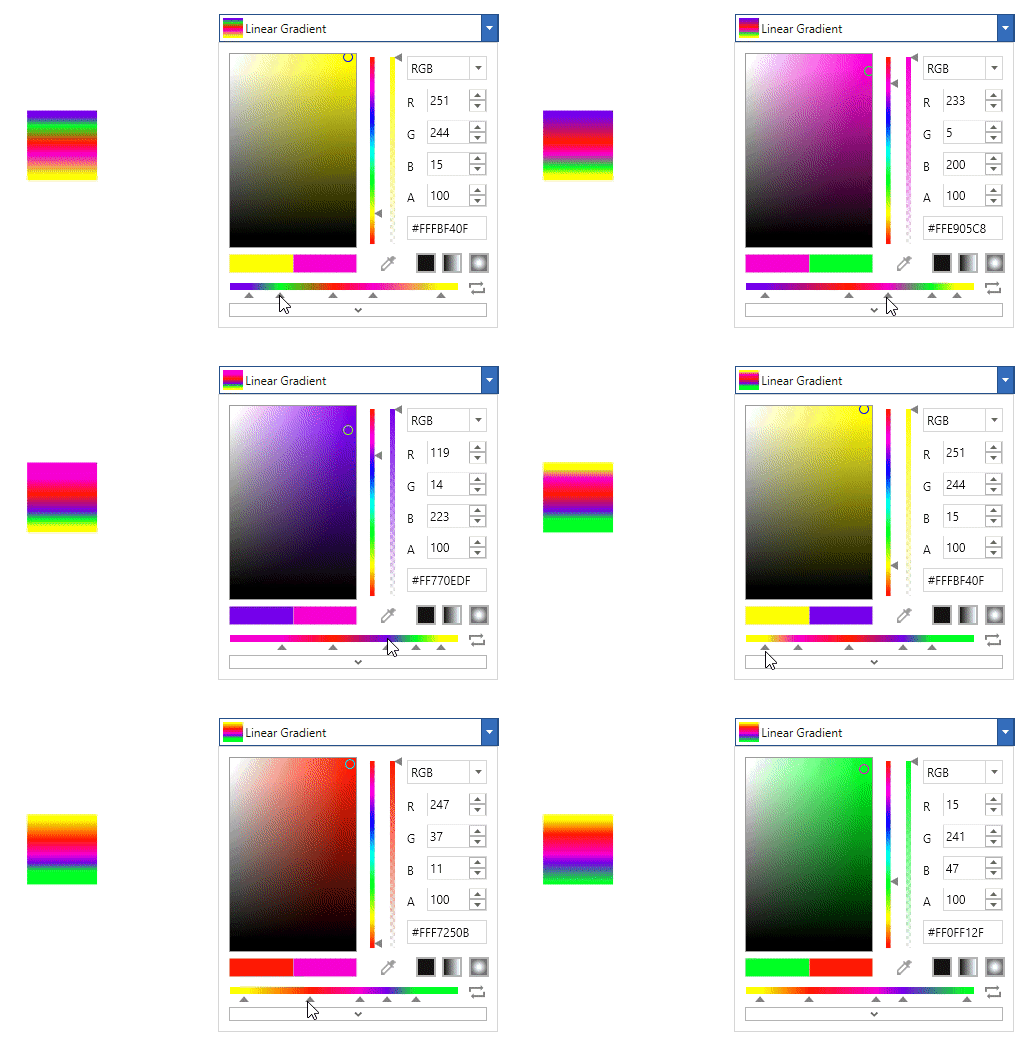
Change GradientStops Colors
You can change the colors of a created gradient by changing the color of its gradient stops. The color of a gradient stop is changed by selecting that particular gradient stop and choosing a new color from the WPF ColorPicker.
Create Linear Gradient colors
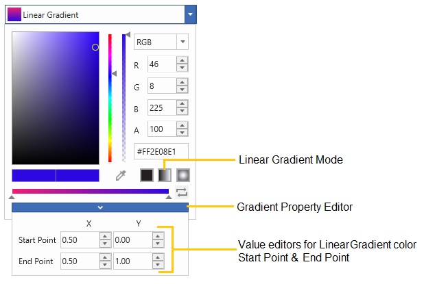
You can create a linear gradient color programmatically using LinearGradientBrush with its GradientStops, StartPoint, and EndPoint properties. You can also create and change the linear gradient at runtime by using the GradientStopsEditor and the StartPoint/EndPoint input options available in the GradientPropertyEditor. By default, the linear gradient colors are combined horizontally. The default value of StartPoint is (0.5, 0), and the default value of EndPoint is (0.5, 1).
| Properties | Description |
|---|---|
| Indicates the Start point of LinearGradientBrush. | |
| Indicates the End point of LinearGradientBrush. |
class ViewModel {
    public Brush LinearGradientBrush {get; set;}
    public ViewModel() {
        //Creating LinearGradient brush
        LinearGradientBrush LinearBrush = new LinearGradientBrush();
        LinearBrush.StartPoint = new Point(0, 1);
        LinearBrush.EndPoint = new Point(1, 1);
        LinearBrush.GradientStops.Add(new GradientStop(Colors.Yellow, 0.0));
        LinearBrush.GradientStops.Add(new GradientStop(Colors.Red, 0.25));
        LinearBrush.GradientStops.Add(new GradientStop(Colors.Blue, 0.75));
        LinearBrush.GradientStops.Add(new GradientStop(Colors.LimeGreen, 1.0));

        // Assigning a created linear gradient brush to `LinearGradientBrush` property
        LinearGradientBrush = LinearBrush;
    }
}<syncfusion:ColorPicker Brush="{Binding LinearGradientBrush}"
Name="colorPicker">
<syncfusion:ColorPicker.DataContext>
<local:ViewModel></local:ViewModel>
</syncfusion:ColorPicker.DataContext>
</syncfusion:ColorPicker>ColorPicker colorPicker = new ColorPicker();
colorPicker.DataContext = new ViewModel();
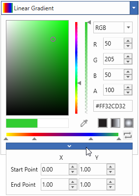
colorPicker.SetBinding(ColorPicker.BrushProperty, new Binding("LinearGradientBrush"));Here, Linear Gradient created by the gradient colors and their location along the gradient axis using the GradientStop objects.
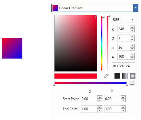
Diagonal Linear Gradient (StartPoint(0,0), EndPoint(1,1))
Vertical Linear Gradient (StartPoint(0, 0.5), EndPoint(1, 0.5)
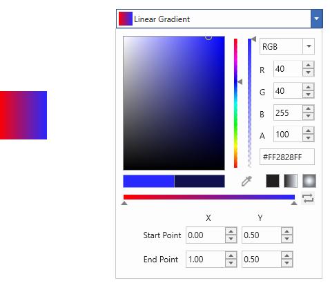
Create Radial Gradient colors
You can create a radial gradient color programmatically using RadialGradientBrush with its GradientStops, GradientOrigin, Radius, and Center properties. Radial gradient brush colors can be changed at runtime using the GradientStopsEditor, and the GradientOrigin, Center, and Radius can be changed at runtime using the input options available in the GradientPropertyEditor.
| Properties | Description |
|---|---|
| Indicates the gradient origin of RadialGradientBrush. | |
| Indicates the centre point of RadialGradientBrush. | |
| Indicates the X value in Radius of RadialGradientBrush. | |
| Indicates the Y value in Radius of RadialGradientBrush. |
class ViewModel {
    public Brush RadialGradientBrush { get; set; }
    public ViewModel() {
         //Creating Radial Gradient brush
        RadialGradientBrush radialBrush = new RadialGradientBrush();
        radialBrush.GradientOrigin = new Point(0.5, 0.5);
        radialBrush.Center = new Point(0.5, 0.5);
        radialBrush.RadiusX = 0.5;
        radialBrush.RadiusY = 0.5;
        radialBrush.GradientStops.Add(new GradientStop(Colors.Yellow, 0.0));
        radialBrush.GradientStops.Add(new GradientStop(Colors.Red, 0.25));
        radialBrush.GradientStops.Add(new GradientStop(Colors.Blue, 0.75));
        radialBrush.GradientStops.Add(new GradientStop(Colors.LimeGreen, 1.0));

        // Assigning a created radial gradient brush to `RadialGradientBrush` property
        RadialGradientBrush = radialBrush;
    }
}<syncfusion:ColorPicker Brush="{Binding RadialGradientBrush}"
Name="colorPicker">
<syncfusion:ColorPicker.DataContext>
<local:ViewModel></local:ViewModel>
</syncfusion:ColorPicker.DataContext>
</syncfusion:ColorPicker>ColorPicker colorPicker = new ColorPicker();
colorPicker.DataContext = new ViewModel();
colorPicker.SetBinding(ColorPicker.BrushProperty, new Binding("RadialGradientBrush"));Here, Radial Gradient created by the gradient colors and their location along the gradient axis using the GradientStop objects.
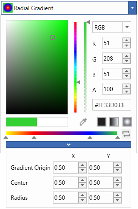
Gradient Origin (0.25, 0.25)
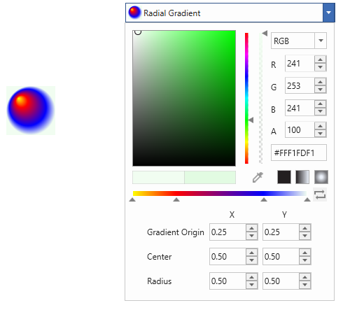
Centre (0.25, 0.25)
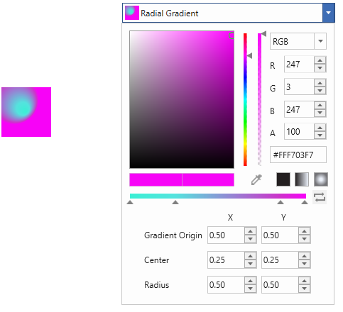
Radius (0.25, 0.25)
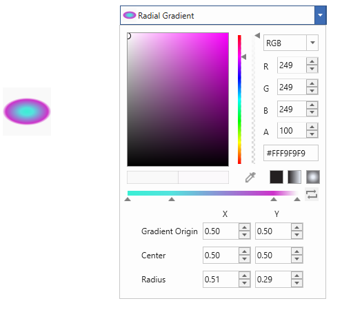
Show or Hide RadialGradientBrush properties
You can control the visibility of RadialGradientBrush properties using the IsGradientOriginVisible, IsCenterVisible, and IsRadiusVisible properties. By default, all RadialGradientBrush properties are visible (True). To hide any of these properties, set its value to False.
<syncfusion:ColorPicker x:Name="colorPicker" IsCenterVisible="False"/>ColorPicker colorPicker = new ColorPicker();
colorPicker.IsCenterVisible = false;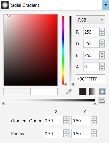
Reverse the Gradient Colors
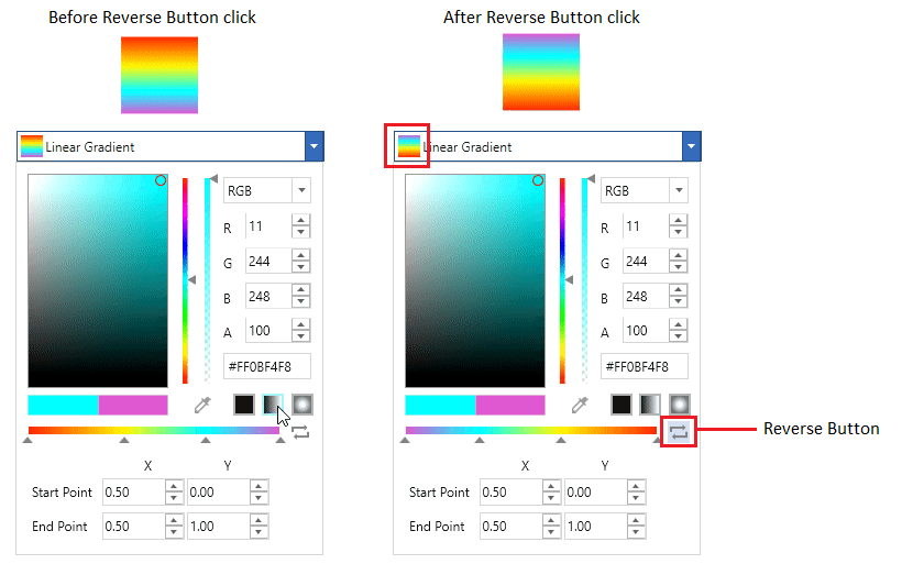
WPF ColorPicker includes a reverse button that flips the gradient — vertically for a linear gradient, and inside-out for a radial gradient.
Show selected gradient color name
By default, the selected gradient mode name is displayed in the WPF ColorPicker. To display the selected gradient color name instead, set the GradientBrushDisplayMode property to Extended. The default value of GradientBrushDisplayMode is Default.
<syncfusion:ColorPicker x:Name="colorPicker" GradientBrushDisplayMode="Extended"/>ColorPicker colorPicker = new ColorPicker();
colorPicker.GradientBrushDisplayMode = GradientBrushDisplayMode.Extended;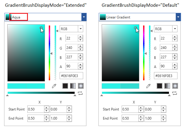
Show gradient color value editor
You can display the gradient property editor in either pop-up mode or extended mode. By default, the editor is displayed in extended mode. To display the editor only in a pop-up, set the GradientPropertyEditorMode property to Popup. The default value of GradientPropertyEditorMode is Extended.
<syncfusion:ColorPicker x:Name="colorPicker" GradientPropertyEditorMode="Popup"/>ColorPicker colorPicker = new ColorPicker();
colorPicker.GradientPropertyEditorMode = GradientPropertyEditorMode.Popup;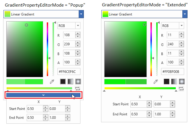
Switch between Solid, Linear, and Gradient brush mode
You can switch the brush mode from solid to linear or radial gradient (and vice versa) either at runtime or programmatically. By default, the Solid brush mode is enabled. To enable the Gradient brush mode, set the BrushMode property to Gradient. You can also switch the brush mode by clicking the corresponding Solid, Linear, or Gradient button placed in the bottom-right corner of the WPF ColorPicker. To hide these buttons, set EnableSolidToGradientSwitch to false. The default value of EnableSolidToGradientSwitch is true.
<syncfusion:ColorPicker x:Name="colorPicker" BrushMode="Gradient" EnableSolidToGradientSwitch="false"/>ColorPicker colorPicker = new ColorPicker();
colorPicker.BrushMode = BrushModes.Gradient;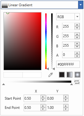
Here, The WPF ColorPicker is in Gradient brush mode.
Switch between Solid, Linear and Gradient brush mode
We can change the brush mode directly by clicking on the corresponding Solid, Linear or Gradient mode buttons which are placed in the bottom right corner of the WPF ColorPicker.
Disable Switching between Solid, Linear and Gradient brush mode at runtime
If we want to disable the Solid, Linear and Gradient brush mode transition at runtime, use the EnableSolidToGradientSwitch property value as false. It will hide the Solid, Linear and Gradient brush buttons. The Default value of EnableSolidToGradientSwitch property is true.
<syncfusion:ColorPicker x:Name="colorPicker" EnableSolidToGradientSwitch="false"/>ColorPicker colorPicker = new ColorPicker ();
colorPicker.EnableSolidToGradientSwitch = false;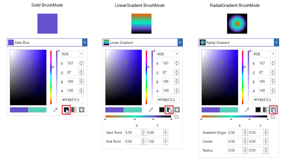
Gradient color changed notification
The selected gradient color in the WPF ColorPicker can be observed using the SelectedBrushChanged event.
<syncfusion:ColorPicker SelectedBrushChanged="ColorPicker_SelectedBrushChanged"
                        Name="colorPicker"/>
ColorPicker colorPicker = new ColorPicker();
colorPicker.SelectedBrushChanged += ColorPicker_SelectedBrushChanged;//Invoked when the selected brush is changed
private void ColorPicker_SelectedBrushChanged(DependencyObject d, DependencyPropertyChangedEventArgs e) {
//Read the new and old brush
Brush newBrush = (Brush)e.NewValue;
Brush oldBrush = (Brush)e.OldValue;
}Click here to download the sample that showcases the Linear GradientBrush and its additional features.
Click here to download the sample that showcases the Radial GradientBrush and its additional features.