How can I help you?
Appearance in WPF color picker (ColorPicker)
18 Feb 20253 minutes to read
This section explains different UI customization, styling, theming options available in ColoPicker control.
Change Header Template
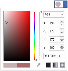
We can customize the header of the ColorPicker by using the HeaderTemplate property.
<DataTemplate x:Key="CustomHeaderTemplate"
              DataType="syncfusion:ColorPicker">
    <StackPanel Orientation="Horizontal">
        <Ellipse Fill="{Binding Brush,
            RelativeSource={RelativeSource FindAncestor,
            AncestorType={x:Type syncfusion:ColorPicker}}}"
                 Name="selectedColorEllipse"
                 HorizontalAlignment="Left"
                 Width="20" Height="20"
                 Margin="2" />
    </StackPanel>
</DataTemplate>

<syncfusion:ColorPicker  HeaderTemplate="{StaticResource CustomHeaderTemplate}"
                         Name="colorPicker"
                         Width ="50" Height="30"/>
NOTE
Change flow direction
We can change the flow direction of the ColorPicker layout from right to left by setting the FlowDirection property value as RightToLeft. The Default value of FlowDirection property is LeftToRight.
<syncfusion:ColorPicker FlowDirection="RightToLeft" Name="colorPicker"/>ColorPicker colorPicker= new ColorPicker();
colorPicker.FlowDirection = FlowDirection.RightToLeft;
NOTE
Setting ToolTip
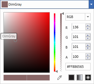
ToolTip is used to show the information about the segment, when you mouse over on the segment. We can show information about the selected color name using tooltip when click and dragging the mouse on the color palette. Tooltip is enabled by default, you can disable it by setting EnableToolTip to false.
<syncfusion:ColorPicker EnableToolTip="True" Name="colorPicker"/>ColorPicker colorPicker = new ColorPicker();
colorPicker.EnableToolTip = true;
NOTE
Theme
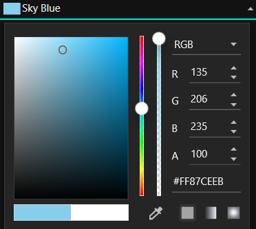
ColorPicker supports various built-in themes. Refer to the below links to apply themes for the ColorPicker,
