How can I help you?
Getting Started with WPF Circular ProgressBar (SfCircularProgressBar)
21 Jan 20254 minutes to read
You can create a WPF application with the SfCircularProgressBar control using the following steps:
Assembly deployment
Refer to the control dependencies section to get the list of assemblies or NuGet package that needs to be added as a reference to use the control in any application.
You can find more details about installing the NuGet package in a WPF application in the following link: How to install nuget packages
Adding control through designer
The SfCircularProgressBar control can be added to a WPF application by dragging it from the toolbox to a designer view. The following assembly reference will be added automatically:
- Syncfusion.SfProgressBar.WPF

Adding control manually in XAML
To add control manually in XAML, follow the given steps:
- Add the following required assembly references to the project:
- Syncfusion.SfProgressBar.WPF
- Import Syncfusion®; WPF schema http://schemas.syncfusion.com/wpf the in XAML page.
-
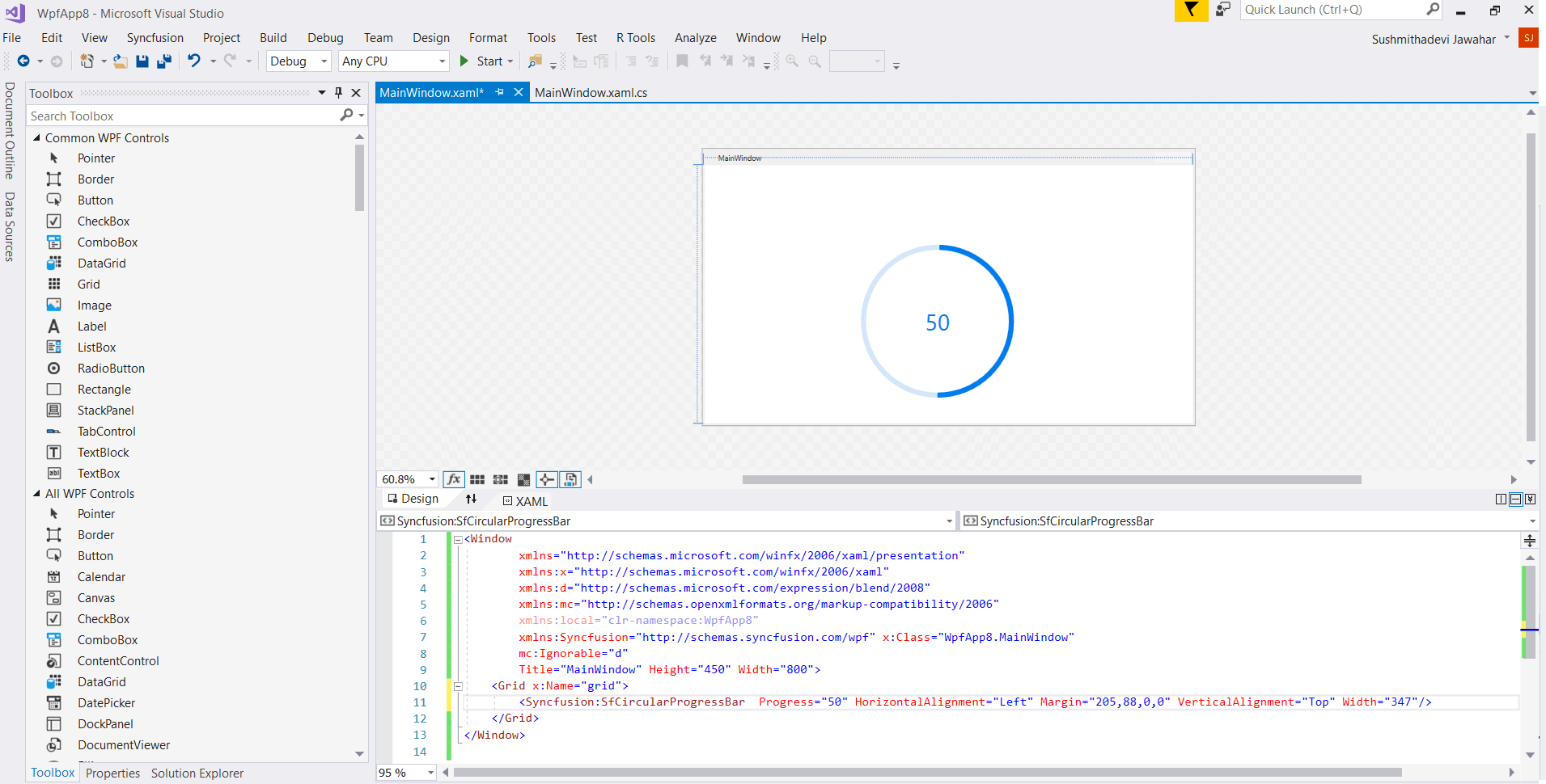
Declare the SfCircularProgressBar control in the XAML page.
<Window
        xmlns="http://schemas.microsoft.com/winfx/2006/xaml/presentation"
        xmlns:x="http://schemas.microsoft.com/winfx/2006/xaml"
        xmlns:d="http://schemas.microsoft.com/expression/blend/2008"
        xmlns:mc="http://schemas.openxmlformats.org/markup-compatibility/2006"
        xmlns:local="clr-namespace:WpfApp4"
        xmlns:Syncfusion="http://schemas.syncfusion.com/wpf" x:Class="WpfApp4.MainWindow"
        mc:Ignorable="d"
        Title="MainWindow" Height="450" Width="800">
     <Grid x:Name="grid">
       <Syncfusion:SfCircularProgressBar  Progress="50"  Width="347"/>
      </Syncfusion:SfCircularProgressBar>
        </Grid>
</Window>
Adding control through code behind
To add control manually through code behind, follow the given steps:
- Add the following required assembly references to the project:
- Syncfusion.SfProgressBar.WPF
- Import the Circular ProgressBar namespace using Syncfusion.UI.Xaml.ProgressBar;.
-
Create an Circular ProgressBar instance, and add it to the window.
using Syncfusion.UI.Xaml.ProgressBar;
namespace SfProgressBar
{
    /// <summary>
    /// Interaction logic for MainWindow.xaml
    /// </summary>
    public partial class MainWindow : Window
    {
        public MainWindow()
        {
            InitializeComponent();

            SfCircularProgressBar circular = new SfCircularProgressBar();
            circular.Progress = 50;
            circular.Width = 347;
            grid.Children.Add(circular);

        }
    }
}

The complete source for this demo can be downloaded here
Theme
Circular ProgressBar supports various built-in themes. Refer to the below links to apply themes for the Circular ProgressBar,
