States in WPF circular progressbar (SfCircularProgressBar)
21 Jan 20251 minute to read
States help to visualize the progress of a task in different modes. You can configure states of the circular progressbar control depending on its usage in following ways.
Determinate
Determinate is the default state. You can use it when the progress estimation is known. ShowProgressValue property allows to indicate the progress of the operation taken place in numerical value.
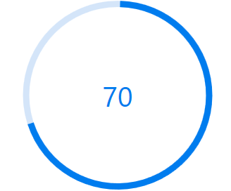
Indeterminate
By enabling the IsIndeterminate property, the state of the progressbar can be changed to indeterminate when the progress cannot be estimated or when not being calculated.
<Syncfusion:SfCircularProgressBar Progress="70" IsIndeterminate="True"/>SfCircularProgressBar Circular = new SfCircularProgressBar { Progress = 70, IsIndeterminate=true};
grid.Children.Add(Circular);
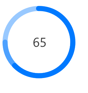
Buffer
Buffer is used as a secondary progress indicator when the primary task depends on the secondary task. This will allow users to visualize both the primary and secondary tasks’ progress simultaneously. The SecondaryProgress property can be set to visualize the secondary progress, and a separate color for the secondary progress can be set by the SecondaryProgressColor property.
<Syncfusion:SfCircularProgressBar Progress="65" SecondaryProgress="75"/>SfCircularProgressBar Circular = new SfCircularProgressBar { Progress = 65, SecondaryProgress = 75 };
grid.Children.Add(Circular);