How can I help you?
Custom Content in WPF circular progressbar (SfCircularProgressBar)
21 Jan 202512 minutes to read
In the circular progress bar, you can add any custom content to the center of the control using ProgressContent property.
For example, you can include add, play or pause button to control the progress. You can also add an image that indicates the actual task in progress or add custom text that conveys how far the task is completed.
The following code sample demonstrates to add custom text that conveys how far the resource is used.
<Syncfusion:SfCircularProgressBar x:Name="CustomContentProgressBarLevel" Progress="70">
            <Syncfusion:SfCircularProgressBar.ProgressContent>
                <StackPanel>
                    <TextBlock Text="{Binding Progress,StringFormat={}{0}%}"  TextAlignment="Center" DataContext ="{x:Reference CustomContentProgressBarLevel}" />
                    <TextBlock Text="Used" />
                </StackPanel>
            </Syncfusion:SfCircularProgressBar.ProgressContent>
        </Syncfusion:SfCircularProgressBar>
SfCircularProgressBar circular = new SfCircularProgressBar();
circular.Progress = 70;
StackPanel stack = new StackPanel();
TextBlock textblock = new TextBlock();
textblock.DataContext = circular;
Binding binding = new Binding
{
Source = circular,
Path = new PropertyPath("Progress"),
StringFormat = "{0}%"
};
textblock.SetBinding(TextBlock.TextProperty, binding);
TextBlock textblock2 = new TextBlock();
textblock2.Text = "used";
stack.Children.Add(textblock);
stack.Children.Add(textblock2);
circular.ProgressContent = stack;
grid.Children.Add(circular);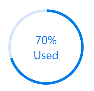
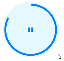
The following code sample demonstrates to include play and pause button which can be controlled at runtime.
<Window.DataContext>
        <local:ViewModel/>
    </Window.DataContext>
<Syncfusion:SfCircularProgressBar x:Name="VideoPlayerProgressBar" Progress="{Binding Path= PlayPauseProgress, Mode=TwoWay}" TrackInnerRadius="0" IndicatorOuterRadius="0.7" IndicatorInnerRadius="0.65" >
            <Syncfusion:SfCircularProgressBar.ProgressContent>
                <Grid>
                    <Button Grid.Row="0"  Grid.Column="0" Visibility="Hidden" x:Name="PlayButton" Click="PlayButton_Clicked"  Background="#00FFFFFF" Width="30" Height="30" >
                        <Image x:Name="image1" Source="Resources\SfProgressPlay.png"/>
                    </Button>
                    <Button Grid.Row="0"  Grid.Column="0" x:Name="PauseButton" Click="PauseButton_Clicked" Background="#00FFFFFF" Width="30" Height="30" >
                        <Image x:Name="image" Source="Resources\SfProgressPause.png"/>
                    </Button>
                </Grid>
            </Syncfusion:SfCircularProgressBar.ProgressContent>
        </Syncfusion:SfCircularProgressBar>
public partial class MainWindow : Window
{
public DispatcherTimer SfCircularBarPlayPauseTimer;
public MainWindow()
{
InitializeComponent();
}
/// <summary>
/// Method represent when pause button clicked.
/// </summary>
/// <param name="sender"></param>
/// <param name="e"></param>
private void PauseButton_Clicked(object sender, RoutedEventArgs e)
{
PlayButton.Visibility = Visibility.Visible;
PauseButton.Visibility = Visibility.Hidden;
(this.DataContext as ViewModel).SfCircularBarPlayPauseTimer.Stop();
}
/// <summary>
/// Method represent when play button clicked.
/// </summary>
/// <param name="sender"></param>
/// <param name="e"></param>
private void PlayButton_Clicked(object sender, RoutedEventArgs e)
{
PlayButton.Visibility = Visibility.Hidden;
PauseButton.Visibility = Visibility.Visible;
(this.DataContext as ViewModel).SfCircularBarPlayPauseTimer.Start()
}
}
public class ViewModel : INotifyPropertyChanged
{
public DispatcherTimer SfCircularBarPlayPauseTimer;
#region Cons
/// <summary>
/// Initializes a new instance of the time class.
/// </summary>
public ViewModel()
{
SfCircularBarPlayPauseTimer = new DispatcherTimer();
SfCircularBarPlayPauseTimer.Tick += SfCircularBarPlayPauseTimer_Tick;
SfCircularBarPlayPauseTimer.Interval = new TimeSpan(0, 0, 0, 0, 30);
SfCircularBarPlayPauseTimer.Start();
}
#endregion
#region Method
/// <summary>
/// Represents to increase the <see cref="PlayPauseProgress"/> value based time interval.
/// </summary>
/// <param name="sender"></param>
///// <param name="e"></param>
private void SfCircularBarPlayPauseTimer_Tick(object sender, EventArgs e)
{
if (PlayPauseProgress < 100)
{
PlayPauseProgress += 1;
}
else
{
PlayPauseProgress = 0;
}
}
#endregion
#region Properties
/// <summary>
///
///// </summary>
private int playPauseProgress;
///// <summary>
///// Gets or sets the CircularProgressBar <see cref="PlayPauseProgress"/> value.
///// </summary>
public int PlayPauseProgress
{
get
{
return playPauseProgress;
}
set
{
playPauseProgress = value;
RaisePropertyChanged("PlayPauseProgress");
}
}
/// <summary>
/// Represents the event trigger while change the property.
/// </summary>
public event PropertyChangedEventHandler PropertyChanged;
/// <summary>
/// Method represents the name of the property that changed.
/// </summary>
/// <param name="name"></param>
private void RaisePropertyChanged(string name)
{
if (PropertyChanged != null)
{
PropertyChanged.Invoke(this, new PropertyChangedEventArgs(name));
}
}
#endregion
}