WPF Circular ProgressBar (SfCircularProgressBar) Overview
8 May 20261 minute to read
The SfCircularProgressBar control indicates the progress of an operation and let users know the remaining time for completion visualizes in circular fashion.
Key features
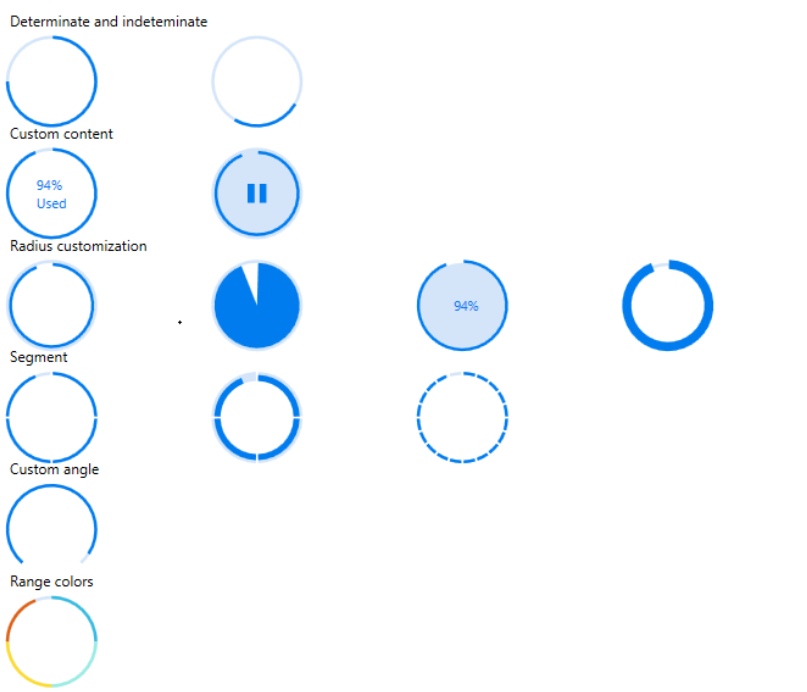
• Determinate and indeterminate: Determinate shows specific quantity of progress that occurred and indeterminate shows a redundant animations of circular progress.
• Custom content: Custom content helps to show the controls progress through user-defined text.
• Radius customization: Radius customization helps to change both inner and outer radii of the Circular ProgressBar.
• Segment: Segment splits the ProgressBar into multiple segments and indicates the progress.
• Custom angle: Custom angle shows the progress drawn to an specific angle for customized appearance.
• Ranges: Specifies the start position and end position to visualize multiple ranges with different colors that are mapped to each range.